Add a K-means Clustering Model to a Chart in Tableau
Aug 6, 2020 • 6 Minute Read
Introduction
Clustering is an important data science activity and is used for customer segmentation. K-Means clustering is an unsupervised machine learning algorithm that is used to group together similar items based on a similarity metric. In this guide, you will learn how to create a k-means clustering model as a chart in Tableau.
Data
This guide will use the Sample Superstore data source available in the Tableau repository.
Steps
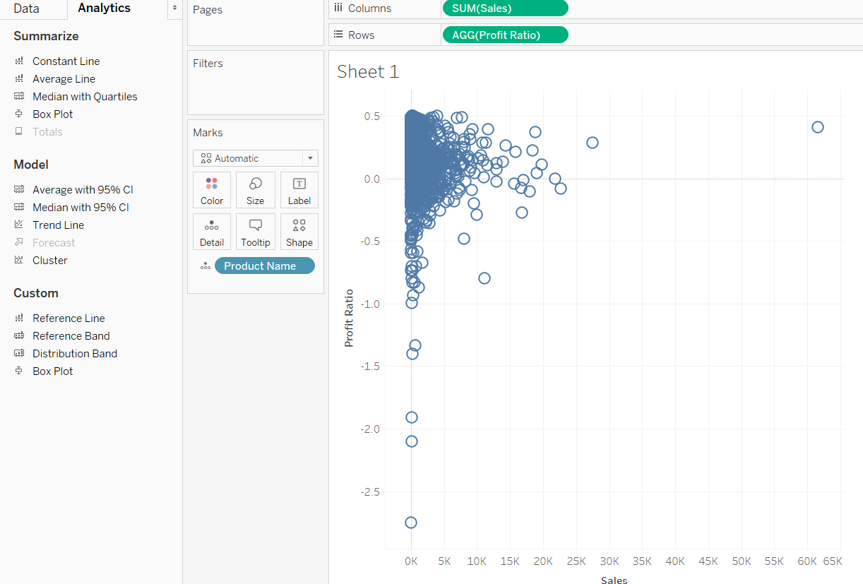
The first step to create clusters is to make a scatter plot. Use the variable Sales and the calculated field Profit Ratio.
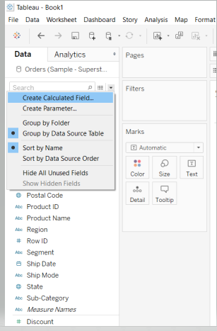
To create a calculated field, right click on the down arrow in the Data pane and select Create Calculated Field from the options. This is shown below.
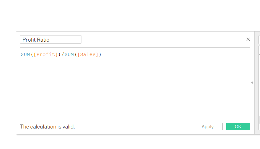
Write the logic in the field as shown below, and name it Profit Ratio.
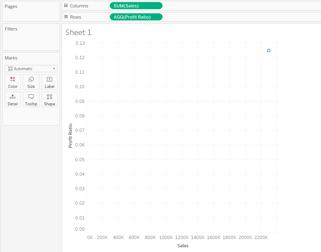
Drag Sales into the Columns shelf and Profit Ratio into the Rows shelf.
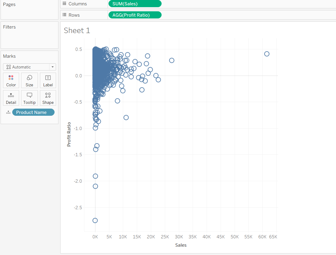
Next, drag Product Name into the Detail card of the Marks pane.
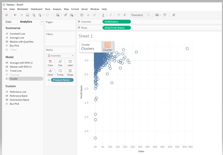
You are ready to initiate the clustering process. To begin, go to the Analytics pane next to the Data pane, as shown below.
In the analytics pane, there is an option for Cluster under the Model section. Drag the Cluster from the analytics pane to the view, as shown below.
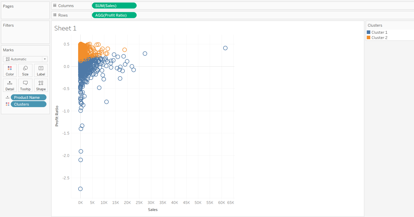
By default, Tableau will use the K-means clustering algorithm and the Euclidean distance measure. Completing the steps above will create two clusters, as shown below.
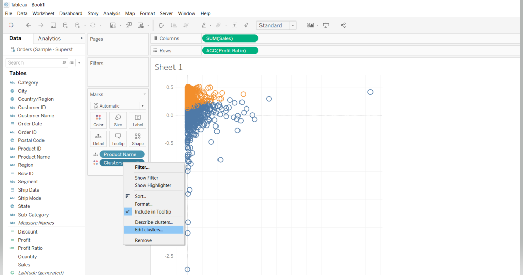
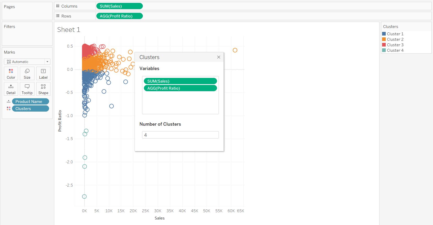
It’s possible to edit the number of clusters. To do this, right click on Clusters and click on Edit Clusters.
In the pop-up that will be displayed, enter 4 as the Number of Clusters.
Also, there is an option to add or remove variables from the cluster. In this example, add the Discount variable to the cluster.
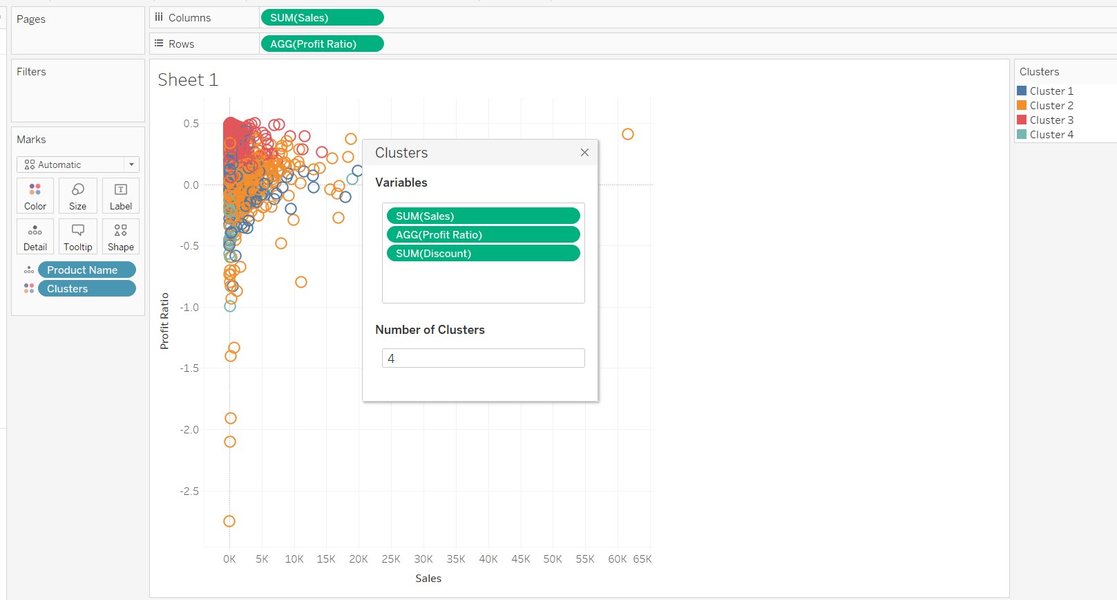
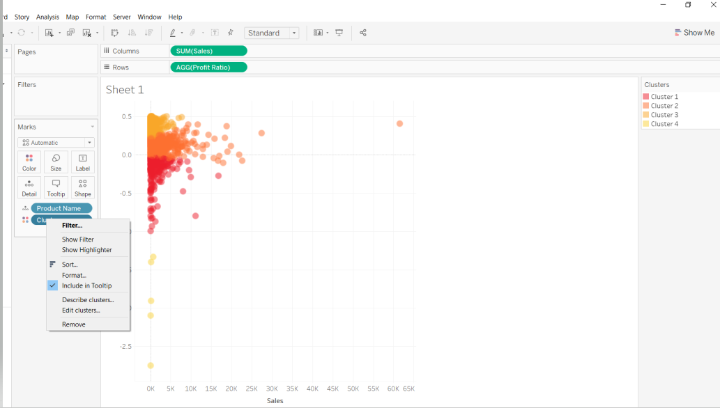
This will create the four k-means clusters. In addition, Tableau provides the option to describe the statistical properties of the cluster, which helps to understand the cluster better. To get this information, click on Clusters in the Marks pane and select Describe clusters..
Completing the above steps will display the result in two tabs. The first tab, Summary, displays the inputs used to generate the clusters and provides statistics that characterize the clusters. From the output below, you can observe there are 236 observations grouped in cluster one, 742 observations in cluster two, 867 observations in cluster three, and five in cluster four.
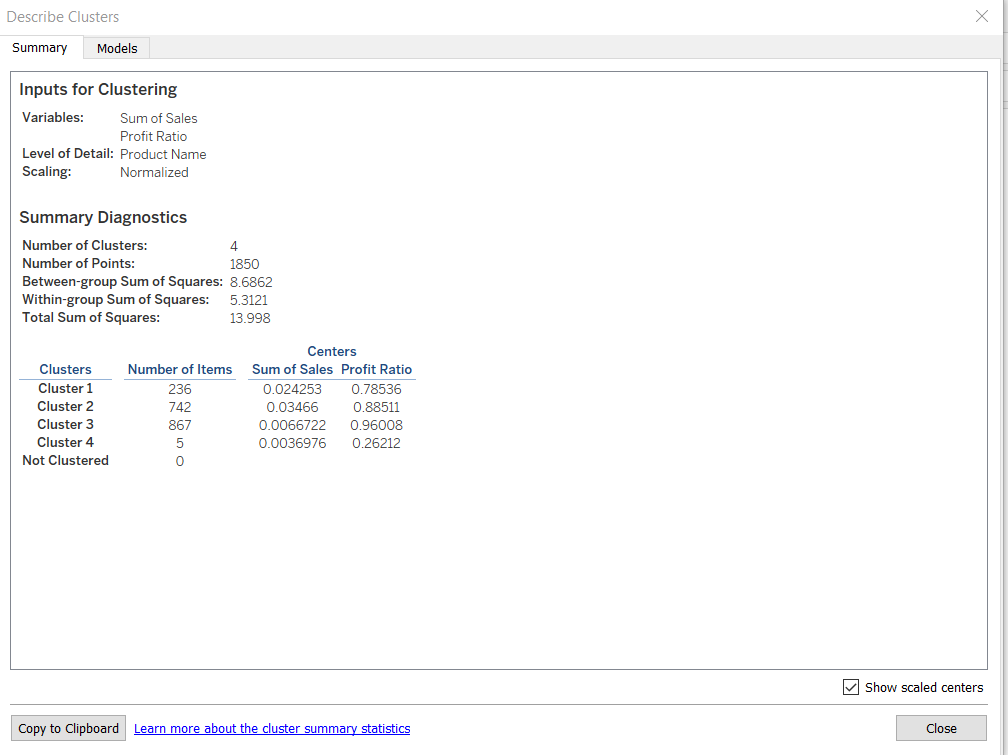
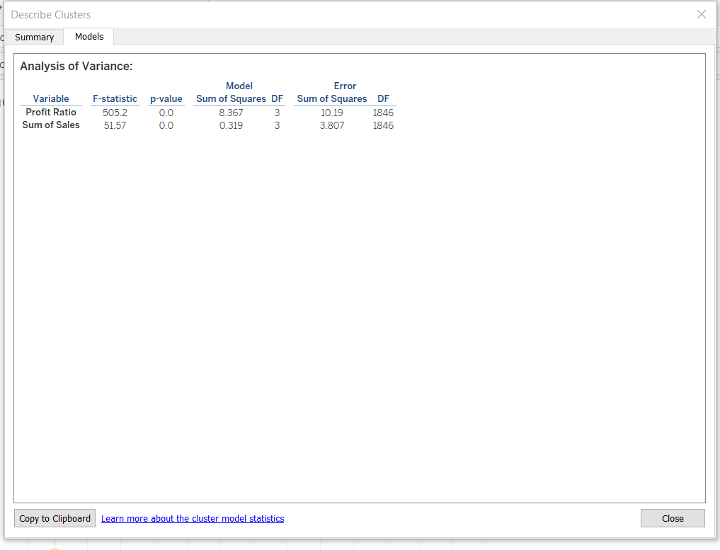
The second tab is the Models tab, which is used to show the statistical information about the model. Analysis of variance, or ANOVA, is used to analyze variation within and between observations that have been grouped into specific clusters. ANOVA is computed per variable, and the result is displayed in the tab, as shown below.
Conclusion
In this guide, you learned how to create a k-means clustering model as a chart in Tableau. You also learned how to display and interpret the results. This will help strengthen your descriptive and diagnostic analytics capabilities.
To learn more about visualization and data analysis using Tableau, please refer to the following guides: