How to Use React Bootstrap with NPM
Aug 23, 2020 • 9 Minute Read
Introduction
React is currently the most preferred JavaScript framework, according to the StackOverflow 2020 Developer Survey. In this guide, we will discuss React Bootstrap, a popular React UI library.
While there are so many React UI libraries to choose from, React Bootstrap remains a popular choice because of its similarity with traditional Bootstrap and the availability of several Bootstrap themes. It is one of the fastest ways to build interfaces using React and Bootstrap.
Installation
To install react-bootstrap as a dependency, run the following command in your React project root directory.
npm install react-bootstrap bootstrap
Or if you prefer Yarn, use this command.
yarn add react-bootstrap bootstrap
You might ask why bootstrap is installed in addition to react-bootstrap. The reason is that react-bootstrap doesn't depend on a specific version of Bootstrap and does not include any CSS on its own, but a stylesheet is required to use react-bootstrap components.
Importing Bootstrap
To use react-bootstrap components, add the following code to src/index.js or App .js.
import 'bootstrap/dist/css/bootstrap.min.css';
And that's it; you can now use React Bootstrap and its components in your app.
Basic Usage
Below are the five most commonly used React Bootstrap components.
- Buttons
- Forms
- Navbar
- Toasts
- Modals
Importing Components
There are two ways to import components from React Bootstrap.
import { Button } from 'react-bootstrap';
Or by pulling specific components from the library.
import Button from 'react-bootstrap/Button';
This import can significantly reduce the amount of code you end up sending to the client. This may be best for individual components, but not if several components are imported.
Using Components
Here is how you can use any React Bootstrap component in your React app.
- Import the component that you want to use, for example, Button.
import Button from 'react-bootstrap/Button';
- Use the imported component with the props that can be found in React Bootstrap docs. For example, Button has props like variant, type, target, size, etc.
      // src/App.js
import React from "react";
import Button from "react-bootstrap/Button";

function App() {
  return (
    <div>
      <Button variant="primary">Click Me!</Button>
    </div>
  );
}

export default App;
Here is how the button will look.

Even if variant="primary" is removed, the button will still look the same since primary is the default value of variant prop.
You can experiment with different props and create new combinations.
- Here is a button with variant="danger" and disabled.
<Button variant="danger" disabled>Click Me!</Button>
.png)
- Here is a button with variant="outline-success" and size="lg".
<Button variant="outline-success" size="lg">Click Me!</Button>
.png)
Example
This example shows the step by step process of styling an app with React Bootstrap.
It will use the character endpoint of the Rick and Morty API, a free REST/GraphQL based API that provides information about characters, episodes, and locations of the Rick and Morty TV show.
- First, request data from the /character endpoint. One way to do this is to use fetch() inside useEffect() hook and store the respose data inside the state variable. By providing an empty array as a second argument to useEffect(), you can ensure that the request is made only after the initial render.
      const [data, setData] = useState([]);

  useEffect(() => {
    fetch("https://rickandmortyapi.com/api/character/")
      .then((res) => res.json())
      .then((data) => setData(data.results));
  }, []);
Next, you need to decide which data we want to show in your app; this example will show name ,image,status, and url. You can check out the Character Schema here.
- You can show the character data in React Bootstrap's Card component. First, make empty cards based on the number of characters in the response using .map() method on the data state.
      // src/App.js
import React, { useEffect, useState } from "react";

function App() {
 const [data, setData] = useState([]);

  useEffect(() => {
    fetch("https://rickandmortyapi.com/api/character/")
      .then((res) => res.json())
      .then((data) => setData(data.results));
  }, []);

  return (
    <div>
      {data.map((character) => (
          <Card key={character.id} style={{ width: "18rem" }}>
         </Card>
      ))}
    </div>
  );
}

export default App;
Here, id of the character is used as the value of the key prop. You will not see anything in the app, since the <Card> component is itself empty.
- You can use Card.Img to display the image inside the <Card> component.
      <Card key={character.id} style={{ width: "18rem" }}>
      <Card.Img variant="top" src={character.image} />
</Card>
Now your application will show different characters' images in a single line without a margin.

You can add className="m-4" to add some margin between cards.
      <Card className="m-4" key={character.id} style={{ width: "18rem" }}>
   <Card.Img variant="top" src={character.image} />
</Card>
- To show name and species, use Card.Title and Card.Text inside Card.Body.
      <Card className="m-4" key={character.id} style={{ width: "18rem" }}>
  <Card.Img variant="top" src={character.image} />
  <Card.Body>
    <Card.Title>{character.name}</Card.Title>
    <Card.Text>{character.species}</Card.Text>
  </Card.Body>
</Card>;
Here is how your card will look.
.png)
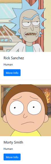
- Finally, add a Buttonto show more information about a particular character. You will also need to import the Button component from the react-bootstrap library.
      <Card.Body>
 <Card.Title>{character.name}</Card.Title>
 <Card.Text>{character.species}</Card.Text>
 <Button variant="primary" href={character.url} target="_blank">
    More Info
 </Button>
</Card.Body>
Here is how your app will look.
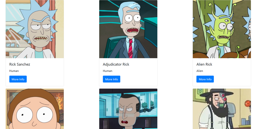
- All the cards in a single line don't look right. To change the layout of the <Card> component, render everything inside <CardColumns> instead of <div>, which will divide the cards into columns.
      import React, { useEffect, useState } from "react";
import { Card, CardColumns, Button } from "react-bootstrap";

function App() {
  const [data, setData] = useState([]);

  useEffect(() => {
    fetch("https://rickandmortyapi.com/api/character/")
      .then((res) => res.json())
      .then((data) => setData(data.results));
  }, []);
  return (
    <CardColumns>
      {data.map((character) => (
        <Card className="m-4" key={character.id} style={{ width: "20rem" }}>
          <Card.Img variant="top" src={character.image} />

          <Card.Body>
            <Card.Title>{character.name}</Card.Title>
            <Card.Text>{character.species}</Card.Text>
            <Button variant="primary" href={character.url} target="_blank">
              More Info
            </Button>
          </Card.Body>
        </Card>
      ))}
    </CardColumns>
  );
}

export default App;
Here is how your app will look.
Conclusion
In this guide, we discussed how to install and use React Bootstrap in any React app, and we saw an example where styling became more straightforward and faster with React Bootstrap. Not every component was discussed here, so you should try to explore different components available in React Bootstrap.
Here are some additional resources that can be helpful.
Happy coding!