Build a Tree Map and Pie Chart in Power BI
Nov 10, 2020 • 7 Minute Read
Introduction
In business intelligence, you are often required to create pie charts and tree maps. A pie chart is a circular graph divided into slices to show the composition of the whole data in parts. Each constituent of a pie chart is represented in percentages, and the sum of all the parts is equal to hundred.
Tree map is another technique used for displaying hierarchical data using nested figures, usually rectangles. The space in the visualization chart is divided into rectangles per the size and order of a numerical variable.
This guide will demonstrate how to create a pie chart and a tree map in Power BI desktop.
Data
In this guide, you will work with a fictitious data set of bank loan disbursal across years. The data contains 3,000 observations and 17 variables. You can download the dataset here. The major variables are described below:
-
Date: Loan disbursal date.
-
Income: Annual Income of the applicant (in US dollars).
-
Loan_disbursed: Loan amount (in US dollars) disbursed by the bank.
-
Age: The applicant’s age in years.
-
Gender: Whether the applicant is female (F) or male (M).
-
Interest_rate: Annual interest rate, in percentage, charged for the disbursed loan.
-
Purpose: Purpose for which loan was taken.
-
Month: Month in which loan was disbursed.
You will start by loading the data.
Loading Data
Once you open your Power BI Desktop, the following output is displayed.
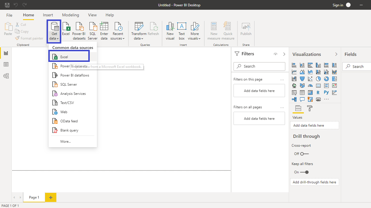
Click on Get data and select Excel from the options.
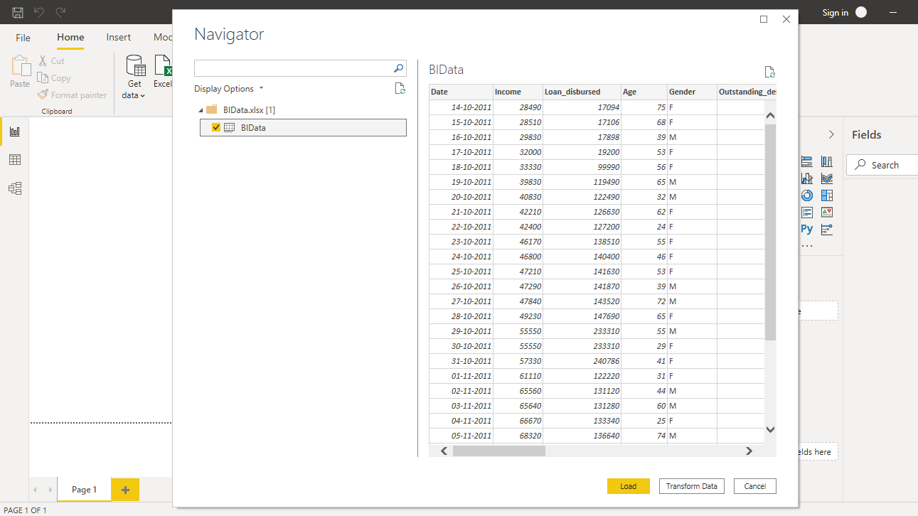
Browse to the location of the file and select it. The name of the file is BIdata.xlsx, and the sheet you will load is the BIData sheet. The preview of the data is shown, and once you are satisfied that you are loading the right file, click Load.
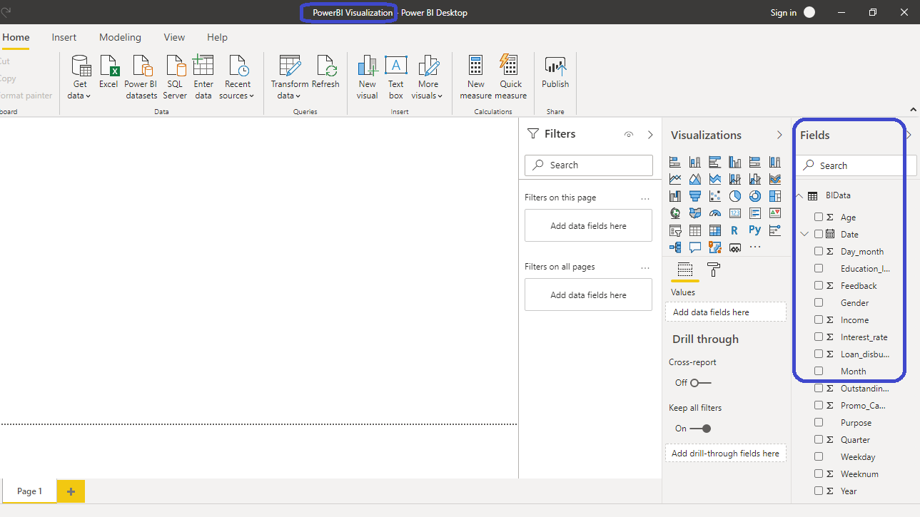
You have loaded the file, and you can save the dashboard. It is named PowerBI Visualization. The Fields pane contains the variables of the data.
Pie Chart
The Visualization pane located on the right side of the Power BI desktop contains the list of possible visualization charts. The chart you will use is Pie chart.

Click on the chart shown above, and it will create a chart box in the canvas. Nothing is displayed yet because you are yet to add the required visualization arguments. These are added in the options located under the Visualizations pane. Another thing you can do is collapse the Filters option in the pane with the arrow > sign.

You will visualize the different categories of the Purpose variable, and its contribution to Loan_disbursed. Start by dragging the Loan_disbursed variable into the Values options, and the Purpose variable into the Legend field. This will generate the following plot.

Resize the chart as per your convenience. Hovering to a section of the pie chart displays the value of the component and the contribution to the total value. In the output below, the Purpose category displayed is Personal. A total of $135.57 million was disbursed for this category, and it contributes 31.05 percent of total loan disbursed by the bank. In the same manner, you can examine the other components of the pie chart.

Formatting Pie Chart
There are several options to perform formatting of choice. Click on the Format option displayed in the small box below, and you will see different options.

You will format the color and alignment of the chart title as shown below.

If you want to give border to the chart, you can select the Border option.

Tree Map
In Power BI, you can locate the tree map chart option in the Visualizations pane.

Click on the tree map chart option and the following will be added to the canvas.

Select the chart and you will have different options to fill. In this guide, you will build a tree map to visualize average loan disbursed across months. The objective is to see if there is any seasonality at month level on loan disbursal. Drag the Month variable into the Group field, and Loan_disbursed variable into Values field.

From the above chart, you can infer that October, June and February are the months with highest loan disbursal. However, the plot is giving summary of loan disbursed by default, while what you're looking for in this example is the average loan disbursed per month. To make this change, click on the down arrow next to Loan_disbursed as shown below.

The above step will open the option where you can select the Average option.

Now you can see that the variable in the Values field is changed to Average of Loan_disbursed.

The output above shows some changes from the previous tree map. October has the highest loan disbursal across years, but the highest average loan disbursed is for June. To get the values displayed in the chart, you can go to the format option, and select Data labels.

From the above output, you can infer that the average loan disbursal was highest for month of June, while it was lowest for November.
Conclusion
Both pie charts and tree maps are great tools for storytelling using visualization. When the qualitative variable has fewer labels, or categories, a pie chart is visually appealing. However, if the number of measures is large, such as twelve Months, a tree map is a better alternative. Both of these charts are used across industries including manufacturing, utilities, ecommerce, retail, etc.
These charts are also used in various functions of an organization. For example, the finance function may want to use a pie or tree map chart to understand the cost mix of its operating and fixed expenses.
Advance your tech skills today
Access courses on AI, cloud, data, security, and more—all led by industry experts.
