Building a Time Series Chart in Tableau
Time series forecasting is a critical requirement for many organizations. Tableau provides the flexibility to reflect on historical data and analyze trends.
Oct 30, 2020 • 6 Minute Read
Introduction
Time series forecasting is a critical requirement for many organizations. The starting point of forecasting is a time series visualization, which provides the flexibility to reflect on historical data and analyze trends and seasonal components. It also helps to compare multiple dimensions over time, spot trends, and identify seasonal patterns in the data. A few examples include stock market analysis, population trend analysis using a census, or sales and profit trends over time.
Definition of Time Series
Time series analysis is a statistical technique used to record and analyze data points over a period of time, such as daily, monthly, yearly, etc. A time series chart is the graphical representation of the time series data across the interval period.
In this guide, you will learn how to build a time series chart in Tableau.
Steps
Tableau provides convenient options for building time series charts. The built-in date and time functions allow you to use the drag-and-drop option to create and analyze time trends, drill down with a click, and easily perform trend analysis comparisons.
To build a time series chart in Tableau, we will use the built-in Sample Superstore data that comes with the Tableau installation. Please follow the steps outlined below to create a time series chart.
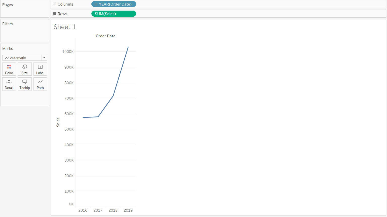
- Drag the Order Date field to the Columns shelf and the Sales variable to the Rows shelf. The default chart will give us a yearly trend line chart. The Marks shelf automatically selects a line graph for the chart.
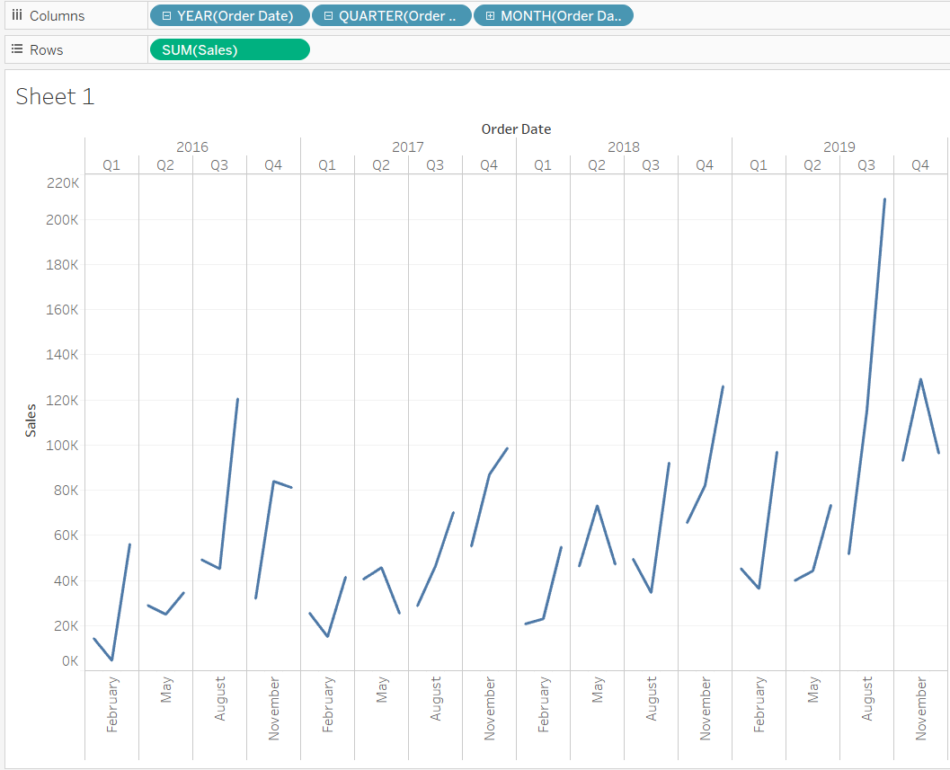
- In the chart above, we see that the display is in years. To further drill down to quarter and month levels, we can simply click on the plus icon on the order date in the Columns shelf. This will generate the following output, which now displays the data broken down to the month and quarter level.
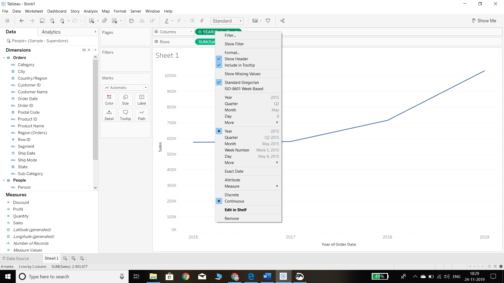
- The above chart is useful, but it is displayed in a discrete format. It will be more beneficial if the data is displayed in continuous form. To convert the chart into a continuous format time series chart, the first step is to roll up the YEAR (Order Date) back to year level, and then the second step is to right-click on it and select the Year and Continuous options. This is illustrated in the chart below.
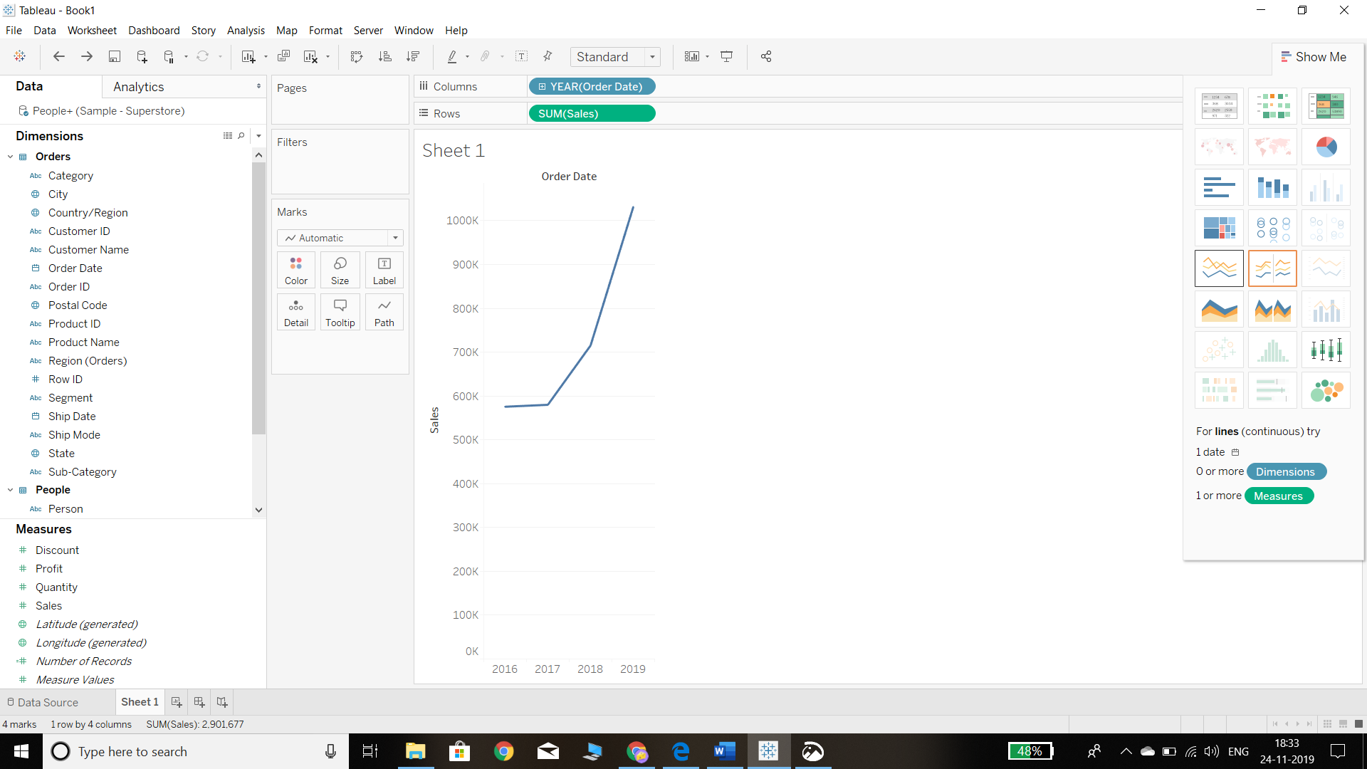
- Another option in Tableau to build the continuous chart is to directly select the line chart type in the Show Me card, as shown in the chart below.
The above chart shows the trend of annual sales during the period 2016 through 2019. There is a continuous trend of increase in sales volume. However, it is better to analyze the time series data by breaking it down to a monthly level.
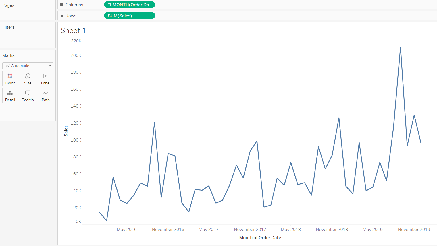
- It is easy to change the chart breakdown from annual to monthly. This can be done by simply changing the Columns shelf from YEAR (Order Date) to MONTH (Order Date). This will generate a monthly time series chart. From an analytics perspective, this chart is more insightful as it allows us to see the sales fluctuations across months and years. This is also useful for decomposing the seasonality and trend components of the time series data.
- Tableau also provides the ability to change the path property as well as the chart type.
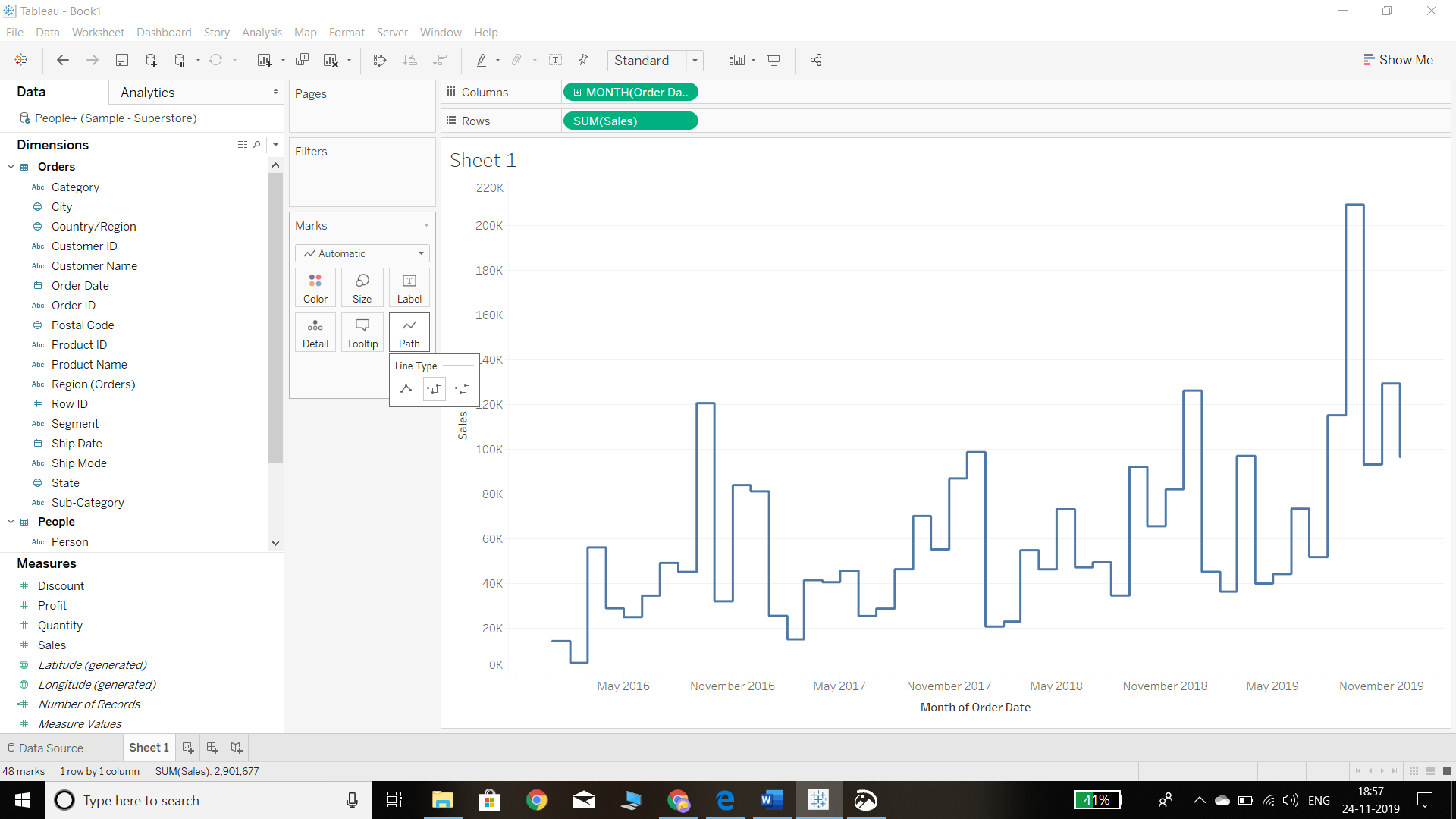
Change the Path Property
We can change the path property by going into the Marks shelf and clicking on the Path option. There are three options for the type of line graph for the view, and selecting the second option will produce the following chart. The output is like the previous chart, but the trend shifts are more pronounced now.
Change the Chart Type
We can change the chart type to options such as a bar or an area chart, either from the Marks shelf or from the Show Me option. However, for time series data, this is not suggested as the line chart is the best option.
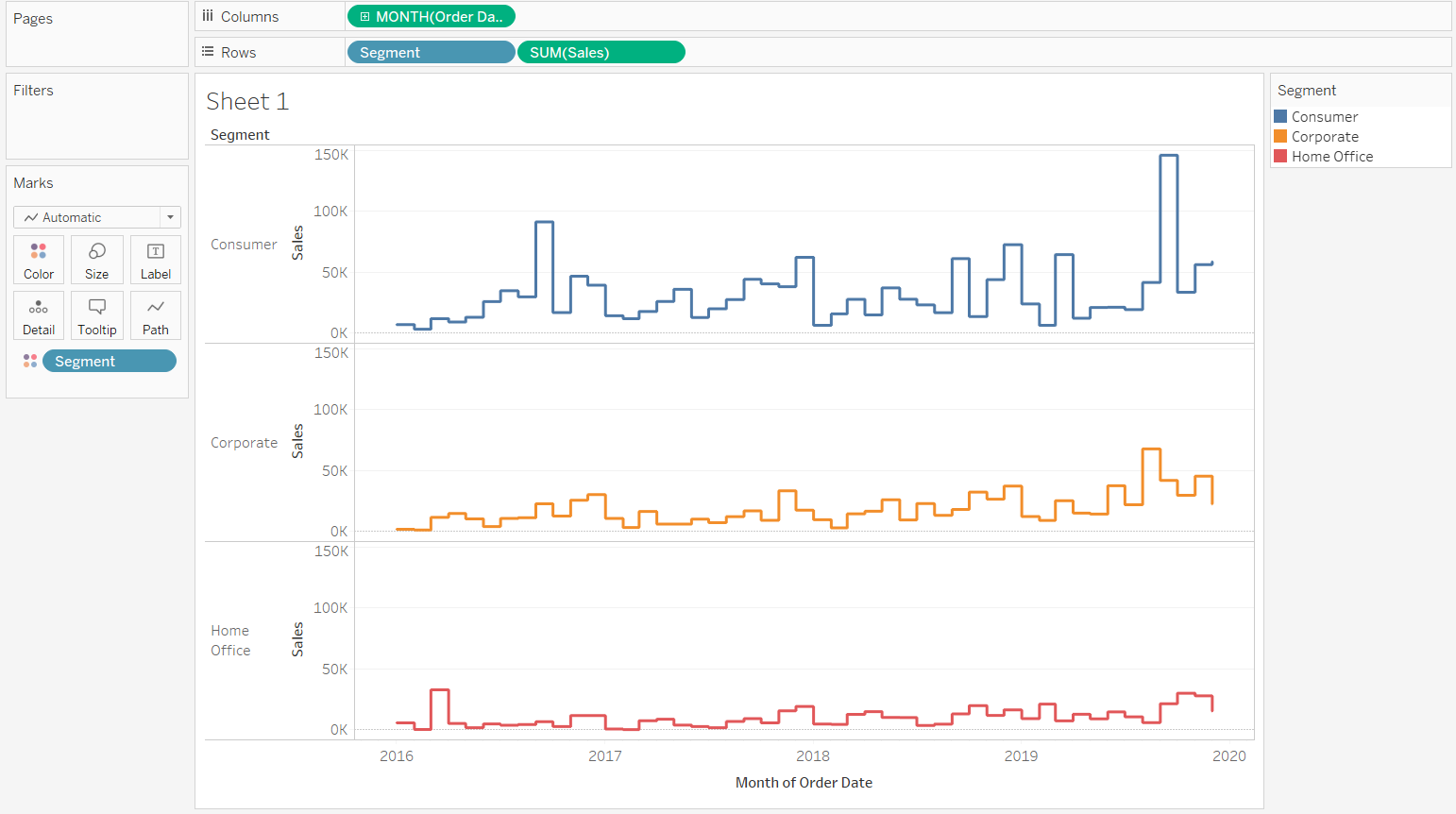
Adding Categories to Time Series
In the previous sections, we have learned how to build a time series chart with two variables, sales and time. However, sometimes it is important to add more variables to a chart to understand and analyze it better. For instance, it could be useful to visualize sales by segment across time. This can be done easily in two ways. First, simply drag the Segment field to the Color pane in the Marks shelf. The second method is to move the category to the Rows shelf to show it separately.
Conclusion
In this guide, you learned about building a time series chart in Tableau and the different options available. You also learned about adding an additional category to a time series chart. This will help you in not just creating and analyzing time series data, but also in forecasting.
Advance your tech skills today
Access courses on AI, cloud, data, security, and more—all led by industry experts.
