Building Line Charts in Power BI
Nov 24, 2020 • 6 Minute Read
Introduction
A line chart is a popular visualization chart used to represent a series of data points connected by a straight line. It is used to represent continuous data sets. Time series forecasting and stock market trend analysis are common applications of line charts. This guide will demonstrate how to build line charts in Power BI Desktop.
Data
In this guide, you will work with a fictitious data set of bank loan disbursal across years. The data contains 3,000 observations and 17 variables. You can download the dataset here. The major variables are described below:
- Date: Loan disbursal date.
- Income: Annual income of the applicant (in US dollars).
- Loan_disbursed: Loan amount (in US dollars) disbursed by the bank.
- Gender: Whether the applicant is female (F) or male (M).
- Interest_rate: Annual interest rate, in percentage, charged for the disbursed loan.
Start by loading the data.
Loading Data
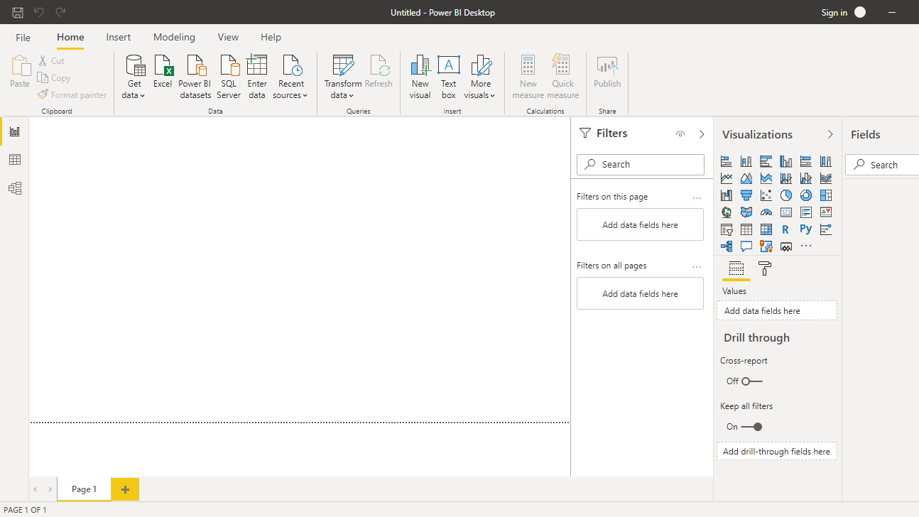
Once you open Power BI Desktop, the following output is displayed.
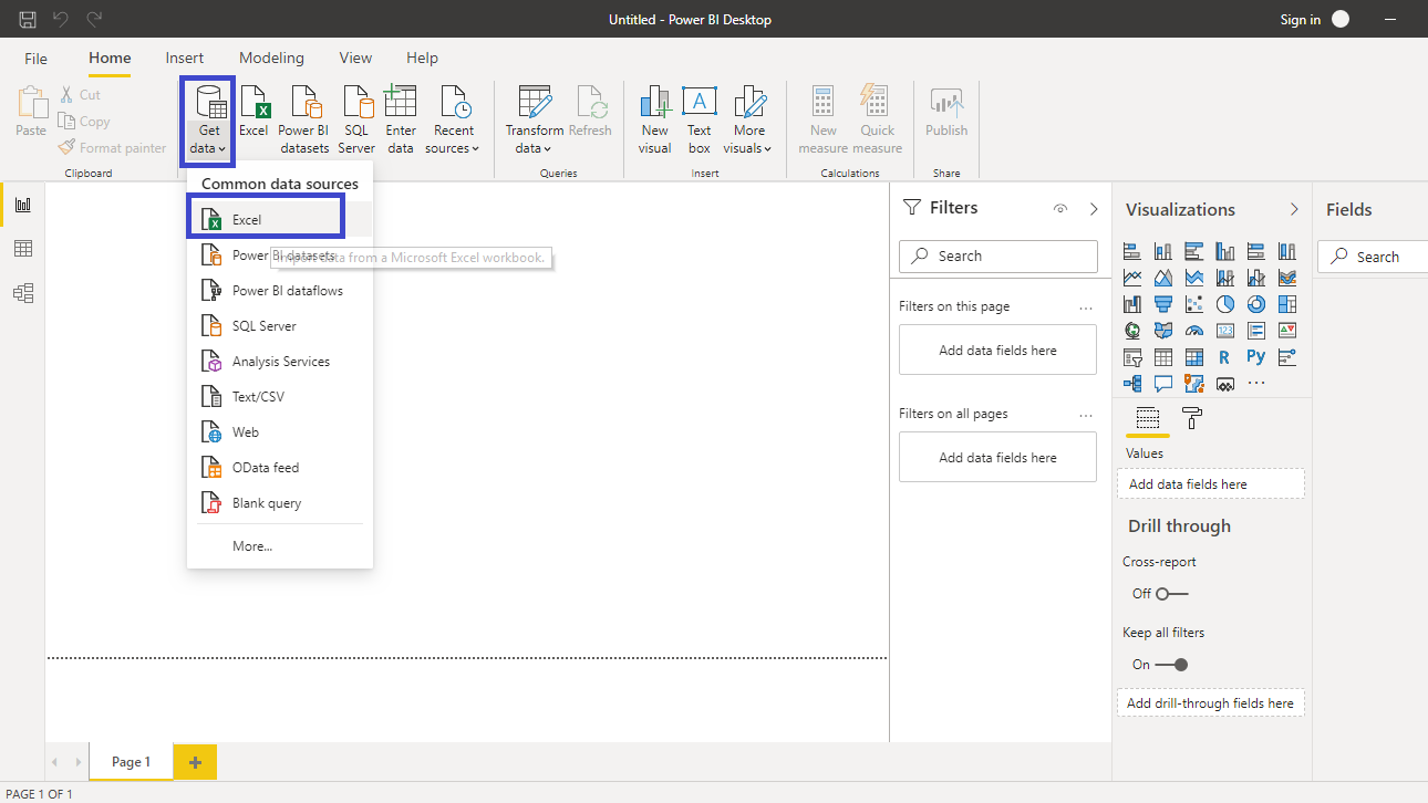
Click on Get data option and select Excel from the options.
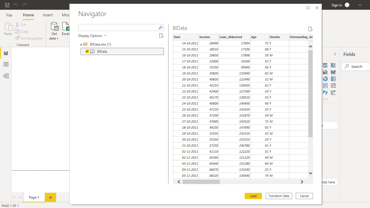
Browse to the location of the file and select it. The name of the file is BIdata.xlsx, and the sheet you will load is BIData sheet. The preview of the data is shown, and once you are satisfied that you are loading the right file, click Load.
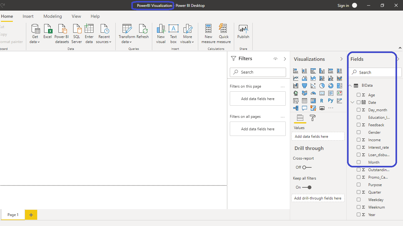
You have loaded the file, and you can save the dashboard. It is named PowerBI Visualization. The Fields pane contains the variables of the data.
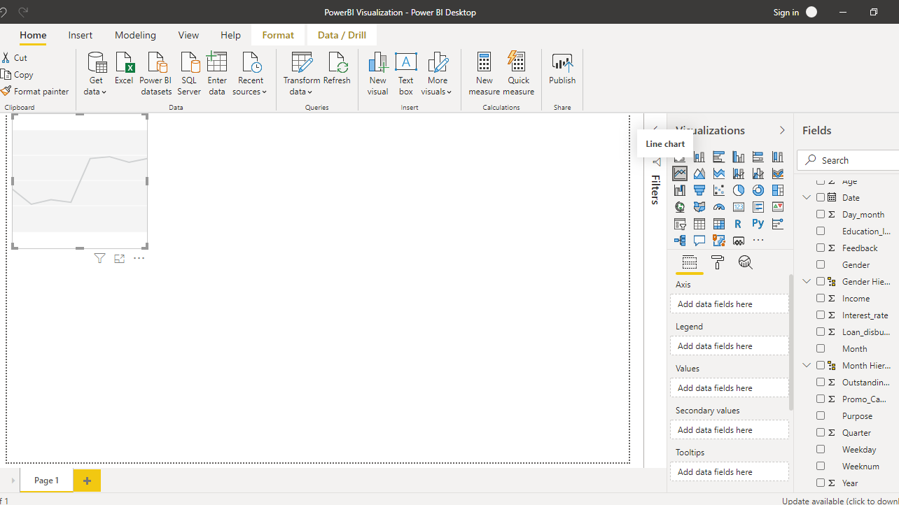
Adding Line Chart
The first step is to add a Line chart from the Visualizations pane.
Drag the variable Date into the Axis field, and Interest_rate in the Values field.
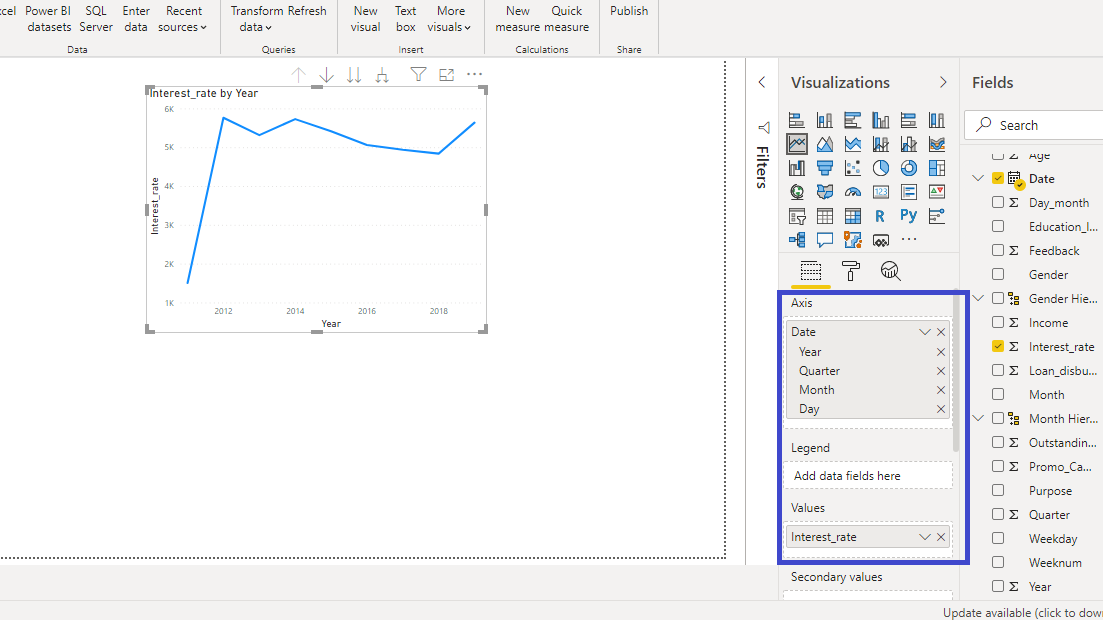
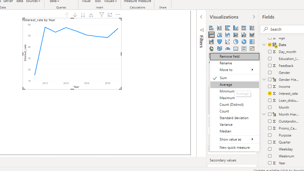
The above line chart is incorrect as it adds the interest rate values. To make the correction, right click and select Average.
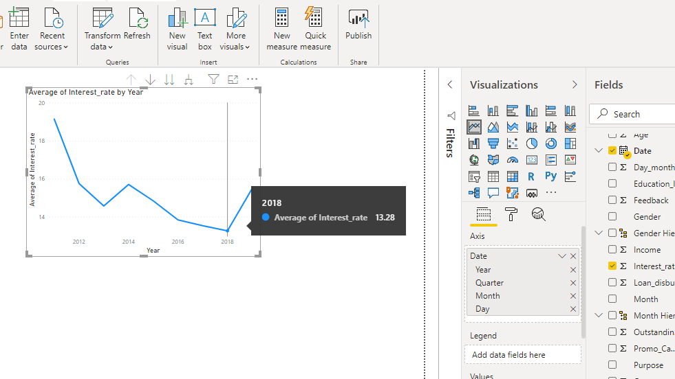
The above step will produce the correct line chart that displays the average interest rate.
Format Line Charts
The Format field in Power BI Desktop provides several options to format the chart. To begin, turn on the Data labels as shown below.
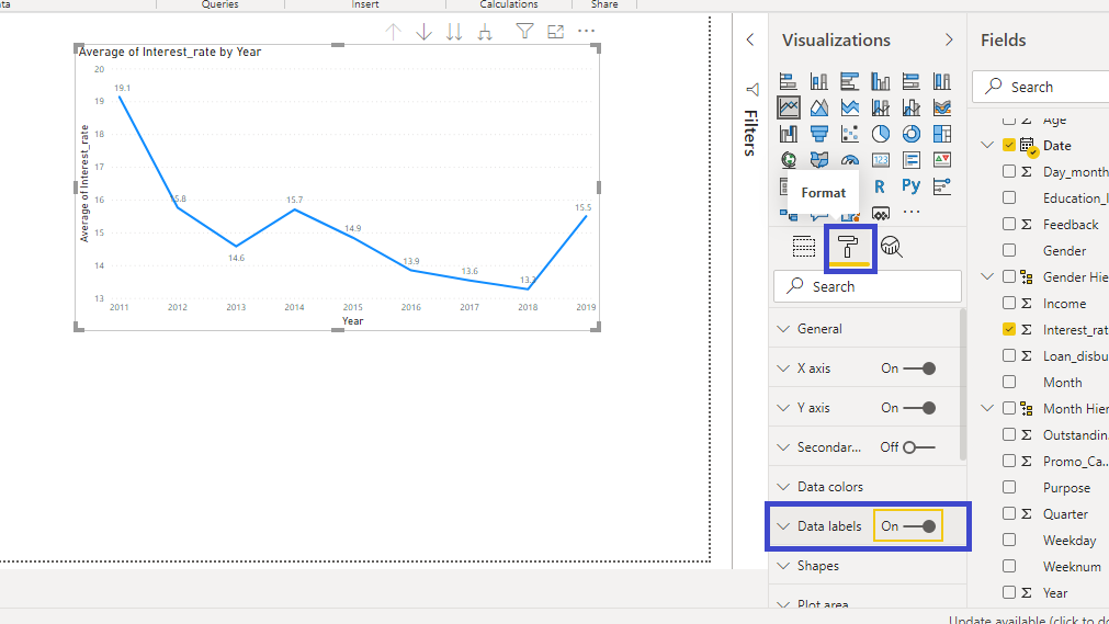
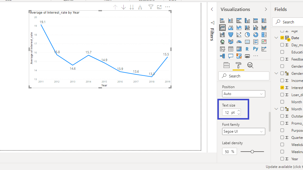
You can see the data labels plotted in the line chart, but the text size is small. Set the Text size to twelve.
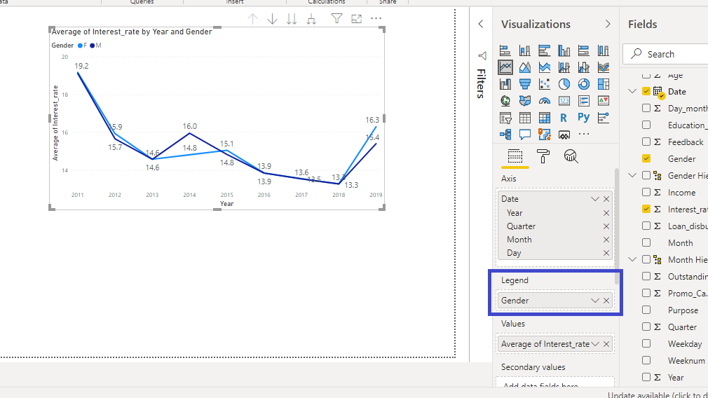
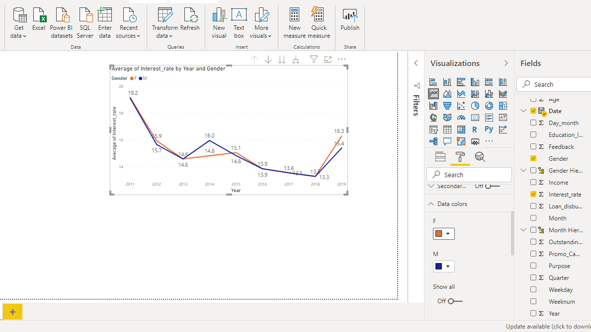
You can also add new dimensions to the chart. For example, drag the Gender variable into the Legend option. This creates two line charts corresponding to gender.
If you want to change the color of either of the line chart, that is also possible. Go to Data colors and you will see the default color for both gender.
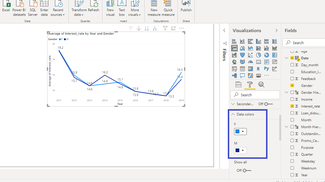
Click on the default color for F and several color options will be displayed.
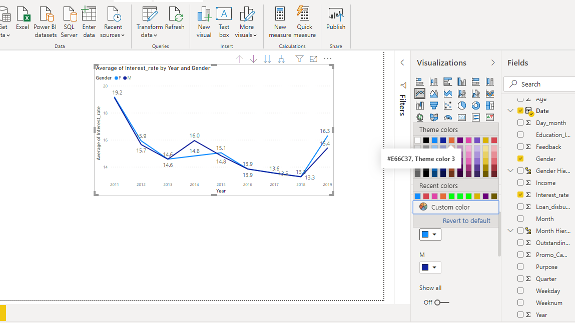
Pick the color of your choice or as shown in the chart below to generate the following output.
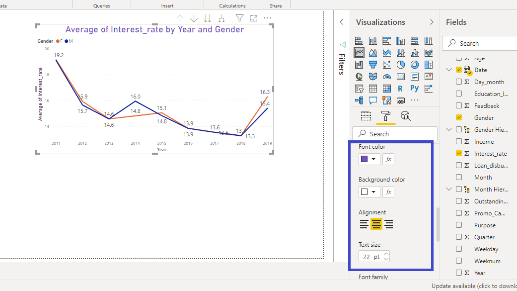
You can also format the title of the chart. Go to the Title option under Format.
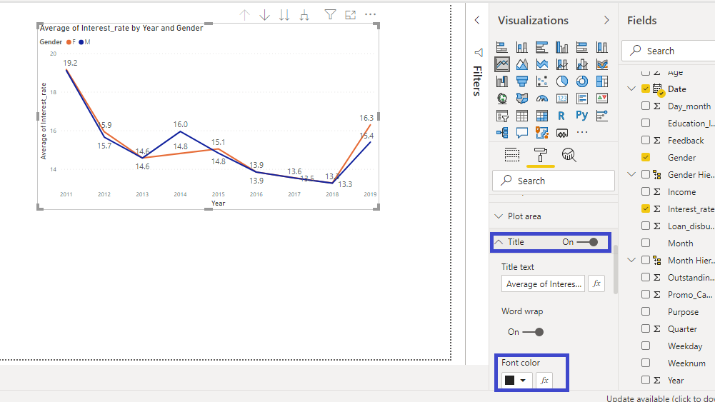
Change the Font color, Alignment, and Text size of the title. This will generate the resulting output.
Conclusion
Line charts are used across industries because of their power to represent changes across time. They are used for time series forecasting and in various financial reporting tasks. Another advantage is that you can represent changes in multiple variables across time. Line charts are used across sectors and knowledge of building line charts is a useful skill set to enhance your business intelligence capabilities.
To learn more about building powerful visualization in Power BI Desktop, please refer to the following guides:
Advance your tech skills today
Access courses on AI, cloud, data, security, and more—all led by industry experts.
