Comparison of D3 and Dimple Code for Line Charts
See a side-by-side comparison of D3 vs Dimple for line charts. Learn how Dimple can simplify some arcane D3 constructs in this free tutorial.
Jan 10, 2019 • 25 Minute Read
Introduction
During my time as a SharePoint developer, D3 and Dimple have come in handy for various graphical and charting applications. This article will (re)introduce you to D3 and Dimple and briefly discuss the benefits of using them together. This article ultimately aims to explain how Dimple simplifies some arcane D3 constructs.
What is D3?
In a previous article, Creating great visualizations with D3, Dimple, and SharePoint, I outlined some reasons why D3, which stands for Data Driven Documents, and Dimple are useful for SharePoint Visualization projects. Let me summarize some key points.
First, a definition from my previous article: “D3 is a JavaScript library for producing dynamic, interactive data visualizations in web browsers. It makes use of the widely implemented SVG, HTML5, and CSS standards. It is the successor to the earlier Protovis framework.
To find out more about this technology, let’s see what D3’s main page says: D3 allows you to bind arbitrary data to a Document Object Model (DOM), and then apply data-driven transformations to the document. For example, you can use D3 to generate an HTML table from an array of numbers. Or, use the same data to create an interactive SVG bar chart with smooth transitions and interaction.
D3 is versatile
D3 is not a monolithic framework that seeks to provide every conceivable feature. Instead, D3 solves the crux of the problem: efficient manipulation of documents based on data. This avoids proprietary representation and affords extraordinary flexibility, exposing the full capabilities of web standards such as HTML, SVG, and CSS. With minimal overhead, D3 is extremely fast, supporting large datasets and dynamic behaviors for interaction and animation. D3’s functional style allows code reuse through a diverse collection of official and community-developed modules.
Many examples of D3 exist out on the web. Googling “D3 examples” should give sites containing thousands of examples each! Some visual work is shown below, courtesy of the gallery of Christopher Viau.
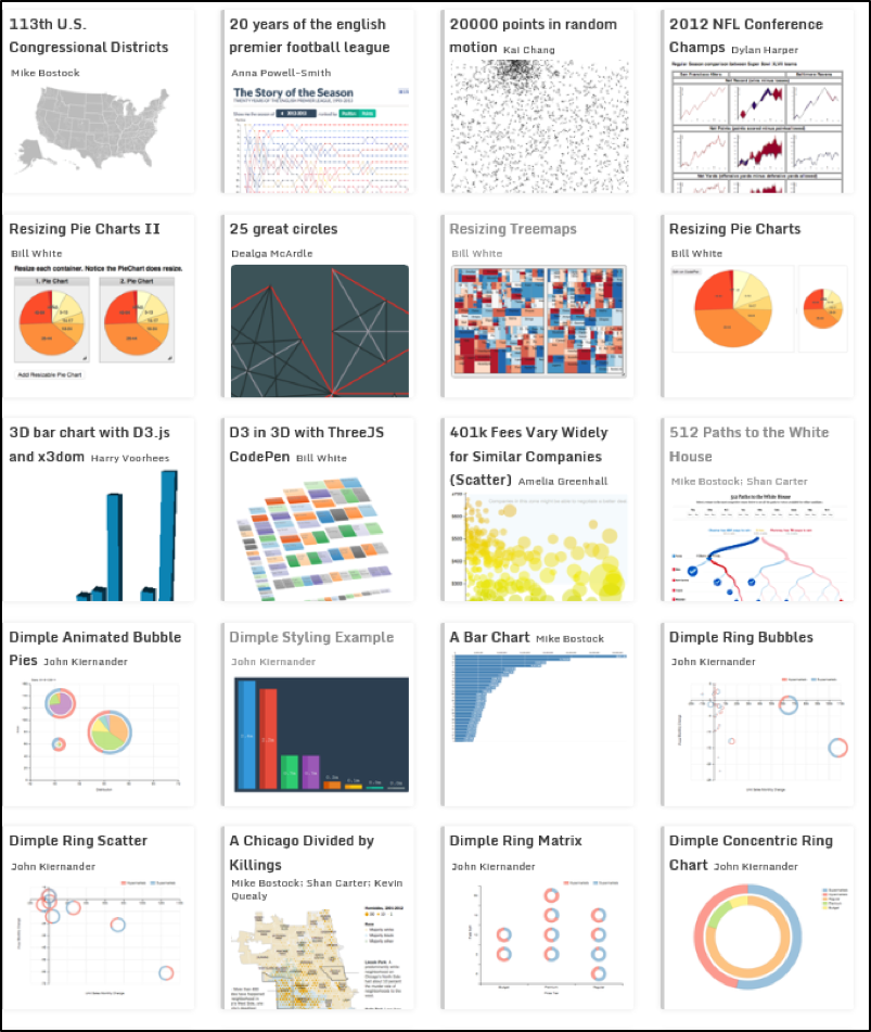
D3 charts and graphs have permeated the internet for interactive graphical displays from sports to presidential races.
Even crossword Word Graphs are based on D3 layouts and code:

D3 Word Graph
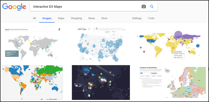
Also, interactive statistical maps and population studies have all found a fertile home in d3 code--just Google “Interactive D3 Maps” and choose the images:
What is Dimple?
Dimple is another programming language with the sole aim to simplify D3. The main site for dimple https://dimplejs.org states it more eloquently: “The aim of Dimple is to open up the power and flexibility of d3 to analysts. It aims to give a gentle learning curve and minimal code to achieve something productive. It also exposes the d3 objects so you can pick them up and run to create some really cool stuff.”
Before leaving D3 and Dimple, it is important to note that both come from a language derived in part from jQuery, which is based off JavaScript.
Why are D3 and Dimple useful?
- D3 and Dimple are free.
- There are tons of examples and plenty of documentation on the net.
- D3 and Dimple both have libraries that derive from jQuery--so the syntax should be familiar to jQuery and JavaScript Programmers.
- Both languages work with the Document Object Module (DOM). As such, they can build complex HTML structures and respond to events.
- Because both libraries bind the actual DOM element, amazingly detailed tooltips are produced.
- The D3 library has awesome date and time functions (Compare to Momentjs.com)
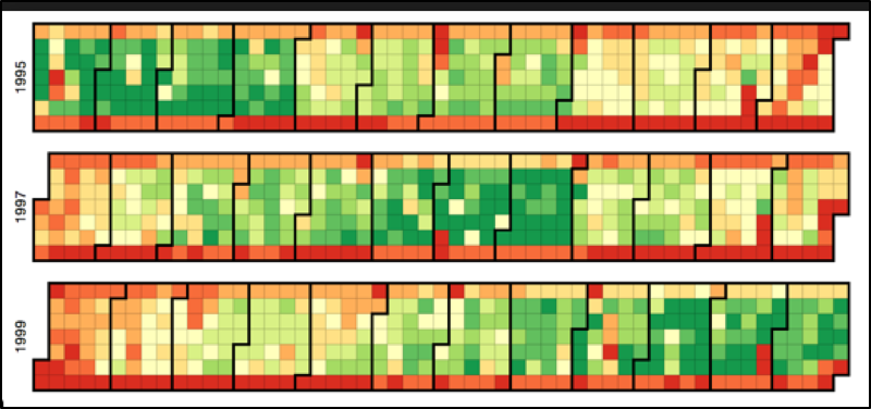
Some of the Daily Heat Maps produced by D3 show every day within multiple years by week and day:
D3 and Dimple Line Chart Example
Now that the main players, D3 and Dimple, have been introduced, let’s take them for a test drive.
We will compare a small line chart written in Dimple with the same basic functionality written in native D3.
But before the actual comparison, let’s set some expectations of what we will encounter in Dimple code since the aim of Dimple is to simplify D3.
We should expect the following from the Dimple Code: • Less Code • Simplified Routines • Uniform Class Labels for CSS elements
After we have examined the Dimple Code line by line, we will explore the DOM Elements created by the code. To accomplish this, we will use the Chrome Developer Tools to view the structures produced. D3 code will need to create similar structures to accomplish the same functionality.
Dimple versus D3 Code
For the comparison, I have chosen two simple line charts, one done in Dimple, and the other done in native D3. My comparison code examples can be download from https://github.com/sonisick/d3anddimpleexamples https://goo.gl/Vm4Frc. Download a zip file and unzip. The code will run from any modern browser.
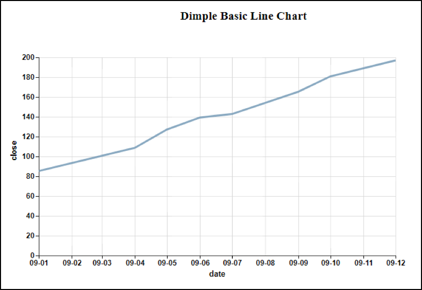
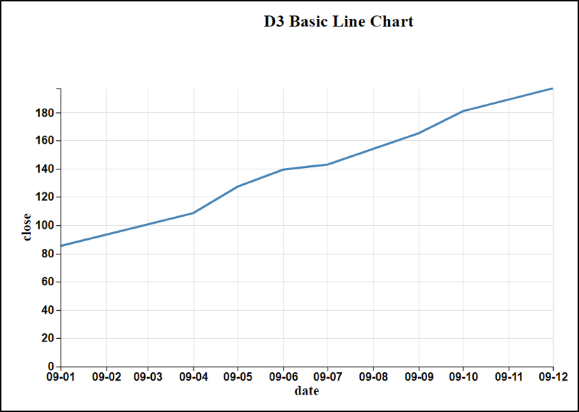
The Chart Contenders
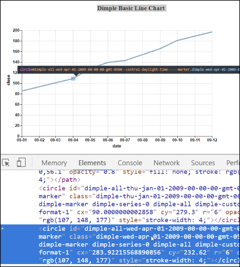
Not exactly an impressive set—but you gotta start somewhere. One thing to note even at this stage, Dimple wants to show its stuff: just run your cursor slowly over the dimple plot line, and you should see the phenomenon depicted below:

Dimple Exuberant about Data!
Now let’s look into the Dimple Code.
Dimple Code
The data for both come from an internal variable in each of the chart samples called data. The variable data is simply a JSON object:
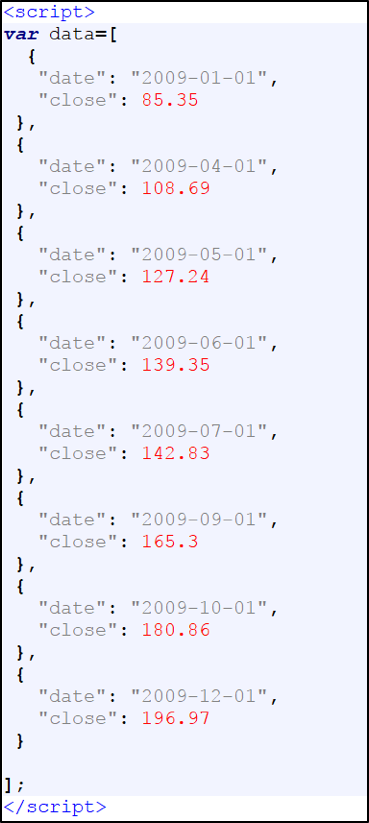
JSON Data for both Examples
The above variable object is enclosed with an opening and closing Script tag <script>, so that the section can be collapsed as we concentrate on the main coding routine. The CSS Style tag will also be collapsed and referenced only when needed.
With the data portion and CSS Styles collapsed, the code is quite succinct with just nine lines of actual Dimple Code:
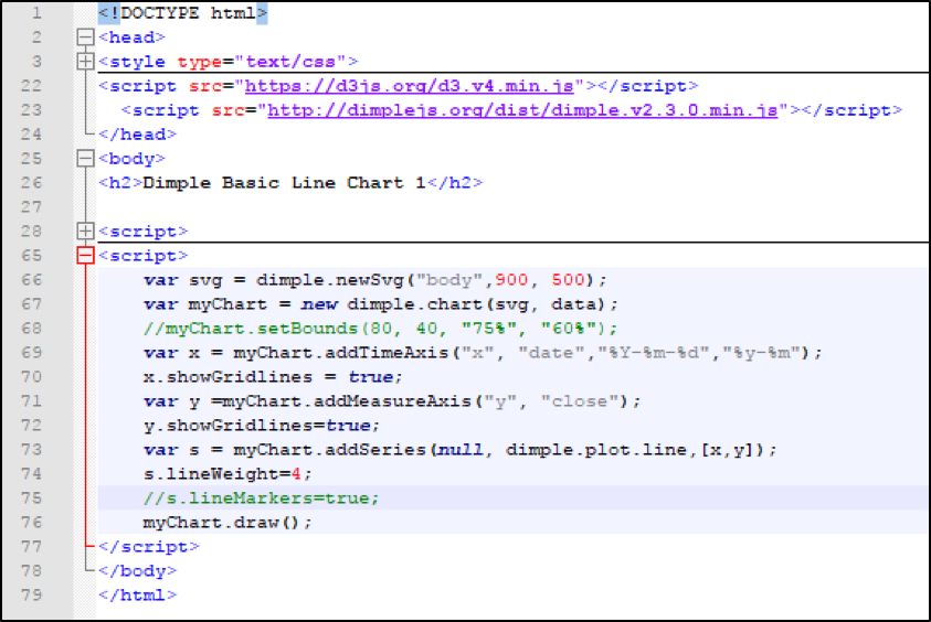
First Dimple Example
Code breakdown
After the collapsed CSS styling, we see on lines 22 and 23 two script tags referencing the D3 and Dimple libraries. The D3 reference is always listed before the Dimple reference because the helper Dimple library depends on a D3 library being present. Also, it is necessary to coordinate the correct version of D3 with a specific Dimple version. Since we are using the D3 v4 library, we need the Dimple v2.3 library.
After the Body tag on line 25, we see a Chart Title.
Line 28 shows us the collapsed Script tag for the JSON data variable.
Next, after the open Script tag, we have the Dimple code.
Line 66 simply creates a new SVG element with the dimensions of 900 pixels width by 500 pixels height.
Dimple by default allocates an area with the dimensions of 80 percent of the height and 80 percent of the width for the chart’s plot area. The remainder of the space is for axis, axis labels, and padding.
Line 67 creates a new Dimple chart from the svg variable and the data variable. Line 68 is a comment I left in as an example of formatting the plot area if the defaults 0f 80 percent are not suitable. The command is “myChart.setBounds.” You can check the parameters by clicking on the link to the API Reference: (https://goo.gl/M2KhKt).
Line 69 adds the x-axis as a Timed Axis. The parameters are the axis name, a date column, the Input Format (how the data is formatted), and the Output format. The last parameter is the way the date will be formatted on the axis. In this example, the format on is x-axis is “yy-mm”; e.g. the date of 1/1/2009 will format as 09-01.
(The following is a shortend URL to D3 Time Formatting Documentation: https://goo.gl/wp8NGz).
Line 70 explicitly turns on the x gridlines.
Line 71 adds the Measured Axis for the y-axis. The only parameters needed are the axis name and the y-column name.
Line 72 explicitly turns on the y gridlines.
Line 73 creates the line series from the columns extracted from our data variable.
The addSeries command has three parameters. The first is used to create multiple series by further dissecting the data. In the current example, the first parameter is null.
An example where a non-null value is used in the first parameter is a multi-series line chart that I produced for a book entitled “The SharePoint 2013, D3 and Dimple Connection” (https://goo.gl/eqqXGT).
The data contained two separate series: one for the Production Run and the other for the Average or Idealized Run. Each series produced a line on the graph.
Having multiple series in the same data source is called disaggregation or further splitting the data into multiple series.
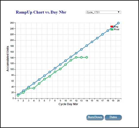
Multi-series line chart example
In this case of the above multi-series line chart the addSeries line looks as follows:
var lines = myChart.addSeries("Run Type", dimple.plot.line, [x,y]); The data in the file is split into two series by the first parameter called “Run Type.” The result is that two separate lines are produced: one for the Run Type of “Prod” and the other for the Run Type of “Avg.”
The second parameter on line 73 is simply the name of the Dimple graphing object--which is essentially the Dimple Chart type. In this example, we are using the “dimple.plot.line.”
The other graphing objects are dimple.plot.area, dimple.plot.bar, and dimple.plot.bubble. Each of these objects correspond to a specific Dimple chart. The third parameter indicates the values required to create a combined unique value--in this case for a line point. Here we are using data from the x and y coordinates.
Line 74 sets the weight of the plot line.
Line 75 is a comment to show how to turn on the lineMarkers--more on this later.
Line 76 performs the magic of rendering the chart.
Exploration of the Dimple Dom Structure
Before we look at the plain D3 coded graph, we need to examine what Dimple has created in the Document Object Model (DOM) Structure. To do the inspecting, we utilize the Developer Tools in the Chrome Browser.
All modern browsers have comparable debuggers or developer tools. I find Chrome more convenient to use. One of my favorite things about the Chrome Developer is that when you hover over or click on a DOM object, the tool highlights the area occupied by the HTML element on the screen. In the ensuing screens, we will show many instances of highlighted areas of HTML objects.
The objective at this stage is to view the structures that Dimple automatically creates. The main structures the we will concentrate on is the HTML group elements, . The group element is a container object and not directly visible in rendered HTML. It groups functional elements together.
When we view the raw D3 code, we will see that much more coding work is required to create these group objects which Dimple supplies effortlessly.
To open the Developer Tools, either use the F12 key or do a Control Shift and “I” key combination. Also, make sure you have the Elements Tab open, since this will be the focus of our exploration.
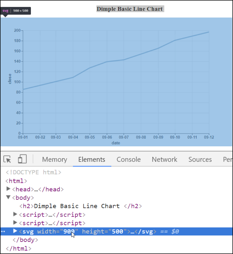
First, hover the cursor over or click on the SVG tag , you should see the entire chart area in blue with svg label displayed at the top:
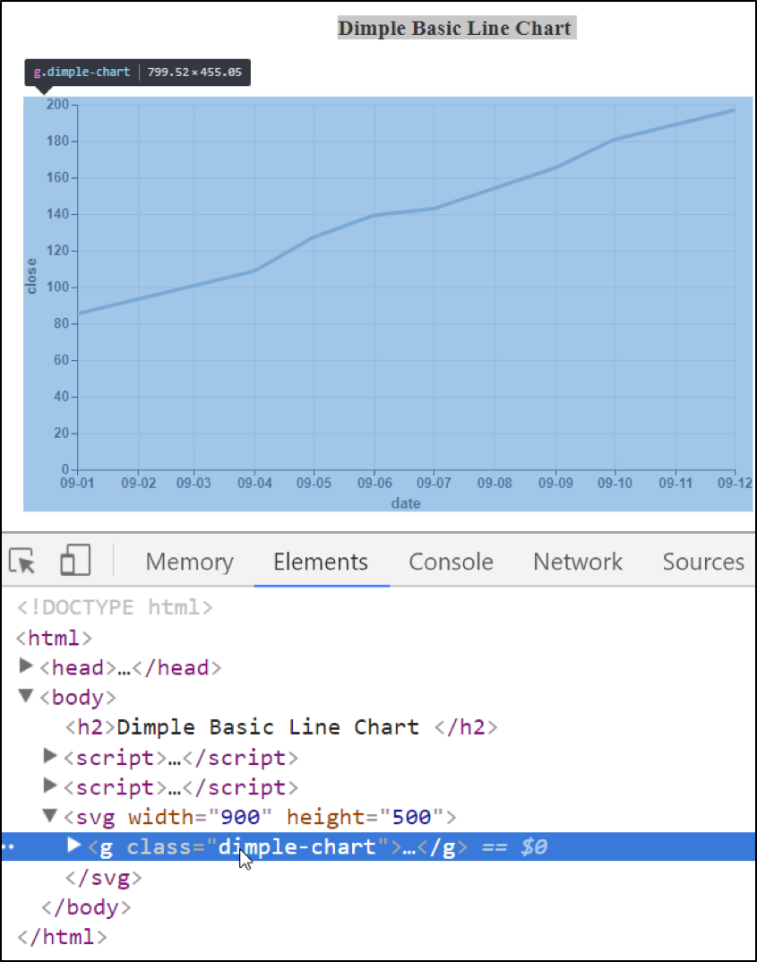
Next, click to open the triangular arrow on the SVG tag to reveal the first group tag. Hover over or click the Group element with the class of dimple-chart. Your screen should look similar to the following:
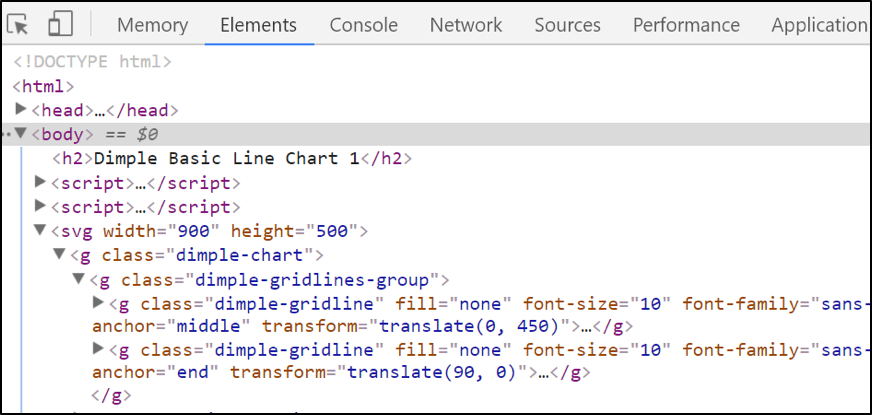
Similarly, open the Group tag with the class of dimple-chart to reveal three additional groups:
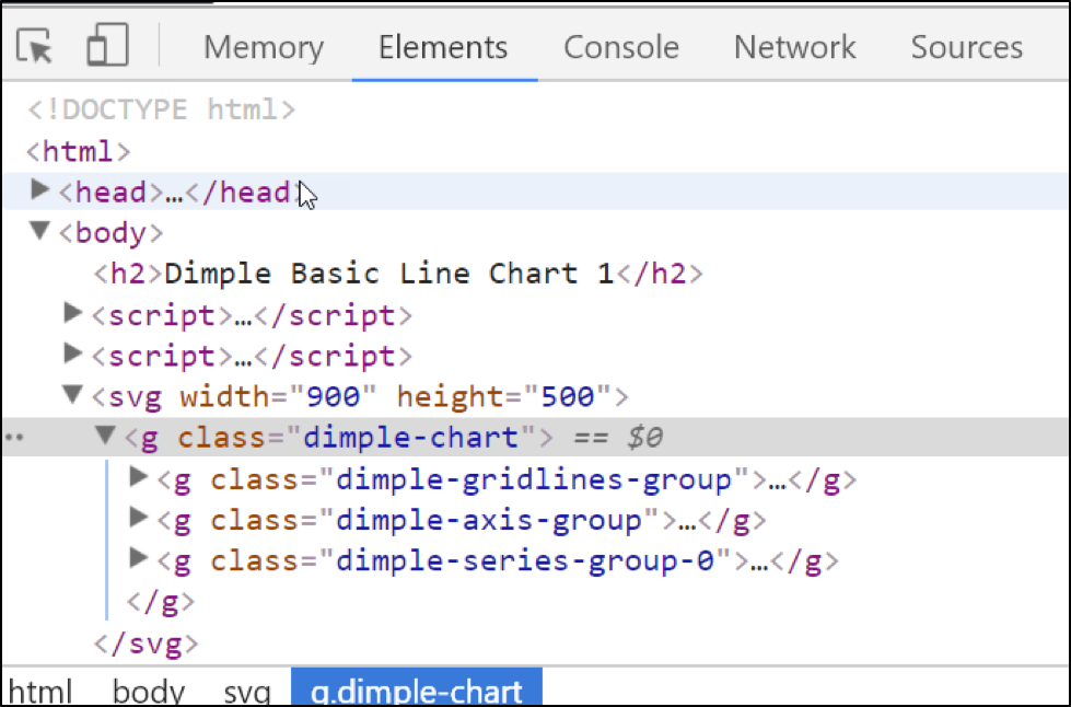
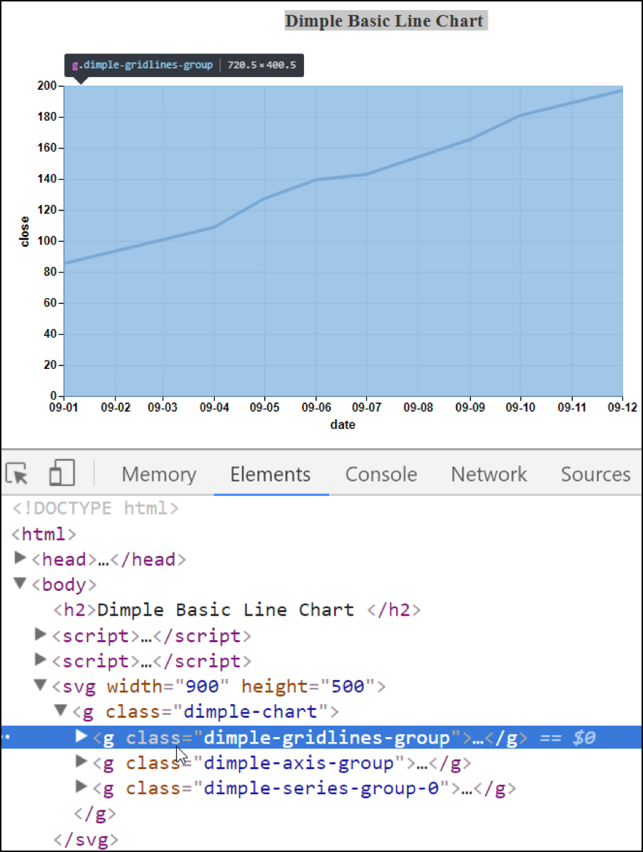
These groups correspond to the gridlines, axis, and series, respectively. Both the gridlines and axis extend over the entire chart area, whereas, the series only extends over the area traversed by the actual line. Note that the top display label as you hover over or click on each of the groups:
Now open the first group under the dimple-gridlines-group. This should reveal two more groups. One is for the vertical lines, and the other is for the horizontal lines:
We will only explore the first group which holds the vertical lines or ticks. Now click to open the first dimple-gridline subgroup:
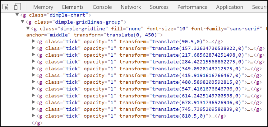
As we cursor down the groups of vertical ticks or lines, we can see each vertical gridline successively pointed out with a label:
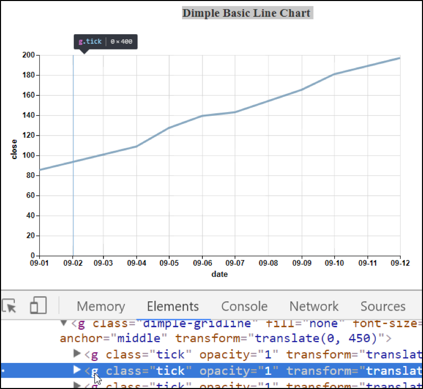
Vertical Gridline Groups
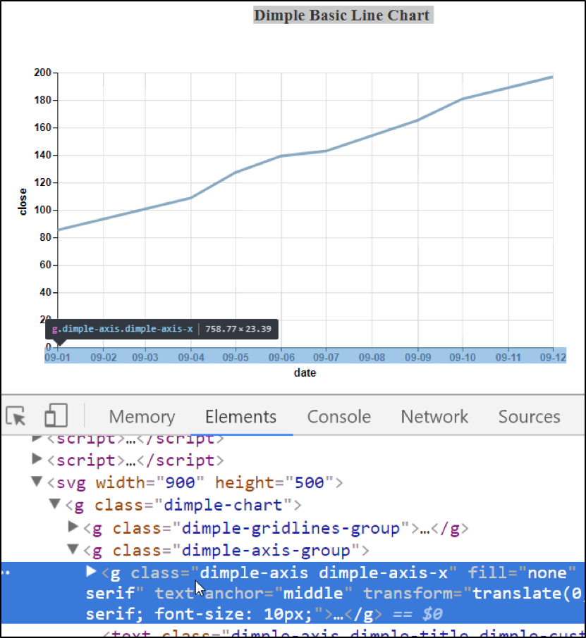
If we were to open the second group which contains the horizontal ticks or lines, you would see the same phenomenon of the horizontal lines being highlighted with a label appearing to identify the current one as they were clicked or hovered. Traversing the horizontal group is left as an exercise for the interested student. Now, close the group with the dimple-gridline-group class and open the group with the dimple-axis-group class and hover over or click on each group with the class of “dimple-axis dimple-axis-x”:
Next expand the “dimple axis dimple-axis-x” group and view the groups of individual ticks:
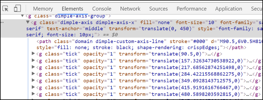
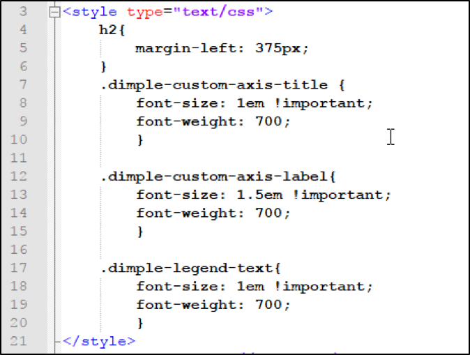
These ticks point to individual axis labels. In this case the x-axis. Expanding one of the class of tick reveals a Text element which contains the CSS Selector dimple-custom-axis-label used to style the individual axis labels:
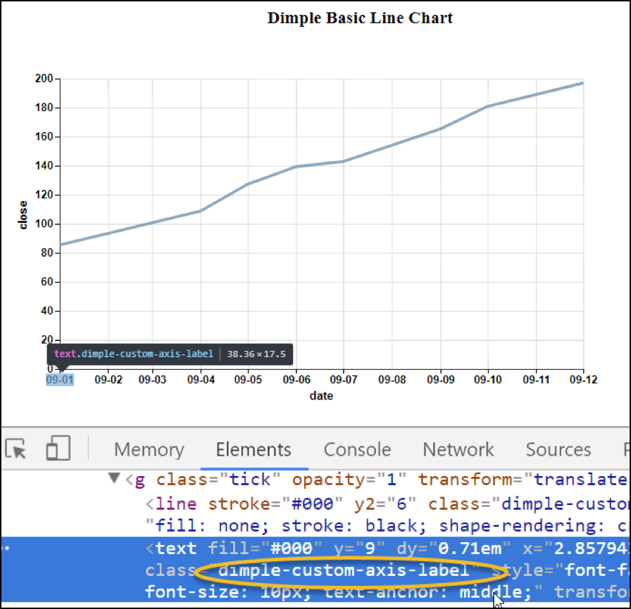
Click the triangle to compress the tick element we just expanded. Then scroll down and notice the Text HTML tag indented slightly. If you hover over it or click on it, it will display a label over the axis title. Note also the CSS Class of dimple-custom-axis-title within the text class names. This class is also used in the y-axis label and is what we use as the selector in CSS to style both elements:
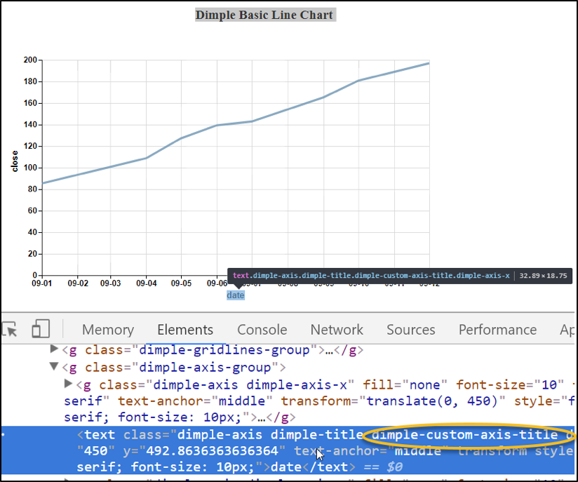
Next, hover your cursor over the next group element with the class of “dimple-axis dimple-axis-y”:
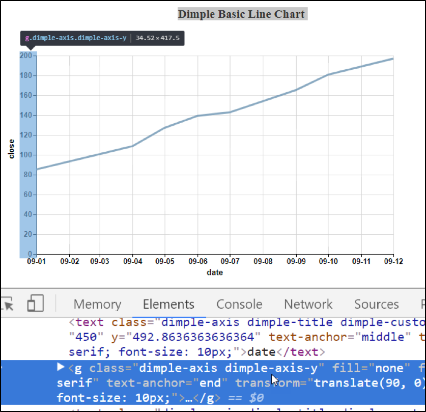
We do not need to look at the text element just beneath our current group with the custom class of custom-axis-title--trust me it’s there. This text element contains the CSS Selector for styling the y-axis label.
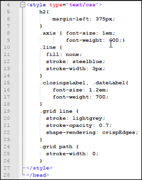
Hopefully, you now see where the CSS gets the classes to format the axis and labels. The following is a listing of the CSS Style Sheet that was initially collapsed as we viewed the Dimple Code:
I don’t blame anyone if you’ve contracted “hoveritis” --it’s an occupational hazard. 😉
Before we leave the Chrome Developer Tools, we need to briefly view one last group element. This is the last group under the class dimple-chart.
Remember there was initially three group before we got expansion-crazy. It might be helpful if you are following along to close some of the group lower in the hierarchy.
This last group called dimple-series-group-0 contain the information for the dimple point on the line. Open the dimple-series-group-0 and just after the Path HTML Element, you will see a number of Circle HTML elements. We can quickly see what they belong to by guess what? Yes, hovering over them or clicking on them:
As we hover over or click on individual circle tags, we can see the marker traverse across the page.
I may need a hover board after all this hovering! 😉
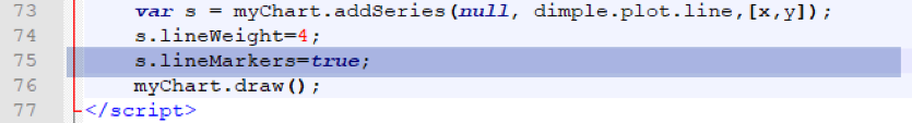
All we need to do to fully bring out Dimple circles and tooltips is to uncomment one line in our code to turn on the lineMarkers:
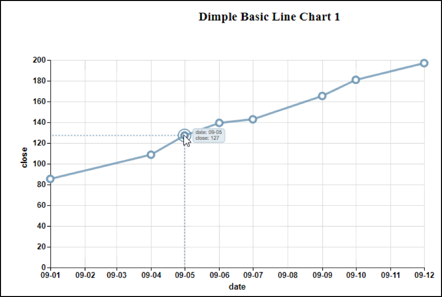
This gives us the following display with the circles visible and fully functional tooltips:
If we were to go back and look at the dimple-series-0 group, we would find more attributes added to our circle tags that provide for the circle size and color.
Hopefully, now we can see how nine lines of Dimple Code (ten counting setting the lineMarker) can produce such a confluence of DOM objects. The focus of the next section is not to teach you everything about D3 but to illustrate the D3 code that Dimple eliminated while making this chart.
D3 Code
Let’s look at the CSS first. D3 does not have the same uniform class structure that we found in Dimple. In Dimple, it was easy to find our classes and build our CSS Selectors. There is a little more work to do in D3. We will need to add classes as we build our objects. As you look the code I produced, you will note the additions of classes at various points so that a label or axis could be formatted through a CSS Selector:
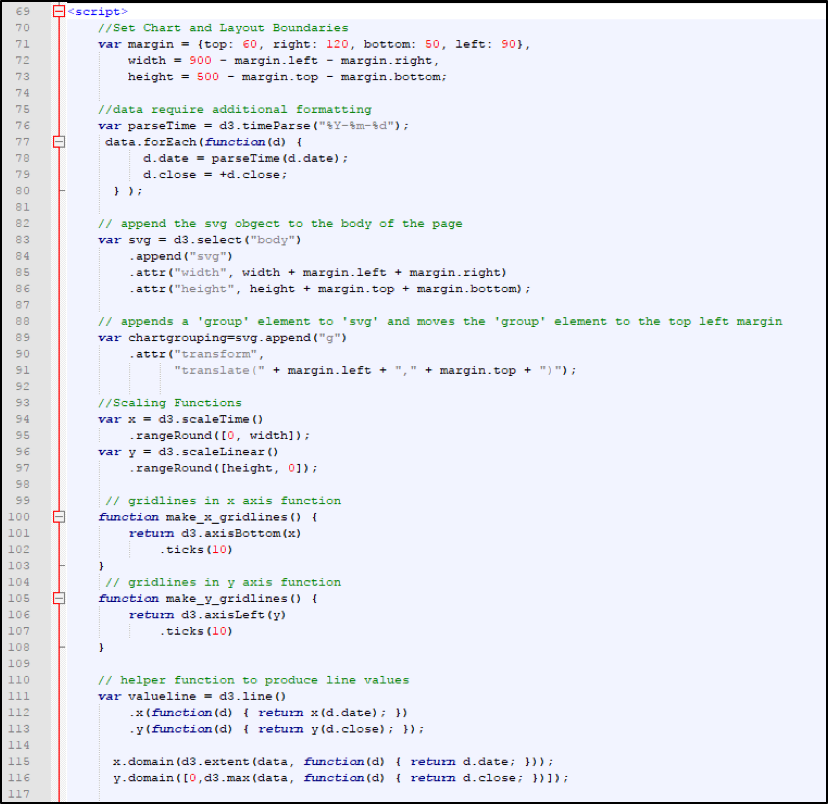
Not counting the comment line, we have approximately 80 lines of code to traverse. There will be two screens, again the CSS and variable holding our sample data will not be shown.
One thing to remember about native D3 is that we have a lot of positioning and transforming to make a line chart look as we expect. Natively, the y-axis increases in the negative direction. So, the x-axis would be at the top of the chart, and the chart would be increasing downward.
Remember how Dimple assumed the plot area would be 80% of the allocated size, no such assumption here. The first part of the next display deals with setting the margins:
D3 Code Breakdown
Let's go through this step by step
Lines 71-73 cover the setup variable to use in margin calculations.
Lines 76-80 do some formatting of the data so that D3 is comfortable with data.
The date is formatted according to the timeParse function. The plus sign in front of d.close assures we are dealing with a number.
Dimple seemed to understand the data without this function.
Lines 83-86 create the SVG element and append it to the body with height and width attributes.
Lines 89-91 create the top group. The group is saved to a variable called chartgrouping because other elements will be appended to it.
Lines 94-97 scale the x and y to the height and width variables which were calculated earlier. Remember the margins were subtracted out.
Lines 100-103 create the function that will be called to create the x-gridlines.
Lines 105-108 create the function that will be called to create the y-gridlines.
Lines 111-113 create the helper function to create the points on the line.
Lines 115-116 set up the x and y domains. The domains are mapped to the scales set up earlier to determine what values will be assigned for a given x and y coordinate.
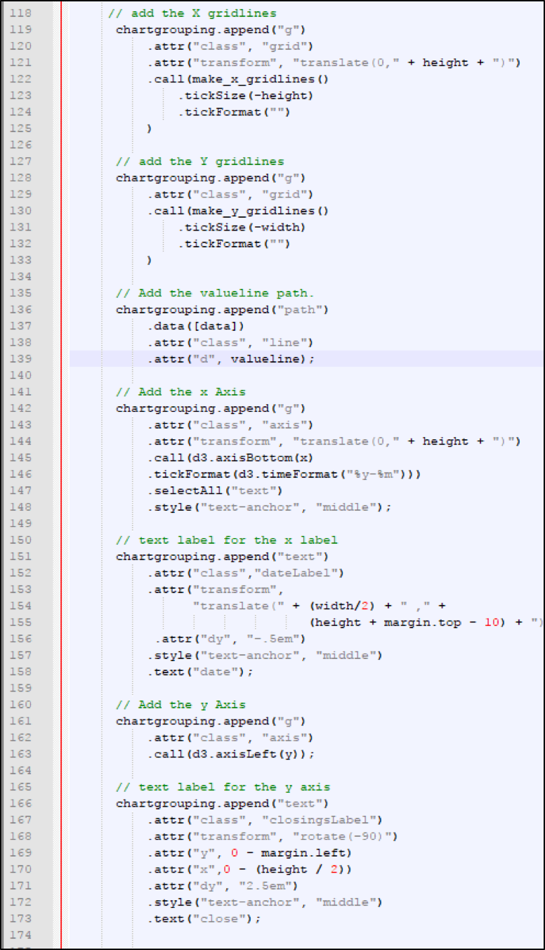
Lines 119-125 add the x-direction gridlines. Note first another group is being created and added under the chartgrouping group, and the transformation to move the lines down using the height variable. Also, note the class attribute grid being added for the CSS styling and a call to the function make_x_gridlines with two parameters.
Lines 128-133 add the y-direction gridlines. Note another group is being created and added under the chartgrouping group; then, the class attribute grid being added for the CSS styling. Also, the function make_y_gridlines is being called with two parameters.
Lines 136-139 attach to the data and create the path using the line help function valueline. Also, the class line is being added for CSS styling.
Lines 142-148 create the x-axis. First, another group is created and added to the chartgrouping group; then, the class of axis is added. Next a transformation occurs to position the x-axis similar to the transformation for x gridlines. Next, a call is made to an internal D3 function called axisBottom with x as a parameter and a format for the time ticks of a two-position year with a dash and a two-position month. Finally, all the text is selected and the format of anchoring the text in the middle of the tick is applied.
Lines 151-158 create and format the x-axis label. This time a text node is appended to the group chartgrouping. A class of dateLabel is assigned for CSS Styling. Next, a transformation to roughly center the label on the x-axis is performed. Finally, a style of the text-anchor middle is assigned with the text being date.
Lines 161-163 create the y-axis by first appending a group to the group chartgrouping. Finally, the internal D3 function axisLeft is called with the y parameter.
Lines 166-173 create the label for the y-axis. First, a text node is appended to the group chartgrouping. A class of closingLabel is assigned for CSS Styling. Next, a transformation to rotate the orientation of the text by 90 degrees is applied; also, some adjustment to the position to roughly center within the y-axis and to place it a little outside of the ticks. Finally, a style of the text-anchor middle is assigned with the text being date.
Piece of Cake! Right?
One thing to note is that Dimple cannot perform every D3 task or function. At present, it performs a limited set of D3 functions. In this simple example, Dimple handles all of the D3 tasks quite well. In more complex examples, you may need to revert partially or completely to D3.
Remember that even with Dimple, native D3 functionality is available. Without Dimple, however, many tasks become verbose or difficult to read, review, and implement.
Conclusion
In this article, we first identified what D3 and Dimple were. Then we examined the code for a short and sweet Dimple line chart. After that, we poked under the hood to examine the DOM group objects created by our nine-line Dimple program. Finally, we looked at a comparable D3 line chart to compare the routines needed to produce the same effect.
Make no mistake: although D3 code is more verbose and dense, D3 is more capable, and thus powerful, than Dimple. But if we have the choice, it's good to know that Dimple greatly simplifies the process by reducing the programming workload.
That's it for now! I hope you enjoyed this guide! Happy coding!
Advance your tech skills today
Access courses on AI, cloud, data, security, and more—all led by industry experts.
