Objective Data Analysis and Visualization
Oct 13, 2020 • 6 Minute Read
Introduction
We are under constant attack, bombarded by messages that aim to influence our thoughts, behaviors, and actions. Often times, we learn that those messages are actually white lies containing elements of truth, yet they are manipulated to fit into a predefined narrative supported by deceptive data visualizations.
SafeTechNext Scenario and Data Set
Imagine you're a data journalist responsible for reporting on data, security, and privacy for a large online news portal. You receive a direct message from a PR agent on a social media platform representing cyber defense company SafeTechNext. The agent mentions that the latest data breach numbers are out, and suggests interviewing one of SafeTechNext's cyber security experts for an article about how to keep sensitive data safe.

The PR agent has also posted several visualizations to make your job as a data reporter easier. However, the visualizations are not as objective as they appear to be on the surface.
Use Segmentation to Create Relationships
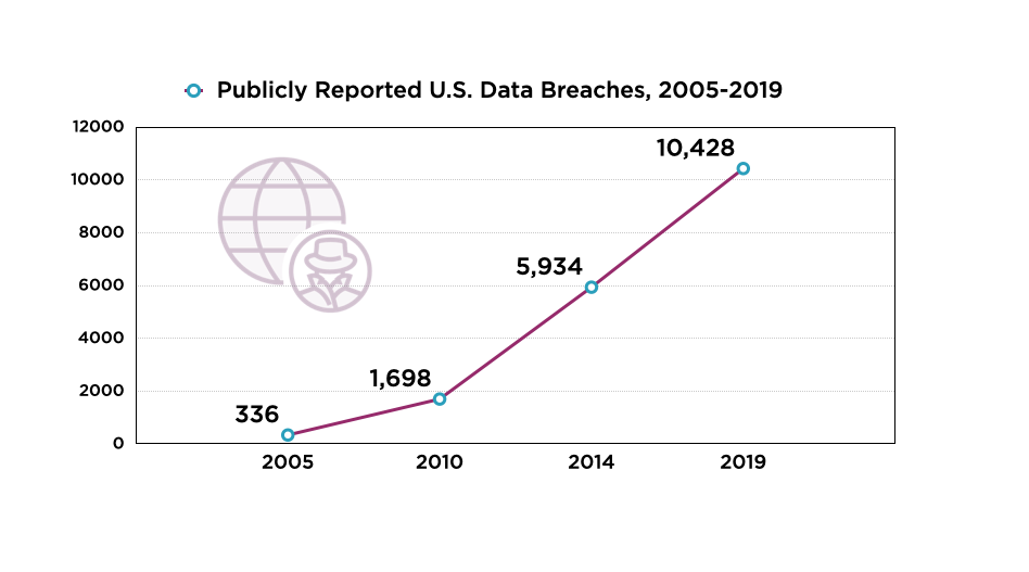
The chart is split into five-year segments, instead of showing how many data breaches occurred each year. This is a deceptive practice that can make the number of data breaches appear to increase year after year. While this may be used by the PR agent to fit a narrative, an objective data visualization would show annual data breaches.
How can you make this data visualization objective?
Select a different chart type to visualize annual data breaches. For example, a bar chart communicates data breach trends more effectively than the agent-provided chart. While the data story may not be as dramatic as the non-objective data breach chart, you'll build better, longer-lasting relationships with stakeholders by stating the facts and letting the target audience decide the issue. Spread your research across multiple groups representative of your target audience. This includes using internal tools and working with outside vendors to gain objective viewpoints about the data.
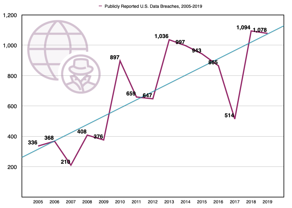
Use Color to Highlight Value
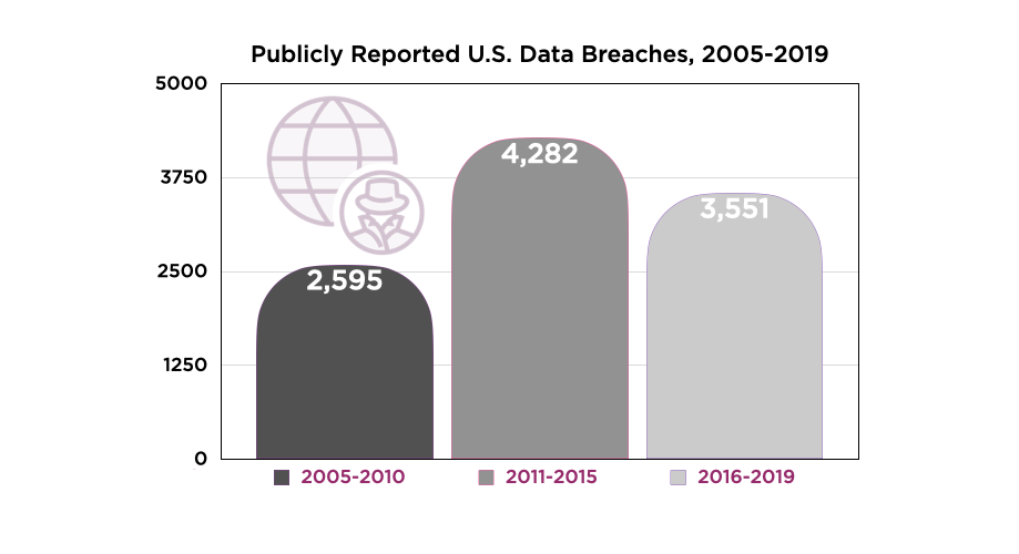
What's wrong with this chart?
The color shading of each segment is misleading. Data storytellers typically use darker colors to represent density, while lighter shades are used to represent fewer data points. In this chart, however, the darkest color is used for the fewest number of data breaches over a six-year time period. This suggests that the years 2005-2010 hold more weight than the other two segments, which introduce inaccurate measurements due to the agent comparing three time periods that have a different number of years. The 2005-2010 period is six years, 2011-2015 is five years, and 2016-2019 is four years.
How can you make this data visualization objective?
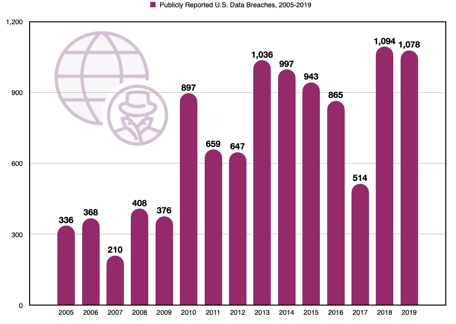
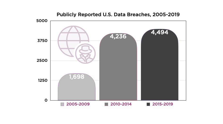
First, create three segments with the same number of years. Next, use lighter shades for low density data and darker colors for higher density data. As the data below shows, the number of breaches is actually rising instead of falling.
Adjust Size to Fit Scale
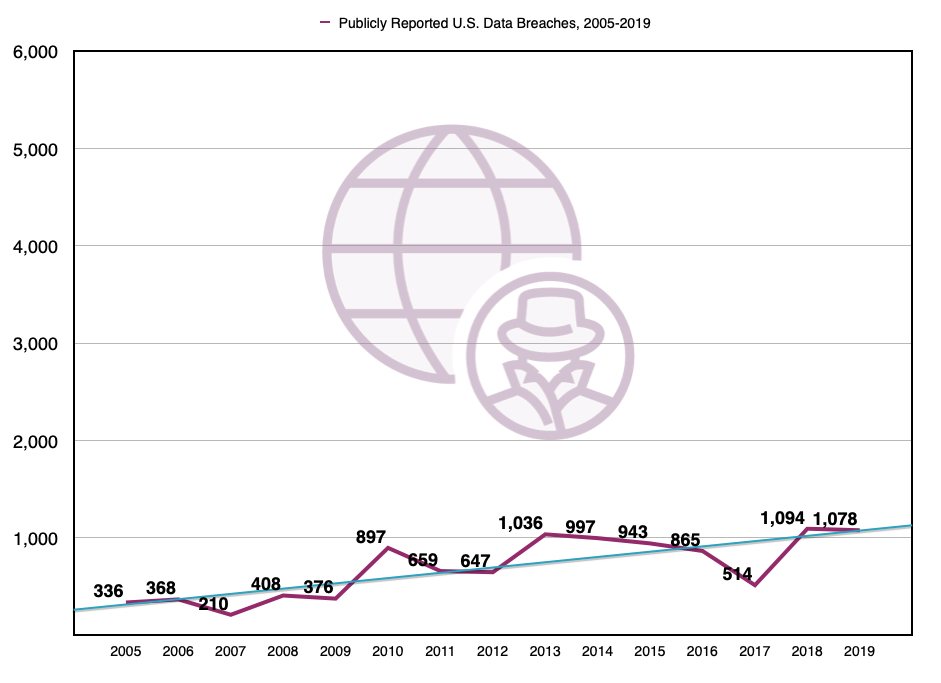
This last data visualization suggests that data breaches have been consistent year-over-year. However, this is only because the data visualization is scaled to make the trend over time appear insignificant. However, when put in context just one data breach can include hundreds of thousands of records containing personally identifiable information (PII). In the wrong hands, the results can be devastating.
How can you make this data visualization objective?
Use the same scale you used for the other visualizations in your data story. If you're zooming in to highlight a specific data point, consider drilling down into the data and creating a separate chart that focuses on only that data point. You can then include the chart as another view in your dashboard, or add the chart to a new slide for your presentation.
Conclusion
Data visualizations are used to build support among stakeholders. However, they often contain bias. To create objective data visualizations, consider how segmentation, color, and scale are used to communicate your insights.
View my other Pluralsight guides, The Building Blocks of Dashboard Design and How to Start a Dashboard Project in Tableau Desktop. I also recommend watching my Exploring Strategy & Vision and UX Research Analysis courses to develop and present insights about customer behaviors, attitudes, and motivations.
The data in this guide was created to demonstrate objective data visualization concepts. It's not intended to represent real data breach incidents. This guide was inspired by data from the Privacy Rights Clearinghouse. The data was manipulated slightly for visual effect
Advance your tech skills today
Access courses on AI, cloud, data, security, and more—all led by industry experts.
