Table and Matrix Visualization in Power BI
Power BI has brilliant plotting capabilities, but it also provides lots of depth for tabular visualizations.
Nov 10, 2020 • 10 Minute Read
Introduction
Power BI has brilliant plotting capabilities, but it also provides lots of depth for tabular visualizations. This is especially important for a textural set of data or for analyzing a text category in your report. The table and matrix visualization charts in Power BI provide the option to display categorical variables with text labels in the report.
The main difference between table and matrix visualizations is that tables are two-dimensional. This means they display data only in two dimensions. On the other hand, matrix visualization gives you the option to specify multiple variables in rows and columns. It also gives you the opportunity to take advantage of Power BI's drill-down functionality.
In this guide, you will learn how to perform table and matrix visualization in Power BI Desktop.
Data
In this guide, you will work with a fictitious data set of bank loan disbursals across years. The data contains 3000 observations and 17 variables. You can download the dataset here. The major variables are described below:
- Date: Loan disbursal date.
- Income: Annual Income of the applicant (in US dollars).
- Loan_disbursed: Loan amount (in US dollars) disbursed by the bank.
- Age: The applicant’s age in years.
- Gender: Whether the applicant is female (F) or male (M).
- Interest_rate: Annual interest rate, in percentage, charged for the disbursed loan.
- Purpose: Purpose for which loan was approved.
Start by loading the data.
Loading Data
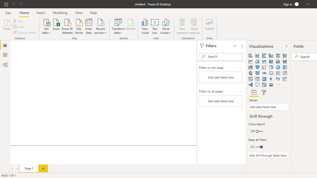
Once you open the Power BI Desktop, the following output is displayed.
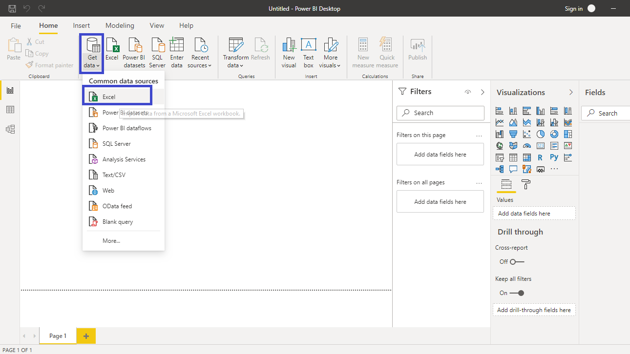
Click on Get data and select Excel from the options.
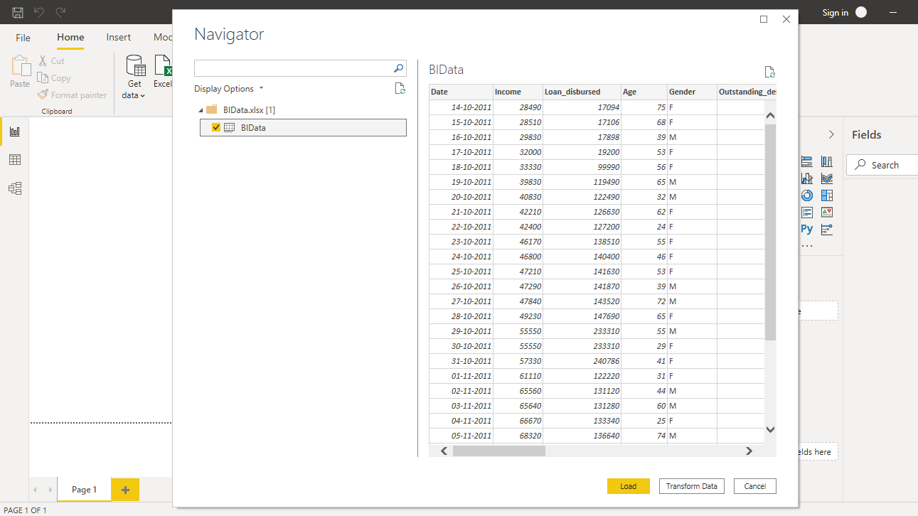
Browse to the location of the file and select it. The name of the file is BIdata.xlsx, and the sheet you will load is BIData sheet. The preview of the data is shown, and once you are satisfied that you are loading the right file, click Load.
You have loaded the file, and you can save the dashboard. It is named PowerBI Visualization. The Fields pane contains the variables of the data.
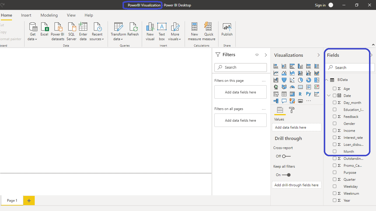
Table Visualization
You can locate the table chart in the Visualizations pane.

Click on the chart shown above, and it will create a default table in the canvas. Nothing is displayed yet because you have yet to add the required visualization arguments.

The next step is to fill the arguments under the Values option. The variables to be used are Purpose, Interest_rate, Month, and Loan_disbursed. Drag these variables into Values, which will create a table as shown below.

Two of the variables—Purpose and Month—are categorical variables that contain text labels. Table visualization becomes useful when you have many labels in a category as it is difficult to visualize them otherwise. You can see that total of the variable Interest_rate is displayed. This is because the default aggregation type is the sum. This is incorrect as you are interested in the average interest rate and not the sum of rates.

To change this, right-click and select the Average option.

The correct interest rate value is now displayed as an average.

Formatting Options
The above table is ready, but it requires formatting. There are several formatting options in PowerBI, and you can explore some of these. Start with the Column headers under the Format pane.

Increase the font size of the table headers. You can do that by setting the Text size to 14. This will increase the text size of column headers in the table.

Next, change the size of the values in the table. You can find this below the Column headers option.

Set the Text size of 12. This will increase the font size of values inside the table. Now you can see that the table is properly visible.

You can also scroll up and down the table with the hover tool, as shown below.

Matrix Visualization
Sometimes table visualization is not sufficient, and you want to add more granularity to your chart. This is where matrix chart visualization becomes helpful. You can find the Matrix chart under the Visualizations pane.

Click on the Matrix chart shown above, and it will create a chart in the canvas. Nothing is displayed yet because you have yet to add the required visualization arguments.

Under the Fields pane, drag Purpose into Rows and Date into the Columns pane. For Date, you will see a hierarchy of Year, Quarter, Month, and Day. This gives you the flexibility to select the Date hierarchy of your choice. For this guide, keep it at the Year level. For Values, drag the Loan_disbursed variable.

Formatting Options
The next step is to format the matrix chart. Start with the Column headers under the Format pane.

Increase the font size and alignment of the headers. Set Text size to 13 and Alignment to Center. This will increase the text size and alignment of column headers.

Next, change the size of the Row headers.

Under Row headers, set the Text size to 13 and keep the Alignment at Auto.

You have formatted the column and row headers, but the same also needs to be done for the values. Use the Values option to make this change.

Set the Text size to 12.

The output above shows that you have made the formatting changes in the matrix chart.
Adding More Variables to the Chart
You can also add an additional variable to the chart. Drag and place the Interest_rate variable below Loan_disbursed in the Values pane.

The interest rate aggregation needs to be converted to Average. You can do this by right-clicking on the variable and selecting Average.

Completing the above step will create the desired chart. You can see that the total of loans disbursed was $10.8 million in 2011, and the average interest rate charged by the bank was 19.15 percent.

You can also scroll left and right in the matrix chart with by hovering, as shown below.

You can see that the total of loans disbursed was $57.3 million in 2019, and the average interest rate charged by the bank was 15.51 percent.
Conclusion
Multivariate reporting is a common requirement in business intelligence. You will often be asked to present data from different dimensions. If the variables are textual in nature, table and matrix visualization is a good option to explore. This type of visualization is used across industries and is therefore a great skill to have.
In this guide, you learned how to implement table and matrix visualization in Power BI desktop. This will help you in descriptive and diagnostic analytics tasks, in addition to enriching your Power BI visualization capabilities.
To learn more about building powerful visualizations in Power BI Desktop, please refer to the following guide:
Advance your tech skills today
Access courses on AI, cloud, data, security, and more—all led by industry experts.
