View and Describe the Trend Model of a Trend Line in Tableau
Jun 24, 2020 • 6 Minute Read
Introduction
A trend line is a bounded line that tracks movement or change in a measure. It is a common analytical technique for estimating a trend or relationship between continuous variables.
In this guide, you will learn to create, view, and describe the model of a trend line.
Data
To plot a trend line, we need a date field to track the change in one or more measures over time. Also, the trend line can be plotted for two continuous variables. Adding dimensions is optional but recommended in cases where it helps extract useful information.
This guide will use the Sample Superstore data available in the Tableau repository.
Create a Trend Line
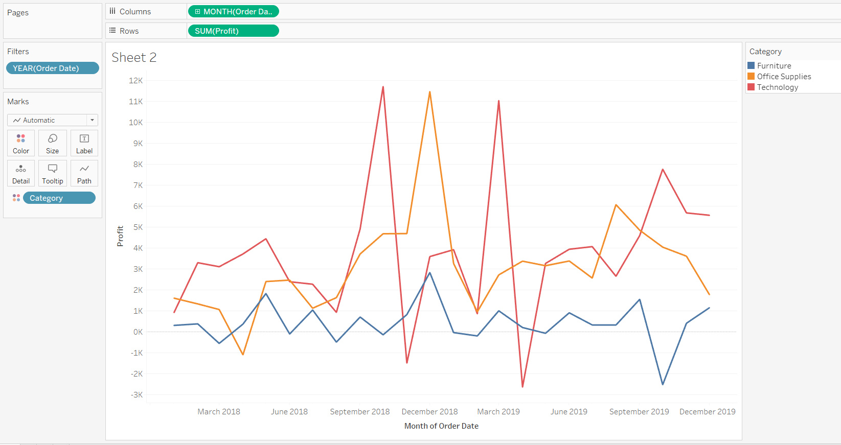
To begin, drag the Order Date into the Columns shelf.
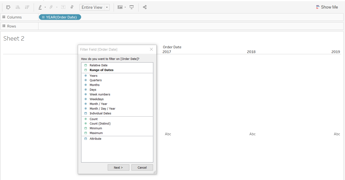
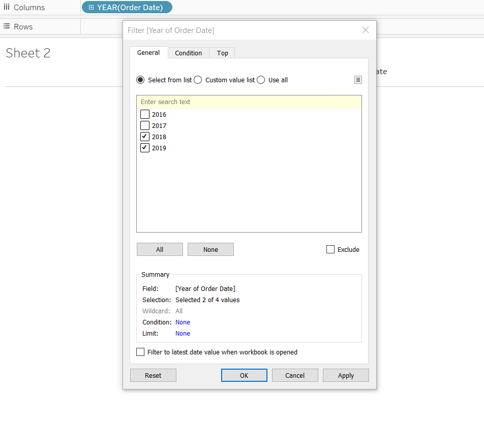
Next, drag Order Date into the Filter pane and, for this guide select only the years 2018 and 2019.
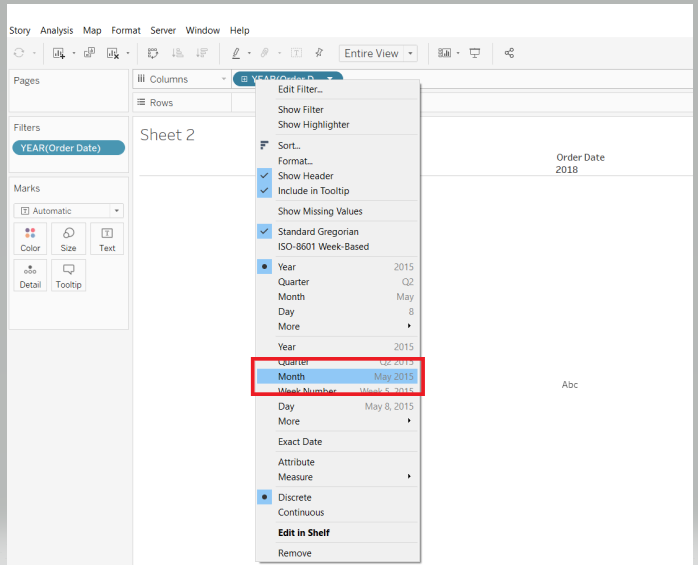
Click on Order Date in the Columns shelf, and select the options Month and Continuous.
The next step is to drag the field Profit to the Rows shelf. Also, add the variable Category into the Color option of the Marks card.
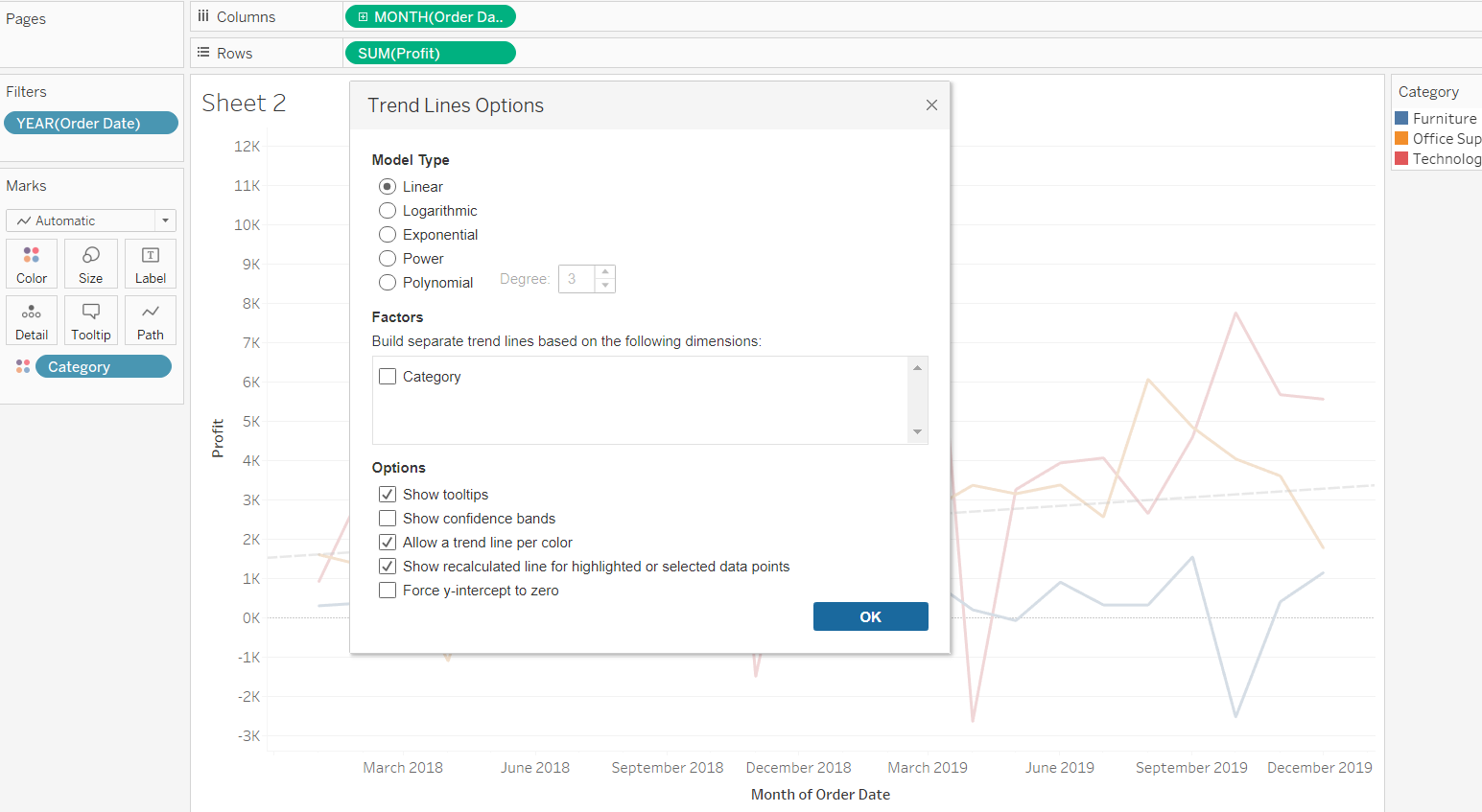
You have added the required fields, and the next step is to add the trend line. To do this, go to the Analytics pane and select Trend Line.
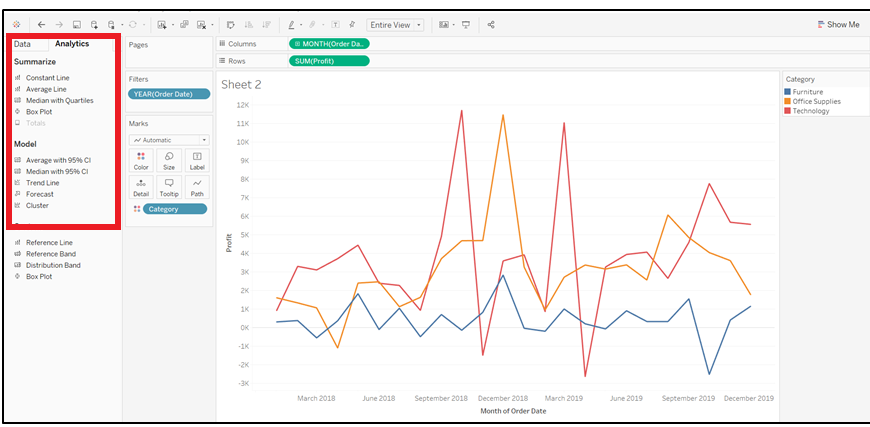
Completing the steps above will generate the following output.
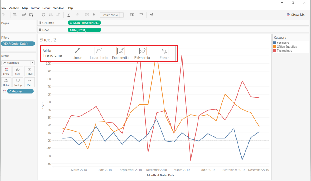
In the output above, you can see that the options to add Logarithmic and Power trend lines are disabled. This is because these models are not eligible for the representation selected in the view.
In the subsequent sections, you will explore the common trend lines used in analytics.
Linear Trend Line
s
This is the most popular trend line, and it is used to determine the presence or lack of a linear relationship between the continuous variables. Continuing with the chart created in the previous step, select the Linear trend line option. The following output is generated.
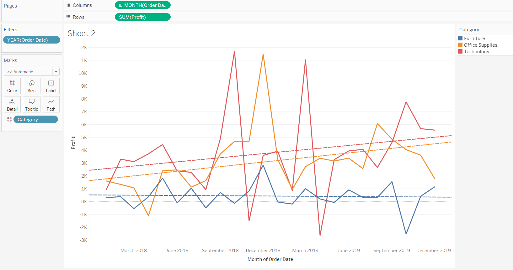
The output above shows that three trend lines have been generated, one representing each category. To get a single trend line, right-click and select the Edit All Trend Lines option as shown below.
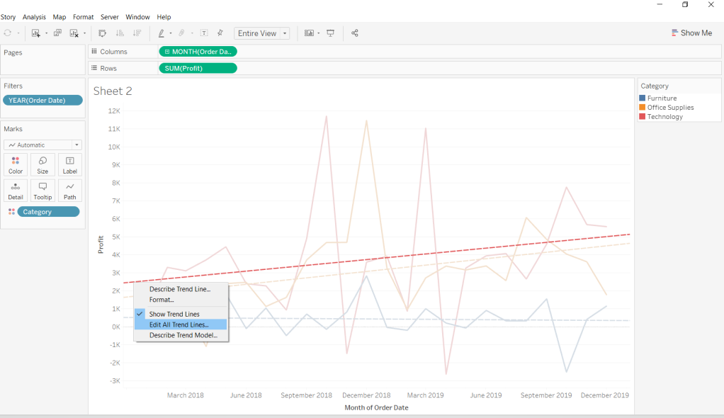
Next, uncheck Category from the Factors option to get a single trend line.
You also have the option to describe the trend line and the underlying model.
Select the Describe Trend Line Model option above to generate the model details.
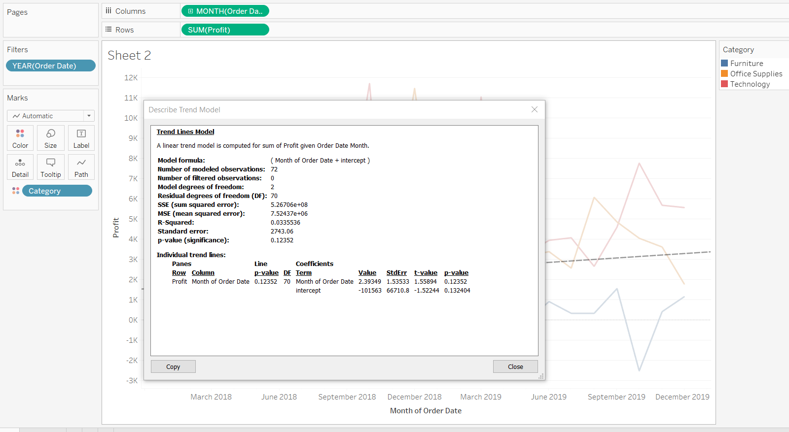
The output of the linear trend line model shows that the relationship is not strong. The R-squared value is only 3.3%, and the p-value is greater than 0.05, which indicates that the relationship between the two variables is not linear.
Logarithmic Trend Line
s
The logarithmic trend line is best suited to cases where the rate of change—increase or decrease—between the variables changes quickly, but then gradually levels out. Also, note that the logarithmic model is not defined for negative values, which requires the negative values to be removed before the trend line is estimated.
Repeat the steps in the previous example, but this time, replace Order Date with Sales, and select the Logarithmic trend line. This will generate the following output.
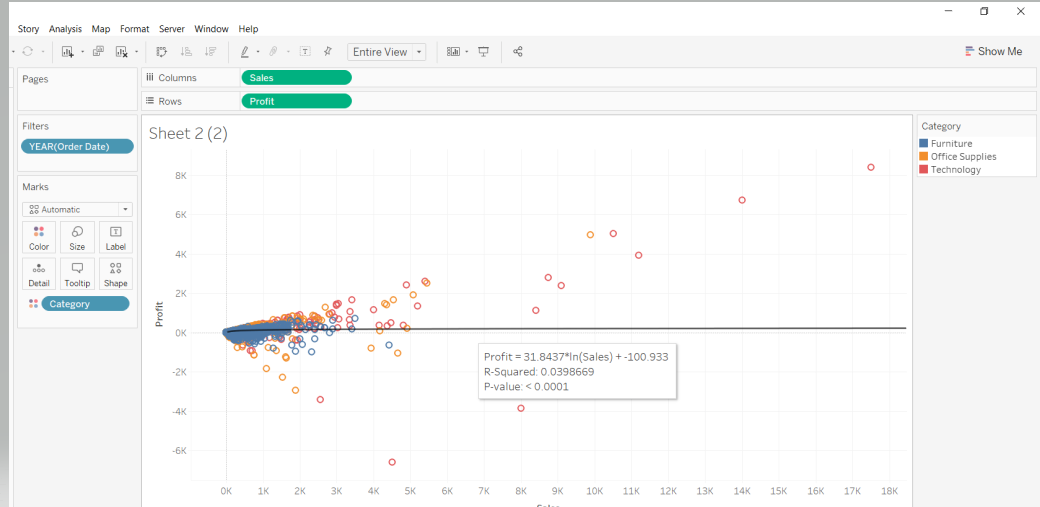
The output shows that the p-value is less than 0.05, which is significant, indicating that a logarithmic trend line is a good fit between sales and profit.
Exponential Trend Line
s
This is best suited for variables where the rate of change is way too high and jumps very quickly. Add a trend line as discussed in the previous section and select the Exponential trend line option. This will generate the following output.
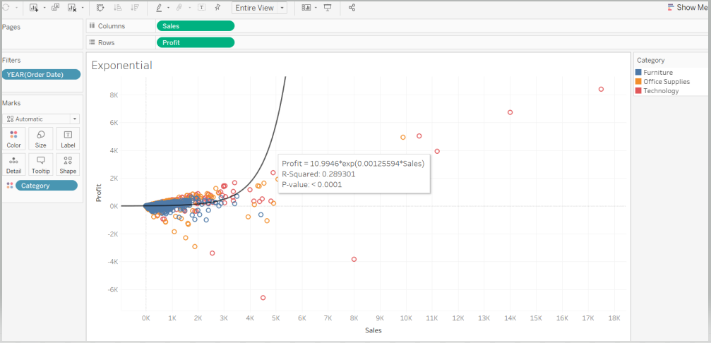
The output shows that the p-value is less than 0.05, which is significant, indicating that an exponential trend line is also a good fit between sales and profit.
Conclusion
In this guide, you learned the basics of different types of trend lines and how to create them in Tableau. You also learned how to display and interpret the underlying models of these trend lines. This knowledge will help strengthen your visualization and diagnostic analytics capabilities.
To learn more about visualization and data analysis using Tableau, please refer to the following guides:
- Building Dual-Axis Combination Charts in Tableau
- Building a Box-and-Whisker Plot in Tableau
- Building a Time Series Chart in Tableau
- Building a Gantt Chart in Tableau
- Building a Bullet Graph in Tableau
- Use Built-In Statistical Modeling in Tableau
- Building a Burndown Chart in Tableau
- Adding Trend Lines to Continuous Charts in Tableau
- Create a Reference Band in Tableau
- Create a Reference Line in Tableau
Advance your tech skills today
Access courses on AI, cloud, data, security, and more—all led by industry experts.
