Create a Collapsible Table Row with React-Bootstrap
Collapsible rows are a handy option when you want to show child properties or records to the end user, and they also can be useful to show statistics such as charts and reports.
Nov 10, 2020 • 9 Minute Read
Introduction
Tables and forms are essential elements used in almost all web apps. Every JavaScript-based framework or library uses different UI frameworks to design their forms and tables to render the record and user interactivity through forms.
Collapsible rows are a handy option when you want to show child properties or records to the end user, and they also can be useful to show statistics such as charts and reports. In this guide, you will learn how to implement a collapsible row using React Bootstrap and other third-party libraries.
Collapsible Row Using a React Bootstrap Custom Implementation
A popular UI framework for React is react-bootstrap, which provides various Bootstrap-backed elements and components for React apps. react-bootstrap contains the set of components and its API to configure components in your app, and it can also change its behavior or appearance based on business requirements.
To use react-bootstrap, install some libraries, as shown below.
      npm install react-bootstrap
npm install bootstrap
After installing both the above libraries, the next step is to import CSS to your app's parent component, such as App.js.
import "bootstrap/dist/css/bootstrap.min.css";
Now import Table from the library react-bootstrap, and also import collapse.js,as shown below.
      import React, { Component } from "react";
// Table from react-bootstrap
import { Table } from "react-bootstrap";
// Bootstrap CSS
import "bootstrap/dist/css/bootstrap.min.css";
// To make rows collapsible
import "bootstrap/js/src/collapse.js";
The next step is to integrate the table and implement expandable rows. For a quick demonstration, create the table, and with each table row, create one child row to expand.
      render() {
    return (
        <>
            <Table striped bordered hover>
                <thead>
                    <tr>
                        <th>#</th>
                        <th>Name</th>
                        <th>Email</th>
                    </tr>
                </thead>
                <tbody>
                    <tr
                        data-toggle="collapse"
                        data-target=".multi-collapse1"
                        aria-controls="multiCollapseExample1"
                    >
                        <td>1</td>
                        <td>TEST 123</td>
                        <td>[email protected]</td>
                    </tr>
                    <tr class="collapse multi-collapse1" id="multiCollapseExample1">
                        <td>Child col 1</td>
                        <td>Child col 2</td>
                        <td>Child col 3</td>
                    </tr>
                    <tr
                        data-toggle="collapse"
                        data-target=".multi-collapse2"
                        aria-controls="multiCollapseExample2"
                    >
                        <td>2</td>
                        <td>TEST 456</td>
                        <td>[email protected]</td>
                    </tr>
                    <tr class="collapse multi-collapse2" id="multiCollapseExample2">
                        <td>Child col 1</td>
                        <td>Child col 2</td>
                        <td>Child col 3</td>
                    </tr>
                </tbody>
            </Table>
        </>
    );
}
In the above table, a few Bootstrap features are developed. Three different properties get attached along with each table row.
      data-toggle="collapse"
data-target=".multi-collapse1"
aria-controls="multiCollapseExample1"
All the above properties define the collapsible content target and allow the row to be toggled using the property called data-toggle.
Once any of the table rows are clicked, their respective child rows should get expanded. However, you need to define a unique identification so that the specific children get expanded.
      <tr class="collapse multi-collapse1" id="multiCollapseExample1">
    <td>Child col 1</td>
    <td>Child col 2</td>
    <td>Child col 3</td>
</tr>
In the above example, there are two classes defined with the class props, Collapse and Multi-collapse1, which means that once a user clicks the respective row, it is identified by the id props, and individual CSS is applied to either hide or show the error.
To implement completely working expandable rows using React Bootstrap, follow this code demonstration.
      import React, { Component } from "react";
// Table from react-bootstrap
import { Table } from "react-bootstrap";
// Bootstrap CSS
import "bootstrap/dist/css/bootstrap.min.css";
// To make rows collapsible
import "bootstrap/js/src/collapse.js";

export class Example1 extends Component {
    render() {
        return (
            <>
                <Table striped bordered hover>
                    <thead>
                        <tr>
                            <th>#</th>
                            <th>Name</th>
                            <th>Email</th>
                        </tr>
                    </thead>
                    <tbody>
                        <tr
                            data-toggle="collapse"
                            data-target=".multi-collapse1"
                            aria-controls="multiCollapseExample1"
                        >
                            <td>1</td>
                            <td>TEST 123</td>
                            <td>[email protected]</td>
                        </tr>
                        <tr class="collapse multi-collapse1" id="multiCollapseExample1">
                            <td>Child col 1</td>
                            <td>Child col 2</td>
                            <td>Child col 3</td>
                        </tr>
                        <tr
                            data-toggle="collapse"
                            data-target=".multi-collapse2"
                            aria-controls="multiCollapseExample2"
                        >
                            <td>2</td>
                            <td>TEST 456</td>
                            <td>[email protected]</td>
                        </tr>
                        <tr class="collapse multi-collapse2" id="multiCollapseExample2">
                            <td>Child col 1</td>
                            <td>Child col 2</td>
                            <td>Child col 3</td>
                        </tr>
                    </tbody>
                </Table>
            </>
        );
    }
}

export default Example1;
This complete example contains a react-bootstrap table, and along with the table row, collapsible properties are defined. And respective child elements have unique identification to expand the specific rows.
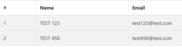
Once you run the above example, the initial output will look like this.
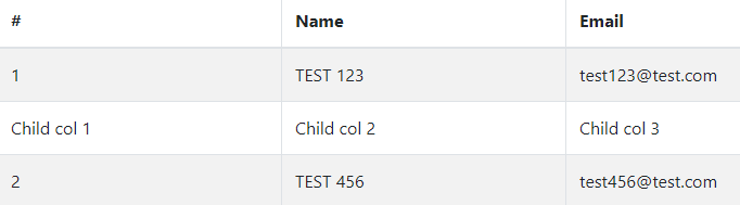
Now click on the first row, and the child rows will be expanded, as shown below.
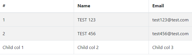
If you click on the second row to expand its child rows, it will look like this.
Using the custom table implementation will give you the above output to expand the rows. And to avoid the expanded feature's misbehavior, you can make it more dynamic and manageable.
Using Other Third-Party Libraries
The table's custom implementation may help to expand the row. But it comes with some limitations, including lack of time, resources, and efforts.
However, you can use other third-party libraries to make table rows expand with a more advanced user interface. There are other libraries you can use to get started with expanding a table:
- react-bootstrap-table
- react-bootstrap-table2
- react-collapsing-table
- Material-ui collapsible table
Conclusion
Tables are the building blocks of any web or mobile app used to show information; hence, they should be well configured to tackle any development challenges.
Libraries like react-bootstrap and react-bootstrap-table are great choices for using tables and making rows expandable. I hope you will be able to implement a collapsible feature after going through this guide.
Advance your tech skills today
Access courses on AI, cloud, data, security, and more—all led by industry experts.
