Interactivity in Tableau Data Visualizations
In this guide, you will learn how to create dynamic charts in Tableau that contain additional information and yet display only what is asked for.
Nov 1, 2020 • 6 Minute Read
Introduction
A picture is worth 1,000 words, but a one-minute, 30-FPS video is worth 1,800 pictures—which means as you increase the dimension, you get more information at the cost of increased complexity.
When you are up for a presentation, it is important to understand what kind of media you put on your slides. When you present results to stakeholders and clients, you need to precisely and concisely convey important information. You can fill your Powerpoint slides with text and some images, but is that the most efficient way to present your insights? Maybe, maybe not! If you convert your images from static to dynamic, they can convey a lot more information while also hiding unnecessary information.
In this guide, you will learn how to create dynamic charts in Tableau that contain additional information and yet display only what is asked for.
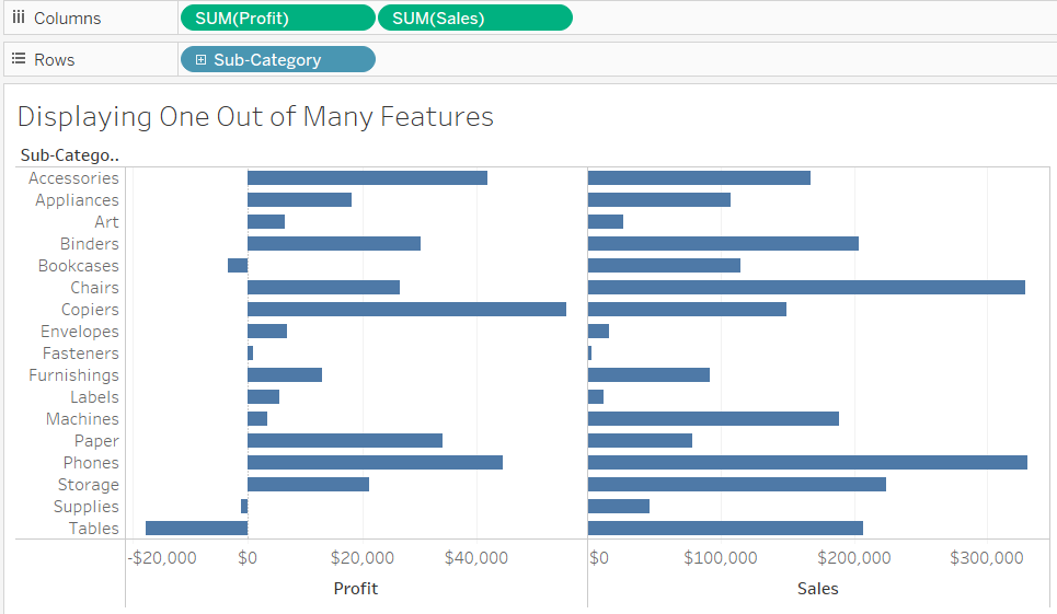
Displaying One Out of Many Features
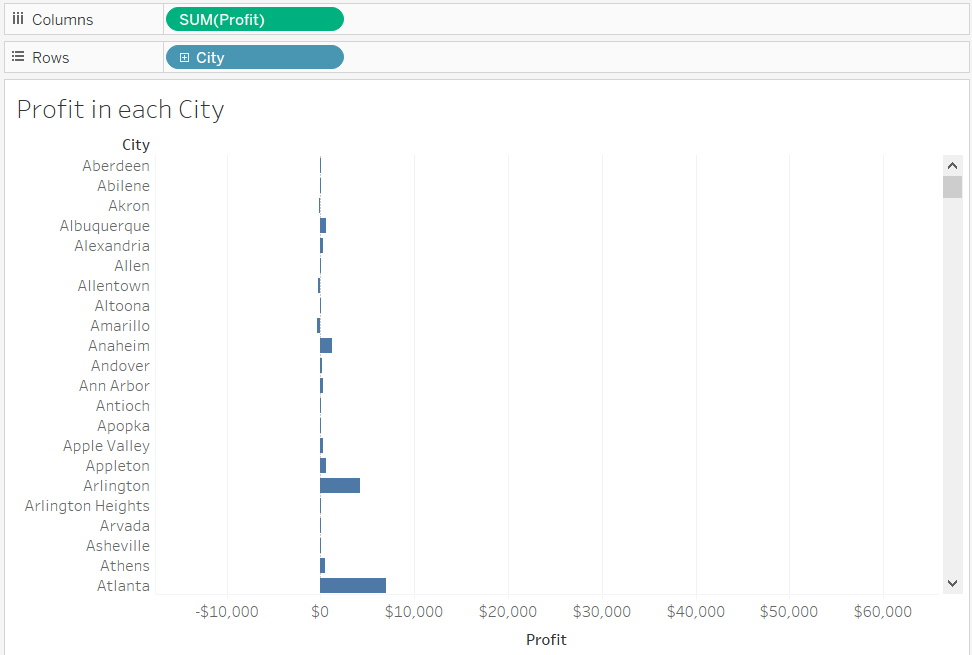
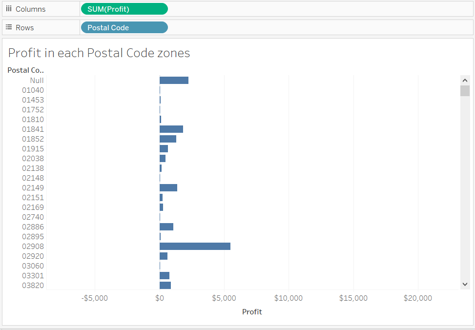
Consider a bar chart that consists of hundreds of bars. All of these bars can be adjusted in a single view, but nobody can recognize the labels associated with them due to overlapping text. Instead, when you have a lot of bars, a better option is to visualize only each bar and the data associated with it one at a time.
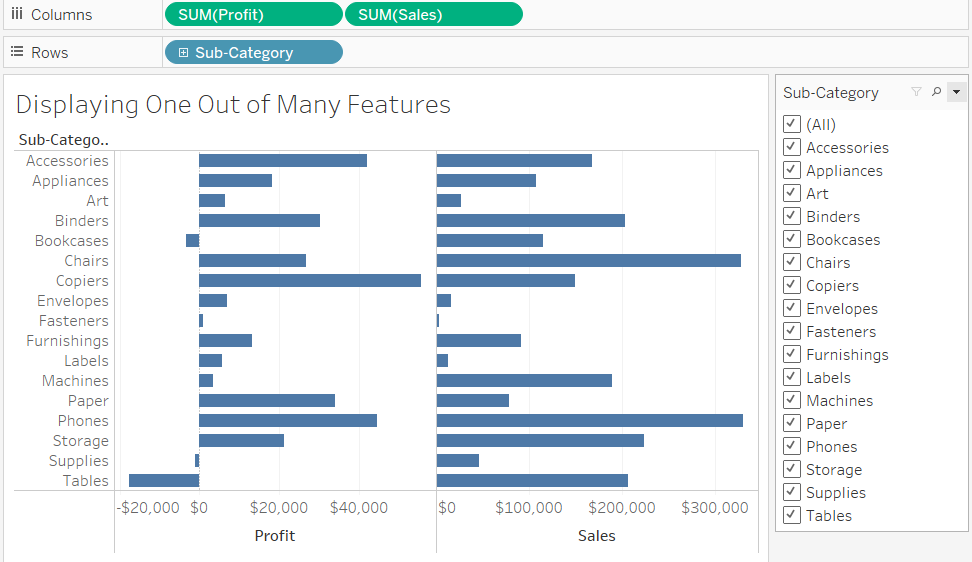
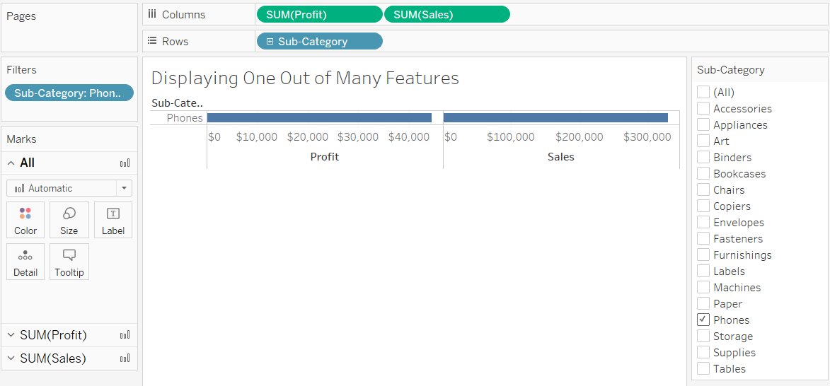
When you have hundreds of product names inside the card and you find it difficult to search for a specific product name, you can always use the Find Values option. This option lets you type the name of the product instead of manually searching for it.
Displaying Multiple Charts Dynamically in a Dashboard
How can you present information from multiple charts in the same area? Maybe you can use dual-axis charts that combine data of multiple time-series into one chart, or maybe you can go for sub-plotting! Most people find the dual-axis plot a little difficult to understand due to multiple magnitudes sharing the same space. As far as sub-plotting is concerned, four to nine sub-plots work in a chart, but increasing the number to 20, 40, and so on only diminishes the size of each sub-plot.
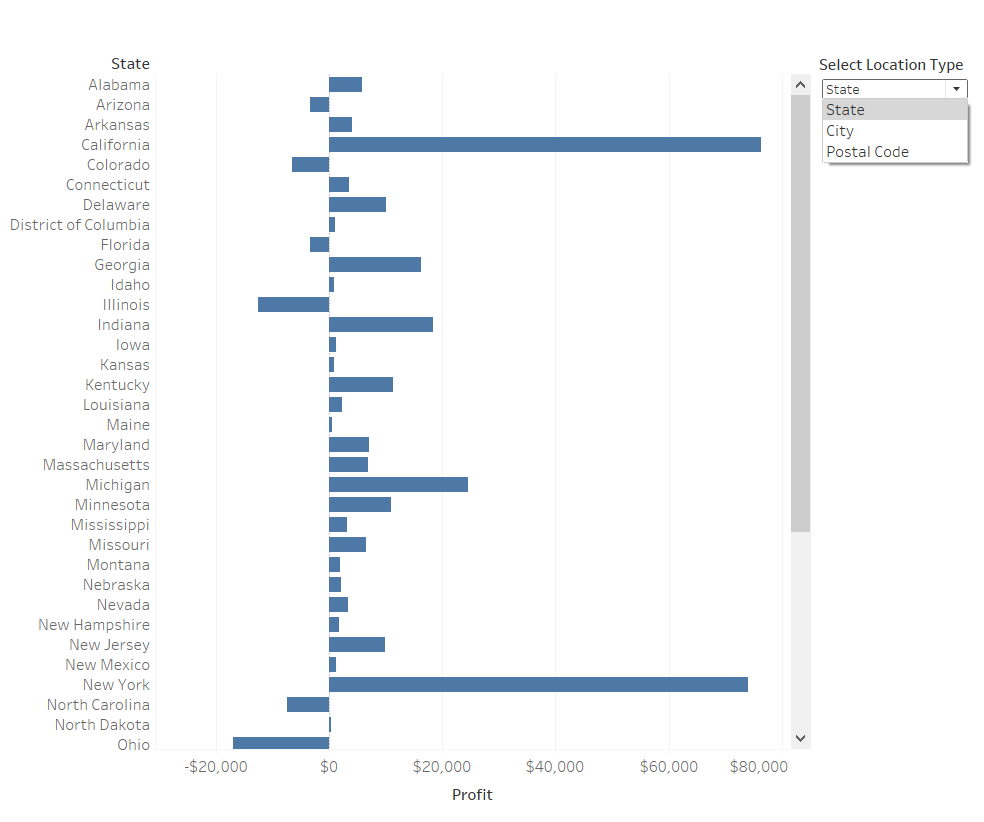
A better solution to visualize multiple plots in a single chart is to place a drop-down list next to the chart and let users select which plot they want to visualize. This way you get a properly sized chart without the confusion of multiple magnitudes mixing together.
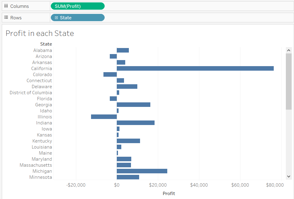
To create a dynamic dashboard, load the Sample - Superstore dataset in Tableau. You will be creating three charts, each representing one of the following relationships:
- Chart 1: Profit in each state
- Chart 2: Profit in each city
- Chart 3: Profit in each postal code zone
Drag and drop Profit to the Columns shelf followed by State, City, or Postal Code to the Rows shelf, one in each of the three sheets. If you wish, you can rename the charts in each sheet.
Now, go to each of the three sheets and perform these steps:
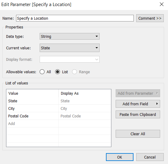
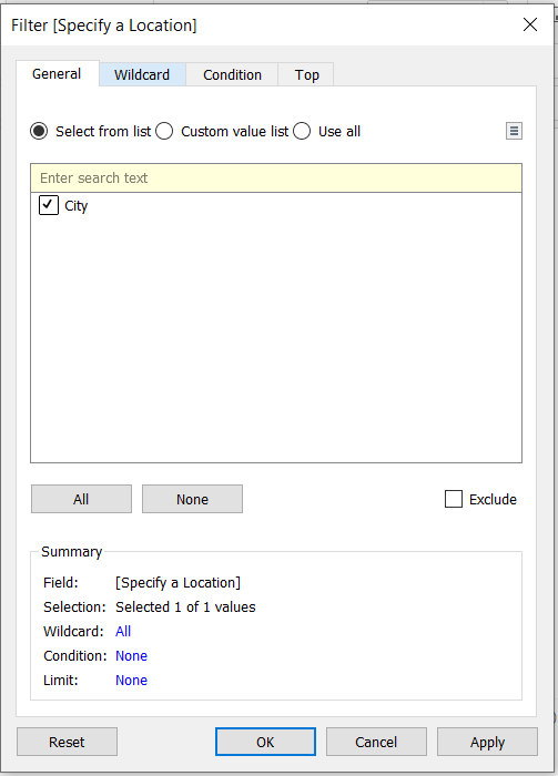
- Right-click on the created parameter and click Show Parameter Control. This opens up a card on the extreme right of the chart. Select a value associated with the chart. For example, if you are on a chart that displays profit in each city, select City.
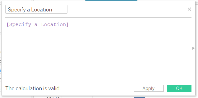
- Drag and drop the created calculated field in the Filters card, which opens up a dialog box. Select the value within the dialog box, as shown below for the city chart:
With the above operations complete, you can move ahead to create a dashboard. Once on the dashboard, drag and drop the horizontal layout object in the blank white space. Next, drag and drop each of the three sheets in the dashboard working area and hide the title of each sheet, if needed. This completes the creation of a dynamic chart in Tableau.
Conclusion
Tableau has a built-in labeling feature that lets you view the details of your chart just by hovering the mouse. You can further increase the productivity of your charts by either providing a filter to display only one out of many features or toggling between charts using a drop-down menu. This guide has explained both of these methods. You can learn more about creating dynamic Tableau charts from this blog.
Advance your tech skills today
Access courses on AI, cloud, data, security, and more—all led by industry experts.
