Map Visualizations in Python Using Folium
This guide will introduce you to Folium, a library that combines the data analytics capabilities of Python and the mapping strengths of leaflet.js.
Sep 17, 2020 • 4 Minute Read
Introduction
Data visualization projects sometimes have a geographical component. These may include the distribution of certain phenomena in a country, region, or continent, the geo-location of different items of interest, or other similar things. The geographical dimension is important and has to be part of the data visualization to drive the insight home.
In Python, tools exist that allow developers to generate maps with an extra layer of data representation and visualization. One of the resources that enables this is Folium, a library that combines the data analytics capabilities of Python and the mapping strengths of leaflet.js.
To get familiar with the library, consider a scenario where you would like to display store locations and net revenue in ($) of a popular fast food franchise in the African country of Kenya. For this task, the data is provided as a sample CSV below.
The guide assumes that you have at least intermediate level knowledge in Python and that you have a general understanding of geography and geo data.
Sample Data
For this plotting exercise, consider this CSV extract for sample data.
      store,latitude,longitude,revenue
nairobifoods,-1.302473,36.7451004,600000
kajiadofoods,-1.3999999,36.6293008,120000
nakurufoods,-0.7944065,34.4749338,30000
kisumufoods,-0.1950621,34.596355,40000
Sample App
Since the visualization relies on leaflet.js, Folium is best experienced in a notebook environment like Google colab or Jupyter Notebooks. To set up, open a new notebook and run the installation for both Folium and pandas by running the command below on a new cell.
pip install folium pandas
On the next cell, import the required libraries and read the dataset.
      import folium
import pandas as pd

franchises = pd.read_csv('location/of/sample/csvfile')
#view the dataset
franchises.head()
The next step is to set up a map and view it. In a new cell, copy the code below.
      center = [-0.023559, 37.9061928]
map_kenya = folium.Map(location=center, zoom_start=8)
#display map
map_kenya
The next and final step involves adding the location tags and popups of the franchise joints all over the country. In a new cell, copy the code below.
      for index, franchise in franchises.iterrows():
    location = [franchise['latitude'], franchise['longitude']]
    folium.Marker(location, popup = f'Name:{franchise["store"]}\n Revenue($):{franchise["revenue"]}').add_to(map_kenya)

#display the map
map_kenya
Once this is done, run all the cells in your notebook to load the CSV and view the maps.
Since the map is interactive, the user can click on each marker and view the franchise name and revenue generated.
Alternative Approach
The above example involves running Folium in a notebook environment. There is an alternate approach where the project can be developed locally in an IDE and the result generated as an HTML file. To run the same app with this approach, copy the code block below into the file folium_app.py.
      import folium
import pandas as pd

franchises = pd.read_csv('location/of/sample/csvfile')
#view the dataset
print(franchises.head())
center = [-0.023559, 37.9061928]
map_kenya = folium.Map(location=center, zoom_start=8)
for index, franchise in franchises.iterrows():
    location = [franchise['latitude'], franchise['longitude']]
    folium.Marker(location, popup = f'Name:{franchise["store"]}\n Revenue($):{franchise["revenue"]}').add_to(map_kenya)

# save map to html file
map_kenya.save('index.html')
Run the above code and the index.html file will be generated. You can view it in the browser and interact with the map.
Sample Screen
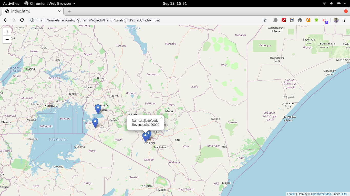
Here's a look at Folium in action.
Conclusion
You now know how to visualize data with a geographical dimension using Folium maps. This skill is vital in any business role that involves data analytics, such as data scientist, business intelligence developer, data analyst, or GIS developer.
To further build and complement this knowledge of Python Folium, explore alternative Python mapping libraries, such as Bokeh Maps and Plotly Maps.
Advance your tech skills today
Access courses on AI, cloud, data, security, and more—all led by industry experts.
