Adding Static Visualization to Power BI Reports
Nov 23, 2020 • 8 Minute Read
Introduction
Visualization charts like bar charts, scatter plot, line charts, and gauge charts are powerful. However, sometimes you will want to add static visualization elements like text boxes, shapes, or images to a Power BI report. These static elements help the layout and the flow of your report. This guide will demonstrate how to add static visualization elements in Power BI Desktop.
Data
In this guide, you will work with a fictitious data set of bank loan disbursal across years. The data contains 3,000 observations and 17 variables. You can download the dataset here. The major variables are described below:
- Date: Loan disbursal date.
- Loan_disbursed: Loan amount (in US dollars) disbursed by the bank.
- Interest_rate: Annual interest rate, in percentage, charged for the disbursed loan.
Start by loading the data.
Loading Data
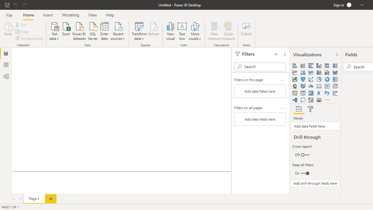
Once you open your Power BI Desktop, the following output is displayed.
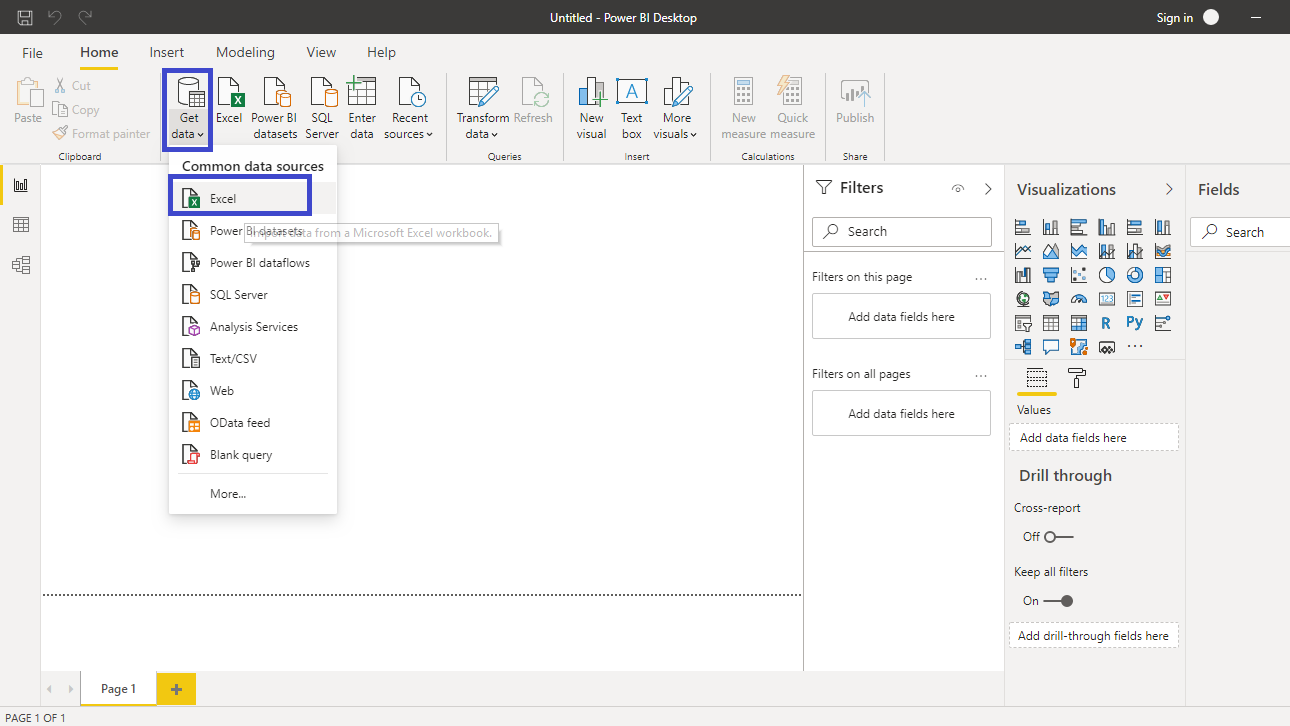
Click on Get data option and select Excel from the options.
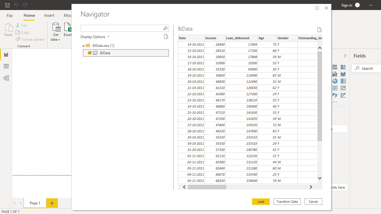
Browse to the location of the file and select it. The name of the file is BIdata.xlsx, and the sheet you will load is BIData sheet. The preview of the data is shown, and once you are satisfied that you are loading the right file, click Load.
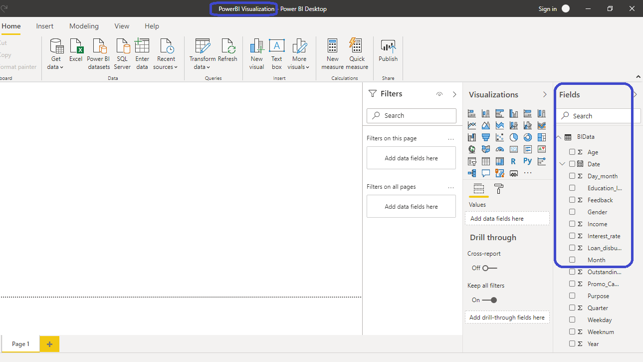
You have loaded the file, and you can save the dashboard. It is named PowerBI Visualization. The Fields pane contains the variables of the data.
Adding Visualizations
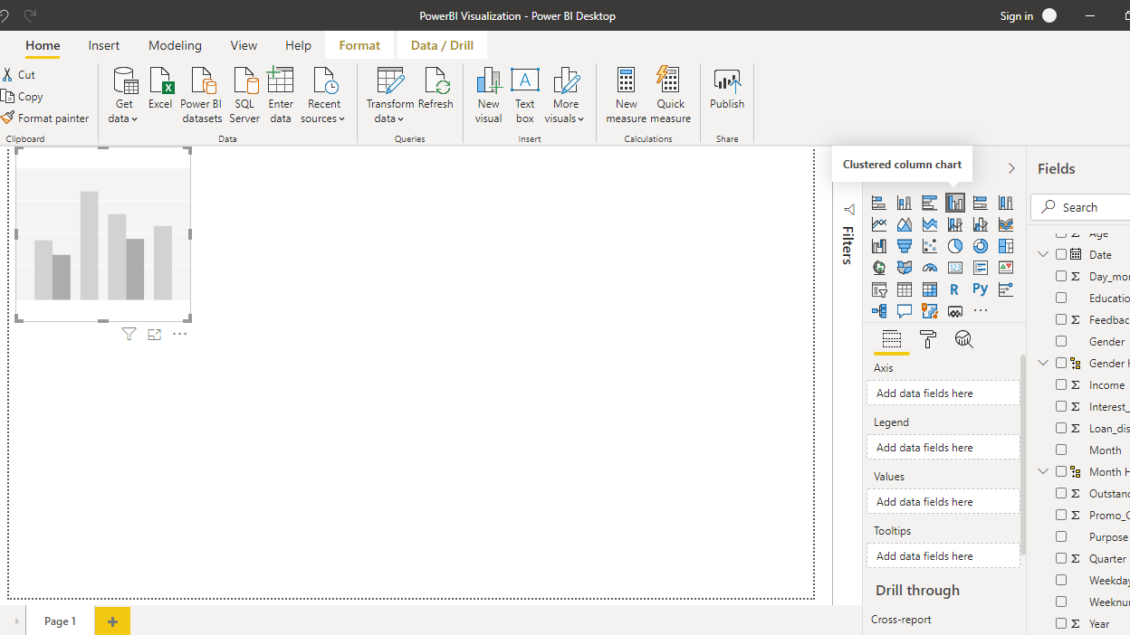
To begin, you will need a chart, table or a matrix. You will create a clustered column chart in this guide. You can locate it in the Visualizations pane. Click on the chart and it will create a chart box in the canvas. Nothing is displayed because you haven't yet added the required visualization arguments.
You can resize the chart on the canvas. The next step is to fill the visualization arguments under the Fields option as shown below. Drag the variable Date into the Axis field, and Loan_disbursed in the Values field.
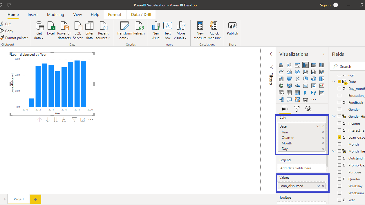
The output above shows the Loan_disbursed by Year chart. Next, you will add a Line chart.
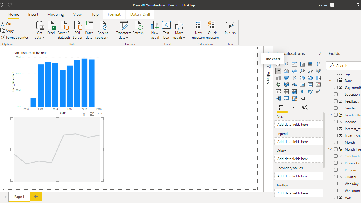
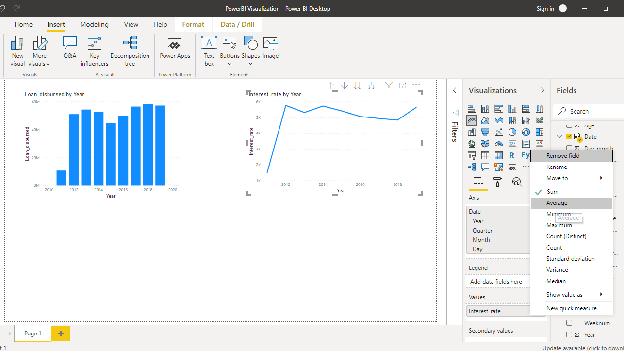
Drag the variable Date into the Axis field, and Interest_rate in the Values field.
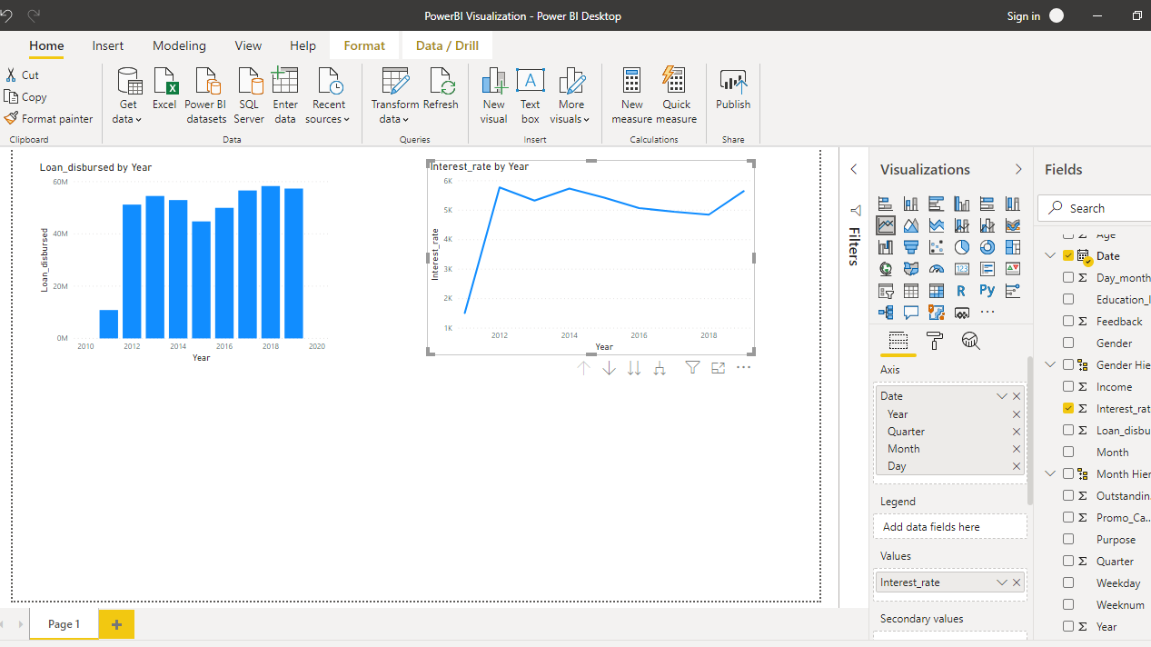
The above line chart is incorrect as it adds the interest rate values. To make the correction, right click and select Average.
You have the baseline charts ready, and you can add static elements to the report.
Adding Static Visualization
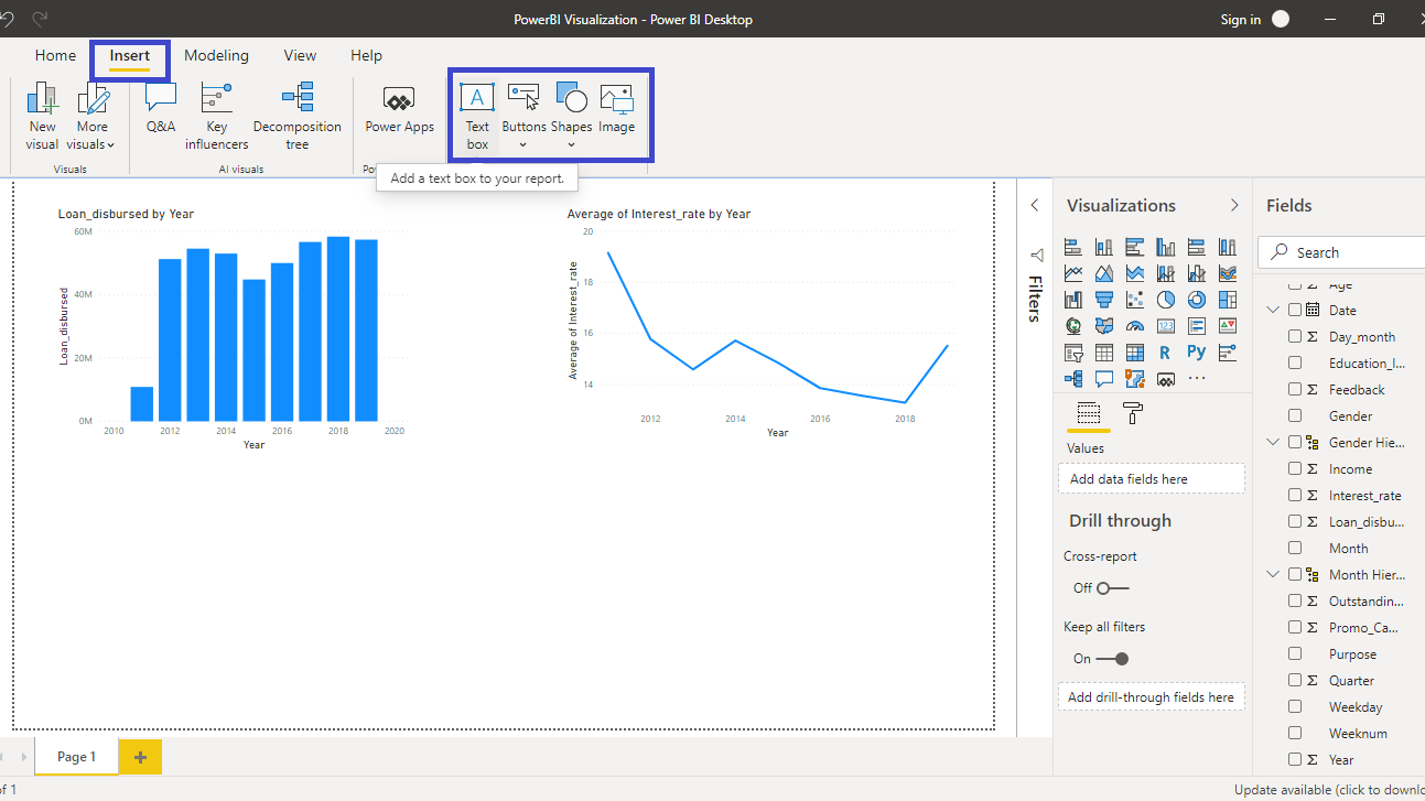
You can find the static visualization elements under the Insert option. You can see the various options available.
Adding Text Box
Click on the Text box ribbon as shown above. It will create a text box in the canvas.
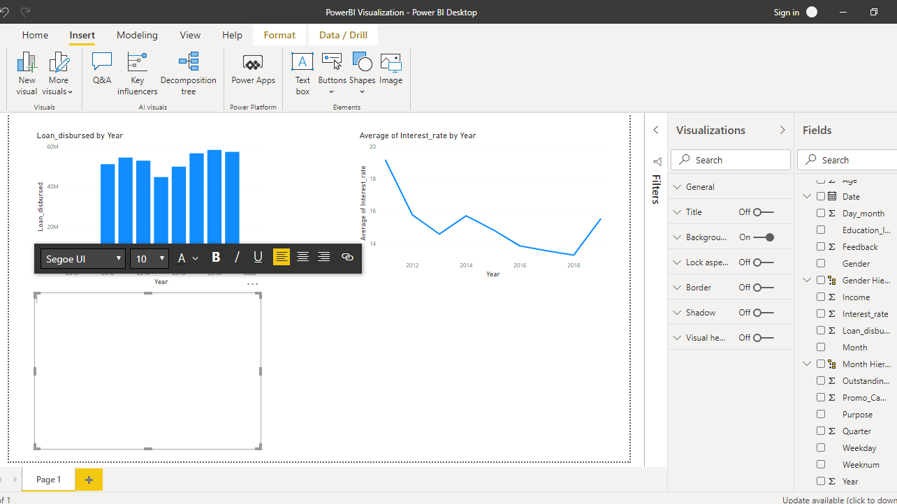
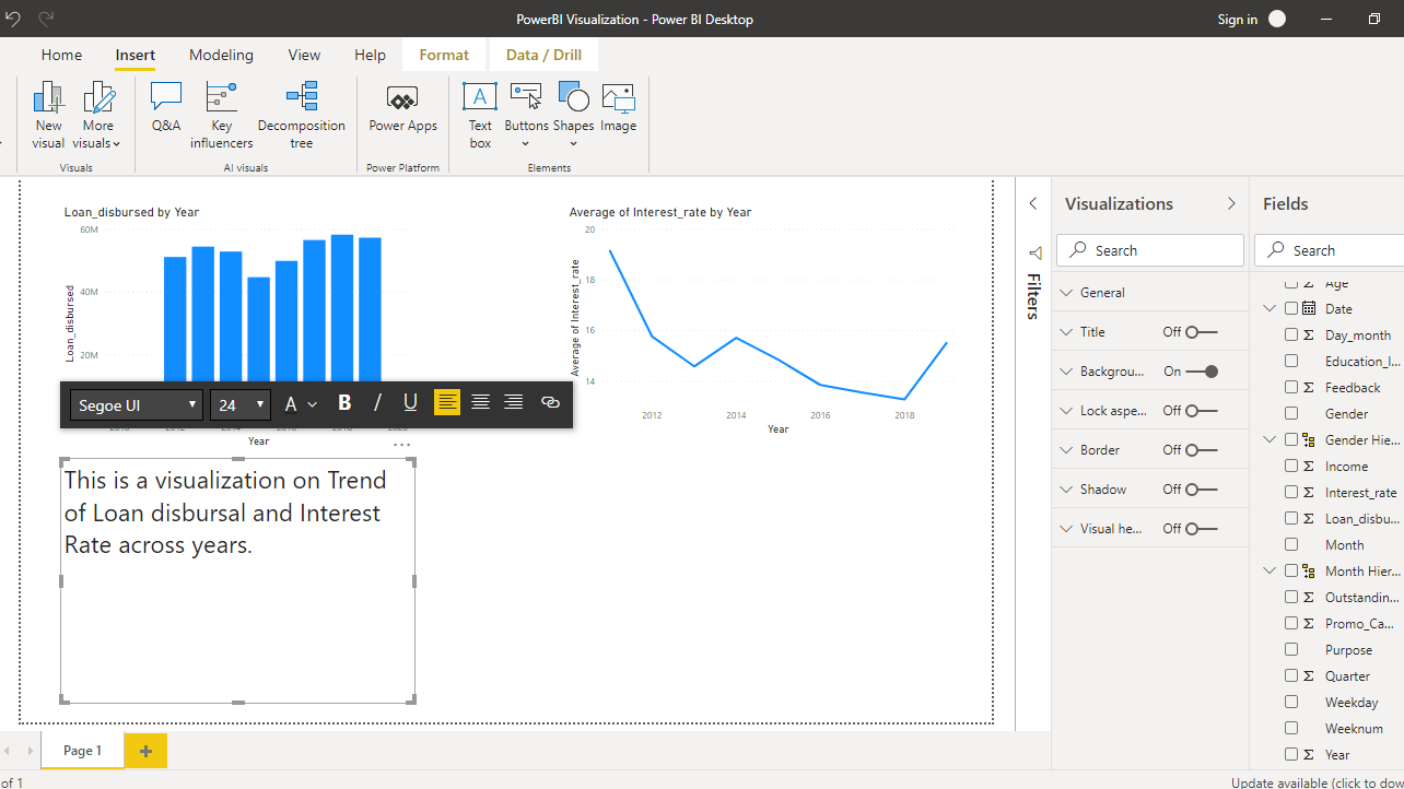
Click on the text box in the canvas and you can add the relevant text in the box. In this case, you will add This is a visualization on Trend of Loan disbursal and Interest Rate across years. You can set the font size to 24.
You can also add a hyperlink. In this case, you will add the link to the data.
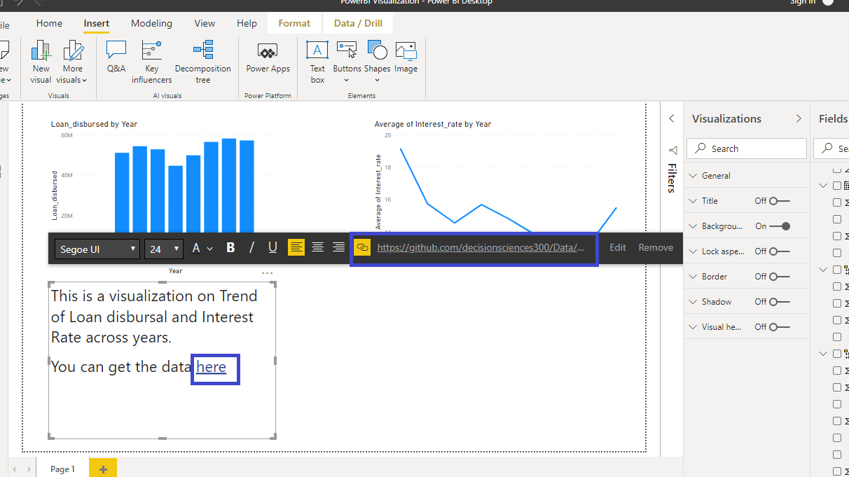
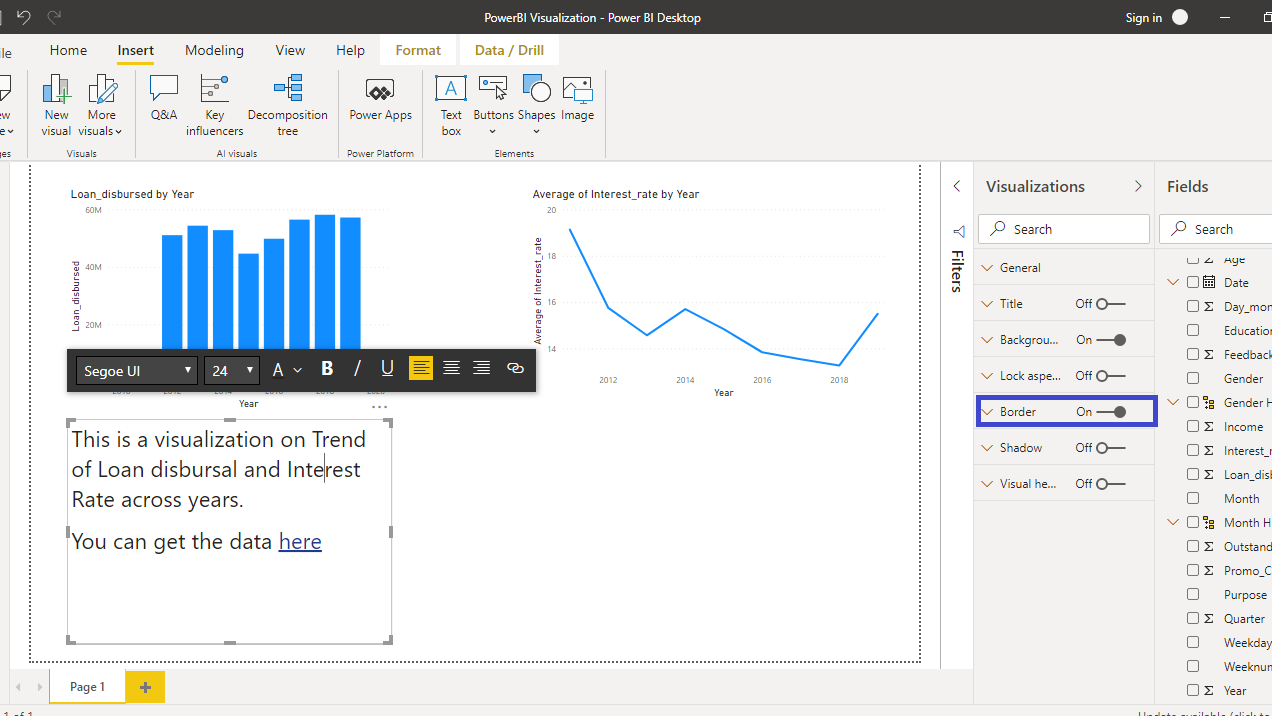
To format the text box, you can look at the several options. In this case, turn on the Border.
Adding Images
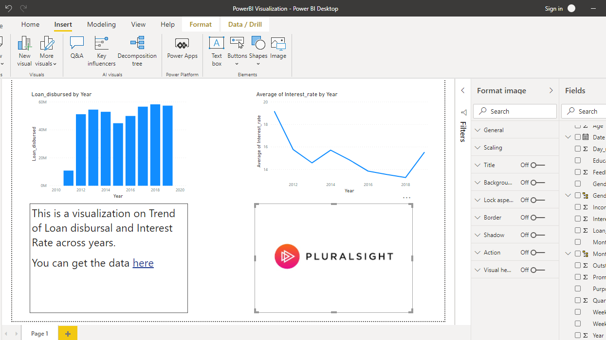
At times, you might want to include an image in the dashboard, for example, a logo or a picture. To do this, click on the Image option as shown below.
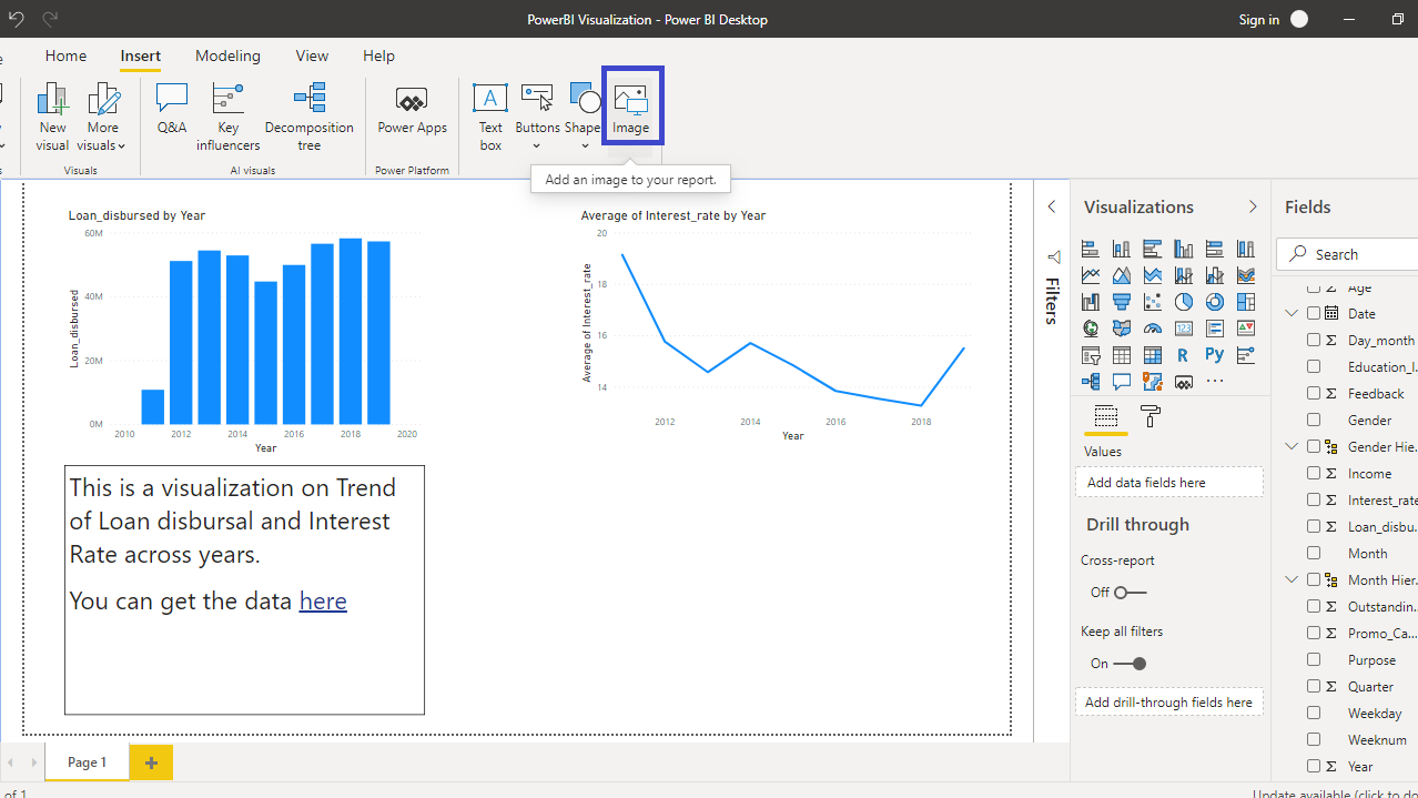
Once you click on Image you will have the option to browse for the image in your laptop, and load it. In this case, you will insert the image of Pluralsight.
Adding Shapes
Power BI provides the user option to add several shapes into the canvas.
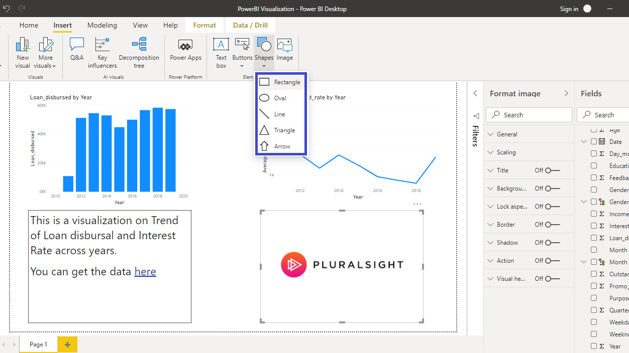
Click on Rectangle and a rectangular box gets added into the canvas.
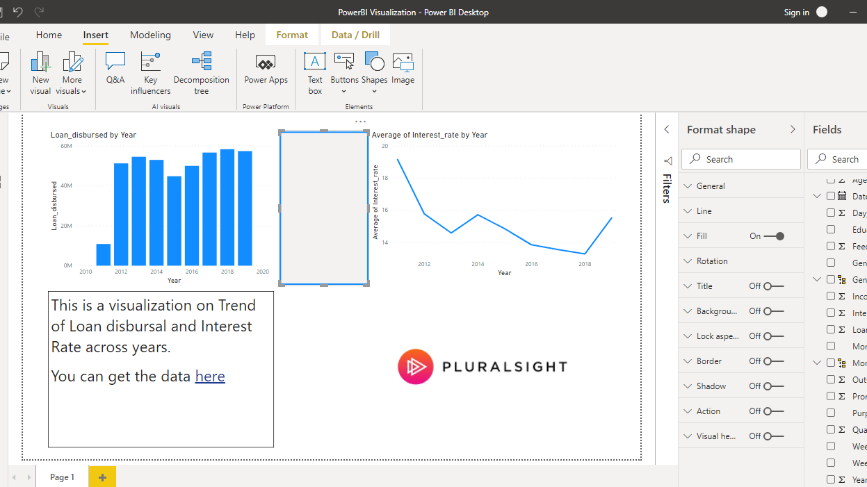
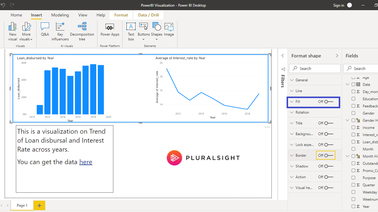
You can extend the rectangle to include both the top images, Loan_disbursed by Year and Average of Interest_rate by Year. Both these charts are related to loans sanctioned by the bank across time, and therefore it makes sense to include a shape that covers both these chart types. Turn off the Fill option as shown below.
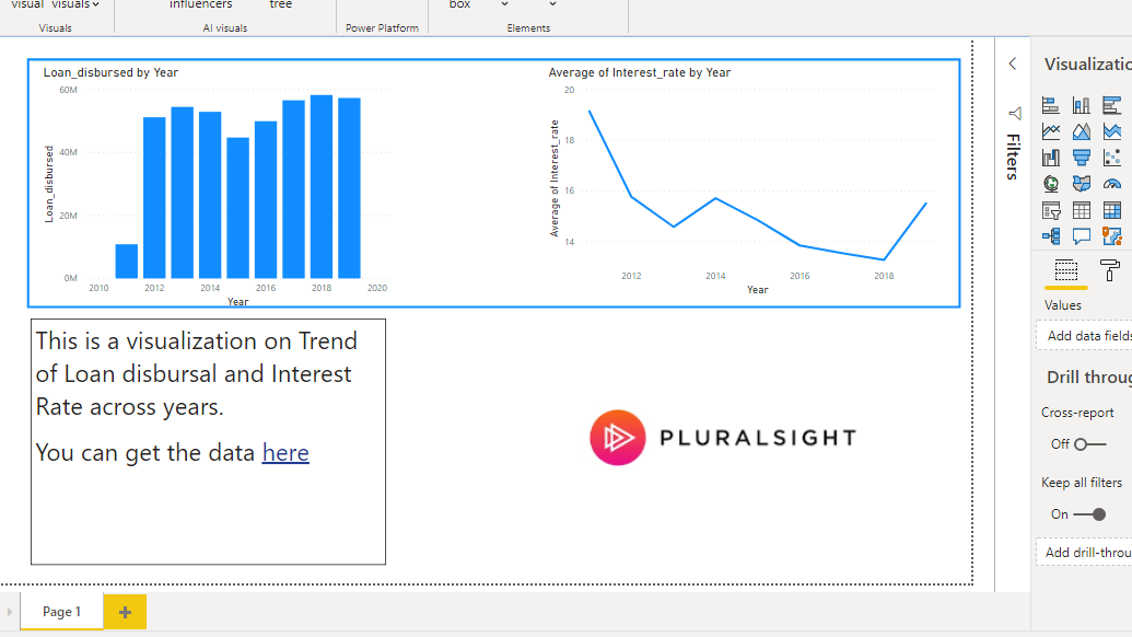
Completing the above steps will generate the final chart shown below.
Conclusion
Static elements provide an aesthetic appeal to visualization. They also help in binding together charts that are related to an underlying concept. A lot of power can be added to visualization dashboards across industries, with the knowledge of how to add static elements to the Power BI report.
To learn more about building powerful visualization in Power BI desktop, please refer to the following guides:
Advance your tech skills today
Access courses on AI, cloud, data, security, and more—all led by industry experts.
