Analyzing Data with Qlik Sense
In this guide, you will learn how to create a new app, upload your data, analyze it, and present your insights using Qlik Sense, which performs faster data analytics than other packages in Python, R, and Julia.
Nov 9, 2020 • 7 Minute Read
Introduction
Qlik Sense is a product offered by the company Qlik. You can use it to perform faster data analytics compared with other analytics packages available in Python, R, and Julia. Qlik Sense generates insights automatically based on all important features. Plus, you can also rely on its NLP search engine to create custom visualizations.
In this guide, you will learn how to create a new app, upload your data, analyze it, and finally present your insights.
Getting Your App and Data Ready
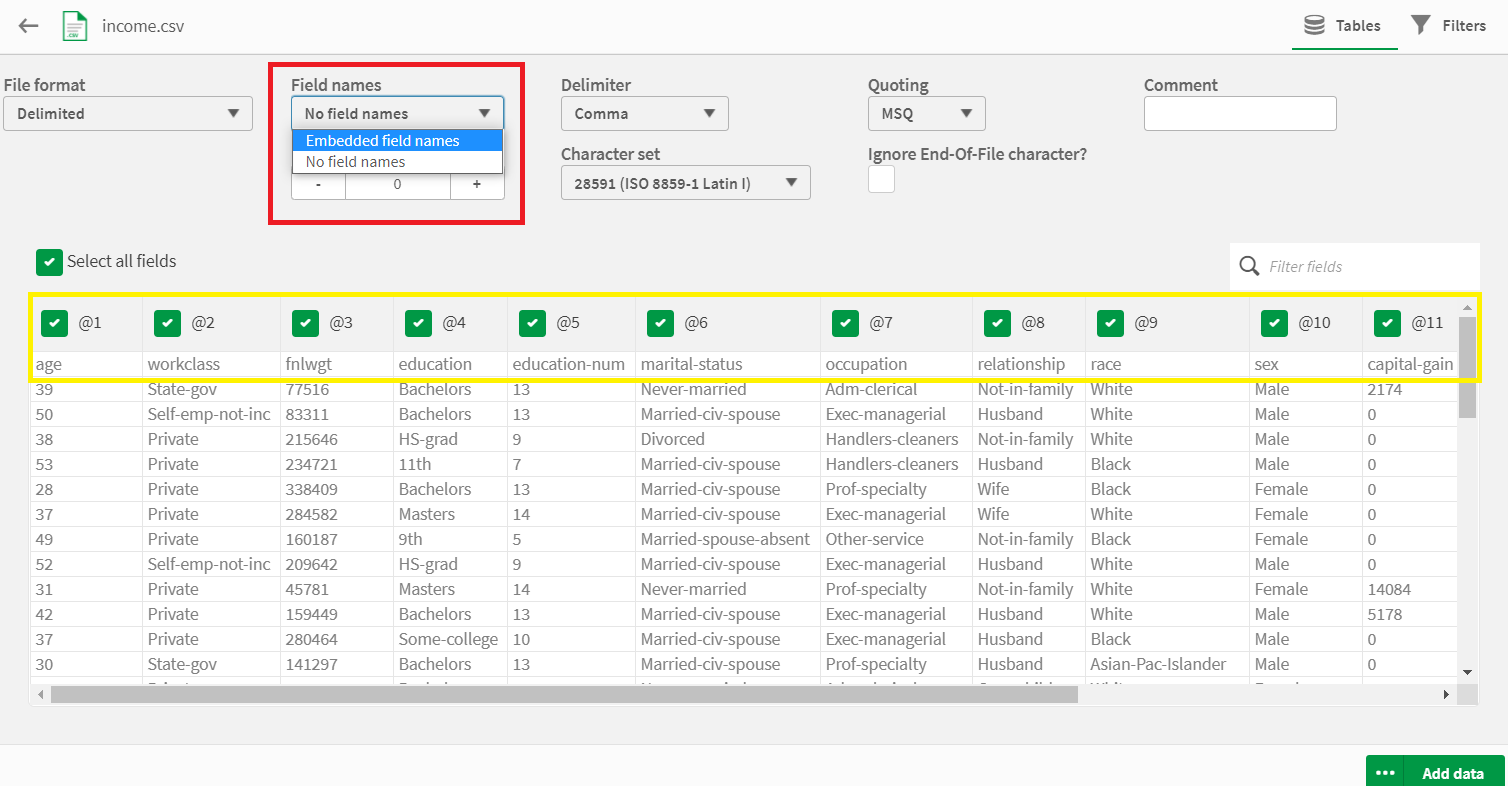
Download the adult dataset from the UCI Machine Learning Repository, add headers to the data, and save the complete file with the name income.csv.
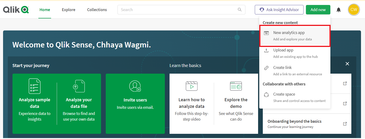
Next, head to your Qlik Sense account and click on the New analytics app button to initiate the creation of a new app:
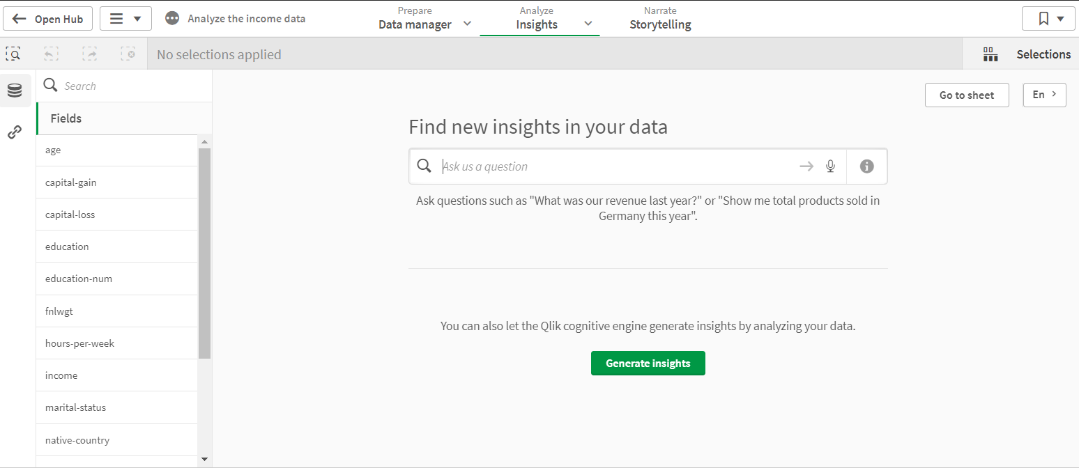
The above action will take you to a blank sheet, but you need to reach for the Insights dashboard to create visualizations. To do so, click Insights under the Analyze tab available at the top and center of the webpage.
One-Click Insights
Applying NLP to the Data to Generate Insights
SQL is considered a higher-level language because you can write codes that are almost like writing a sentence in the English language. However, Qlik Sense goes to the next level by giving you the freedom to write an actual English sentence, and it uses natural language processing (NLP) to generate requested custom visualizations.
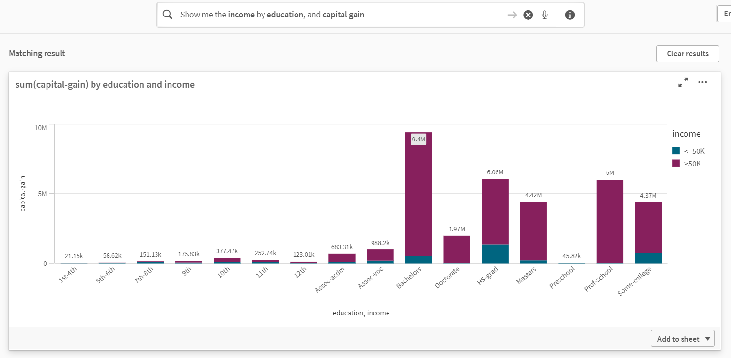
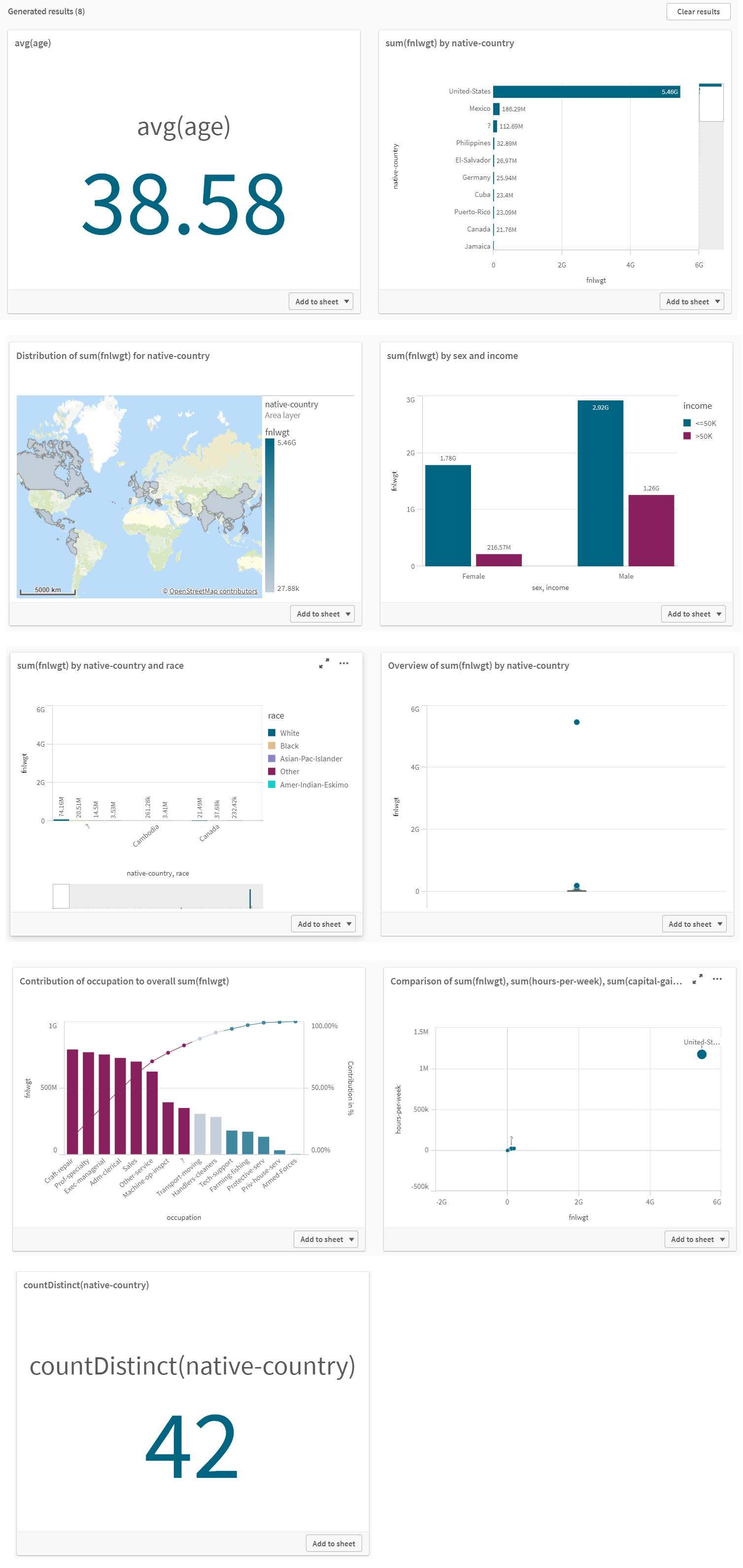
The bar chart shows a wonderful relationship among the three features. You can select this chart and add it to the sheet with the two other previously added charts. Notice that the dataset already has income and education column names, so filtering out those two columns is easy based on the passed query. However, the dataset is using the term capital-gain not capital gain, and yet Qlik Sense's NLP algorithms are able to correlate these two terms.
Selecting Features Manually
If you don't want to rely on the automatically generated insights or the NLP search engine's insights, you can always pick up features manually to build custom visualizations. To do so, check the boxes in front of the desired fields.
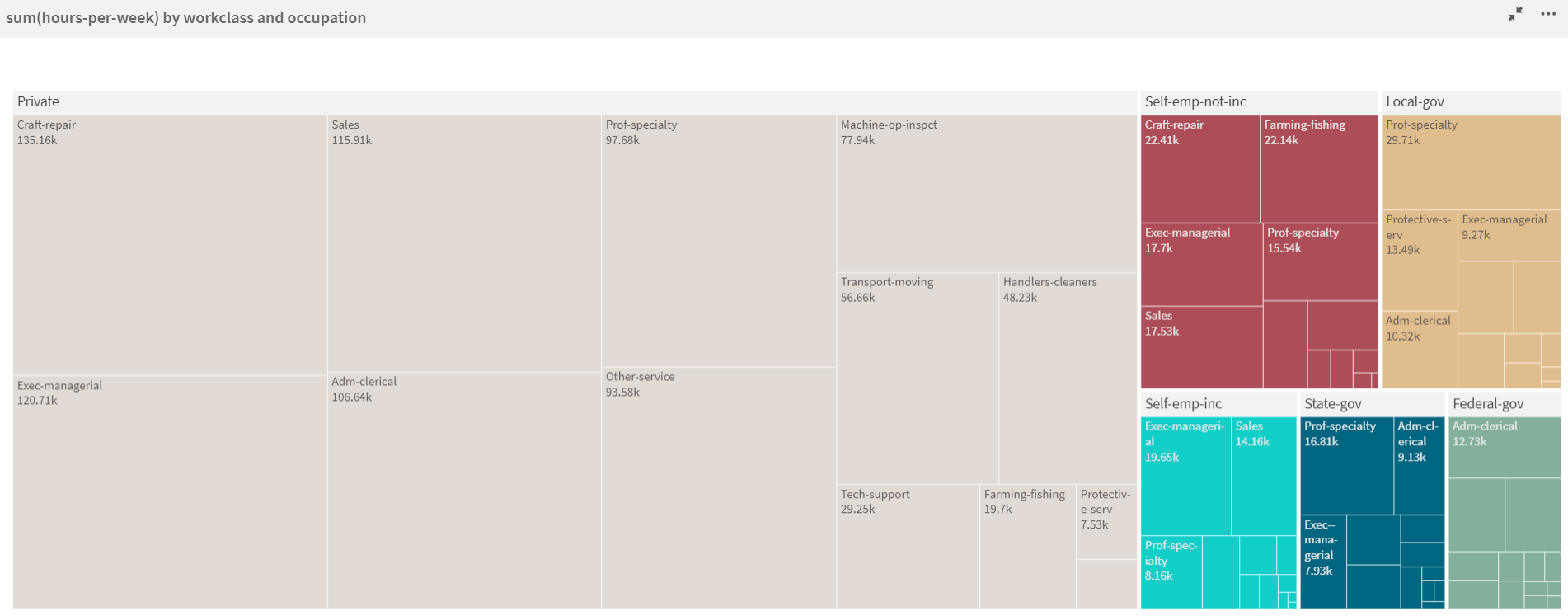
Consider a case where you want to find out the hierarchy of occupation roles based on the number of hours worked per week and the working class (private, local government, self-employed, etc) they belong to.
Deriving Insights from the Sheet
Here are the main insights you can deliver using these charts:
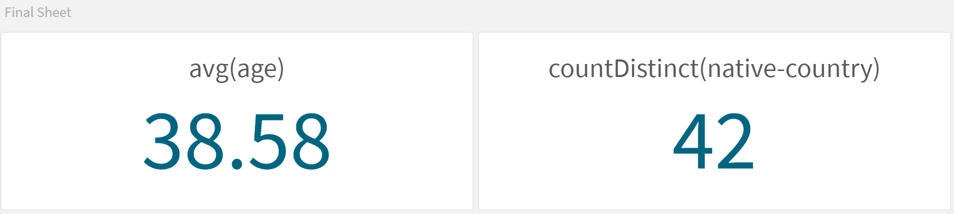
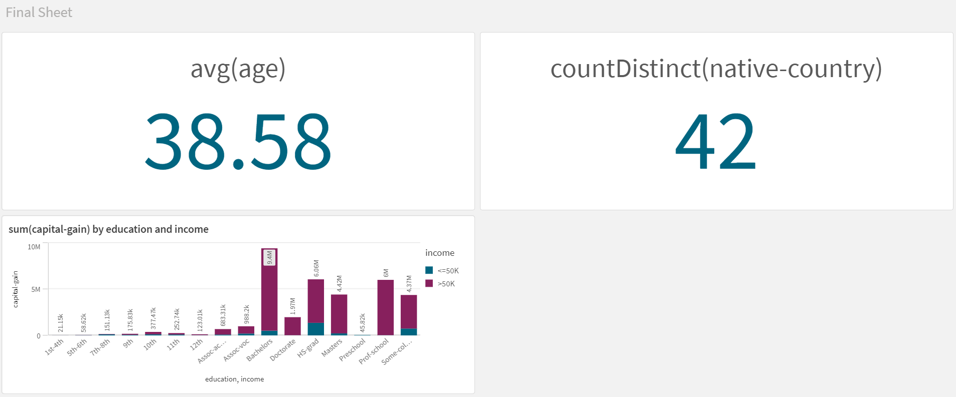
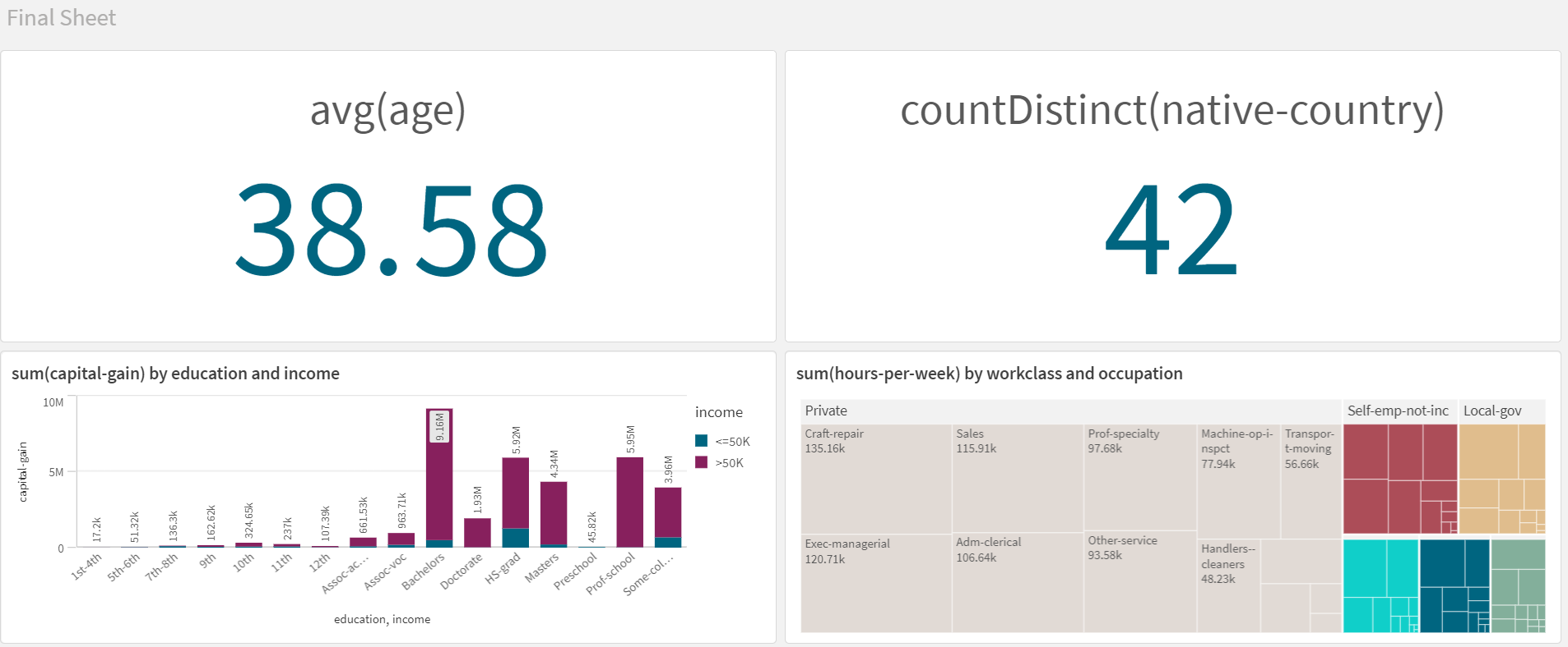
- Chart 1: The average age of the employees is 38.58 years (approximately 39 years).
- Chart 2: The total number of distinct native countries is 42.
- Chart 3: People with bachelor's degrees have the highest capital gain, earning more than USD $50,000, followed by high-school graduates.
- Chart 4: Here's the list of job roles that have the highest number of working hours:
| Workclass | Job Role | | -- | -- | | Private | Craft-repairmen | | Unincorporated self-employed | Craft-repairmen | | Incorporated self-employed | Executive manager | | Federal government | Administration clerk | | State government | Professional specialty | | Local government | Professional specialty |
Conclusion
Qlik Sense provides you an advanced visualization platform just like Tableau. You can generate quick insights with a click of a button as well as use its NLP-powered search engine to interpret the meaning of an English query. You can publish multiple sheets and stories for storytelling. For further learning, you can refer to the Qlik Sense for Analysts learning path provided by Pluralsight, which consists of multiple courses to teach you the ins and outs of Qlik Sense.
Advance your tech skills today
Access courses on AI, cloud, data, security, and more—all led by industry experts.
