Installing and Using Material UI with React
Material-UI has components, styles, themes, icons, and so much more and can be used as a single resource for all your styling needs.
Oct 29, 2020 • 7 Minute Read
Introduction
With over 60,000 GitHub stars, Material-UI is one of the most popular React UI libraries. It has components, styles, themes, icons, and so much more and can be used as a single resource for all your styling needs.
In this guide, we will discuss how to install Material-UI, import components, and use them inside your React app.
Installation
To install Material-UI, run the following command in your React project's root directory.
npm install @material-ui/core
Or if you prefer yarn, run the following command.
yarn add @material-ui/core
Material-UI works best with Roboto font, but it is not automatically loaded by Material-UI, so you will have to add it yourself. There are many ways to do this. One of the easier ways is by using Google Web Fonts.
Add the following code to the <head> tag of your public/index.html file.
<link rel="stylesheet" href="https://fonts.googleapis.com/css?family=Roboto:300,400,500,700&display=swap" />
Icons
With Material-UI, you can use both font icons and SVG icons. To use font icons, add the following code to the <head> tag of your public/index.html file.
<link rel="stylesheet" href="https://fonts.googleapis.com/icon?family=Material+Icons" />
To use SVG icons, run the following command, and install @material-ui/icons as a dependency.
npm install @material-ui/icons
Basic Usage
In this section, we will discuss how to use Material-UI in your app. We will style a <Button> component using various props.
The first thing to do in order to use any Material-UI component is to import that component. In your App.js, add the following code at the top with other imports.
      import React from "react";
import { Button } from '@material-ui/core';
Or you can import by pulling specific components from the library.
import Button from '@material-ui/core/Button';
Now use this component inside the App() function, then pass primary in color prop and contained in variant prop.
export default function App() {
return (
<div>
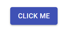
<Button color="primary" variant="contained">
Click Me
</Button>
</div>
);
}
Here is how this button will look.
You can change the size by passing the size prop to the Button component. This size prop can take small, medium, and large as its value.
      <Button size="large" color="primary" variant="contained">
  Click Me
</Button>
Here is how this button will look.
.png)
You can also add icons to this button using startIcon and endIcon props; as the name suggests, startIcon adds icon before the text of the button and endIcon adds it after the text.
But first, you need to import the icons into your App.js. In this example, you will create login and logout buttons. You can search for your desired icons here.
Import AccountCircle icon from @material-ui/icons.
import LoginIcon from '@material-ui/icons/AccountCircle';
Now, pass this LoginIcon to the startIcon prop of the Button component.
      <Button startIcon={<LoginIcon />} color="primary" variant="contained">
  Login
</Button>
Here is how this button will look.
.png)
You can also pass this icon to the endIcon prop.
      <Button endIcon={<LoginIcon />} color="primary" variant="contained">
  Login
</Button>;
Here is how this button will look.
.png)
Now for the logout button. Import the ExitToApp icon from @material-ui/icons.
import LogoutIcon from '@material-ui/icons/ExitToApp';
For the logout button, pass secondary to the color prop, which will make the button red; that makes sense since it is a logout button.
      <Button startIcon={<LogoutIcon />} color="secondary" variant="contained">
  Logout
</Button>
Here is how this button will look.
.png)
You can further group these buttons using the ButtonGroup component. First, import the ButtonGroup component to App.js.
import ButtonGroup from "@material-ui/core/ButtonGroup";
Using ButtonGroup, remove repetitive props from the buttons and pass them to ButtonGroup instead.
For example, here varaint="contained" is common to both the buttons, so you can pass it to ButtonGroup instead and remove it from individual buttons.
      <ButtonGroup variant="contained">
  <Button endIcon={<LoginIcon />} color="primary">
    Login
  </Button>
  <Button startIcon={<LogoutIcon />} color="secondary">
    Logout
  </Button>
</ButtonGroup>
Here is how this will look.
.png)
You can also change the buttons' orientation by passing the orientation prop to the ButtonGroup component.
      <ButtonGroup variant="contained" orientation="vertical">
...
</ButtonGroup>
Here is how this will look.
.png)
You can explore all the examples discussed above here.
There are many props besides the one discussed here available for every component. You can read more about them in the official docs.
Conclusion
In this guide, we discussed how to install and use Material UI in any React app. We also saw how to add icons and style components.
Try to explore different components, themes, icons, and styles available in Material UI. Here are some additional resources that can be helpful.
Happy coding!
Advance your tech skills today
Access courses on AI, cloud, data, security, and more—all led by industry experts.
