Explore R Libraries: ggplot2
ggplot2 is a package in the tidyverse collection whose sole purpose is to create graphics. It is based on the concept of a layered grammar of graphics.
Oct 23, 2020 • 8 Minute Read
Introduction
ggplot2 is a package in the tidyverse collection whose sole motive is to create graphics. It is a well-known library in R based on the concept of layered grammar of graphics. The grammar of graphics enables you to concisely describe the components of a chart, and the layered approach applies those components layer-wise, making it easy to read and understand the code. Apart from building graphs, it is widely used in exploratory data analysis since the best way to understand a dataset is to visualize it, which makes it easier to extract relations.
Prerequisites
To install the ggplot2 package, run one of the following code snippets.
      #To install the entire tidyverse collection which includes ggplot2
install.packages("tidyverse")
      #To install ggplot2 alone
install.packages("ggplot2")
Basic Components
There are a few basic components of ggplot2:
- ggplot(): This creates a new ggplot2 object.
- aes(): This creates the aesthetic mapping means describing how the variables in the data are mapped to visual properties.
- +: This allows you to add layers while creating any plot.
Understanding Layers in ggplot2
If we talk about the layers concept in ggplot2, there are four primary layers:
- Data: Data or subset of a dataset that has been used to create plots.
- Aesthetics: The mappings of the variables in the plot.
- Geometrics: The geom function used to represent data points.
- Theme: Different visual styles for the plot.
Let's look at the basic graphing template and use it to create a few graphs.
      ggplot(data = <DATA>) +
  <GEOM_FUNCTION>(mapping = aes(<MAPPINGS>))
ggplot(data = <DATA>) is the first layer. Use the mpg dataset, which is included in the ggplot2 library and will be available when you load it. Below are the columns of the mpg dataset.
      data(mpg)
colnames(mpg)

"manufacturer" "model"        "displ"        "year"         "cyl"          "trans"        "drv"
"cty"          "hwy"          "fl"           "class"
Let's create a histogram on the column hwy.
      #You can ignore theme_classic() function if you want, the resulting plot would be in the default theme.
ggplot(mpg, aes(hwy))+
geom_histogram(binwidth = 5)+
theme_classic()
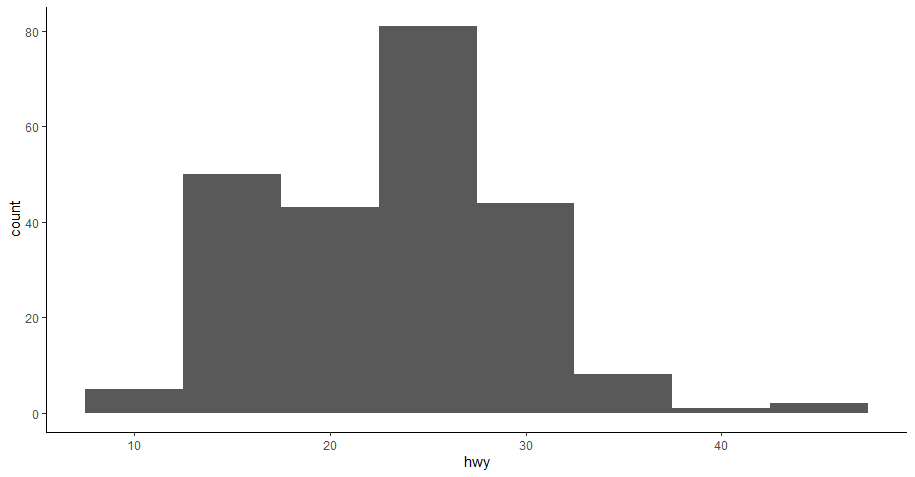
The code above uses all four layers. Data and aesthetic are included in ggplot(mpg, aes(hwy)), then the geom_histogram() function added the geometrics of the histogram, and finally, theme_classic() is optional.
There are different types of geom functions available in ggplot2 that can be used in different situations to create different plots. A geom is a geometric object that uses a plot to represent data, for example, a bar chart will use the bar geom, a line chart will use the line geom, and so on. This is reflected in the names of the geom functions as they are named accordingly, such as geom_line(), geom_bar(), etc.
In addition to primary layers, there are a few other useful features in ggplot2 such as coordinate system, faceting, and statistical transformation, which we will explore in the remainder of this guide.
Faceting
In faceting, you split a plot into multiple subplots using any categorical column or variable of the dataset. If you want to divide your plot using one variable, use the facet_wrap() function, and if you want to divide it using two variables, then use the facet_grid() function.
Let's apply both functions on the histogram you created earlier.
      # Saving histogram plot in a variable
a <- ggplot(mpg, aes(hwy))+
geom_histogram(binwidth = 5)+
theme_classic()

# Creating subplots using "cyl" column
a + facet_wrap(~cyl)
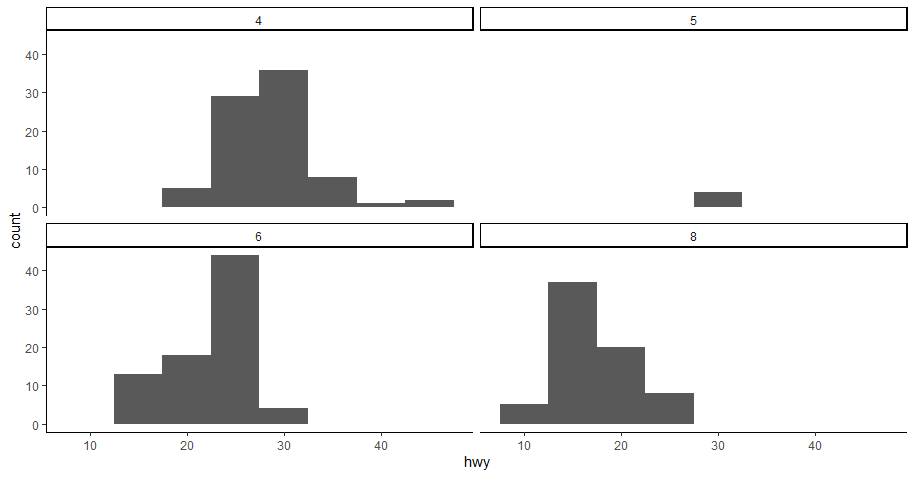
As you can see, now we have four subplots, one for each unique value against the cyl column.
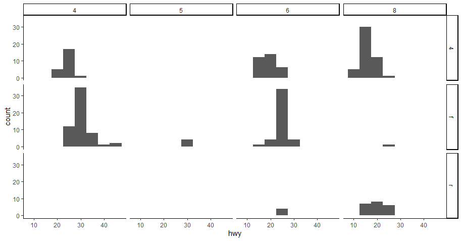
Now for the facet_grid() function. In this function, you will use two categorical columns from the dataset.
      # You will use 'a' variable storing the histogram again thus reducing code redundancy

a + facet_grid(drv ~ cyl)
Coordinate System
The default coordinate system in ggplot2 is a Cartesian coordinate system where the x and y positions are independent to locate a data point. There are different coordinate system functions in ggplot2 that is used on different occasions. The most famous ones are coord_flip() and coor_polar().
Let's look at a few examples to understand the use of coord_flip() and coord_polar().
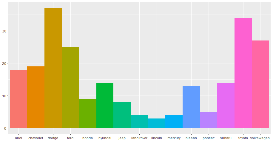
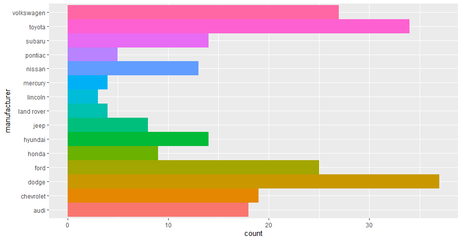
      # First create a bar chart, try to find yourself the reason for using  fill, show.legend, and width arguments

bar <- ggplot(data = mpg) +
     geom_bar(
         aes(x = manufacturer, fill = manufacturer),
         show.legend = FALSE,
         width = 1  )

bar
      #lets use coord_flip()

bar + coord_flip()
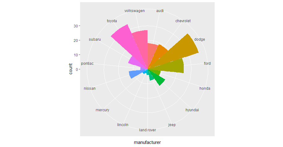
As for coord_polar(),let's apply it to the same bar chart to use polar coordinates.
bar + coord_polar()
Statistical Transformation
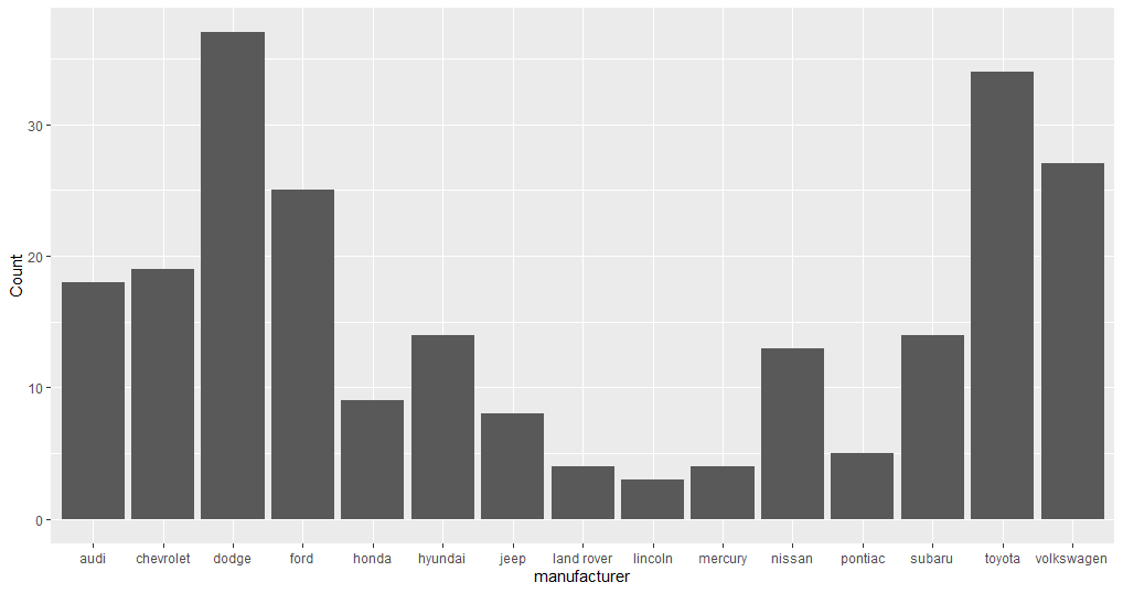
If you look at the bar chart we created previously, you can see it shows additional information, including the count of records against each manufacturer, but the count is not available in the dataset. Some graphs show raw values, while others calculate new values and add them to the plot. The algorithm used to calculate new values for a graph is called a statistical transformation, or stat.
A bar graph can be created using the stat_count() function instead of geom_bar(). Every geom function has a default stat that can be overridden. See the example below.
      # Creating a dataset
library(dplyr)
a <- mpg%>%
   group_by(manufacturer)%>%
   summarise(Count = n())

# Resetting the stat of geom_bar() from count to identity

ggplot(data = a)+
     geom_bar(mapping = aes(x = manufacturer, y = Count), stat = "identity")
Applying All Layers
In the previous sections, you learned a foundation of creating a graph using ggplot2 along with facets, coordinate systems, and statistical transformation. Now let's apply all of these using the template below.
      ggplot(data = <DATA>) +
  <GEOM_FUNCTION>(
     mapping = aes(<MAPPINGS>),
     stat = <STAT>
  ) +
  <COORDINATE_FUNCTION> +
  <FACET_FUNCTION>
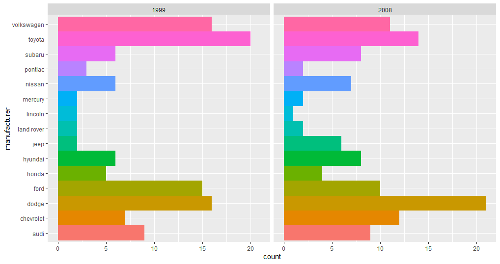
Keep stat = "count", which is a default, and use the mpg dataset only.
      ggplot(data = mpg)+
 geom_bar(mapping = aes(x = manufacturer, fill = manufacturer),
   stats = "count", show.legend = FALSE,
         width = 1  )+
   coord_flip()+
   facet_wrap(~year)
Conclusion
This guide explains the basics of creating a graph using ggplot2 in R. You can also use ggplot2 for your own data visualization requirements or in any data analysis project. There is a lot of flexibility when you are creating graphs with ggplot2. Each function contains a set of arguments that is available to tweak the graph accordingly. As a part of open source development, new features are added continually. This guide gives you a push to explore more in ggplot2.
For more information, visit this repo.
Advance your tech skills today
Access courses on AI, cloud, data, security, and more—all led by industry experts.
