Coloring Charts in Power BI
Nov 23, 2020 • 8 Minute Read
Introduction
For building powerful and beautiful visualizations, it's important to understand and know how to control the color aspect of the charts, and how to format them according to requirements. This guide will demonstrate how to change the color of data points in the charts and other related formatting options in Power BI.
Data
In this guide, you will work with a fictitious data set of bank loan disbursal across years. The data contains 3,000 observations and 17 variables. You can download the dataset here. The major variables are described below:
- Date: Loan disbursal date.
- Income: Annual income of the applicant (in US dollars).
- Loan_disbursed: Loan amount (in US dollars) disbursed by the bank.
- Age: The applicant’s age in years.
- Gender: Whether the applicant is female (F) or male (M).
- Interest_rate: Annual interest rate, in percentage, charged for the disbursed loan.
- Purpose: Purpose for which loan was taken.
- Weeknum: Week number of the year.
Start by loading the data.
Loading Data
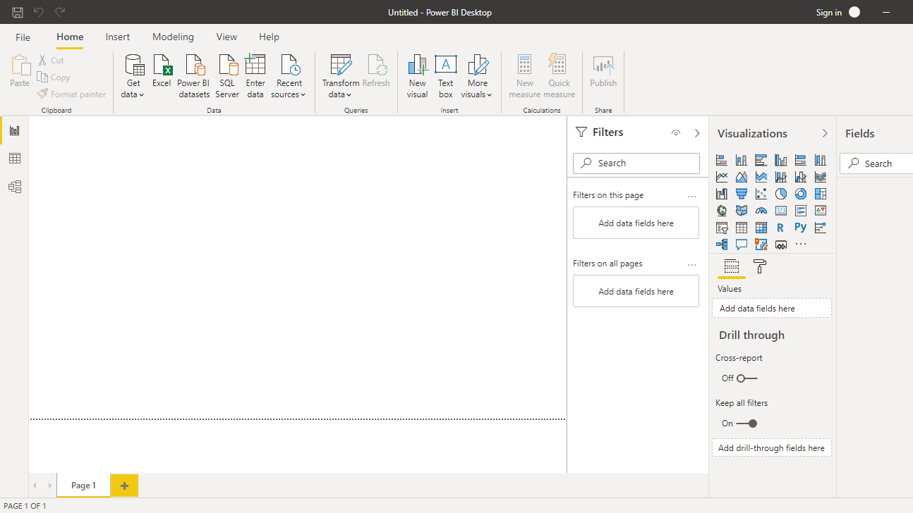
Once you open your Power BI Desktop, the following output is displayed.
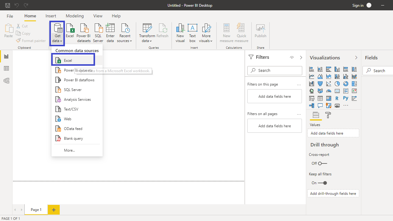
Click on Get data option and select Excel from the options.
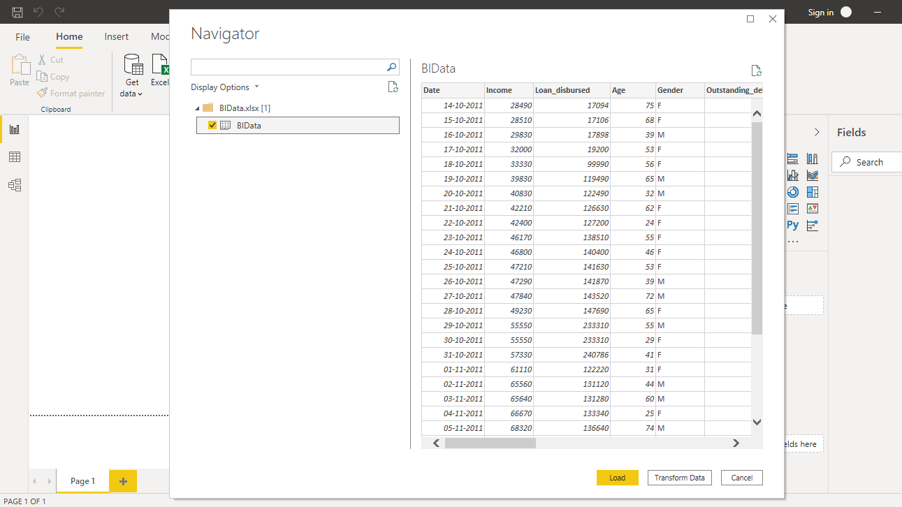
Browse to the location of the file and select it. The name of the file is BIdata.xlsx, and the sheet you will load is BIData sheet. The preview of the data is shown, and once you are satisfied that you are loading the right file, click Load.
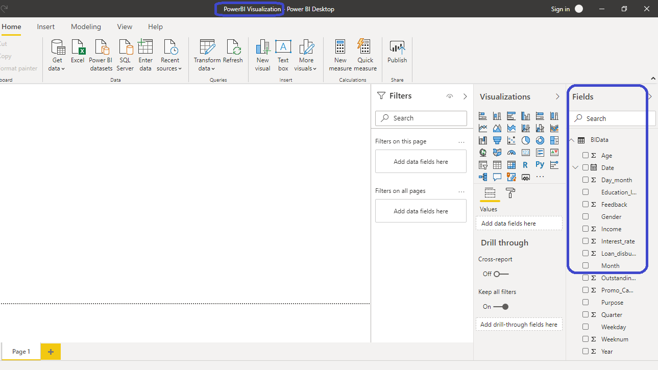
You have loaded the file, and you can save the dashboard. It is named PowerBI Visualization. The Fields pane contains the variables of the data.
Coloring Clustered Column Chart
To begin, you will need a chart, table or a matrix. You will create a Clustered column chart in this guide. You can locate it in the Visualizations pane. Click on the chart and it will create a chart box in the canvas. Nothing is displayed because you haven't yet added the required visualization arguments.
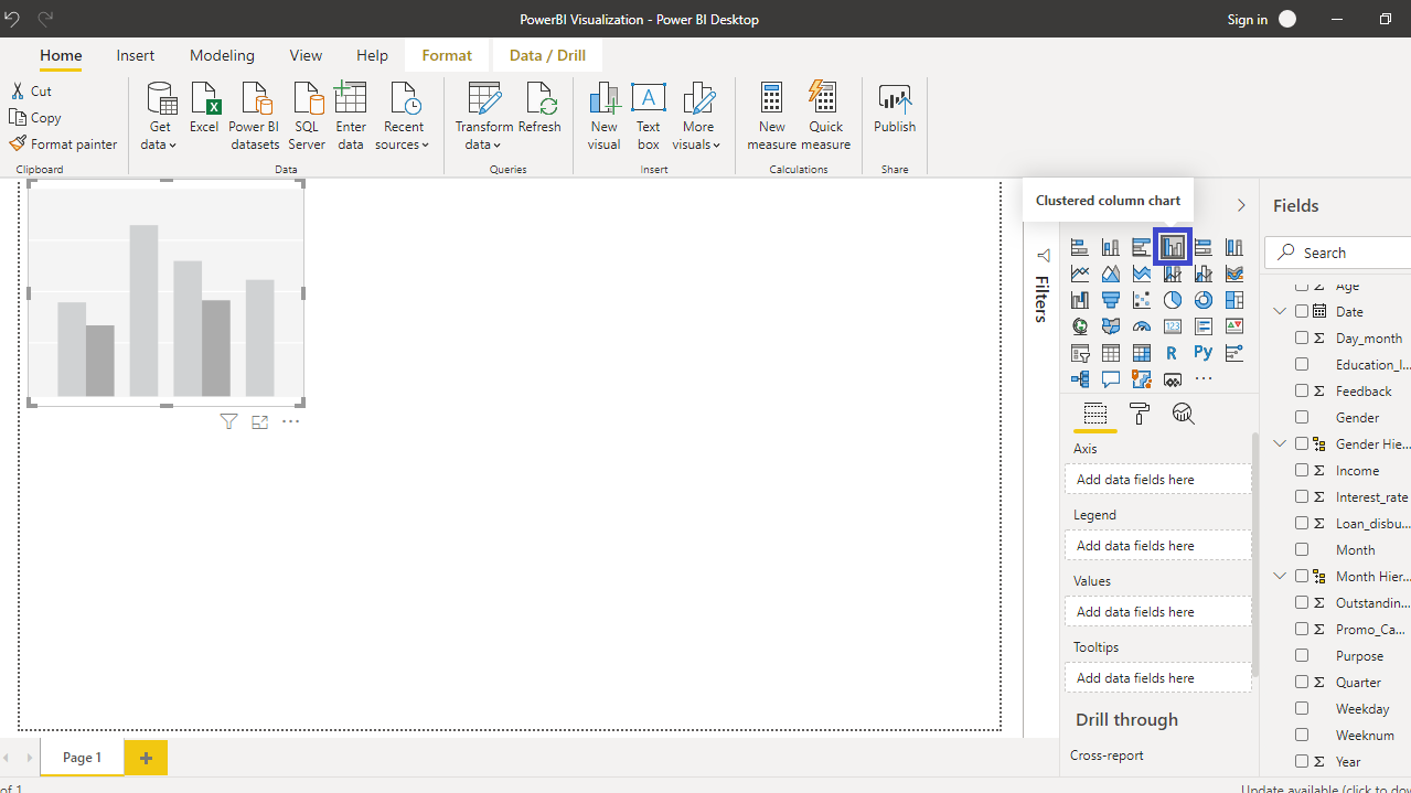
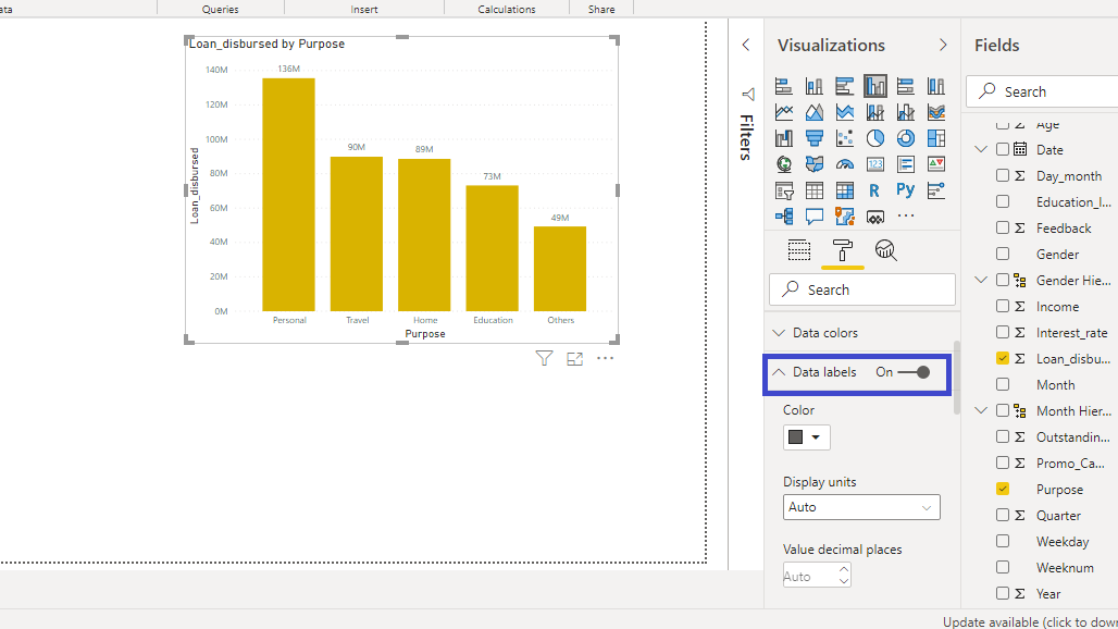
You can resize the chart on the canvas. The next step is to fill the visualization arguments under the Fields option as shown below. Drag the variable Purpose into the Axis field, and Loan_disbursed in the Values field.
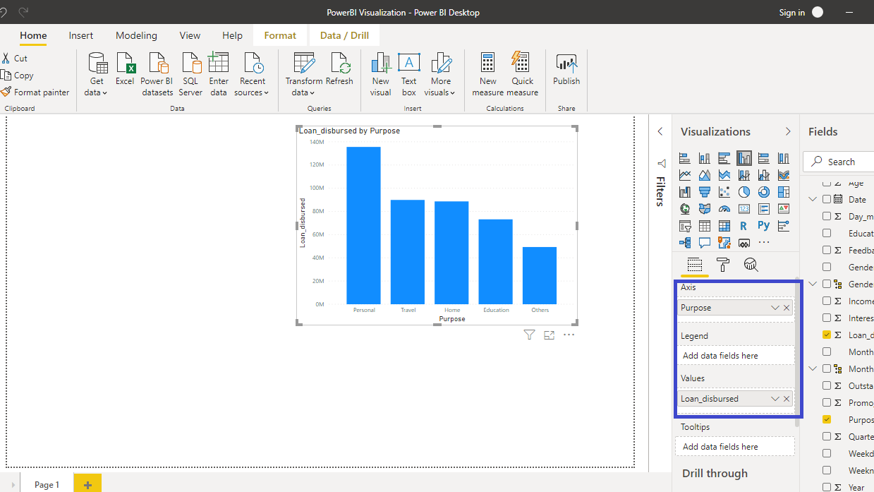
The output above shows the Loan_disbursed by Purpose chart. You can format the chart under the Format tab. For example, if you want to change the color of the bars, go to Data colors, and you will see the default color type.
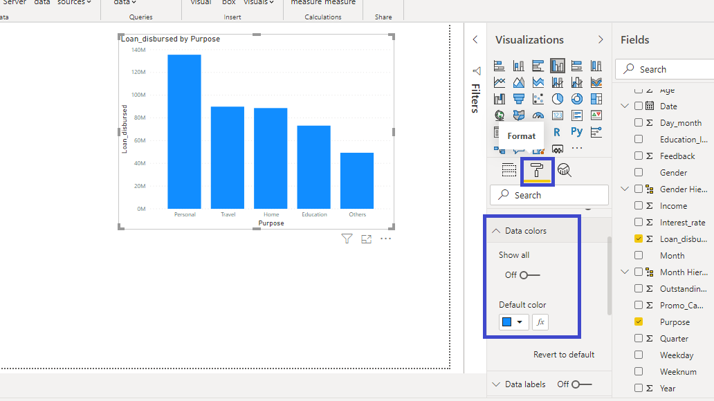
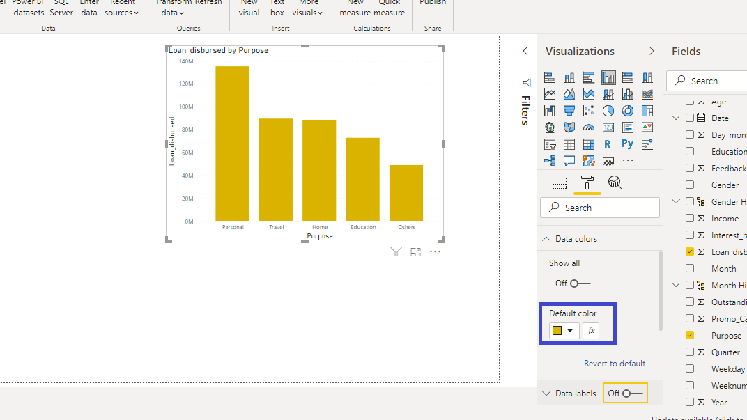
The default color type is blue, and you can change it to the color of your choice.
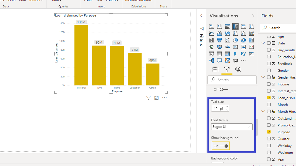
To add the values to the chart, turn on the Data labels.
You can also increase the size of the labels. Set the Text size to twelve and turn on the Show background option. This will add the background to the labels.
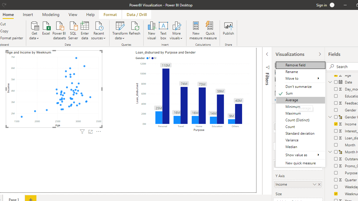
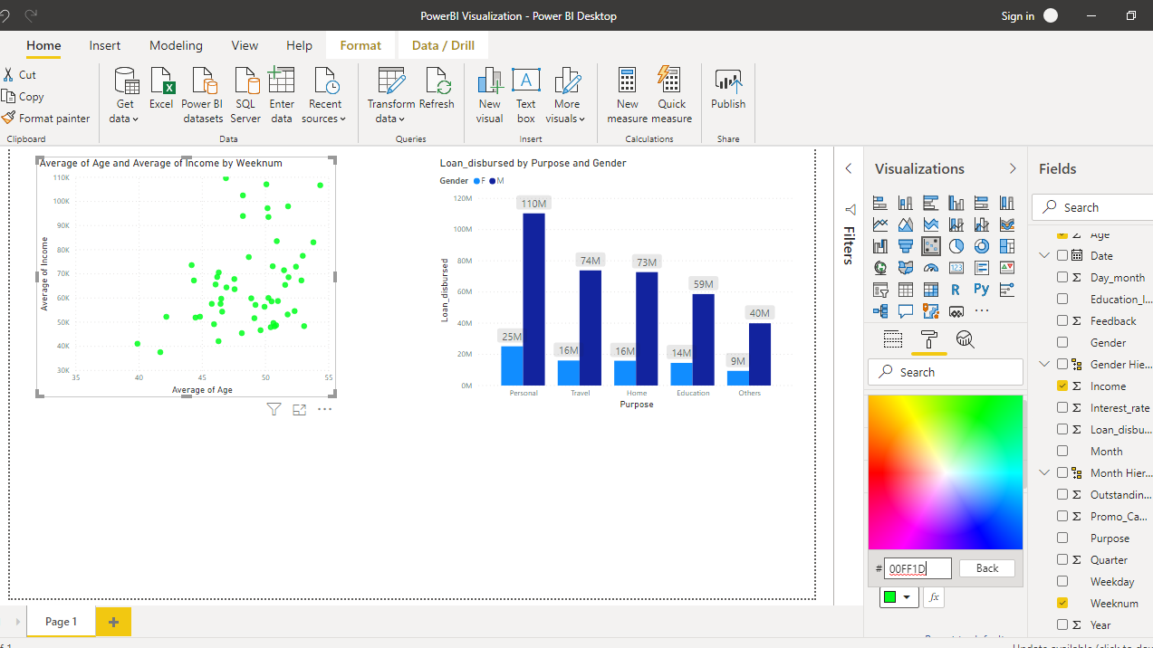
The other thing you can do to change the color is add more dimensions to the chart. This can be done by adding new variable as a dimension. For example, drag the Gender variable to Legend option. This will change the chart as shown below.
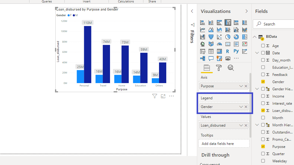
The output above shows that the chart now displays Loan_disbursed by Purpose and Gender, and has corresponding two colors for the Gender categories.
Coloring Scatter Plot
You will now explore the Power BI coloring options with another chart. To begin, search and click on the Scatter chart, which is located in the Visualizations pane.

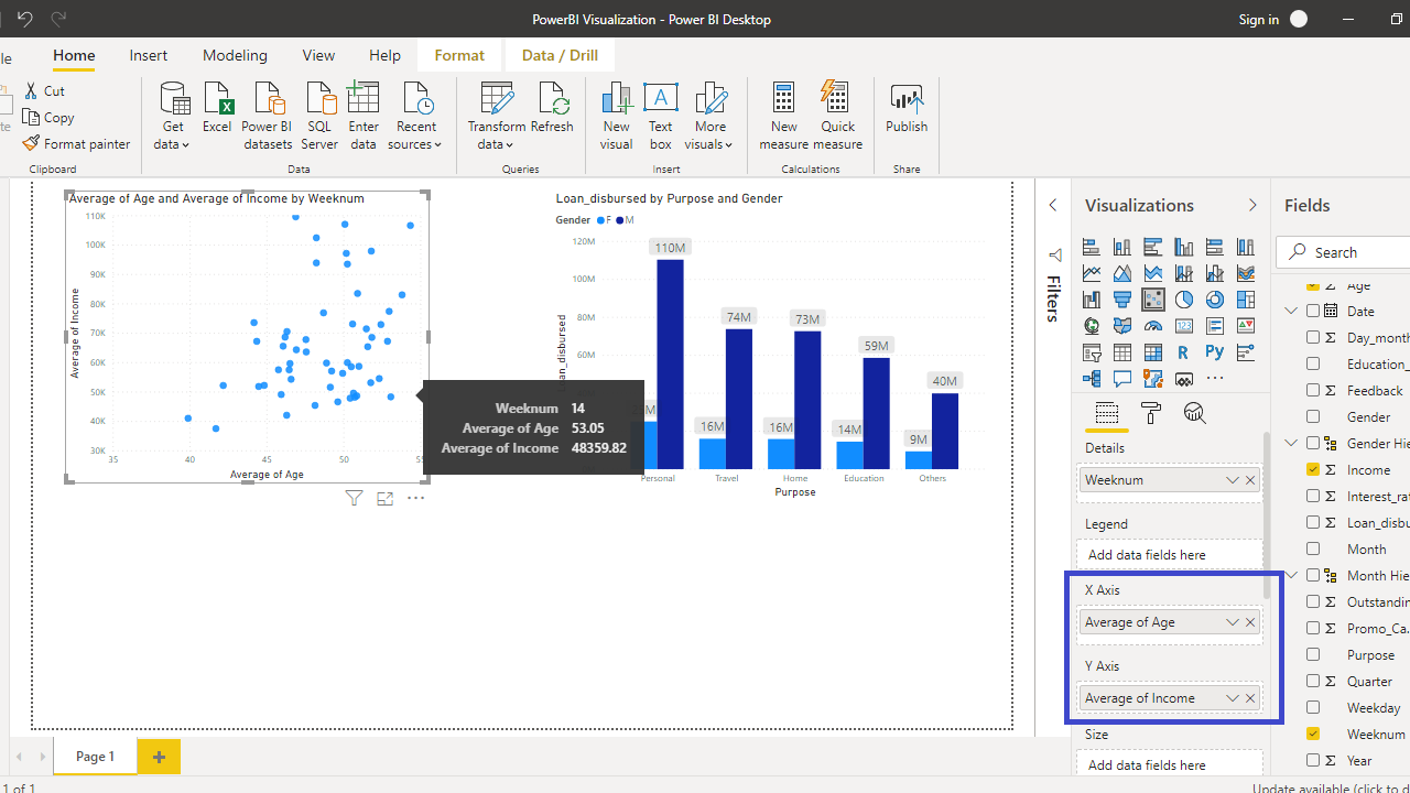
The next step is to add the required visualization arguments. Drag the Weeknum variable into the Details option, Age in the X Axis field, and Income in the Y Axis field.
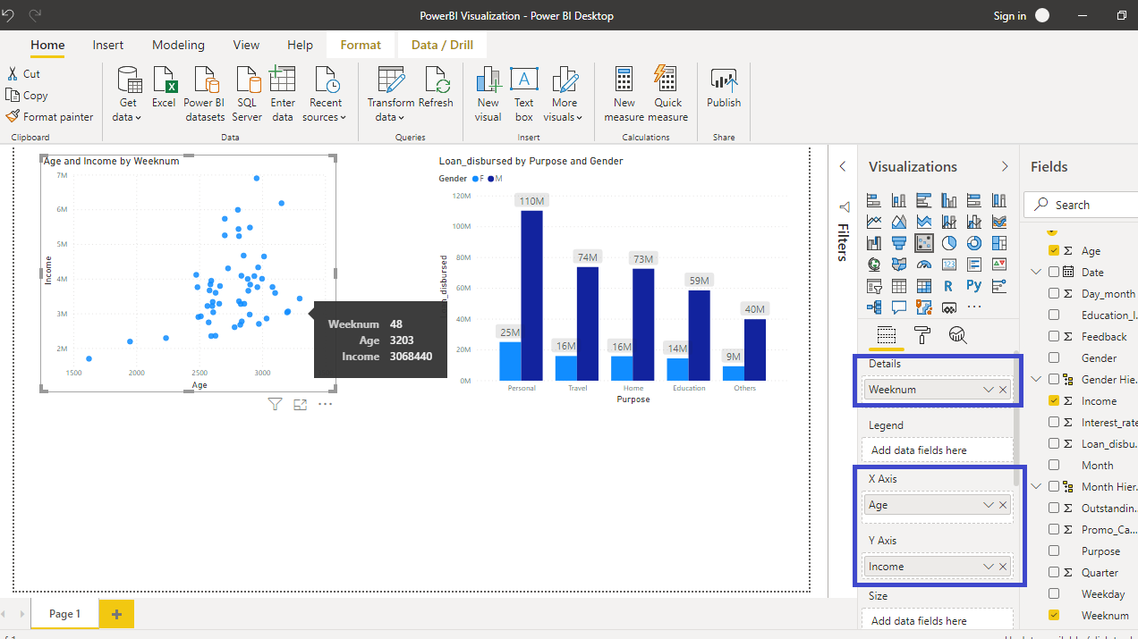
In the output above, you can see that the values in the Age and Income variable are being added up. This is an incorrect comparison, and the correct comparison is to take average of both the variables. To make the correction, right click and select Average for both the variables.
Completing the above step will create the resulting chart with correct comparison between the two variables.
To make changes in the chart color, go to the Format pane and select Data colors. You will see that blue is the default color.
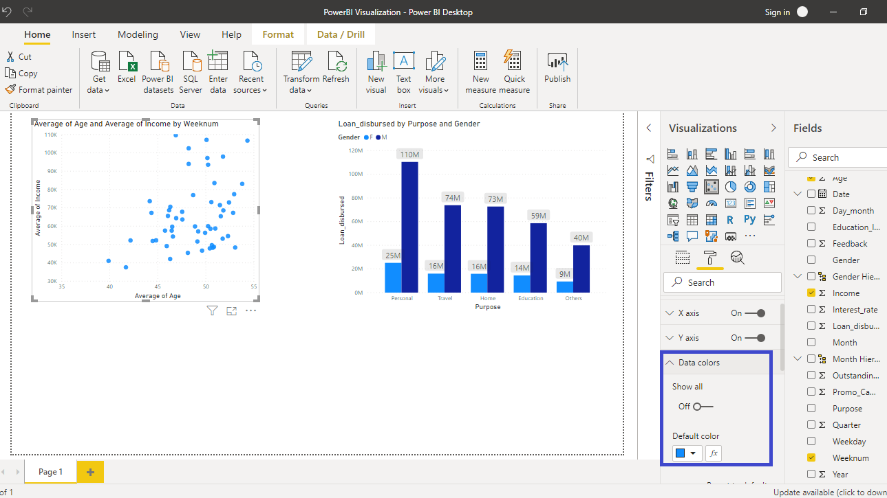
There are various options to change the color.
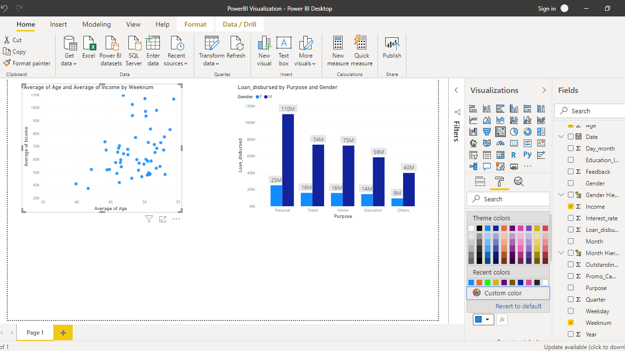
You can select from the options, or click on Custom color to select a custom color as shown below.
The output above shows that the custom color has been added to the chart.
Conclusion
The importance of being able to control the color combination of the charts cannot be emphasized enough. The visualization dashboards, reports and business intelligence tasks require that you can utilize the color combinations in an intelligent manner, so that maximum business value and insights are derived from it. This is a great skill set to add because you will be using it regularly across sectors and organizational functions.
To learn more about building powerful visualization in Power BI desktop, please refer to the following guides:
Learn More
Explore these Power BI courses from Pluralsight to continue learning:
Advance your tech skills today
Access courses on AI, cloud, data, security, and more—all led by industry experts.
