Data Visualization with ggplot2
There are a huge number of graphs available in R, each with a specific quality and used to show certain factors that are hidden in data.
Oct 27, 2020 • 5 Minute Read
Introduction
R is an amazing open source platform for data visualization. It is capable of creating any type of chart. But before creating any type of chart you should have an idea that what you want to show and select the chart from there. Suppose you have a dataset that shows stock value fluctuations of a company over a period of time, then we would like to use a graph that shows a comparison of values over time. Based on the dataset and thought of representing data, charts can be divided into four types:
- Comparison Charts
- Distribution Charts
- Composition Charts
- Relationship Charts
Comparison Charts
These types of charts would compare the data among the categories or over time. For comparing over categories you could use a bar chart or column chart. For data points that need to be compared over time you can use a line chart or circular area chart.
Distribution Charts
These types of charts would show the distribution of data over one or more variables. For the distribution of one variable, you can use a histogram or density plot. The distribution of two variables can be plotted with a scatter plot.
Composition Charts
These types of charts show changes in composition over time or static composition. For showing the change in composition over time you can use a stacked column chart or stacked area chart. The static composition can be shown through a pie chart or waterfall chart.
Relationship Charts
These types of charts are used to show the relationship between two or more variables. For showing the relationship between two variables you can use a scatter plot. If you want to show the relationship between three variables you can use a bubble chart.
Plotting Charts with ggplot2
In this section you will plot different types of charts using ggplot2 in R. Below are the prerequisites for using ggplot2. You can get more information about this package here.
      # Install ggplot2 in Rstudio
install.packages("ggplot2")

# Loading ggplot2
library(ggplot2)
Creating Comparison Charts
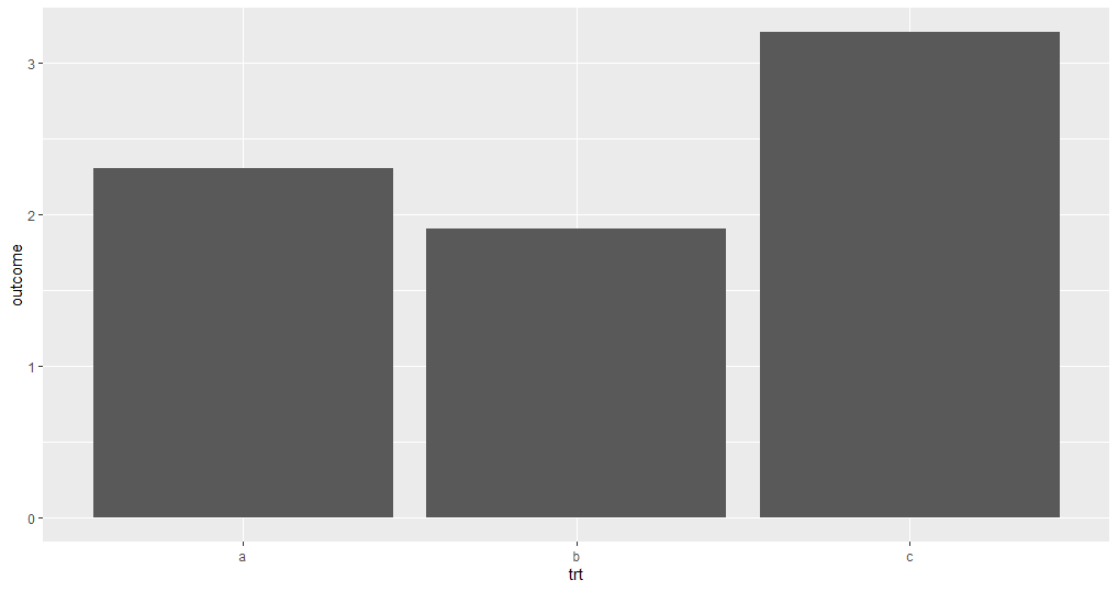
      # Creating a dataframe
df <- data.frame(trt = c("a", "b", "c"), outcome = c(2.3, 1.9, 3.2))

# Plotting a bar plot
ggplot(df, aes(trt, outcome)) +
geom_bar(stat = "identity")
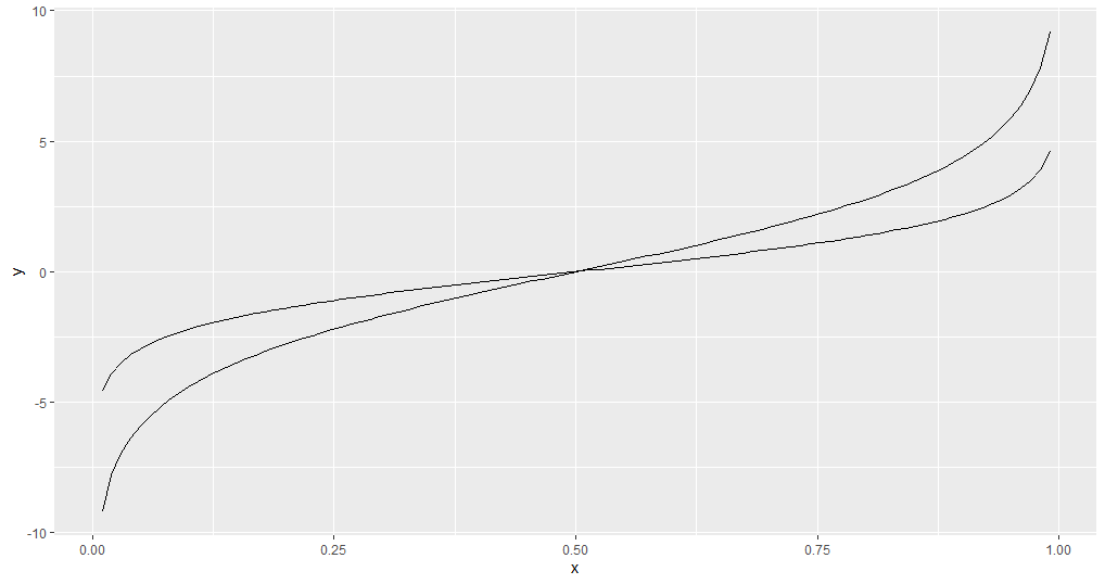
      # Creating dataframe for line plot
x <- seq(0.01, .99, length.out = 100)
df <- data.frame(
  x = rep(x, 2),
  y = c(qlogis(x), 2 * qlogis(x)),
  group = rep(c("a","b"),
  each = 100)
)

# Creating aline plot
ggplot(df, aes(x=x, y=y, group=group))+
geom_line()
Creating Distribution Charts
      # Using diamonds dataset fro creating a density plot
ggplot(diamonds, aes(carat)) +
  geom_density()
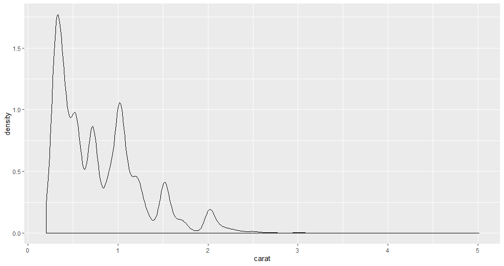
In the density plot, there are no bins defined. This kind of plot is used when there is a huge number of data points. When the data points are low you can use a histogram.
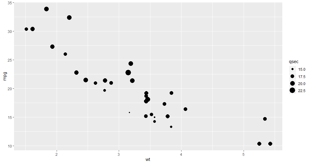
      # geom_point() is used to plot a scatter plot
ggplot(mtcars, aes(wt, mpg))+
geom_point()
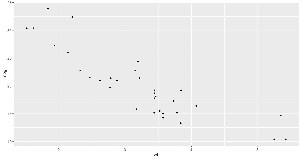
The scatter plot is used to show the distribution of two variables at a time.
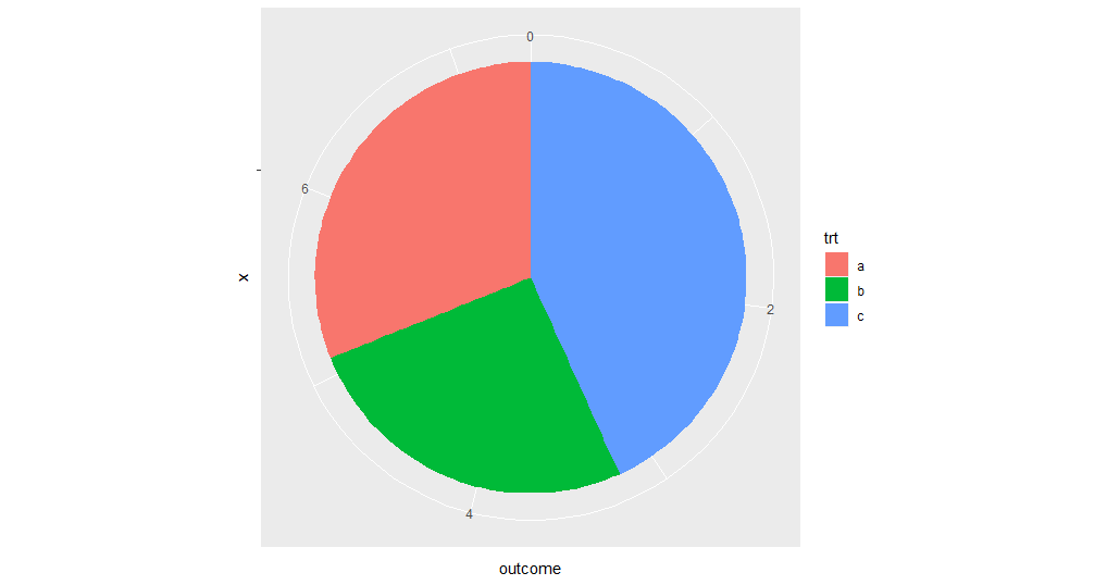
Creating a Composition Charts
There is no geom function available to create a pie chart. However, the bar chart can be converted into a pie chart using the coord_polar() function.
      # Creating a dataframe
df <- data.frame(trt = c("a", "b", "c"), outcome = c(2.3, 1.9, 3.2))
# Plotting a pie plot
ggplot(df, aes(x ="", y = outcome, fill = trt)) +
geom_bar(width = 1,stat = "identity")+
coord_polar("y", start = 0)
Creating a Relationship Chart
The bubble chart is an extension of a scatter plot. In a scatter plot, you can show the relationship between two variables. In the bubble chart, you can show the relationship between three variables at a time.
      # Creating a Bubble chart
ggplot(mtcars, aes(x=wt, y=mpg)) +
  geom_point(aes(size=qsec)
Conclusion
There are a huge number of graphs available, each with a specific quality and used to show certain factors that are hidden in data. You don't need to learn each and every graph, but a few are very important if you want to do data analysis. Data visualization is a huge topic and there are a number of packages developed for visualization purposes. If you want to learn in more detail please visit here.
Advance your tech skills today
Access courses on AI, cloud, data, security, and more—all led by industry experts.
