Describe Problems That Can Be Solved Using Parameters in Tableau
Jun 23, 2020 • 12 Minute Read
Introduction
In business intelligence and analytics, it is often necessary to customize tasks for a particular purpose. A parameter is any value passed to a program to do this. Parameters allow you to come up with scenarios or options that are not available in your data. In this guide, you will learn how parameters can be used to solve problems in Tableau.
Data
Parameters support text, strings, integer, float, date, time, and Boolean data types. This guide will use the Sample Superstore data source available in the Tableau repository and the Global Superstore data that comes from this website.
There are several types of situations in which you may face limitations while building visualizations, and in these cases, parameters are of immense help. In this guide, you will work on two such scenarios.
Scenario One
- Filter Fields Using a Parameter
In this scenario, you will learn how to filter fields using parameters when you have multiple data source worksheets in one dashboard. For example, you may want to filter a column field in two or more worksheets. In this scenario, you will filter on Order Date.
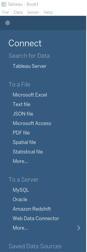
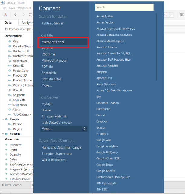
The first step is to load the data. Start by dragging the Superstore data from the Tableau repository. To do this, select Connect to a file, as shown below.
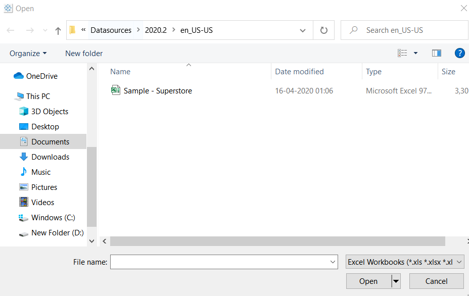
After clicking on Excel, go to Documents, followed by Tableau repository, and then select Datasources. The last step is to select Sample Superstore data.
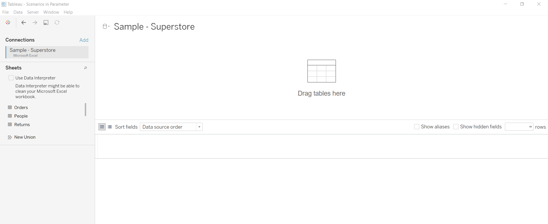
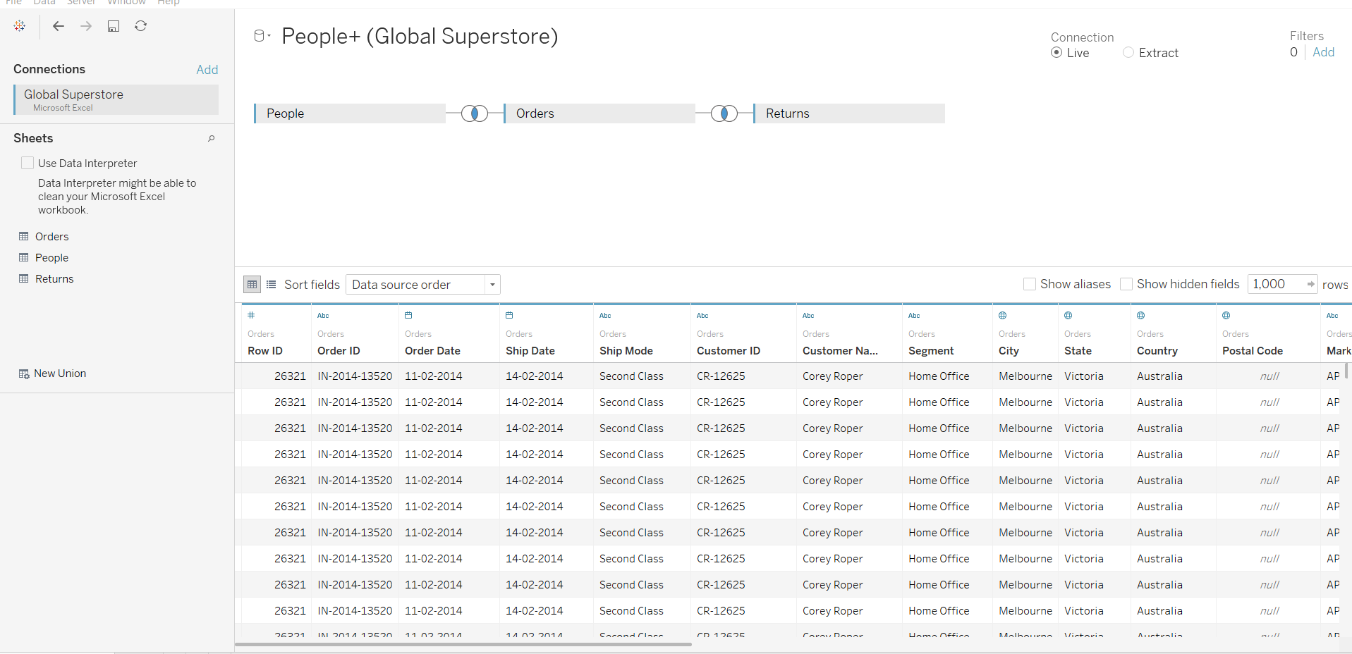
Once you have selected the data, Tableau pulls the Excel sheets for Orders, People, and Returns.
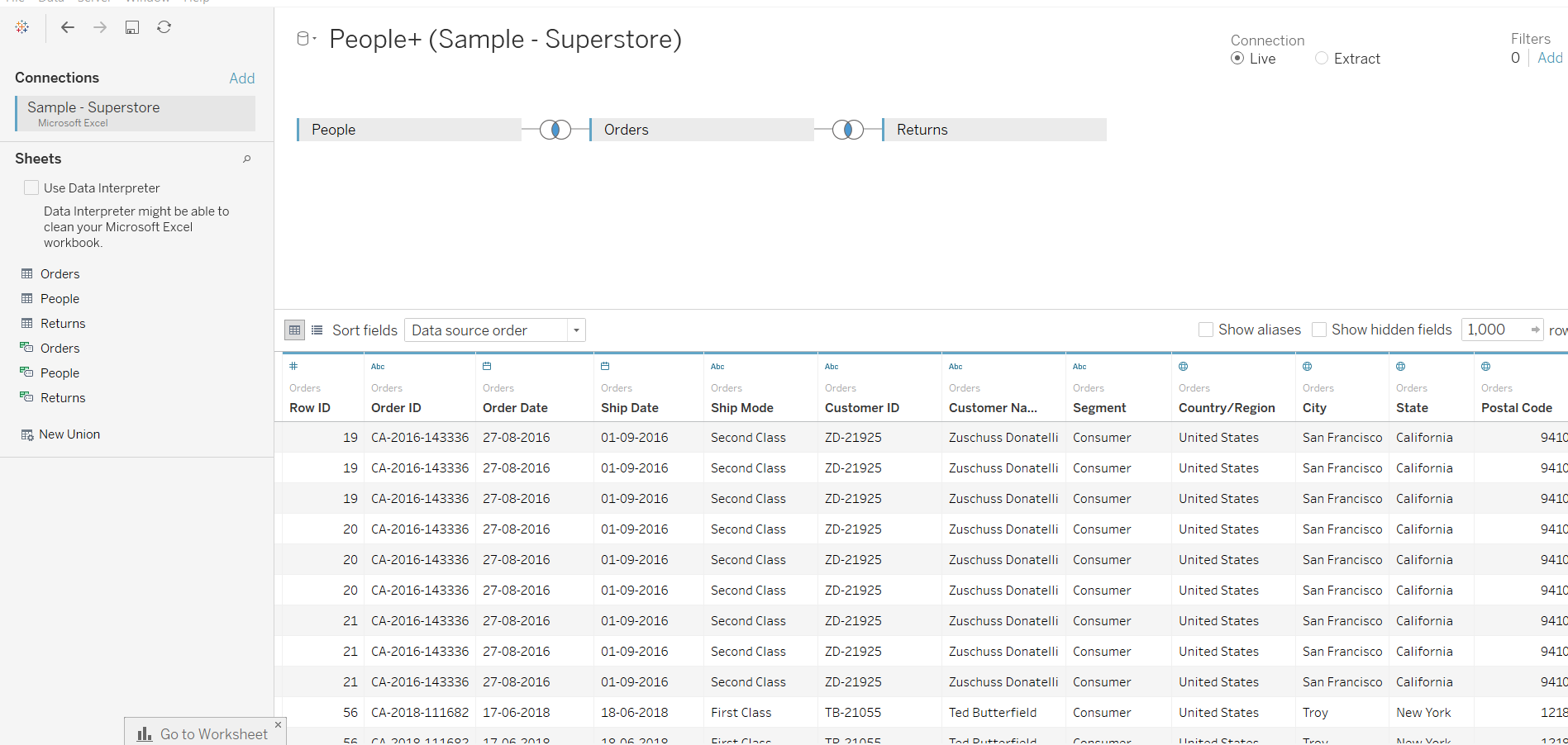
Next, drag the tables into the view and you will have the data in your worksheet as shown below.
To load the second set of data, go to the sheet and select Data, followed by New Data Source.
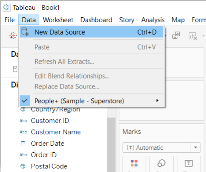
The above steps will open the connection window as shown below.
Now, repeat the process you used for loading the Super Store data, and this time load the Global Superstore data.
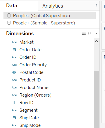
You have loaded both the datasets, and the next step is to go back to the worksheet where you can see both the datasheets.
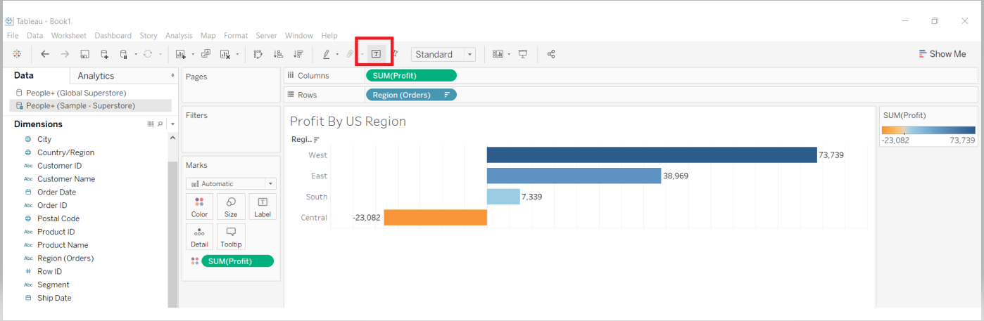
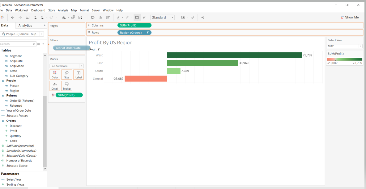
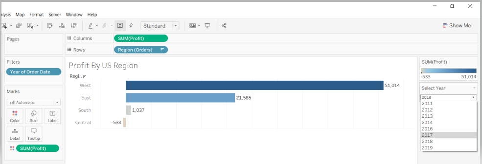
Now, perform operations on both the sheets. The first sheet will be made using Sample Superstore Data. Drag the fields Region to Rows and Profit to the Columns shelf in the first sheet, and name it Profit by US Region.
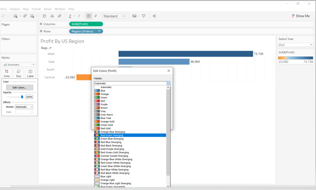
Next, drag Profit to the Color option in the Marks card, and select the Edit Colors tab.
Within the Edit Colors options, select the color combination Red-Green Diverging or any color palette of your choice.
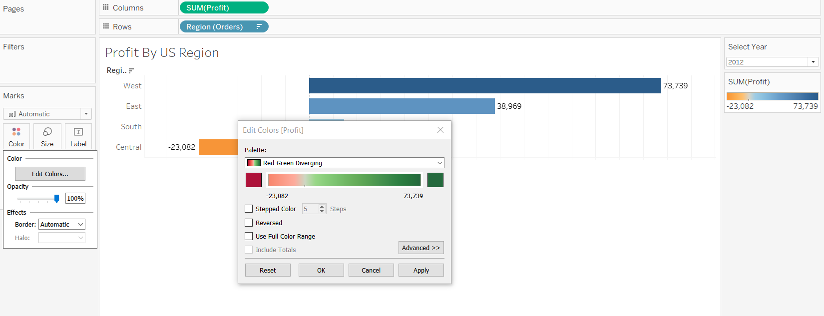
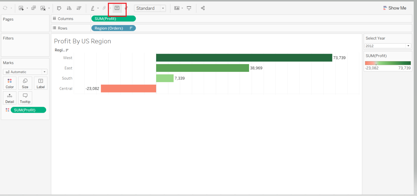
Next, turn on the Label mark to display the value, and click OK. This will generate the following output.
You have created the first sheet and will now create the second sheet. To do this, right-click on the existing sheet and select New Worksheet from the options.
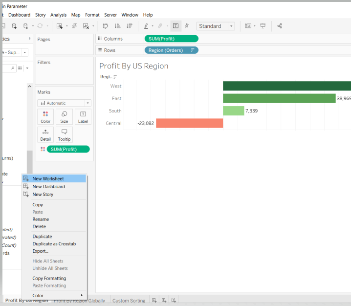
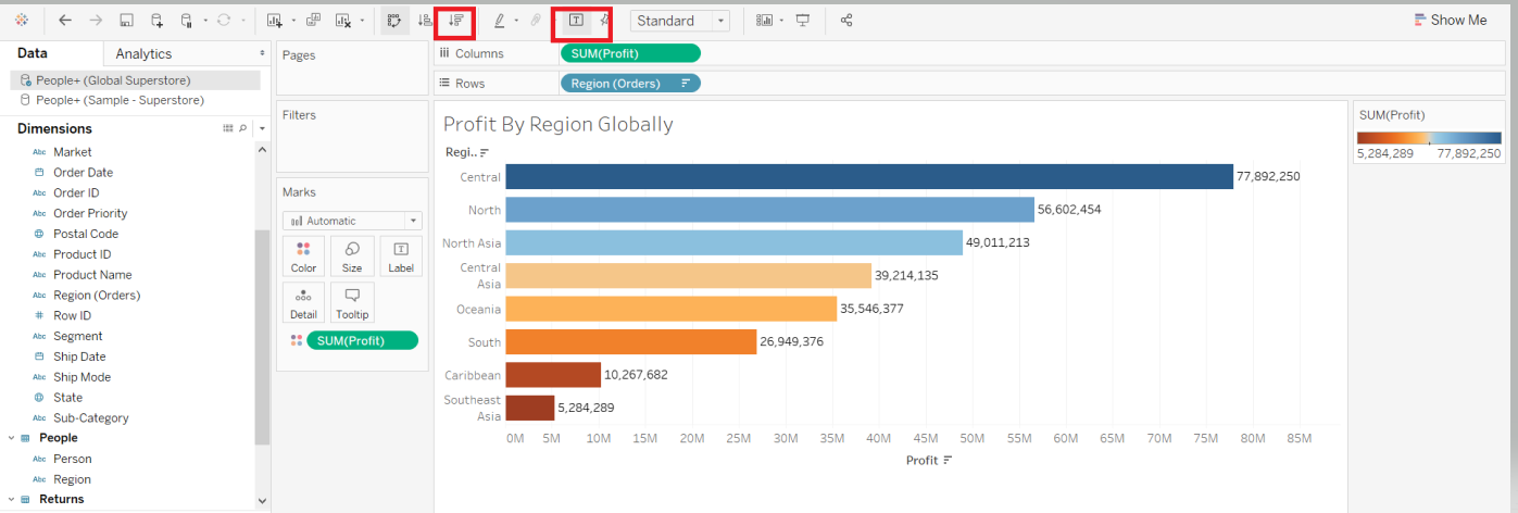
The next step is to select the Global Superstore sheet. Drag the fields Region to the Rows shelf and Profit to the Columns shelf. Also, drag Profit to the Color option in the Marks card and select the Orange - Blue Diverging palette combination. This sheet will be named Profit by Region Globally.
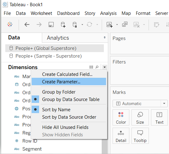
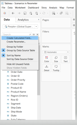
You have created both the sheets, and the next step is to create a parameter. To begin, click on the small down arrow in the data pane and select Create Parameter.
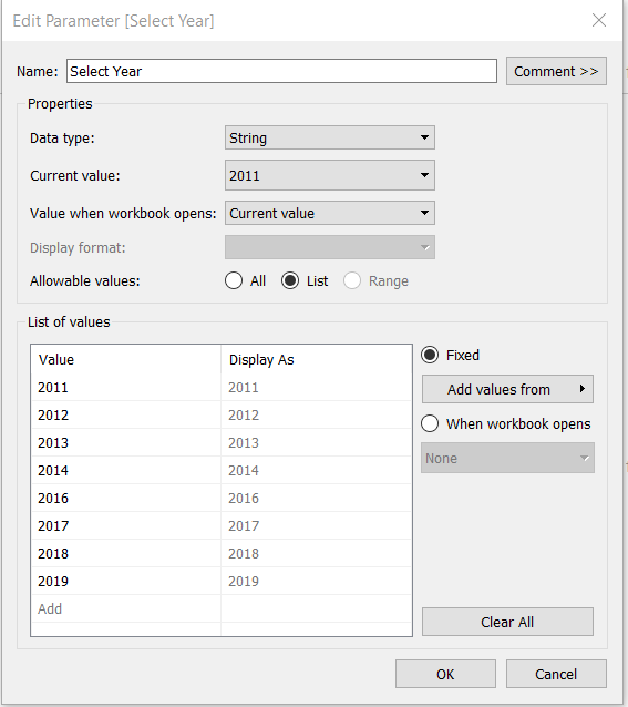
The next step is to specify the details of the parameter. Start by naming the parameter Select Year. Enter all the years from both data sources and complete the options as shown below.
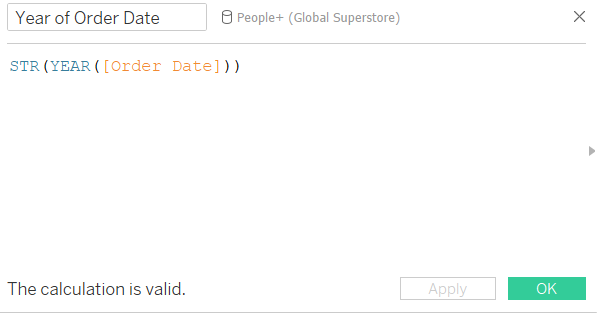
The next step is to create a calculated field in both data sources to convert Year (Order Date) into a string. Create the calculated field as shown below.
Name this calculated field ‘Year of Order Date’.
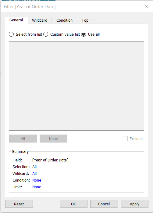
Go to the Profit by US Region sheet and drag the calculated field into the Filters pane.
Next, under the General tab, click on Use all values.
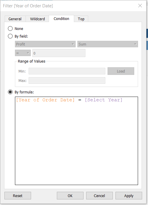
Next, move to the Condition tab of the filter and write a condition as shown below. In this case, Select Year is the parameter.
The next step is to go to the Profit by Region Globally sheet and repeat the above steps you completed for the Profit by US Region sheet. Make sure that you have created the calculated field, Year of Order Date, in this data source too, just like you did above.
You are ready to introduce the parameter into the scenario. To do this, right-click on the parameter and select Show Parameter Control.
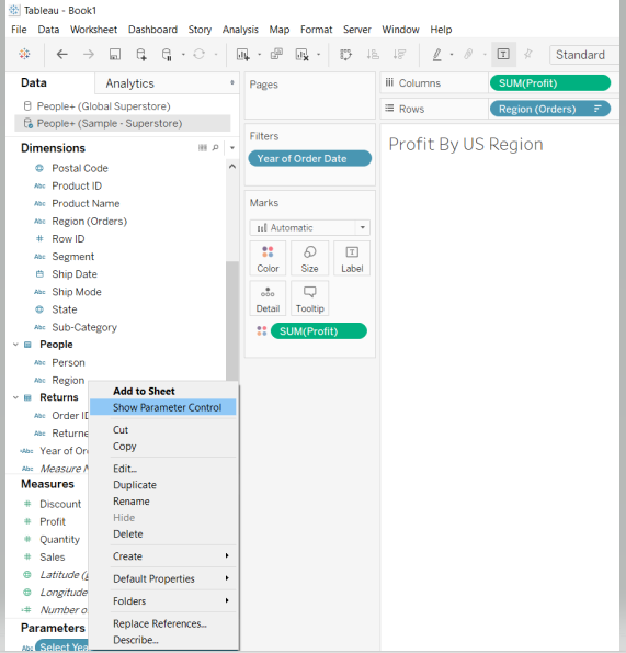
Completing the above step will display the parameter in the top right corner.
Repeat the previous step to show the parameter in the second sheet as well.
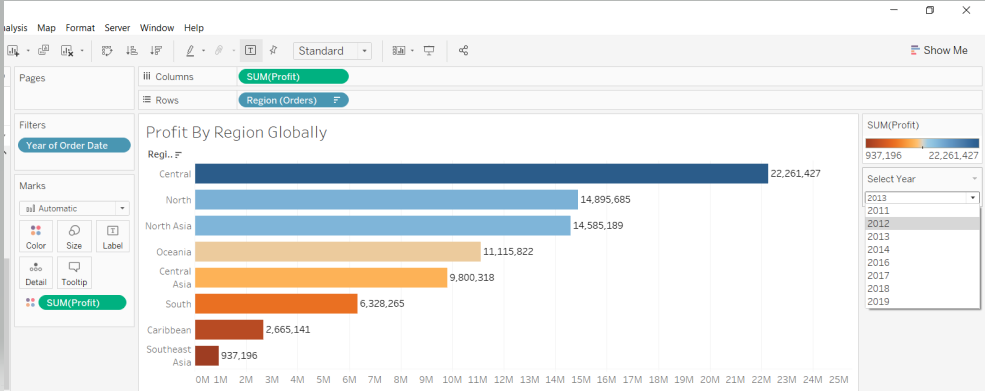
The visualization view is ready, and selecting any year from the parameter will impact both sheets. This is especially helpful if both sheets are part of a single dashboard where the changes in one parameter filter will result in changes to both the sheets.
Scenario Two
- Sort Fields Using a Parameter
Custom sorting allows the user to sort their views in a dashboard however they desire. In this scenario, you will sort the worksheet view based on the sub-category or the measures.
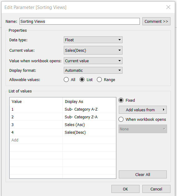
To start with, create a parameter and name it Sorting Views. Refer to the snapshot below to fill the other fields.
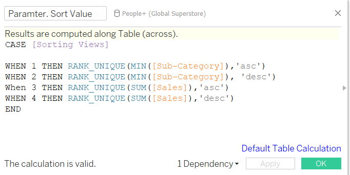
The next step is to create a calculated field and name it Parameter.Sort Value. The calculation is shown below.
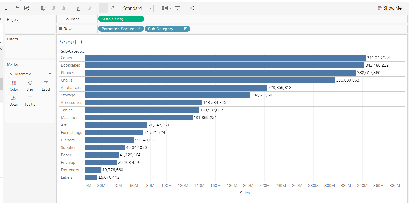
Drag the Sub-Category into the Rows shelf and Sales into the Columns shelf. Next, drag the calculated field, Parameter.Sort Value, into the Rows shelf. Right-click on it to make it discrete.
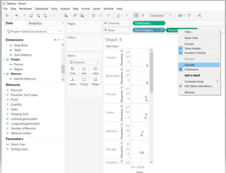
Place the calculated field before the sub-category as shown below.
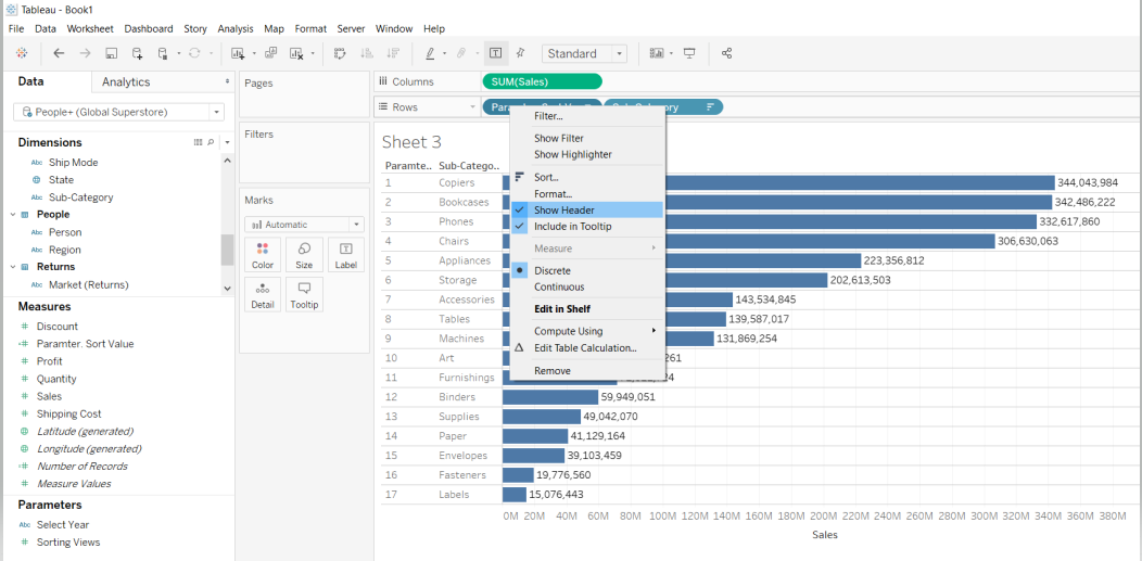
Next, right-click on Parameter. Sort Value, and unselect the option Show Header.
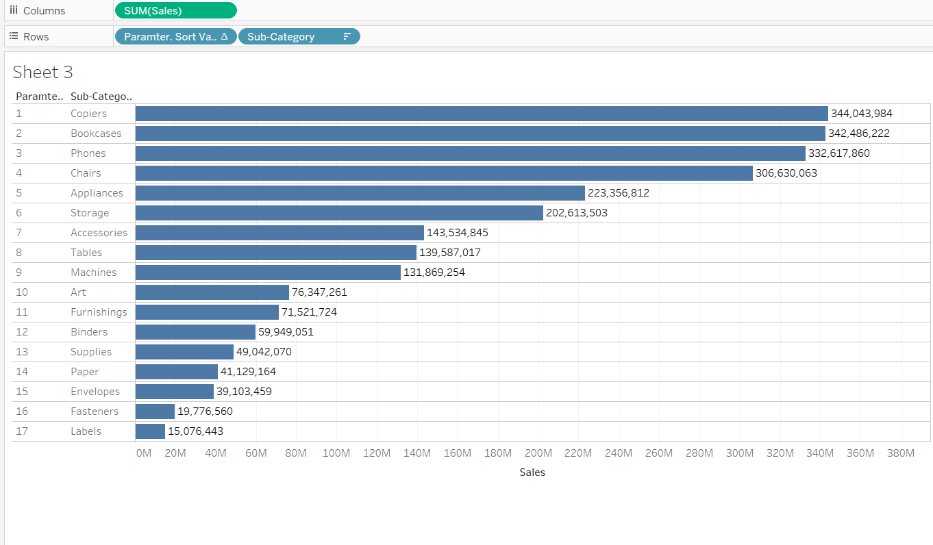
This will generate the output below.
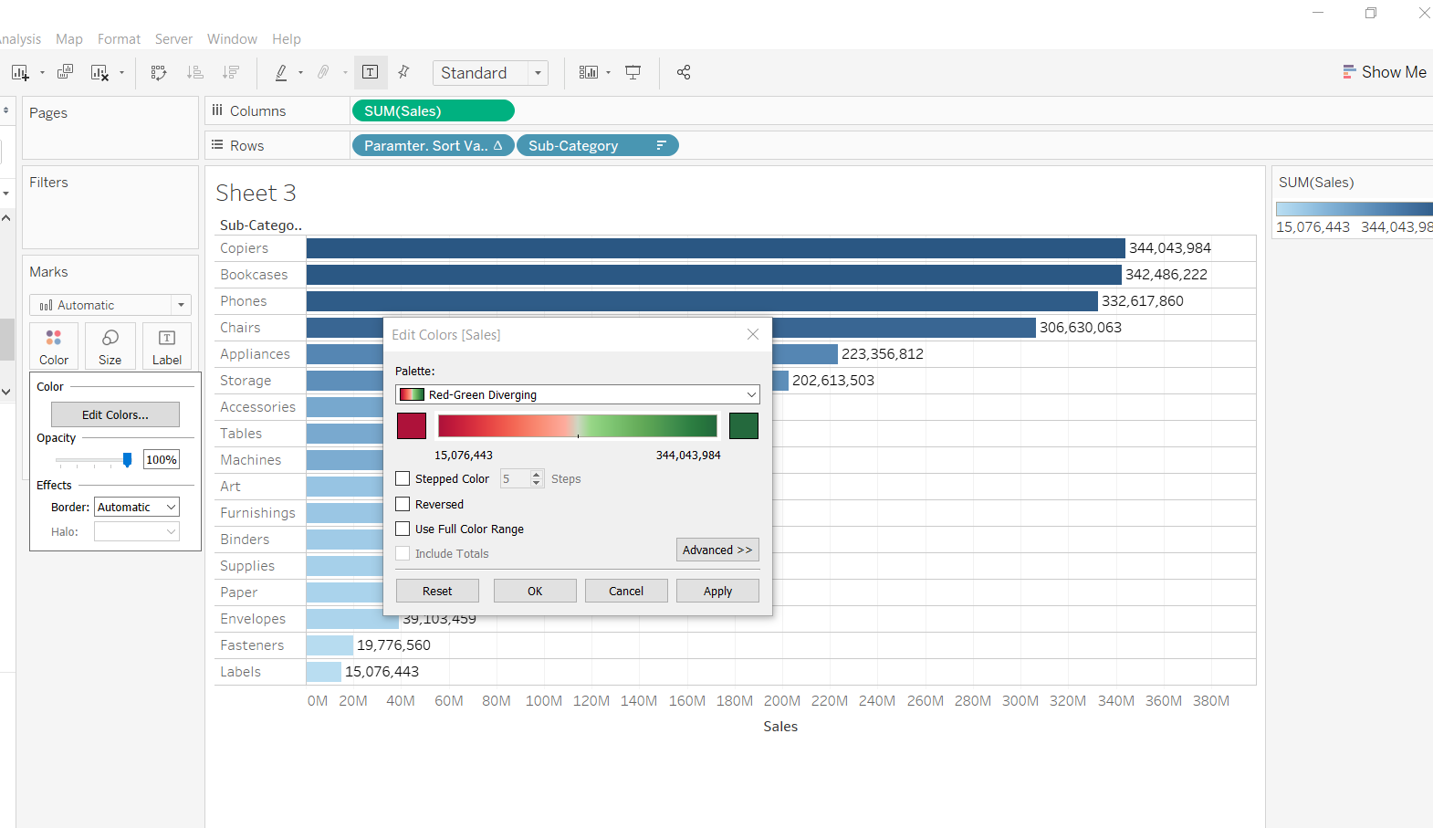
Next, drag the field Sales to the Color option in the Marks pane, and click on Edit Colors to select the Red-Green Diverging color palette. Finally, turn on the label and the following output is generated.
The next step is to integrate the parameter with the calculated field. To do this, right-click on the Sorting Views parameter and select Show Parameter Control.
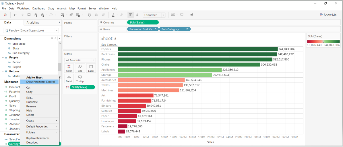
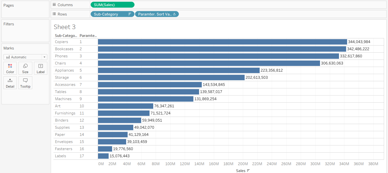
Completing the above steps will generate the following output. You can see that the Sub-Category view is arranged alphabetically.
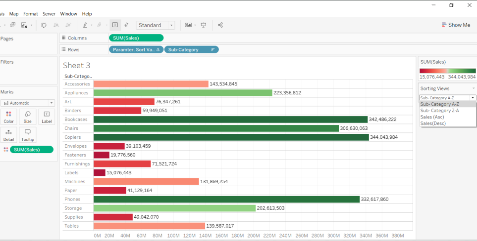
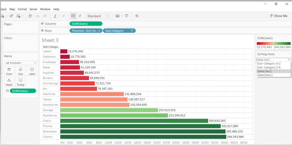
You can make changes in the view by selecting various parameter options. For example, selecting the Sales (Asc) option will display the chart in ascending order of sales.
Conclusion
In this guide, you learned how to use parameters in Tableau to solve different scenarios. You also learned how to use parameters for sorting and filtering and how to do this on multiple worksheets. These skills will help strengthen your descriptive analytics capabilities.
To learn more about visualization and data analysis using Tableau, please refer to the following guides:
- Building Dual-Axis Combination Charts in Tableau
- Building a Box-and-Whisker Plot in Tableau
- Building a Time Series Chart in Tableau
- Building a Gantt Chart in Tableau
- Building a Bullet Graph in Tableau
- Use Built-In Statistical Modeling in Tableau
- Building a Burndown Chart in Tableau
- Adding Trend Lines to Continuous Charts in Tableau
- Create a Reference Band in Tableau
- Create a Reference Line in Tableau
Advance your tech skills today
Access courses on AI, cloud, data, security, and more—all led by industry experts.
