Exploratory Data Analysis with Tableau
Jun 24, 2020 • 7 Minute Read
Introduction
Data science often involves exploratory data analysis (EDA) for descriptive and diagnostic analytics. This process makes observations about data, summarizes it, and explores hidden relationships between variables.
In this guide, you will learn how to perform exploratory data analysis in Tableau.
Data
Exploratory data analysis can be done on all types of data, such as categorical, continuous, string, etc. It can involve univariate, bivariate or multivariate analysis. This guide will examine each of these using the Global Sample Superstore data source from this website.
Preliminary Analysis
Before starting with EDA, it’s important to check and explore the data for nulls, blanks, etc.
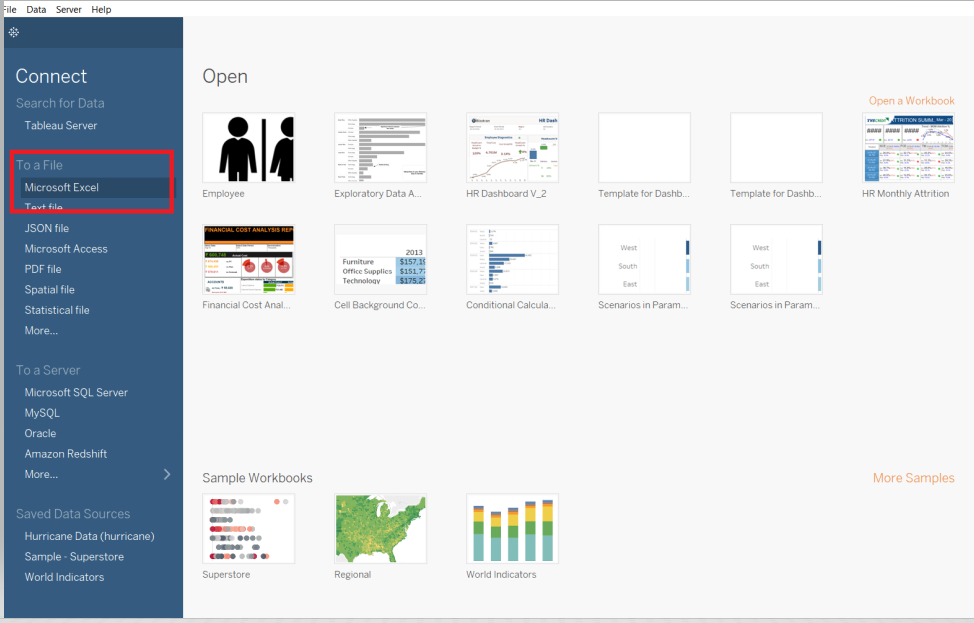
Connect the Tableau desktop to the data source that contains the Global Sample Superstore data.
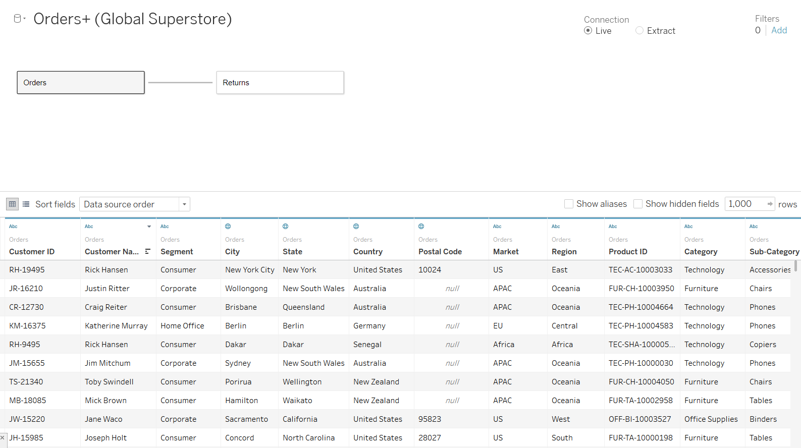
Next, join the Orders and the Returns sheets. In this case, an inner join is performed on the field Order Id.
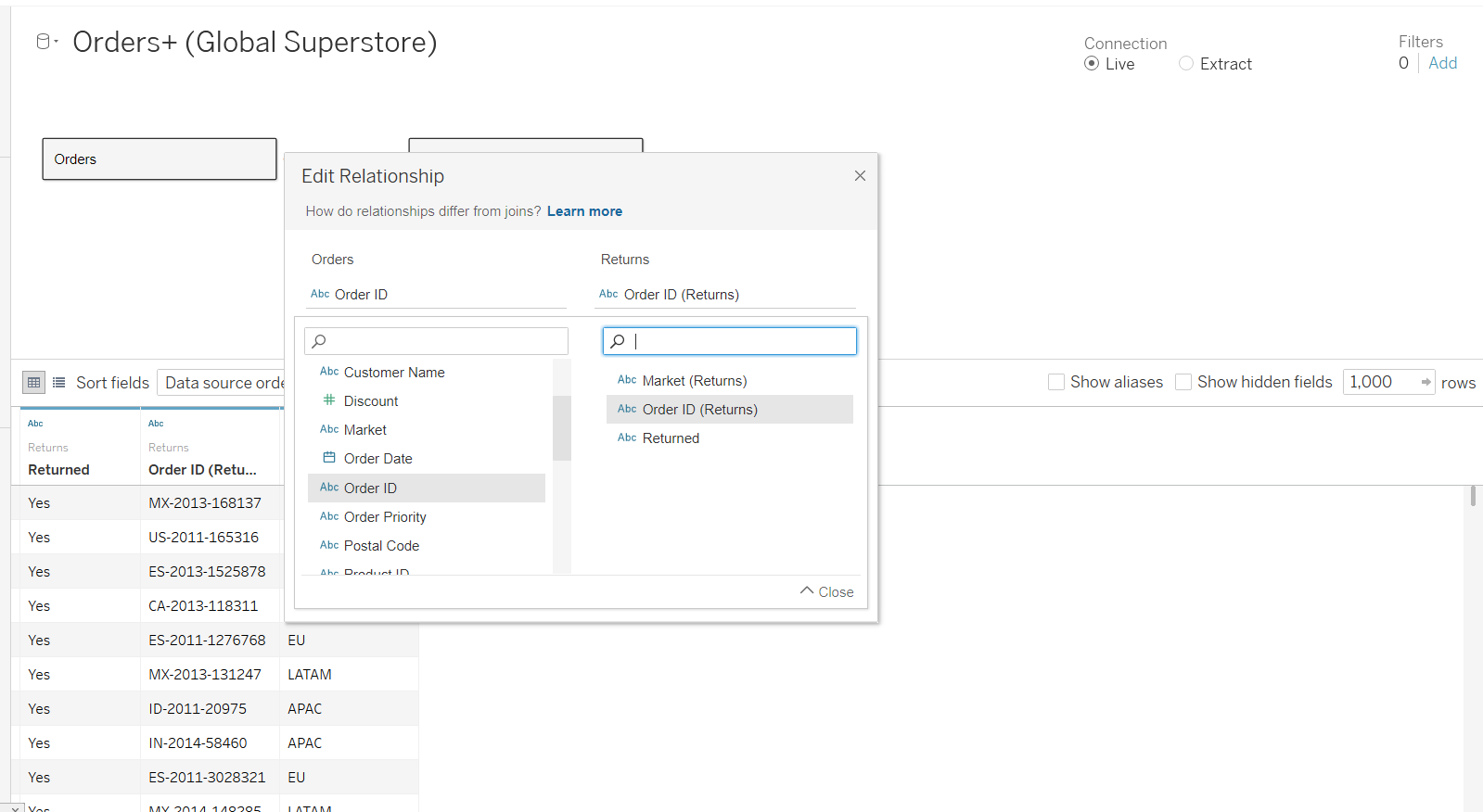
Once the data is joined, you can examine it to identify the presence of null values. If required, the missing values can be filtered out.
The image above shows that there are nulls in Postal Code. However, you can ignore this as that’s not the variable of interest.
Univariate Analysis
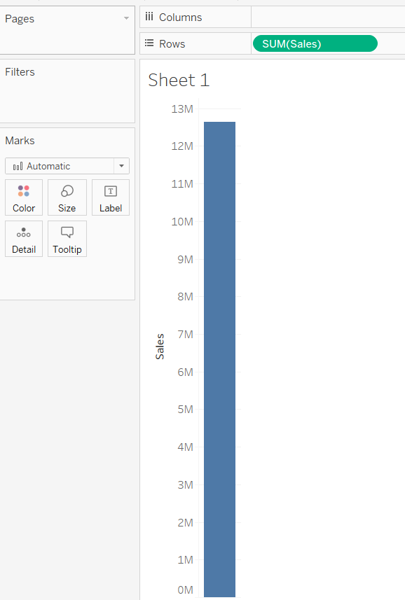
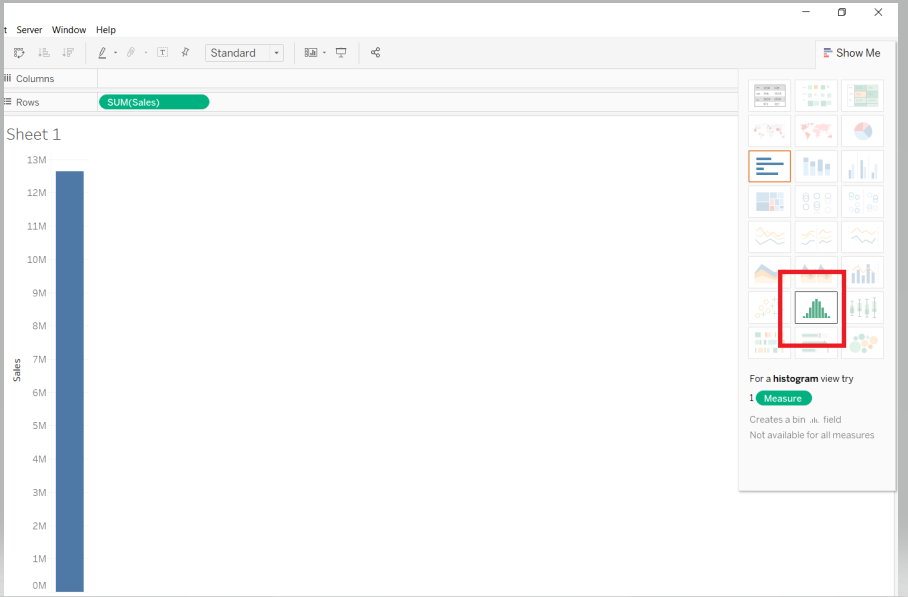
Univariate EDA deals with exploring and analyzing one variable at a time. Statistically, you can represent a variable's distribution using mean, median, or mode. Visually, you can represent it with histograms, boxplots, bar charts, etc. To begin, drag the Sales measure to the Rows shelf.
Go to the Show Me option and you will notice that the histogram is highlighted.
Selecting the histogram will generate the output below.
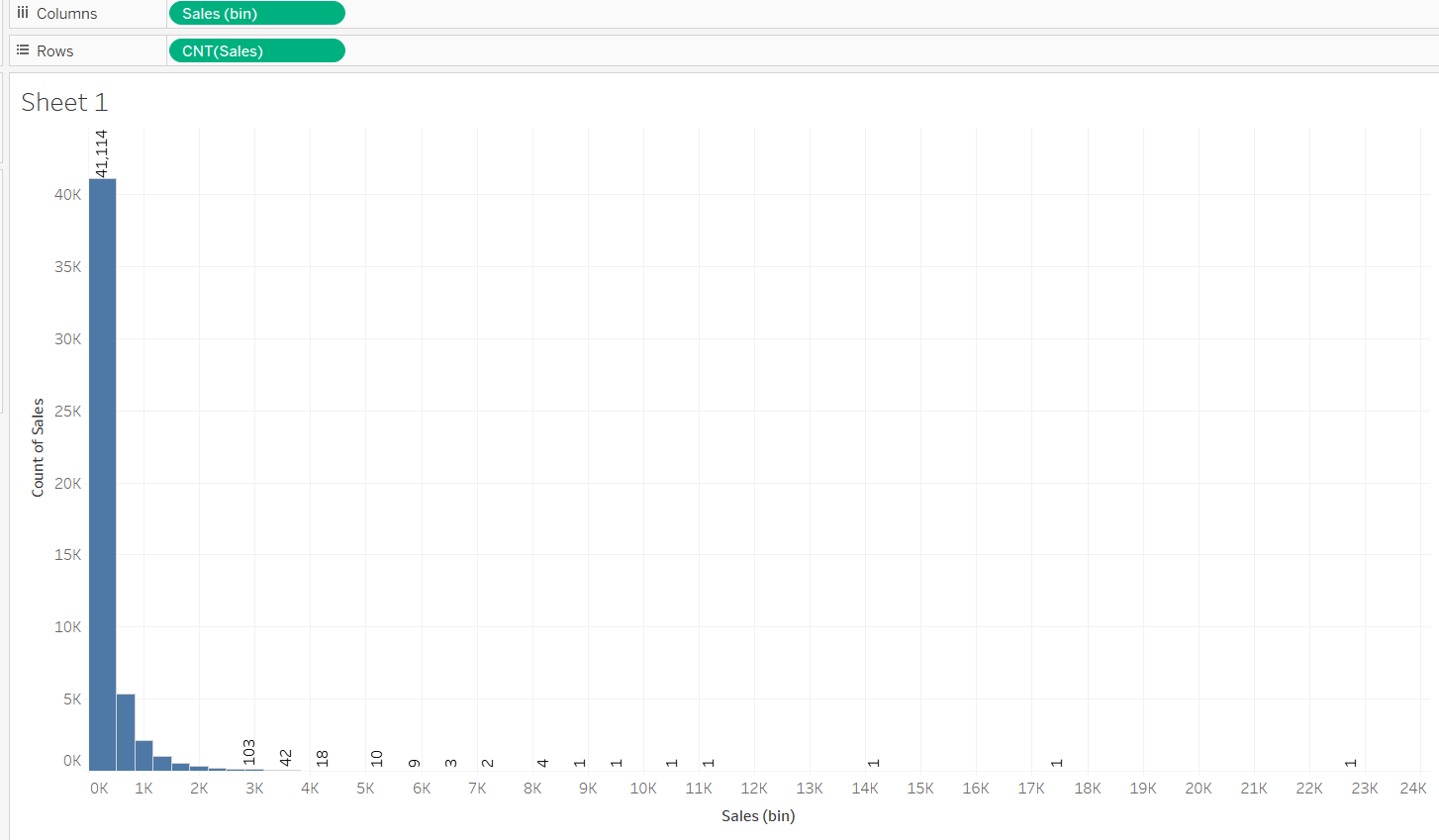
The output above shows that the distribution is skewed. This means that the median should be used as a measure of central tendency for Sales.
Bivariate Analysis
In bivariate exploratory data analysis, you analyze two variables together. You will use a boxplot in this case to understand two variables, Profit and Market.
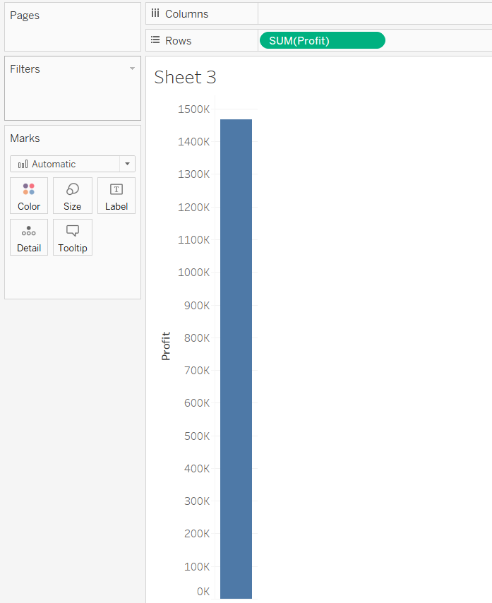
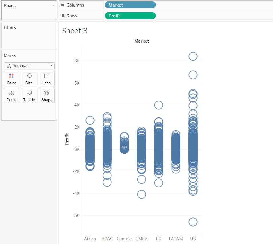
To begin, drag the Profit field to the Rows shelf.
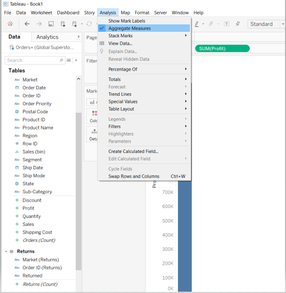
Go to the Analysis tab and uncheck the Aggregate Measures option.
Next, drag the field Market in the Columns shelf.
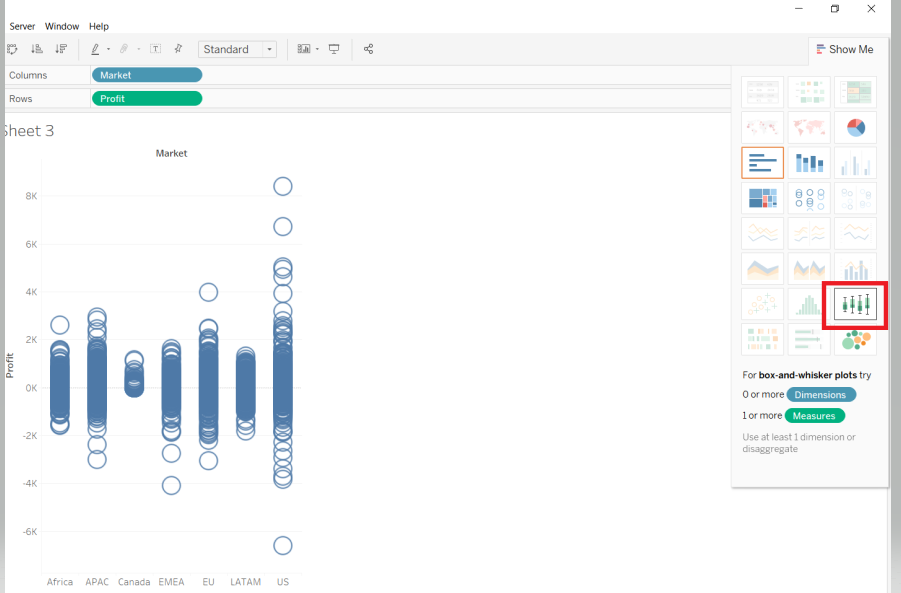
Go to Show Me and select the highlighted box and whiskers plot.
Completing the steps above will generate the following output.
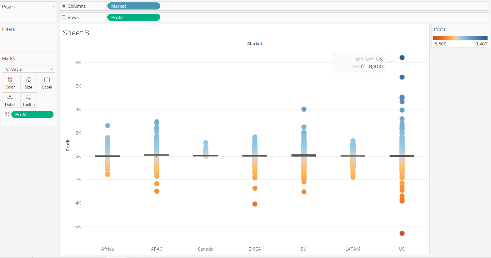
The output above shows that there are more outliers in the US market than any other market. This shows there is more variability in profit in the US market.
Multivariate Analysis
The objective of multivariate EDA is to examine and explore more than two variables at a time. In this case, you will analyze four variables, Sales, Profit, Region, and Category.
The first step is to understand the correlation between sales and profit. To begin, drag the variables Profit and Sales to the Rows and Columns shelves, respectively.
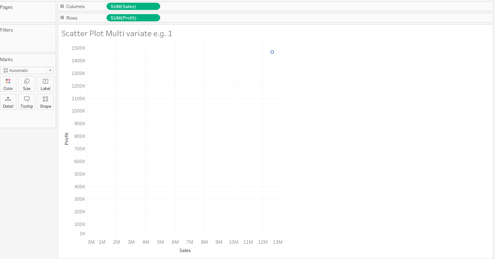
The next step is to display the correlation plot. One technique is to drag the variable Order ID into the Detail option of the Marks card.
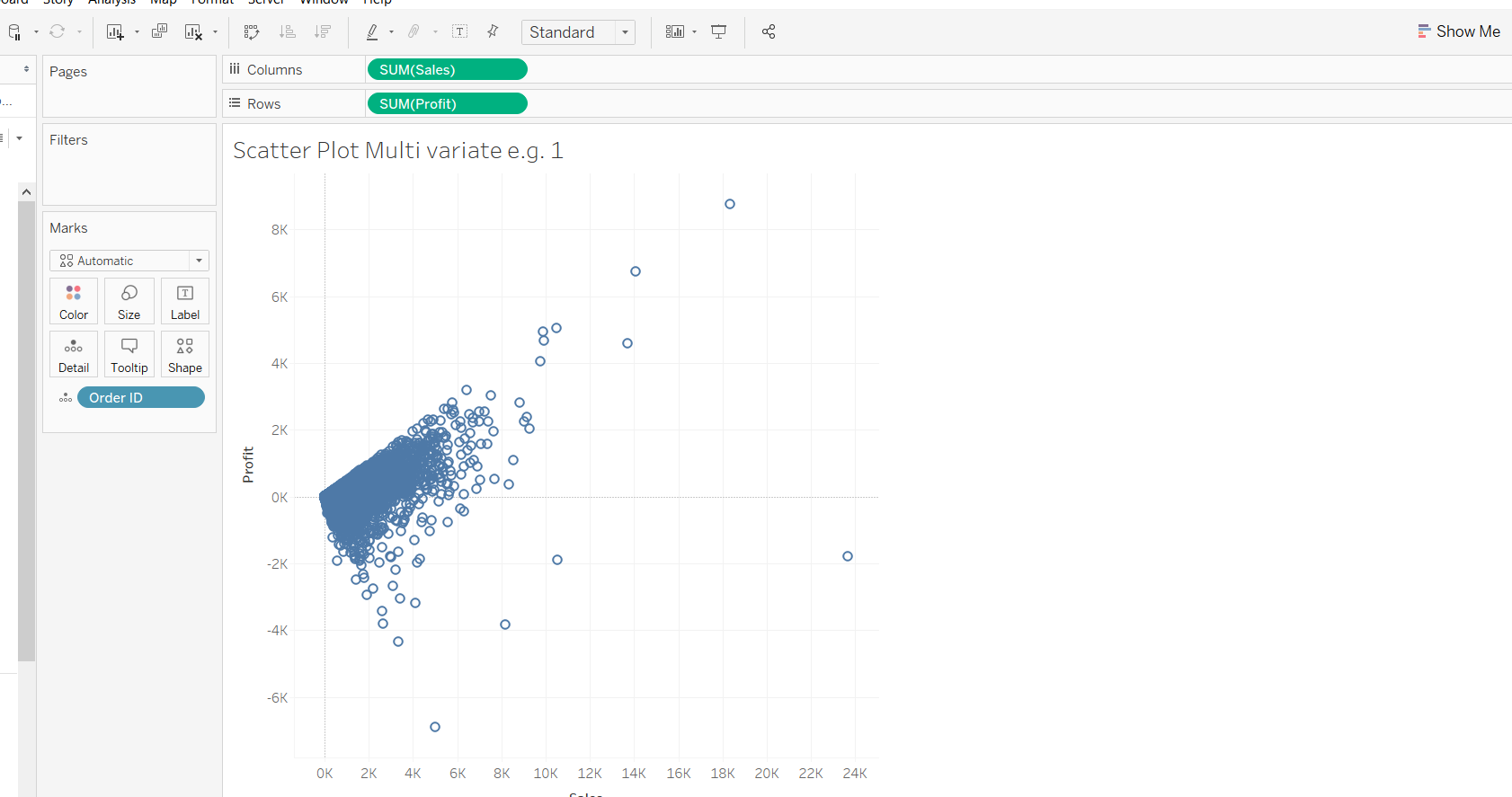
There seems to be a correlation between the two variables. Also, there are outliers, but most of the data is concentrated. Until now, this has been a bivariate plot. To make it multivariate, add more variables.
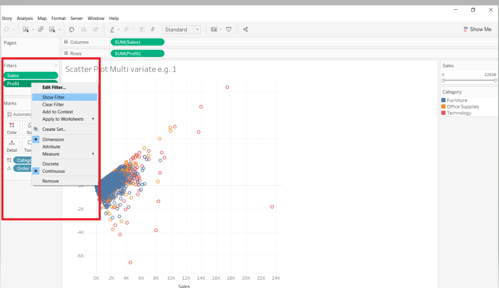
First, place the Category variable in the Color tab. Next, place the Sales and Profit variables into the filter pane so that their values can be changed as desired. Set the aggregation to Sum in the filter option and right-click on each of the filters to select Show Filter.
Add the fourth field, Region, by dragging it to the Shape of the Marks card. This will generate the output below.
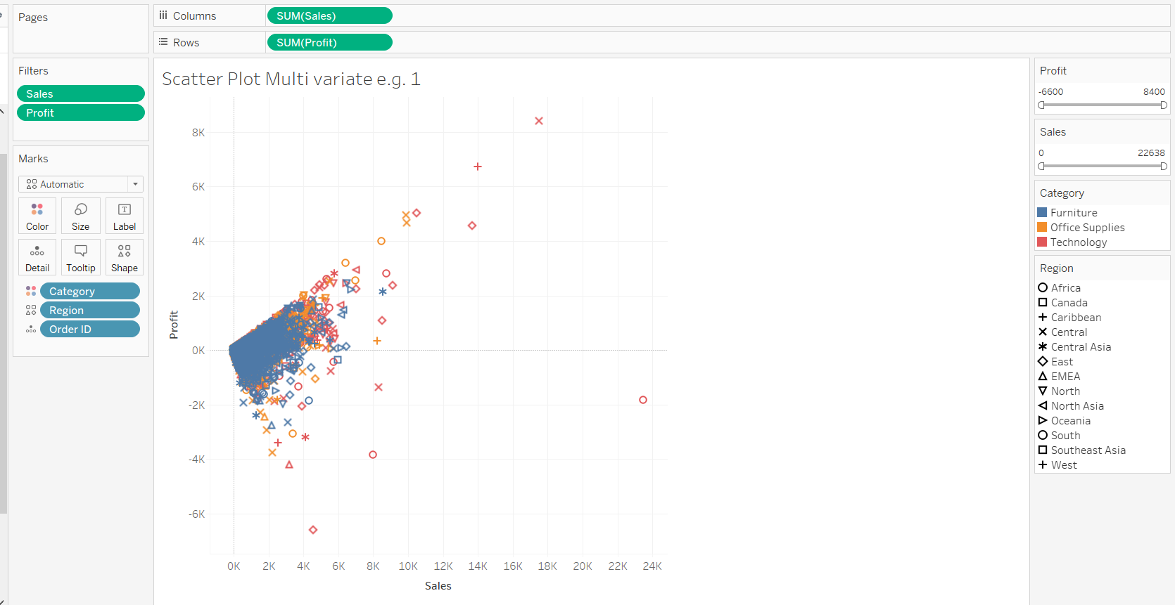
The above image is an example of multivariate EDA examining the relationship between four variables. By changing the options in these variables, you can explore and understand the correlation better between Sales and Profit.
Conclusion
In this guide, you learned how to perform exploratory data analysis (EDA) for descriptive and diagnostic analytics. You learned the basics of univariate, bivariate, and multivariate exploratory data analysis, and how to perform the related visualizations in Tableau. These skills will help strengthen your descriptive and diagnostic analytics capabilities.
To learn more about visualization and data analysis using Tableau, please refer to the following guides:
- Building Dual-Axis Combination Charts in Tableau
- Building a Box-and-Whisker Plot in Tableau
- Building a Time Series Chart in Tableau
- Building a Gantt Chart in Tableau
- Building a Bullet Graph in Tableau
- Use Built-In Statistical Modeling in Tableau
- Building a Burndown Chart in Tableau
- Adding Trend Lines to Continuous Charts in Tableau
- Create a Reference Band in Tableau
- Create a Reference Line in Tableau
Advance your tech skills today
Access courses on AI, cloud, data, security, and more—all led by industry experts.
