Filter Data in Power BI
Nov 18, 2020 • 8 Minute Read
Introduction
On many occasions, analysts are required to filter the data down to specific areas such as highest sales regions, or most expensive inventory items. This requires filtering down the data to specific points under consideration. Exploratory data analysis, which is used for both descriptive and diagnostics analytics, requires many filter operations on the data. You are also required to filter the visualization dashboards you prepare. This guide will demonstrate how to apply filters in Power BI Desktop.
Data
In this guide, you will work with a fictitious data set of bank loan disbursal across years. The data contains 3,000 observations and 17 variables. You can download the dataset here. The variables to be used in this guide are described below:
-
Loan_disbursed: Loan amount (in US dollars) disbursed by the bank.
-
Weeknum: Week number of the year.
Start by loading the data.
Loading Data
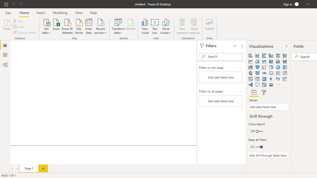
Once you open the Power BI Desktop, the following output is displayed.
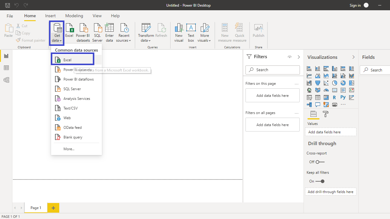
Click on Get data and select Excel from the options.
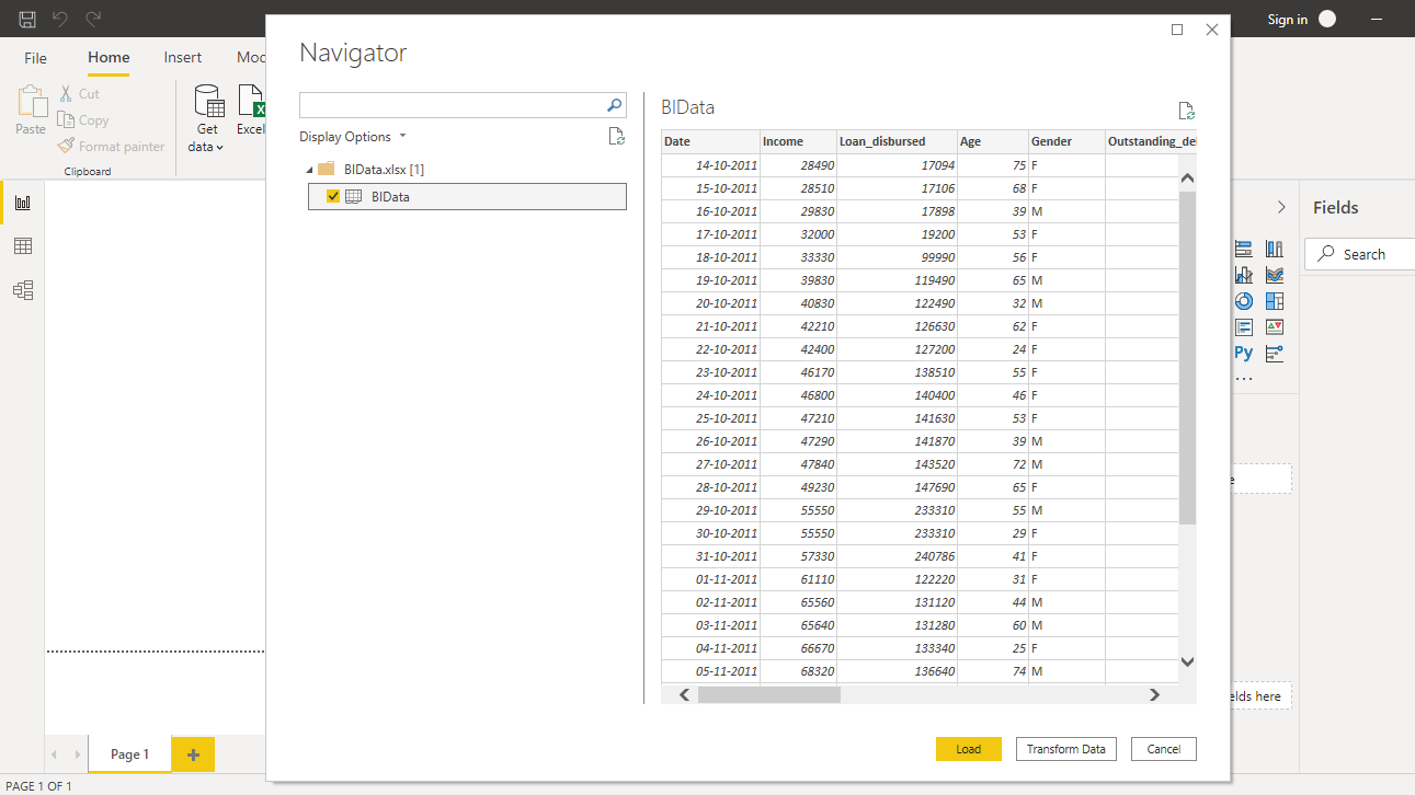
Browse to the location of the file and select it. The name of the file is BIdata.xlsx, and the sheet you will load is BIData sheet. The preview of the data is shown, and once you are satisfied that you are loading the right file, click Load.
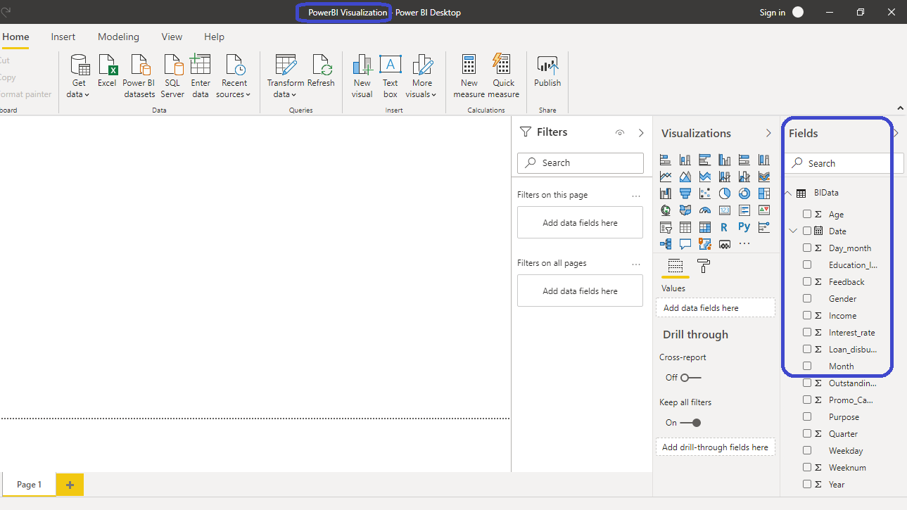
You have loaded the file, and you can save the dashboard. It is named PowerBI Visualization. The Fields pane contains the variables of the data.
Adding Chart
To perform filter operations in Power BI, you will need a chart, table or a matrix. You will create a treemap chart in this guide. You can locate it in the Visualizations pane.

Click on the chart shown above, and it will create a chart box in the canvas. Nothing is displayed because you are yet to add the required visualization arguments.

You can resize the chart on the canvas. The next step is to fill the visualization arguments under the Fields option as shown below. The two variables to be used are Weeknum and Loan_disbursed. Drag the variable Weeknum into the Group field, and Loan_disbursed in the Values field.

The output above shows that the treemap visual is created, and the next step is to explore the filter options.
Filter Operations
The filter operations are performed with the Filters pane. Once the visual is created, the Filters pane automatically displays the variables under Filters on this visual option.

Filter on Numerical Variable
Numerical and qualitative variables require different filter operations. To begin, click on the Loan_disbursed variable under Filters on this visual. Next, you will see many options to filter under Show items when the value option.

The filter operation to perform is to look at a week's numbers when the loan disbursed was less than $5 million. Type the value as shown below.

Click on Apply filter that gives the command to Power BI to perform this filter operation on the selected visual and display the resulting chart.

You can see from the output that there are five weeks of numbers that have less than $5 million loan disbursal.
To extend the example above, if you want to find the week's numbers when the loan disbursal was between $5 million and $10 million, you can select the And option during filter.

This will create the desired output.


Filter on Categorical Variable
Categorical variables are defined as features in which mathematical operations can’t be performed. In the chart, Weeknum is the categorical feature because even though it is represented as numbers, you cannot add two weeks.
For Weeknum variable, there are several options available under Filter type. There are three types of filter operations: Basic filtering, Advanced filtering, and Top N.

You will begin with Basic filtering. If you want to look at Loan_disbursed in the last few weeks of the year, especially closer to Christmas, you can select the corresponding weeks' numbers.

The other common filter operations performed on categorical features is to filter the categories of the variable against a measure. For example, if you want to use the top ten weeks in terms of Loan_disbursed, you can use the Top N filter.
Start by selecting Top N as Filter type. Under Show items, select Top and set the value to 10. Finally, drag the Loan_disbursed variable to the By value field.

Click on Apply filter and the following output is displayed.

The above output shows that the week with the highest loan disbursal is week 42, followed by week 41 and so on.
It is easy to select the bottom ten weeks with lowest loan disbursal, which requires only one change to be made from the above selection. Under Show items, select Bottom and click on Apply filter. This will generate the following result.

Conclusion
Exploratory data analysis is an integral part of machine learning and data science. To explore the data from different dimensions, it is required to perform several filter operations. This a common task and is sector agnostic in nature, which means it has applications across industries such as banking and financial services, manufacturing, utilities, ecommerce, retail, etc. This skill will improve your analytics and business intelligence capabilities.
To learn more about building powerful visualization in Power BI desktop, please refer to the following guides:
Advance your tech skills today
Access courses on AI, cloud, data, security, and more—all led by industry experts.
