How to Compose Components to Create Tabs in React
Mar 16, 2020 • 9 Minute Read
Introduction
This guide will focus on how to compose components to create a tab component that will display a tab-based navigation view in a declarative manner—that is, with fewer and simpler props with no callbacks at the higher level. All the logic will be inside the <Tabs /> component, making it easy to use anywhere in your project.
The Component
Inside the <App /> component, call the <Tabs /> component as follows.
      export default function App() {
  return (
    <div className="App">
      <h1>Tab Component Demo</h1>
      <h2>Start adding tabs to see some magic happen!</h2>
      <Tabs>
        <div title="Tab 1">
          Ut condimentum, ex sit amet rutrum ultrices, nisi velit condimentum
          mi, et sagittis turpis ligula ut neque. Nunc ut arcu velit. Sed
          suscipit nisl est, ut scelerisque elit pretium et.
        </div>
        <div title="Tab 2">
          Phasellus vel nisi lectus. Curabitur ac efficitur quam. Aliquam
          faucibus, nibh non auctor auctor, lectus leo cursus massa, ac ornare
          dolor ante eu libero.
        </div>
        <div title="Tab 3">
          Aliquam erat volutpat. Sed id pulvinar magna. Aenean scelerisque ex
          vitae faucibus faucibus. Proin rutrum est eget odio faucibus tempor.
          Nulla ut tellus non urna congue finibus.
        </div>
      </Tabs>
    </div>
  );
}
The <Tabs /> component can have multiple child components that represent each tab. Each tab must have a title prop and should contain the tab content as its child.
A Simple Component
Let's get the basic structure of the component sorted.
      class Tabs extends Component {
  state = {
    activeTabIndex: 0
  };

  render() {
    const { activeTabIndex } = this.state;
    const activeTab = props.children[activeTabIndex];
    return (
      <div>
        <div className="tabs">
          {
            //
          }
        </div>
        <div className="tab-content">{activeTab.props.children}</div>
      </div>
    );
  }
}
In the state, keep track of the active tab index so that you can track which of the tabs is currently active.
Inside the tabs section, loop through the children and display each title in a <button />. On click of the tab button, set the index as the current active tab. The tab-content section will display the content of the active tab.
      // ...
<div className="tabs">
  {props.children.map((tab, i) => (
    <button
      className="tab-btn"
      onClick={() => {
        setActiveTabIndex(i);
      }}
      key={i}
    >
      {tab.props.title}
    </button>
  ))}
</div>
// ...
Now, if you check out the result, you'll be able to navigate through the tabs. But it's not looking that great; there's no way the user is going to understand which tab is currently active. So, you'll have to create a tab indicator for that.
      // ...
<div className="tabs">
    {props.children.map((tab, i) => (
      <button
        className="tab-btn"
        onClick={() => {
          setActiveTabIndex(i);
        }}
        key={i}
      >
        {tab.props.title}
      </button>
    ))}
</div>
<div className="tab-indicator-container">
  <div
    className="tab-indicator"
    style={{
      width: 100 / props.children.length + "%",
      transform: `translateX(${activeTabIndex * 100}%)`
    }}
  />
</div>
<div className="tab-content">{activeTab.props.children}</div>
// ...
Use the transform property to slide the indicator to the currently active tab. To determine the width of the indicator, consider the tab count, which can be retrieved with props.children.length.
Use this CSS to prettify the component.
      .tabs {
  display: flex;
  align-items: center;
  justify-content: center;
}

.tab-btn {
  display: block;
  flex: 1;
  padding: 8px 20px;
  background: #eee;
  border: 0;
}

.tab-indicator-container {
  display: flex;
  background: #eee;
  margin-bottom: 10px;
}

.tab-indicator {
  height: 3px;
  background: #007bff;
  transition: transform 0.2s;
}

.tab-content {
  padding: 10px;
}
And finally, the <Tabs /> component will look as follows.
      class Tabs extends Component {
  state = {
    activeTabIndex: 0
  };

  render() {
    const { activeTabIndex } = this.state;
    const activeTab = props.children[activeTabIndex];
    return (
      <div>
        <div className="tabs">
          {props.children.map((tab, i) => (
            <button
              className="tab-btn"
              onClick={() => {
                this.setState({ activeTabIndex: i });
              }}
              key={i}
            >
              {tab.props.title}
            </button>
          ))}
        </div>
        <div className="tab-indicator-container">
          <div
            className="tab-indicator"
            style={{
              width: 100 / props.children.length + "%",
              transform: `translateX(${activeTabIndex * 100}%)`
            }}
          />
        </div>
        <div className="tab-content">{activeTab.props.children}</div>
      </div>
    );
  }
}
Instead of a class component, you can also have a functional component by using the useState hook. Here's how the functional version would look.
      const Tabs = props => {
  const [activeTabIndex, setActiveTabIndex] = useState(0);
  const activeTab = props.children[activeTabIndex];
  return (
    <div>
      <div className="tabs">
        {props.children.map((tab, i) => (
          <button
            className="tab-btn"
            onClick={() => {
              setActiveTabIndex(i);
            }}
            key={i}
          >
            {tab.props.title}
          </button>
        ))}
      </div>
      <div className="tab-indicator-container">
        <div
          className="tab-indicator"
          style={{
            width: 100 / props.children.length + "%",
            transform: `translateX(${activeTabIndex * 100}%)`
          }}
        />
      </div>
      <div className="tab-content">{activeTab.props.children}</div>
    </div>
  );
};
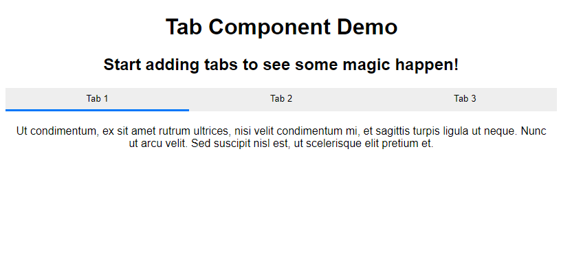
Here's the final output.
Complete Source Code
Here is the full source code for your reference.
App.js
      import React, { useState } from "react";
import "./styles.css";

const Tabs = props => {
  const [activeTabIndex, setActiveTabIndex] = useState(0);
  const activeTab = props.children[activeTabIndex];
  return (
    <div>
      <div className="tabs">
        {props.children.map((tab, i) => (
          <button
            className="tab-btn"
            onClick={() => {
              setActiveTabIndex(i);
            }}
            key={i}
          >
            {tab.props.title}
          </button>
        ))}
      </div>
      <div className="tab-indicator-container">
        <div
          className="tab-indicator"
          style={{
            width: 100 / props.children.length + "%",
            transform: `translateX(${activeTabIndex * 100}%)`
          }}
        />
      </div>
      <div className="tab-content">{activeTab.props.children}</div>
    </div>
  );
};

export default function App() {
  return (
    <div className="App">
      <h1>Tab Component Demo</h1>
      <h2>Start adding tabs to see some magic happen!</h2>
      <Tabs>
        <div title="Tab 1">
          Ut condimentum, ex sit amet rutrum ultrices, nisi velit condimentum
          mi, et sagittis turpis ligula ut neque. Nunc ut arcu velit. Sed
          suscipit nisl est, ut scelerisque elit pretium et.{" "}
        </div>
        <div title="Tab 2">
          Phasellus vel nisi lectus. Curabitur ac efficitur quam. Aliquam
          faucibus, nibh non auctor auctor, lectus leo cursus massa, ac ornare
          dolor ante eu libero.{" "}
        </div>
        <div title="Tab 3">
          Aliquam erat volutpat. Sed id pulvinar magna. Aenean scelerisque ex
          vitae faucibus faucibus. Proin rutrum est eget odio faucibus tempor.
          Nulla ut tellus non urna congue finibus.{" "}
        </div>
      </Tabs>
    </div>
  );
}
styles.css
      .App {
  font-family: sans-serif;
  text-align: center;
}

.tabs {
  display: flex;
  align-items: center;
  justify-content: center;
}

.tab-btn {
  display: block;
  flex: 1;
  padding: 8px 20px;
  background: #eee;
  border: 0;
}

.tab-indicator-container {
  display: flex;
  background: #eee;
  margin-bottom: 10px;
}

.tab-indicator {
  height: 3px;
  background: #007bff;
  transition: transform 0.2s;
}

.tab-content {
  padding: 10px;
}
Conclusion
Tabs make it easier for users to navigate your application, and they are an important part of the UI structure of any application. Most frameworks implement their own version of tabs in their designs, which follow different patterns.
I hope you liked this guide and are looking forward to building some custom components.
Advance your tech skills today
Access courses on AI, cloud, data, security, and more—all led by industry experts.
