Indepth Dimple Code Analysis of a Multiline Chart
Take a guided journey into d3.js and Dimple that will help you in your data processing voyages. Learn more about Dimple js including D3 multi line charts and more!
Jan 10, 2019 • 18 Minute Read
Line Charts!
Despite the best intentions of developers, the path of a project is not always straightforward. The adage about having an objective to “drain the swamp but being up to one’s neck in gators” seems to ring true.
Developing in a specific technology does not make you an expert--just an ambitious learner. The task I chose was to compare a multiline chart in Dimple with a D3 chart to highlight the Dimple efficiencies. Since Dimple comes from D3, I was surprised at the number of turns and complications my analysis took.
My second objective for this article was to provide a meaningful multiline chart example. The charts explored in the article Comparison of D3 and Dimple Code for Line Charts were simplistic and only displayed a single line on the charts.
Line Charts are far and away the most frequent visual that you encounter. They tell us everything from our stock highs and lows, the earthquake count and magnitude to monthly rainfall, and yearly temperatures.
Did I mention I’m down to my Weight-Watcher goal for the hundredth time?
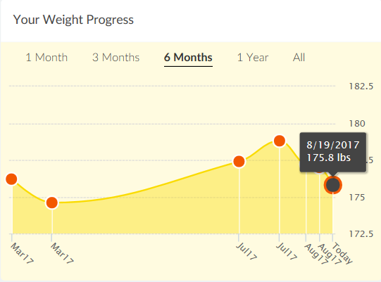
See? I can even log my weight using a line chart. In fact, seldom does a day go by in which I do not interact with at least a couple line charts.
A Multiline Example
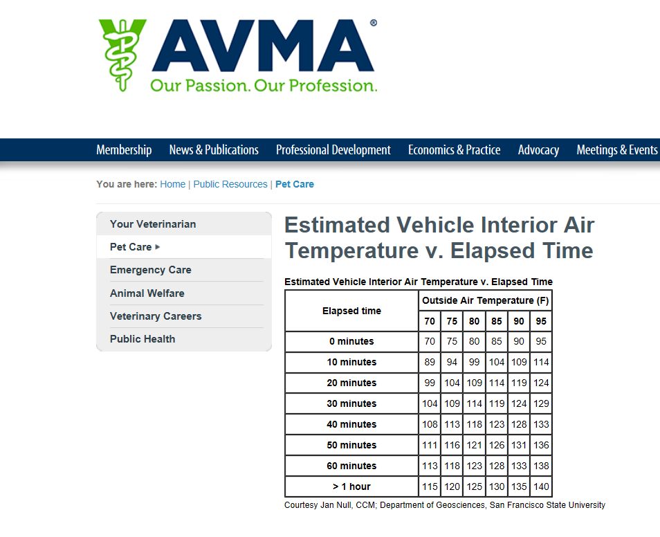
In a study I did, I used the data for the temperature rise in one hour within a closed vehicle. The temperature data was extracted from a website of the Veterinary Medical Association.
Last year, a child died in an area that I work, it haunts me that it can happen. I don't know how I could live with a tragedy like this. It haunts me even more that I forgot my dog in our car after picking him up from a day camp.
Thankfully, my wife immediately asks where Michael was. I had gotten distracted by the radio, and he was a worn-out trooper from his escapades at Camp Wags-A-Lot. Michael was immediately retrieved and was no worse for wear.
Unintentional harm is no less deadly.
The number of deaths and injuries to children and animals due to careless confinement in hot cars, SUVs, or trucks is staggering. My goal was to display this information in a meaningful chart.
Charting the Data
Two identical charts with these simple numbers should have been simple enough, right? Two weeks later, this is the comparison I produced:
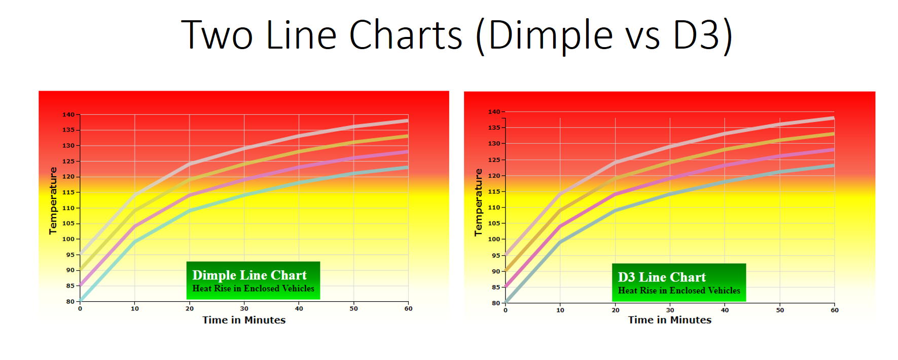
Dimple Chart (left) vs. D3 Chart (right)
It’s a piece of cake, right? I wish.
There were numerous wrong turns and dead-ends along the way to producing these two charts. My discoveries and explorations are the basis of the remainder of the article and should prove enlightening for those aiming to use Dimple for charting data.
For the upcoming examples of Dimple's challenges, I am going to disable a portion of the CSS that does some of the fancier formattings by commenting it out with “/” and “/.”
Specifically, the CSS around the ChartLabel and Background will be commented out to allow us to concentrate more on what Dimple and D3 do.
      svg{
    /*
		background: -webkit-linear-gradient(top, #ff0000 0%,#f86c57 35%,#ffff00 45%,#fffff0 85%,#ffffff 100%) !important; *//* Chrome10-25,Safari5.1-6 */
	}
   /*
   #chartLabel{
		position: absolute;
		background: -webkit-linear-gradient(top, #008000 0%,#00a200 45%,#00c400 65%,#00f000 100%) !important;
                  padding: 10px;
		top: 300px;
		left: 260px;
   }
   */
Also, for the time being, we will be ignoring the gridline functionality to focus on the basics of creating similar sized multiline chart.
The code for the examples is available for download as a zip file from Github.com.
After extracting the zip file, the examples should display in any modern browser connected to the internet. For best results, use Firefox.
You might want to use a good editor like NotePad++ to play with the code and save changed versions.
A Little Debugging
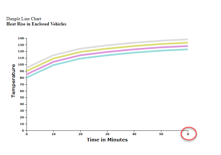
The following image shows two charts. The Dimple chart is on the left, and the D3 chart is on the right. The Dimple chart has a section that I outlined in yellow by my screen-capture editor.
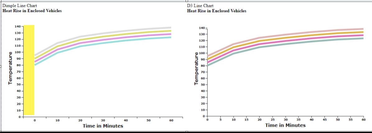
Initially I expected two similarly formatted graphs both starting at zero on the x- and y-axes. Since I could find no “jack-over the y-axis command” in the Dimple documentation, I consulted Google and embarked on a study of axis types.
Although reading the documentation is good and an obvious step, the examples you find rarely meet your needs.
It turns our Dimple is treating the x-axis as a Category Axis, even though everything is ordered. This is not the comparison I wanted and it felt like a gimmick on Dimple's end.
If we look at some other examples where Dimple is using a category axis (not necessarily line charts), we will see that the category axis is meant more for products, product lines, companies. It is not suited for a sequence of numbers like minutes, hours or days:
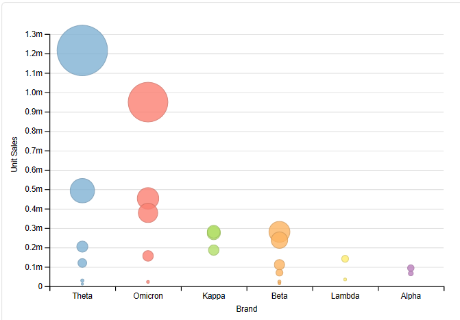
The above chart uses the Category Axis without labels. Both examples shown above came from Advanced Examples on dimplejs.org.
So, clearly I used the wrong axis type; it appears we need a strictly numerical axis to get the two charts to line up. Well, since the actual values are in minutes, let’s try a time axis.
Thanks to the power of Google and Stack Overflow this problem was solved:
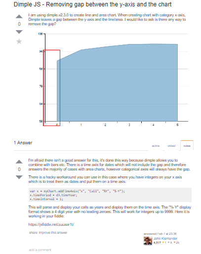
Note that the numeric value used is Years. If we try to use Minutes, which is what we are showing, the chart ends up with a “0” in the “60” minute label because minutes go from 0-59.
The following code segment produces the graph below:
      var x = myChart.addTimeAxis("x", "Time","%M","%-M");
x.timePeriod=d3.timeMinute;
x.timeInterval=10;
The code segment produces the more desirable look on the x-axis:
      var x = myChart.addTimeAxis("x", "Time","%Y","%-Y");
x.timePeriod=d3.timeYear;
x.timeInterval=10;
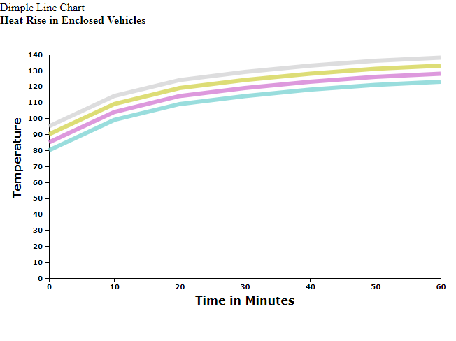
However, we are still not through sprucing up this chart. There is a lot of unused space under the starting y-value of 80. I realize I said I wanted both the x and the y-axis to start at 0, but our data will stand out more if we adjust the y-axis of value 80 to meet the 0 x-axis.
Programming is about changing things on the fly--sometimes you don’t know what you want until you start producing output in the project. Fortunately, the tweak we need to make to the Dimple chart is to adjust a parameter called “overrideMin,” which can be found in the documentation:
y.overrideMin=80
Finished Product
Thus, our new dimple graph looks as follows:
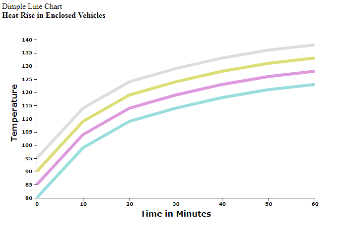
Since the graphs are identical below y = 80, our graph is now more informative and eye-catching.
Now that we’ve considered various aspects of our chart, we can break down the Dimple code that we used.
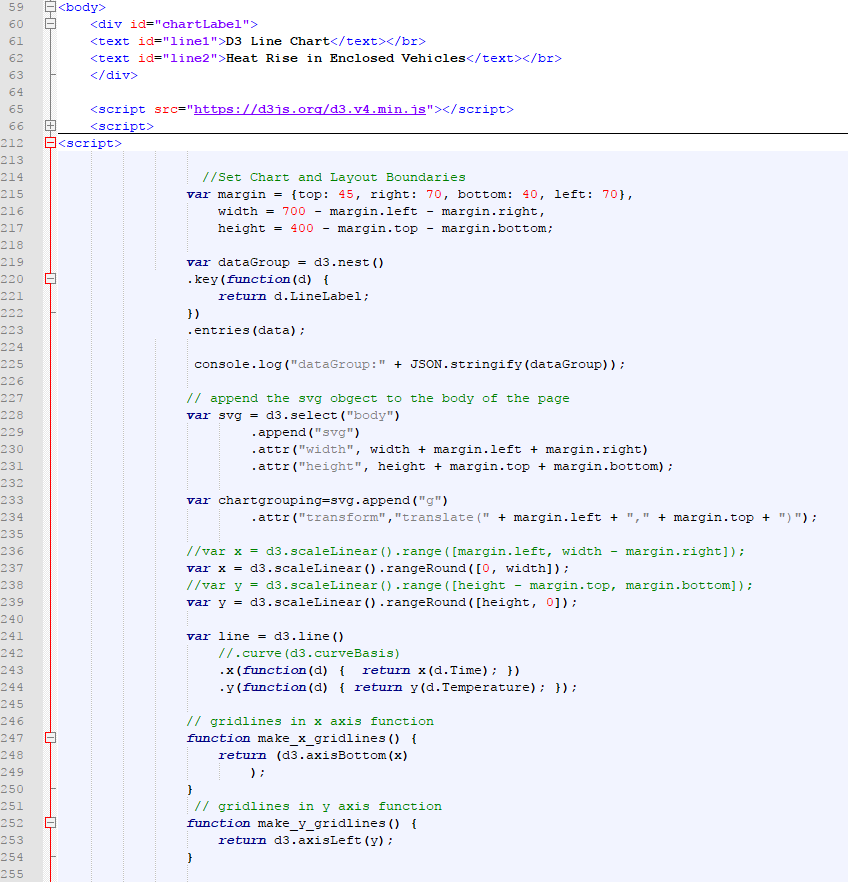
Analyzing the Code
We examine the data first. Script tags surround the data so that we can collapse the sections to increase the visibility of the sections contain Dimple code. The data displayed in the image below is only a brief portion. To view the data in entirety consult the downloaded source from Github.com.
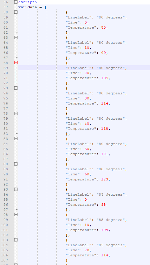
The data is a simply an array of JSON Objects. The data source was created as an internal object to be able to see all the information for this code in one place.
There are three value pairs in each JSON Object: LineLabel, Time, and Temperature in each object.
Now collapsing the CSS and the Data Script, the remainder of the code looks as follows:
D3 and Dimple
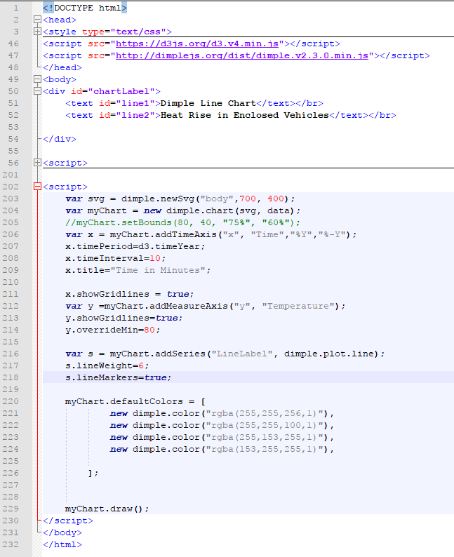
First, note lines 46 and 47. Line 46 first references to the d3.v4 library and line 47 refers to the dimple.v2.3.0 library. D3 is required first, and the two libraries must be synced to the proper versions--which they are. Different versions of Dimple require different versions of D3.
Lines 50-54 contain the div element and text elements for the ChartLabels.
Dimple elements
Next, we will examine the second Script Section, which contains the Dimple Code.
Line 203 defines the svg variable, along with the height and width dimensions. It also attaches the SVG to the “body” element.
var svg = dimple.newSvg("body",700, 400);
Next on line 204, we create the myChart variable from the svg variable and the data variable which contains our JSON Object Array:
var myChart = new dimple.chart(svg, data);
The line on 205 is just a comment is an example line to show how to dimension the myChart if we don’t use the dimple default spacing.
//myChart.setBounds(80, 40, "75%", "60%");
By default, Dimple initializes the height to 80% of the SVG height and the width to 80% of the SVG width.
Lines 206-208 is where we make the sequential axis act like a sequence of years. Essentially, we treat the number as if it were designating years:
      var x = myChart.addTimeAxis("x", "Time", "%Y","%-Y");
x.timePeriod=d3.timeYear;
x.timeInterval=10;
Line 209, put the Label text on the x-axis: x.title="Time in Minutes";
On line 211, we turn on the gridlines for x-axis. Note how simple it is to add this functionality in Dimple:
x.showGridlines = true;
On line 213, we declare the y variable and add the MeasureAxis to the y-axis from the data-temperature value-pair:
var y =myChart.addMeasureAxis("y", "Temperature");
Next on line 213, we turn on gridlines for the y-axis as well, just like the x gridlines:
y.showGridlines=true;
On line 216, Dimple performs the magic of separting the lines based on LineLabel value-pairs from our JSON Object Array:
var s = myChart.addSeries("LineLabel", dimple.plot.line);
The variable s now contains the chart series.
The line at 217, sets the weight of the lines to 6px:
s.lineWeight=6;
Line 218 has not yet been included on any of the visualizations but will add Dimple’s interactive tooltips at data points to the chart as shown below by just turning on the lineMarkers:
s.lineMarkers=true;
Lines 220-226, add the array of colors for the lines:
      myChart.defaultColors = [
		new dimple.color("rgba(255,255,256,1)"),
		new dimple.color("rgba(255,255,100,1)"),
		new dimple.color("rgba(255,153,255,1)"),
		new dimple.color("rgba(153,255,255,1)"),

	];
As a side note, I was rather disappointed that the colors are masked slightly. The colors available don’t reflect the true RGB values, making it difficult to match the native D3 colors to the colors I would have liked.
The final line on 229, performs the chart rendering:
myChart.draw();
Adjusted Chart
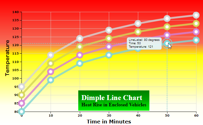
The following is the more functional Dimple chart with user interactivity:
Next, let’s consider what coding efficiencies that the Dimple version afforded us by examining the D3 code to accomplish everything our simple Dimple chart did except for the line markers which creates the interactivity for the elegant tooltips.
A Quick Analysis of the D3 Code.
As noted in the previous article reference at the beginning, Dimple automatically created the group elements for the lines, grids, and the data points. As a result, we will see less code from the start.
For the display images of the D3 Code, I collapsed both the CSS and Data sections. The data is identical in both the D3 and Dimple charts.
The CSS is slightly different between the D3 and Dimple Code. In Dimple, the classes were automatically created and were easily referenced for CSS actions. In D3, the classes had to be created and appended to specific elements to be available for use in CSS. Thus, much more manual coding.
The display of code was split into three images for article readability.
Lines 60-63 contain the div element and text elements for the ChartLabels.
Line 65, shows only one reference which is to the D3 library.
Lines 214-216 build the SVG to specified dimensions.
Lines 219-223 are required to group the data for separate lines. Unlike Dimple’s marvelous addseries command, we have to post-process this data to create subgroupings for each line.
Line 225 provides a console output of the grouping or d3 nest statement that can be viewed in the browser debug window by entering the F12 key and looking at the Console tab. The first segment of the dataGroup object looks as follows and shows the line for the 80 degree starting temperature:
      dataGroup:[{"key":"80 degrees",
    "values":[{"LineLabel":"80 degrees","Time":0,"Temperature":80},
    {"LineLabel":"80 degrees","Time":10,"Temperature":99},
    {"LineLabel":"80 degrees","Time":20,"Temperature":109},
    {"LineLabel":"80 degrees","Time":30,"Temperature":114},
    {"LineLabel":"80 degrees","Time":40,"Temperature":118},
    {"LineLabel":"80 degrees","Time":50,"Temperature":121},
    {"LineLabel":"80 degrees","Time":60,"Temperature":123}]},
The key (starting temperature) is what identifies each line of values.
Lines 228-231 creates the svg variable and appends the SVG element to the body with the height and width attributes set to the adjusted values.
Lines 233-234 creates the main chart group called chartgrouping. It also adjusts the positioning of the chartgrouping.
Line 236 defines the x variable and sets it to the d3.scaleLinear with a range for the width of the chart. (This is not required in Dimple.)
Line 239 defines the y variable and sets it to the d3.scaleLinear with a range for the height of the chart. (Also not required in Dimple.)
Lines 241-244 provide a helper function to draw the line segments when called. (Not required in Dimple.)
Line 247-250 provides a helper function to create the x-gridlines. (Not required in Dimple.)
Line 252-255 provides a helper function to create the y-gridlines. (Not required in Dimple.)
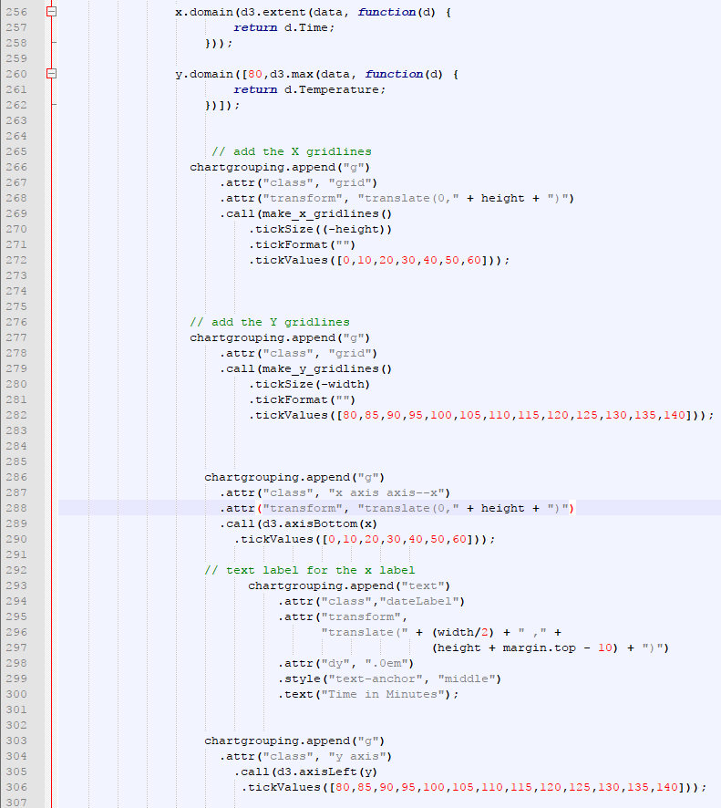
Lines 256-258 define the domain used by the x-axis. (Done slightly differently in Dimple.)
Lines 260-262 define the domain used by the y-axis. (Done slightly differently in Dimple.)
Note: In D3, axes require a range and a domain to map the area to the physical chart area.
Lines 266-271, provide code needed to produce the chart group for x-gridlines. (Not required in Dimple.)
Lines 277-282, provide code needed to produce the chart group for y-gridlines. (Not required in Dimple.)
Lines 286-300 build the x-axis and the bottom label. (Not required in Dimple.)
Lines 303-318 build the y-axis and axis-label. (Not required in Dimple.)
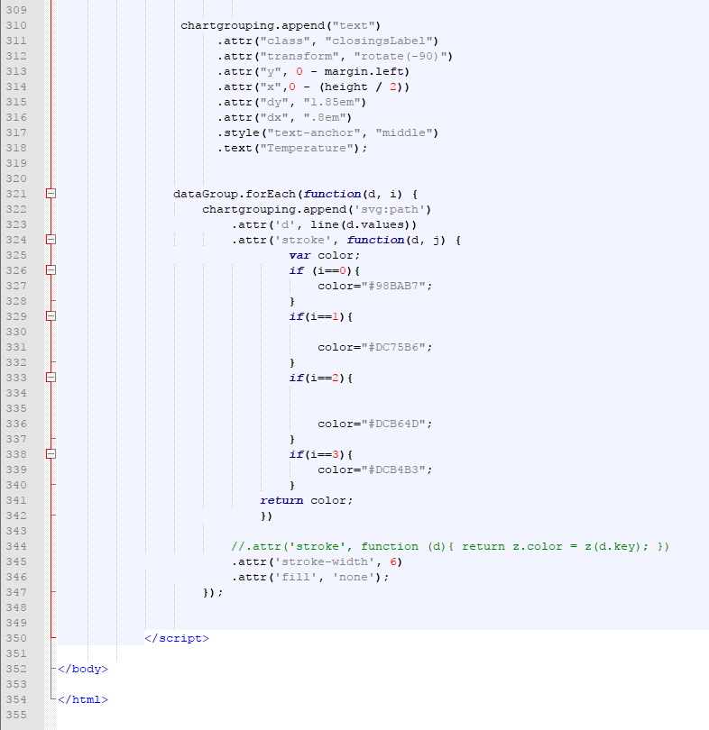
Lines 321-348 build the lines and color them. (Not required in Dimple.) Coloring was done from an array of colors in Dimple.
The listing demonstrates that there is much more manual manipulation in native D3.
Conclusion
A lot of programming is simply experimenting with languages. Languages always surprise programmers, yet programmers are generally laser-focused on building according to the syntax we understand, leading to occasional hiccups even in seemingly simple tasks.
Even though Dimple derives most of its functionality from D3, the packages' operations are different and creating a program that does the same thing in both can be pretty complicated. Even now, though the charts match closely, there are still some subtle differences.
Just by the sheer number of lines not seen in the Dimple Code, it’s obvious that Dimple performs some of the lower level D3 routines internally. This abstraction can be useful if you're looking to finish a project and are willing to sacrifice some minor details or perhaps overall performance.
On the flip side, D3 performs many more data operations than Dimple. Thus, Dimple is not always a viable choice, but it is best when as an expedient alternative.
I hope my journey into d3.js and Dimple was engaging and helpful in your data processing voyages. Please leave your comments and questions in the discussion section below. Thank you for reading!
Advance your tech skills today
Access courses on AI, cloud, data, security, and more—all led by industry experts.
