Styling a React App with Material UI
This guide demonstrates the step-by-step process of creating and styling a React app with Material UI.
Oct 30, 2020 • 13 Minute Read
Introduction
This guide will discuss the step-by-step process of creating and styling a React app with Material UI.
This app will use the character endpoint of the Final Space API, a free RESTful API that provides information about characters, episodes, and locations of the Final Space TV show.
This guide assumes you already know how to install and configure Material UI in a React app. You can read Installing and Using Material UI with React to get started.
Setting Up React App
You can use a Create React App template to quickly initialize a React project without doing any manual configurations.
In your project's root directory, run the following command.
      npx create-react-app react-material-ui-example
cd react-material-ui-example
To install Material-UI, run the following command in your React project's root directory.
npm install @material-ui/core
Add the following code to the <head> tag of your public/index.html file.
<link rel="stylesheet" href="https://fonts.googleapis.com/css?family=Roboto:300,400,500,700&display=swap" />
Delete App.css, index.css, logo.svg from the src directory.
Remove index.css import from the src/index.js file.
      // src/index.js
import React from 'react';
import ReactDOM from 'react-dom';
import App from './App';

ReactDOM.render(
  <React.StrictMode>
    <App />
  </React.StrictMode>,
  document.getElementById('root')
);
Modify your src/App.js file like this.
      // src/App.js
import React, { useEffect, useState } from "react";

function App() {
  return <div></div>;
}

export default App;
Start the development server by running the following command in the terminal.
npm start
Navigate to https://localhost:3000; you will see a blank page since your app is currently empty.
Fetching Data from the API
First, you need to fetch data from the /character endpoint of the Final Space API. You can do this by using fetch() inside the useEffect() hook and storing the response data inside the state variable. You can also use axios to make API requests.
By providing an empty array as a second argument to useEffect(), you can ensure that the request is made only after the initial render.
      function App() {
  const [data, setData] = useState([]);
  useEffect(() => {
    fetch("https://finalspaceapi.com/api/v0/character/?limit=12")
      .then((res) => res.json())
      .then((data) => setData(data));
  }, []);

  return <div></div>;
}

export default App;
In the above code, you have limited the response from the endpoint by passing the /?limit=12 query in the URL.
Using a Container to Wrap a React App
Now, you will use the Container component to add some margins to the app.
Import Container from the Material-UI library.
import Container from "@material-ui/core/Container";
Now, use it inside the App() function.
      return (
  <div>
    <Container> </Container>
  </div>
);
You will not see any change on your app, but some margins have been added to it, which will be apparent after adding other components inside Container.
Adding Heading to React App
Your app needs a heading; for this, use the Typography component of the Material-UI library. Import this component in App.js file.
import Typography from "@material-ui/core/Typography";
Now, use it inside the Container component.
      <Container>
  <Typography color="textPrimary" gutterBottom variant="h2" align="center">
    React Material UI Example
  </Typography>
</Container>
Here is how this will look.
.png)
These are the props that are used:
- gutterBottom: Adds margin to the bottom of the component.
- color="textPrimary": Specifies the color of the text. You can use textSeconadry, primary, etc. also.
- align="center": Center aligns the component.
- variant="h2": Applies the theme typography styles.
There are even more props that you can pass to style the Typography component. You can read about them here.
Creating Character Cards
Next, you need to decide which data to show in your app; this project will display name, image, and status of the character. You can check out the Character Schema and add additional data to the app.
You will import and use Card,CardMedia, and CardContent components to create cards for each character.
      import Card from "@material-ui/core/Card";
import CardContent from "@material-ui/core/CardContent";
import CardMedia from "@material-ui/core/CardMedia";
CardContent is used to show information, and CardMedia is used to display an image inside the Card component.
The source of the image goes in the image prop of the CardMedia component.
Use the .map() method on the data variable to create individual cards for characters. Add the following code after the <Typography> component.
      {
  data.map((character) => (
    <Card
      style={{
        maxWidth: 345,
        boxShadow: "0 5px 8px 0 rgba(0, 0, 0, 0.3)",
        backgroundColor: "#fafafa",
      }}
    >
      <CardMedia style={{ height: "300px" }} image={character.img_url} />
    </Card>
  ))
}
Here is how your app will look.
.png)
In the above code, you have used inline styling to style the Card and CardImage components; it works but makes your code look messy.
Luckily, Material-UI provides a solution for this: makeStyles. Using makeStyles, you can add CSS in JS without making your code look messy.
First, you need to import makeStyles in your app.
import { makeStyles } from "@material-ui/core/styles";
Next, pass all the CSS you need in your app as an object to makeStyles and store it inside a variable, useStyles. This code comes before the App() function. You can create nested objects to style different components.
Here, card is for styling the Card component and media is for styling the CardImage component.
      const useStyles = makeStyles({
  card: {
    maxWidth: 345,
    boxShadow: "0 5px 8px 0 rgba(0, 0, 0, 0.3)",
    backgroundColor: "#fafafa",
  },
  media: {
    height: 300,
  },
});

function App() {
  ...
}
export default App;
To use this inside App() function, initialize a variable before the return statement.
const classes = useStyles();
And that's it. You can now pass this classes and the nested object inside it as the className to style the component.
      {
  data.map((character) => (
    <Card className={classes.card}>
      <CardMedia className={classes.media} image={character.img_url} />
    </Card>
  ))
}
Navigate to https://localhost:3000; you will notice that your app looks just the same as before.
Adding Name and Status to Card
The next step is to add the name and status of the character using the CardContent and Typography component.
Add the following code inside the Card component.
      <Card className={classes.card}>
  <CardMedia className={classes.media} image={character.img_url} />
  <CardContent>
    <Typography color="primary" variant="h5">
      {character.name}
    </Typography>
    <Typography color="textSecondary" variant="subtitle2">
      {character.status}
    </Typography>
  </CardContent>
</Card>
Here is how this will look.
.png)
As you can see, here you have used the Typography component three times, and all of them look entirely different. So the output can change significantly based on what values are passed to a component's prop.
Using Grid Component
This column of cards doesn't look right. To fix this, you will use the Grid component to change the app's layout.
First, import the Grid component in your App.jsfile.
import Grid from "@material-ui/core/Grid";
Next, wrap all the cards inside a Grid component. You can use two types of layout with Grid, i.e., item and container. Here you will use the container layout.
      <Grid container spacing={3}>
  {data.map((character) => (
    <Card className={classes.card}>
      <CardMedia className={classes.media} image={character.img_url} />
      <CardContent>
        <Typography color="primary" variant="h5">
          {character.name}
        </Typography>
        <Typography color="textSecondary" variant="subtitle2">
          {character.status}
        </Typography>
      </CardContent>
    </Card>
  ))}
</Grid>
Next, wrap each individual card inside the Grid component with the item layout.
      {
  data.map((character) => (
    <Grid item xs={12} sm={4} key={character.id}>
      <Card className={classes.card}>
        <CardMedia className={classes.media} image={character.img_url} />
        <CardContent>
          <Typography color="primary" variant="h5">
            {character.name}
          </Typography>
          <Typography color="textSecondary" variant="subtitle2">
            {character.status}
          </Typography>
        </CardContent>
      </Card>
    </Grid>
  ));
}
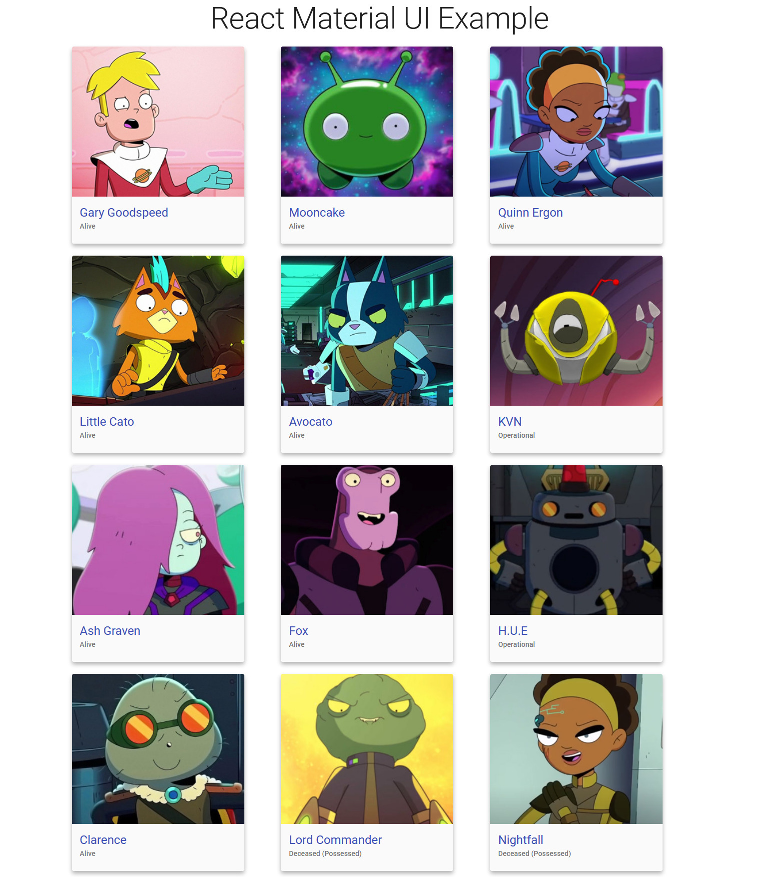
When mapping over an array in React, you need to pass a key prop to distinguish each child element. Here, the id of the character is passed to the key prop.
In the above code, xs and sm grid breakpoints are set as 12 and 4, respectively. If you are not familiar with grid breakpoints, you can read more about them here.
Here is how your app will look.
Complete Code
Here is the complete code for this app.
      import React, { useEffect, useState } from "react";
import Container from "@material-ui/core/Container";
import Card from "@material-ui/core/Card";
import Typography from "@material-ui/core/Typography";
import CardContent from "@material-ui/core/CardContent";
import CardMedia from "@material-ui/core/CardMedia";
import { makeStyles } from "@material-ui/core/styles";
import Grid from "@material-ui/core/Grid";

const useStyles = makeStyles({
  card: {
    maxWidth: 345,
    boxShadow: "0 5px 8px 0 rgba(0, 0, 0, 0.3)",
    backgroundColor: "#fafafa",
  },
  media: {
    height: 300,
  },
});

function App() {

  const [data, setData] = useState([]);

  useEffect(() => {
    fetch("https://finalspaceapi.com/api/v0/character/?limit=12")
      .then((res) => res.json())
      .then((data) => setData(data));
  }, []);

  const classes = useStyles();

  return (
    <div>
      <Container>
        <Typography
          color="textPrimary"
          gutterBottom
          variant="h2"
          align="center"
        >
          React Material UI Example{" "}
        </Typography>
        <Grid container spacing={3}>
          {data.map((character) => (
            <Grid item xs={12} sm={4} key={character.id}>
              <Card className={classes.card}>
                <CardMedia
                  className={classes.media}
                  image={character.img_url}
                />
                <CardContent>
                  <Typography color="primary" variant="h5">
                    {character.name}
                  </Typography>
                  <Typography color="textSecondary" variant="subtitle2">
                    {character.status}
                  </Typography>
                </CardContent>
              </Card>
            </Grid>
          ))}
        </Grid>
      </Container>
    </div>
  );
}

export default App;
You can explore this React app here.
Conclusion
This guide demonstrated the step-by-step process of creating and styling a React app with Material UI. You should try to customize this app further with different Material UI components and layouts.
Here are some additional resources that can be helpful.
Happy coding!
Advance your tech skills today
Access courses on AI, cloud, data, security, and more—all led by industry experts.
