Utilize the Focus Mode of a Chart in Power BI
Nov 24, 2020 • 6 Minute Read
Introduction
While looking at a visualization dashboard, you might want to look at more details of the report. This is where the focus mode in Power BI is useful. This guide will demonstrate how to utilize the focus mode of a chart in Power BI Desktop.
Data
In this guide, you will work with a fictitious data set of bank loan disbursal across years. The data contains 3,000 observations and 17 variables. You can download the dataset here. The major variables are described below:
- Date: Loan disbursal date.
- Loan_disbursed: Loan amount (in US dollars) disbursed by the bank.
- Gender: Whether the applicant is female (F) or male (M).
Start by loading the data.
Loading Data
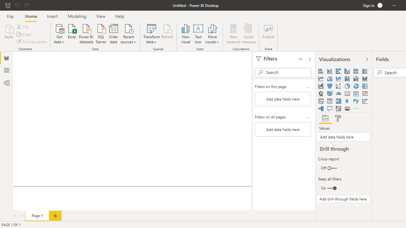
Once you open your Power BI Desktop, the following output is displayed.
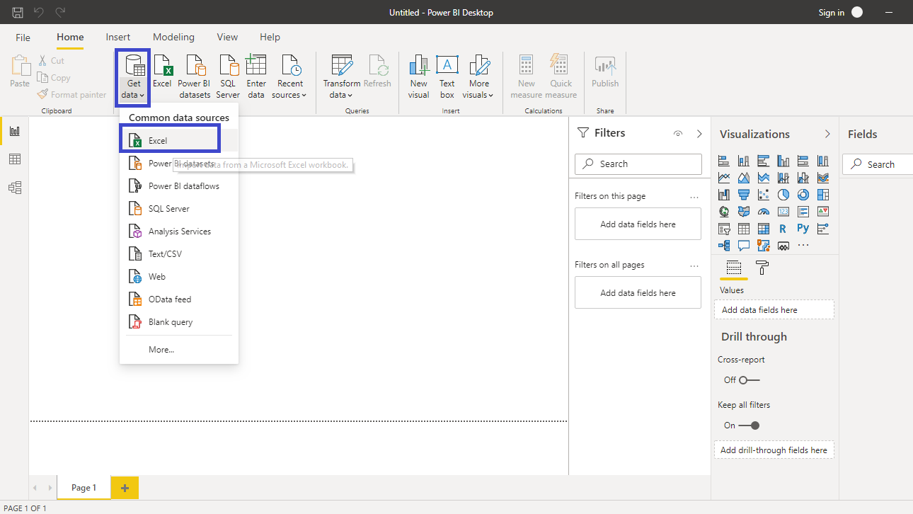
Click on Get data option and select Excel from the options.
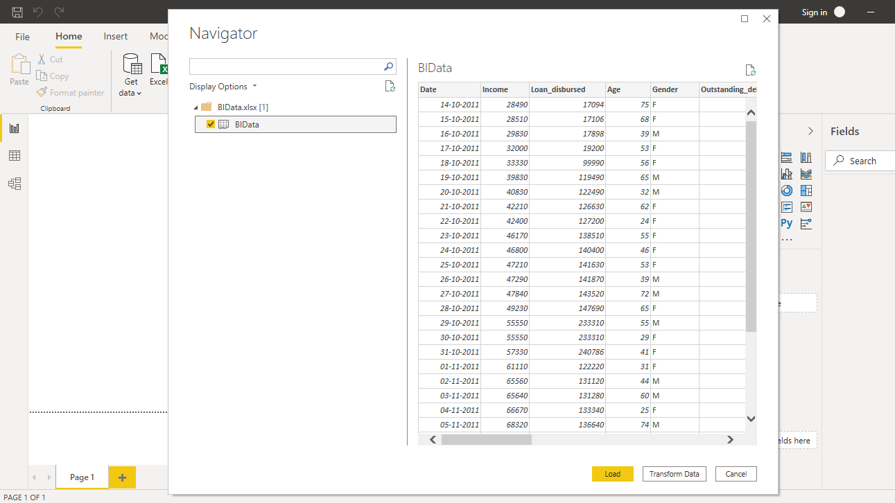
Browse to the location of the file and select it. The name of the file is BIdata.xlsx, and the sheet you will load is BIData sheet. The preview of the data is shown, and once you are satisfied that you are loading the right file, click Load.
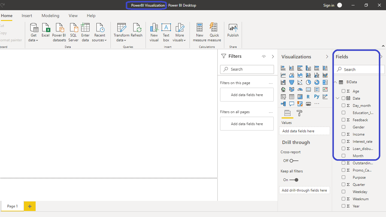
You have loaded the file, and you can save the dashboard. It is named PowerBI Visualization. The Fields pane contains the variables of the data.
Adding Visualization to the Canvas
To begin, click on the Clustered column chart option located in the Visualizations pane. This creates a chart box in the canvas. Nothing is displayed because haven't yet added the required visualization arguments.

You can resize the chart on the canvas. The next step is to fill the visualization arguments under the Fields option as shown below. Drag the variable Date into the Axis field, and Loan_disbursed in the Values field.

The output above shows the Loan_disbursed by Year chart. You are now ready to explore the focus mode.
Explore the Focus Mode
The focus mode is a little icon at the bottom of the chart as shown below.

Click on the focus mode option as shown above, and what it does is that the visual takes over the entire space in the report canvas, as shown below.

You also get access to a few other options with the three dots … symbols as shown below.

Click on the Show as a table option shown in the chart above, and it results in a table view along with the visual.

The layout can be changed with the Switch to vertical layout option.

Selecting the option above will align the table vertically alongside the visual.

You can also export data with the option available.

The other advantage of focus mode is that you can add variables into the chart. Drag the Gender variable into the Legend option as shown below.

The output above shows that the variable Gender is added to both the column chart as well as the table.
Conclusion
Focus mode is an important feature in Power BI as it enables deeper exploratory analysis of the visual. This helps in understanding underlying patterns that would have been difficult to identify otherwise. This is a great feature to use for treating outliers, exploratory data analysis, and to enrich your visual charts.
To learn more about building powerful visualization in Power BI desktop, please refer to the following guides:
Advance your tech skills today
Access courses on AI, cloud, data, security, and more—all led by industry experts.
