Aligning Charts with Gridlines in Power BI
Nov 23, 2020 • 7 Minute Read
Introduction
Building powerful visualization is good, but it is important to make sure that all the charts are aligned properly. This increases the appeal of the visualization and makes it easier to comprehend. In this guide, you will learn how to align charts with gridlines in Power BI Desktop.
Data
In this guide, you will work with a fictitious data set of bank loan disbursal across years. The data contains 3,000 observations and 17 variables. You can download the dataset here. The major variables are described below:
- Date: Loan disbursal date.
- Income: Annual Income of the applicant (in US dollars).
- Loan_disbursed: Loan amount (in US dollars) disbursed by the bank.
- Age: The applicant’s age in years.
- Gender: Whether the applicant is female (F) or male (M).
- Interest_rate: Annual interest rate, in percentage, charged for the disbursed loan.
- Purpose: Purpose for which loan was taken.
- Weeknum: Week number of the year.
Start by loading the data.
Loading Data
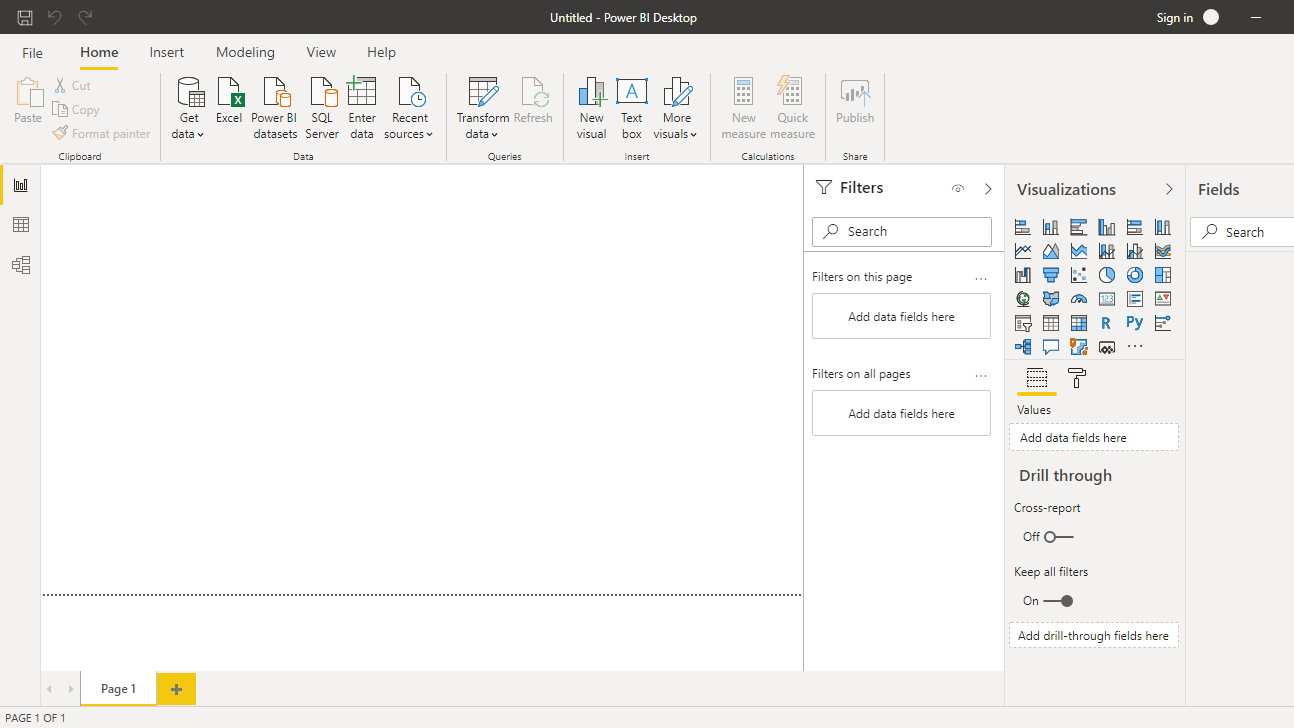
Once you open your Power BI Desktop, the following output is displayed.
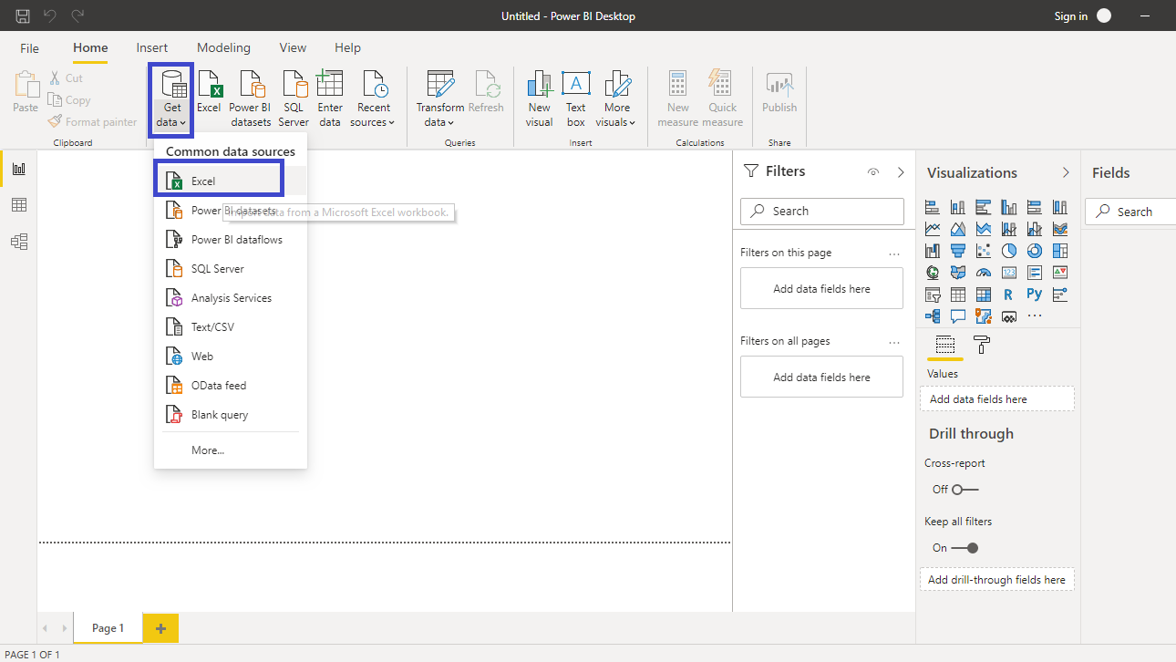
Click on Get data option and select Excel from the options.
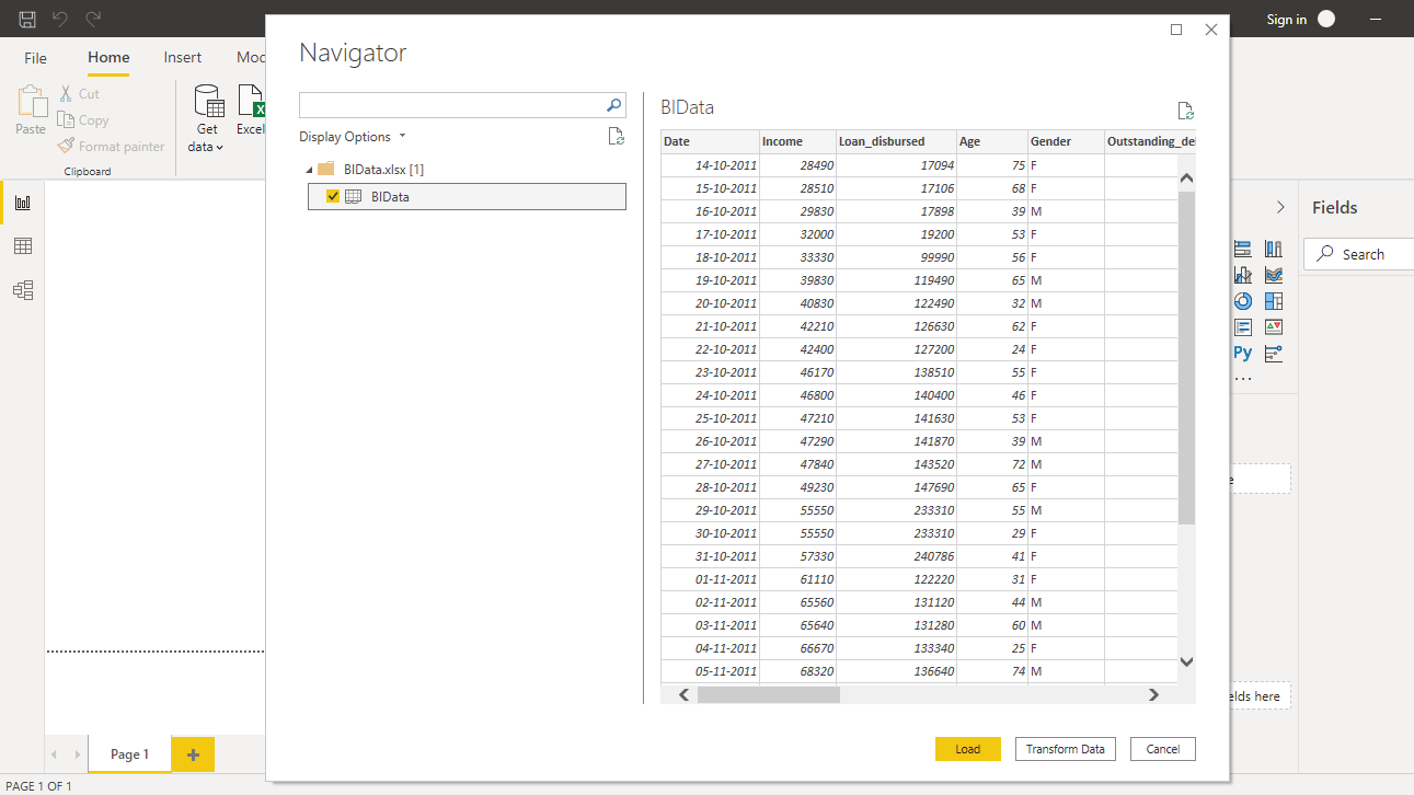
Browse to the location of the file and select it. The name of the file is BIdata.xlsx, and the sheet you will load is BIData sheet. The preview of the data is shown, and once you are satisfied that you are loading the right file, click Load.
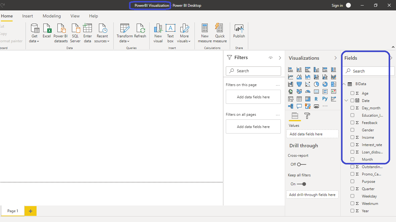
You have loaded the file, and you can save the dashboard. It is named PowerBI Visualization. The Fields pane contains the variables of the data.
Adding Visualizations
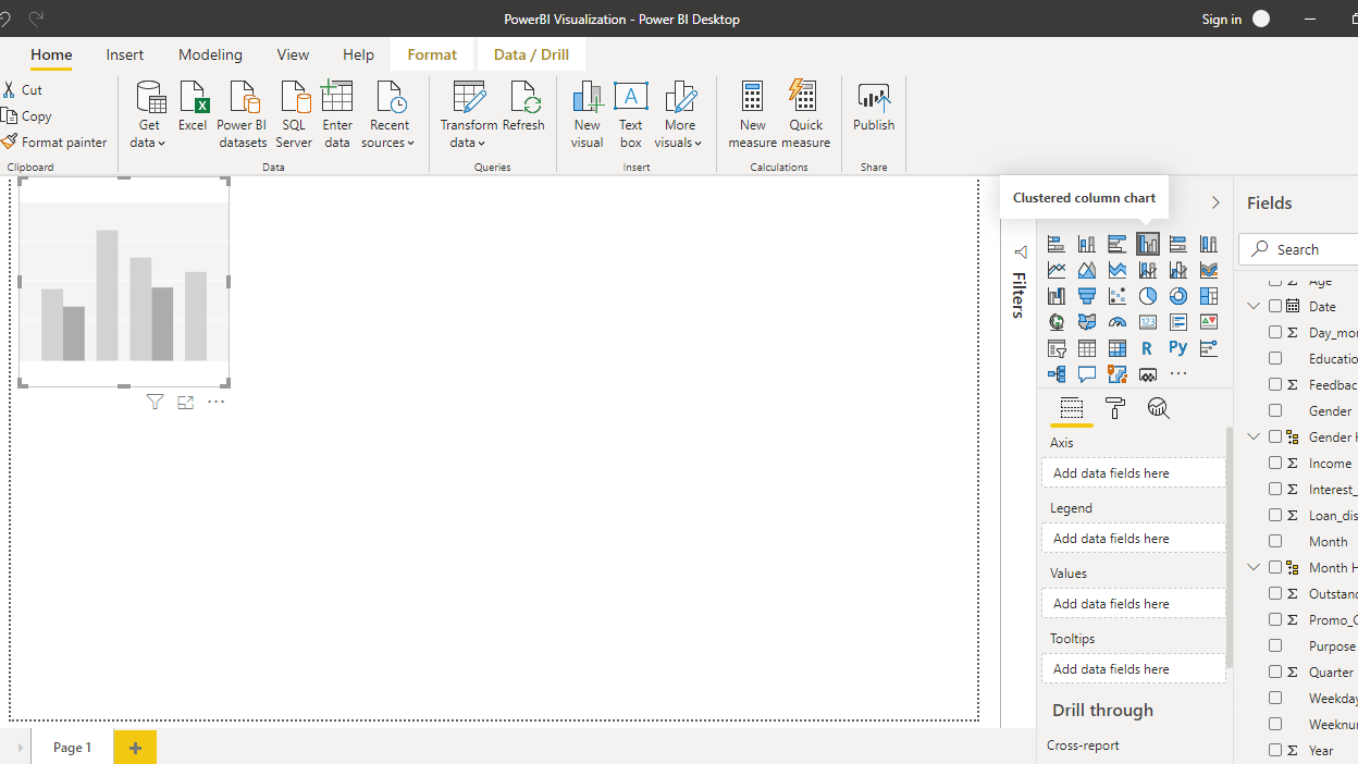
To begin, you will need a chart, table or a matrix. You will create a Clustered column chart in this guide. You can locate it in the Visualizations pane. Click on the chart and it will create a chart box in the canvas. Nothing is displayed because you haven't yet added the required visualization arguments.
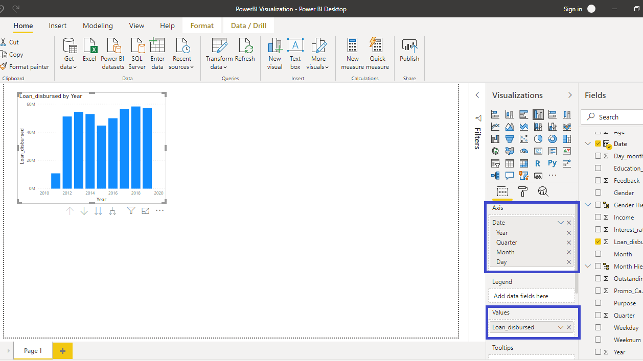
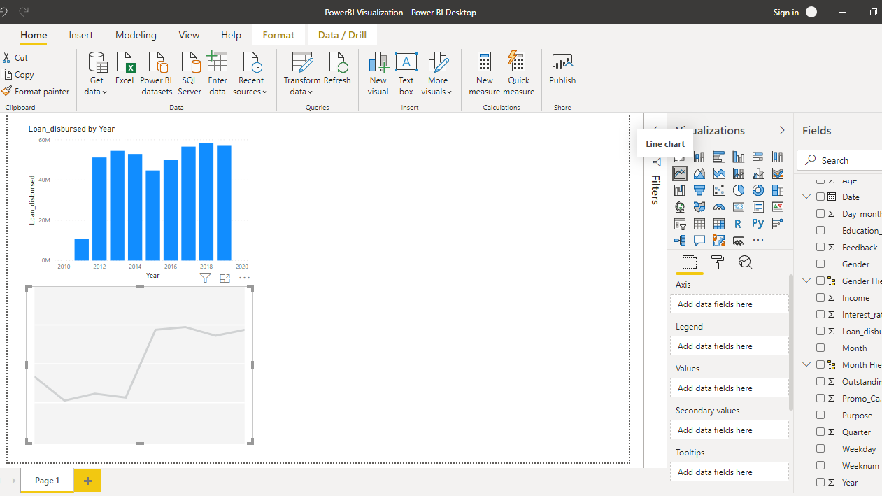
The output above shows the Loan_disbursed by Year chart. Next, you will add a Line chart.
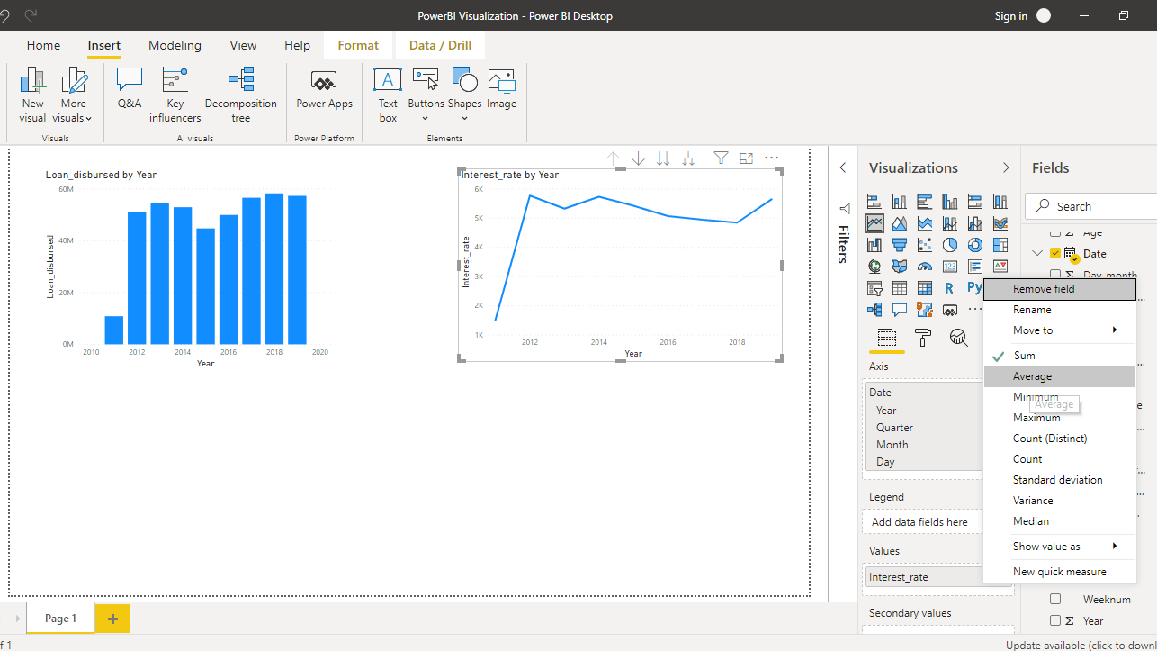
Drag the variable Date into the Axis field, and Interest_rate in the Values field.
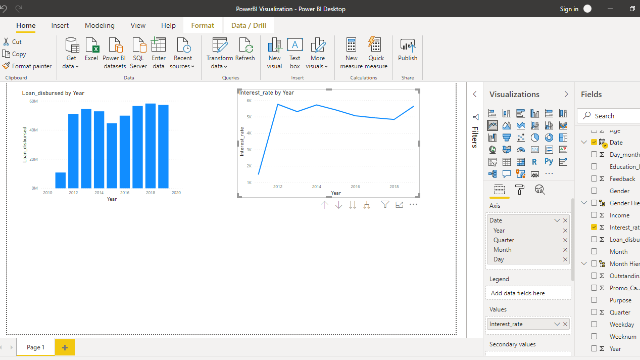
The above line chart is incorrect as it adds the interest rate values. To make the correction, right click and select Average.
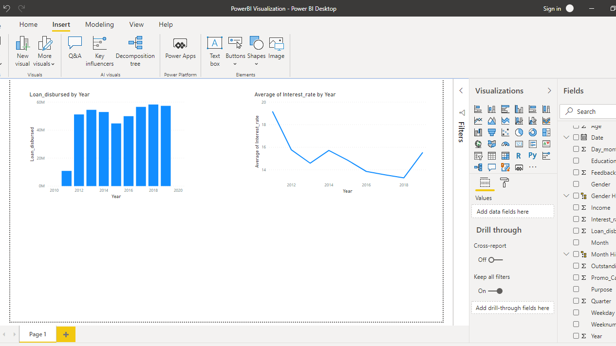
The above step will produce the following output.
You have added two charts at the top of the visualization canvas. You will add two more charts to properly demonstrate the importance of gridlines.
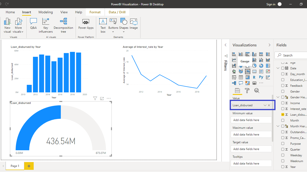
You will add a Gauge chart for the variable, Loan_disbursed, as shown below.
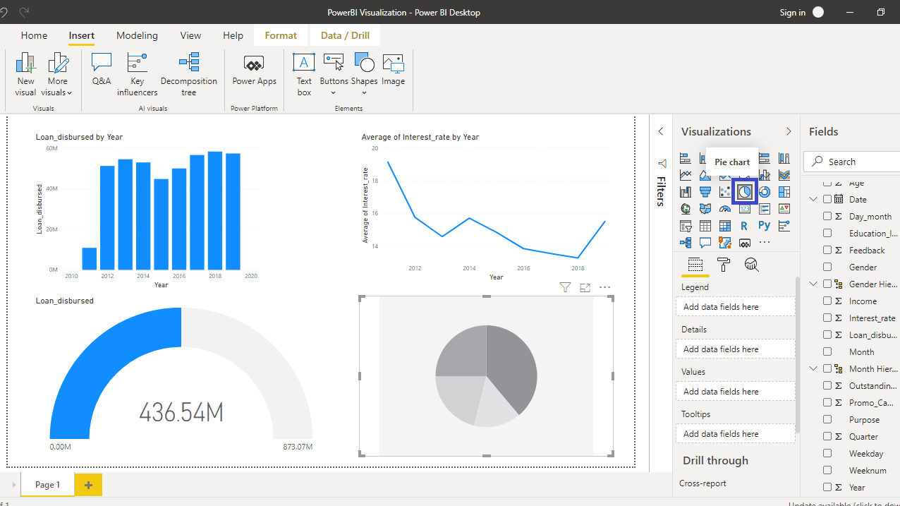
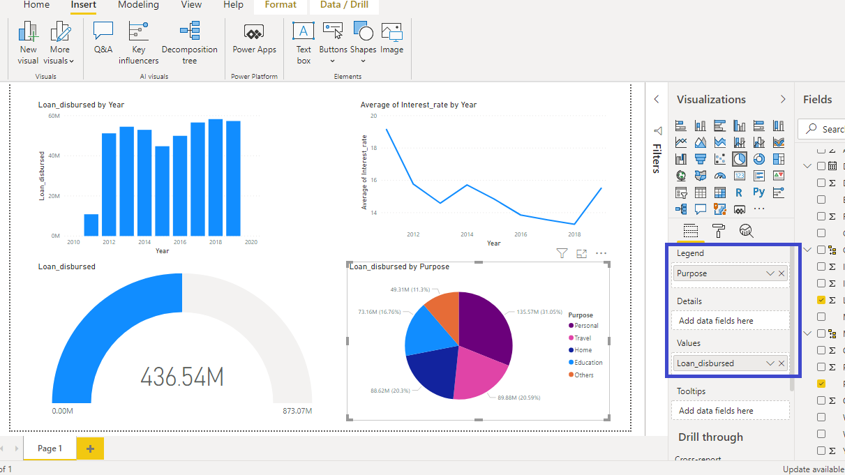
Next, click on the Pie chart visual.
Drag Purpose in the Legend option, and Loan_disbursed in the Values field.
You now have your visualization report ready.
Gridlines and Snap to Grid
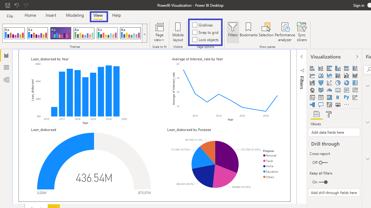
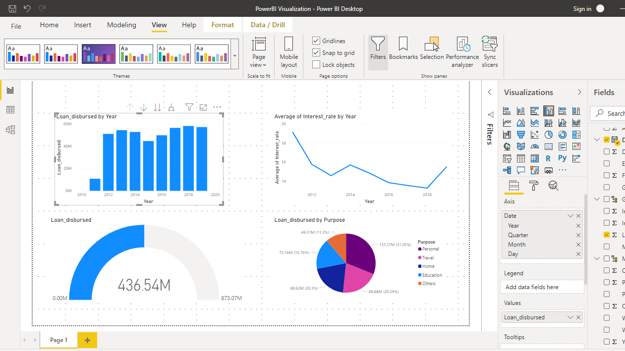
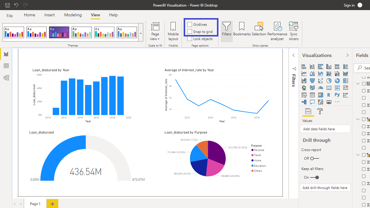
In order to align the charts properly, Power BI Desktop has a great feature called Gridlines and Snap to grid, which allows you to make your report look nice and properly aligned. Under the View tab you will see these two options.
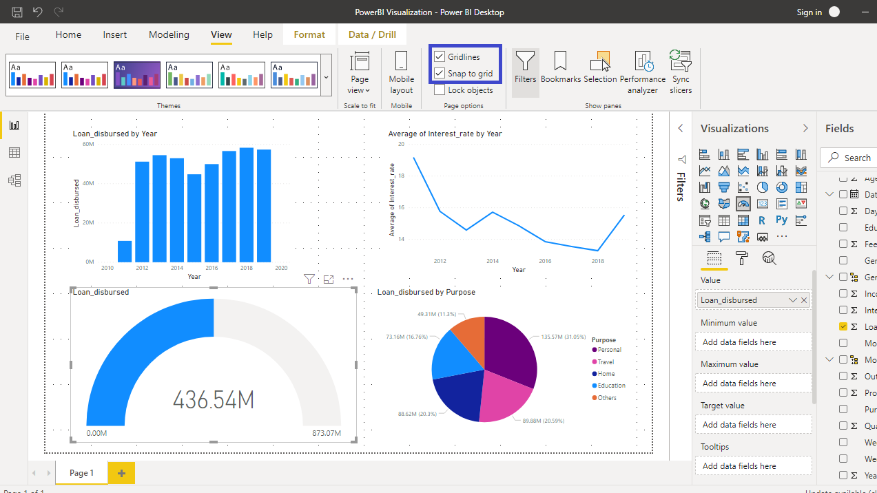
Turn on these two options and you can see gridlines existing for this dashboard.
You can now ensure that all the charts are around the same size and evenly distributed across the report. In case of any discrepancy, you can correct the alignment. For example, the gauge chart is too big and out of the alignment.
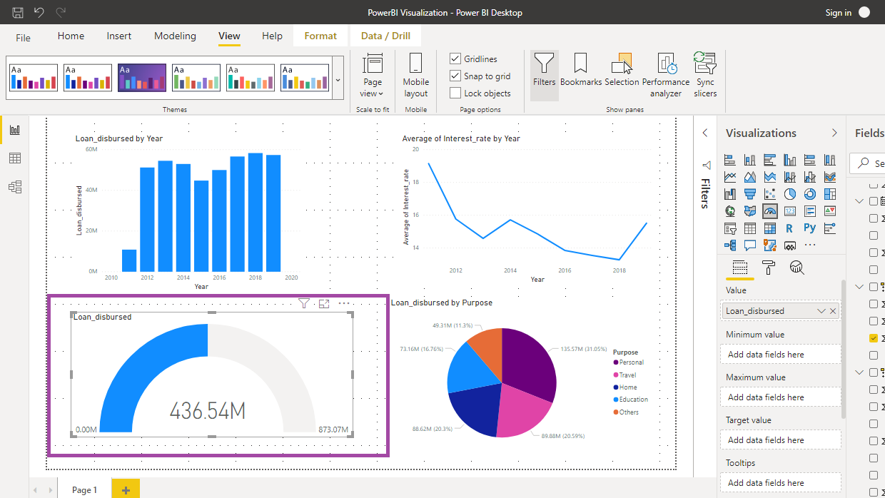
It is easy to align this chart by dragging it within the gridlines.
Once you have aligned the chart, you can turn off the Gridlines and Snap to grid option.
Now you have all the charts aligned and you can share your well-aligned and formatted chart to your team.
Conclusion
Proper formatting of a visualization chart is a must-have skill in analytics and business intelligence. It helps to increase the aesthetic appeal of your report and also makes it easy for others to comprehend. This is an essential skill requirement in consulting and auditing firms. It is also required when you present the findings to senior management. This skill set will strengthen your visualization and presentation skillsets.
To learn more about building powerful visualization in Power BI Desktop, please refer to the following guides:
Advance your tech skills today
Access courses on AI, cloud, data, security, and more—all led by industry experts.

