
- Course
Communicating Data Insights
This course covers the key statistical and technical tools needed to convey clear, actionable insights from data to senior executives, including the use of powerful visualizations such as Sankey diagrams, funnel plots and candlestick plots.
Beginner
- Course
Communicating Data Insights
This course covers the key statistical and technical tools needed to convey clear, actionable insights from data to senior executives, including the use of powerful visualizations such as Sankey diagrams, funnel plots and candlestick plots.
Beginner
Get started today
Access this course and other top-rated tech content with one of our business plans.
Try this course for free
Access this course and other top-rated tech content with one of our individual plans.
This course is included in the libraries shown below:
- Data
What you'll learn
Providing crisp, clear, actionable points-of-view to senior executives is becoming an increasingly important role of data scientists and data professionals these days. In this course, Communicating Data Insights you will gain the ability to summarize complex information into such clear and actionable insights. First, you will learn how to sum up the important descriptive statistics from any numeric dataset. Next, you will discover how to build and use specialized visual representations such as candlestick charts, Sankey diagrams and funnel charts in Python. You will then see how the data behind such representations can now be fed in from enterprise-wide sources such as data warehouses and ETL pipelines.
Finally, you will round out the course by working with data residing in different public cloud platforms, and even in a hybrid environment, that is with some of it on-premise and some of it on the cloud.
When you’re finished with this course, you will have the skills and knowledge to pull together data from disparate sources and use nifty visualizations to convey crisp, actionable points-of-view to a senior executive audience.
Communicating Data Insights
Beginner
Table of contents
-
Version Check | 16s
-
Module Overview | 1m 11s
-
Prerequisites and Course Outline | 1m 19s
-
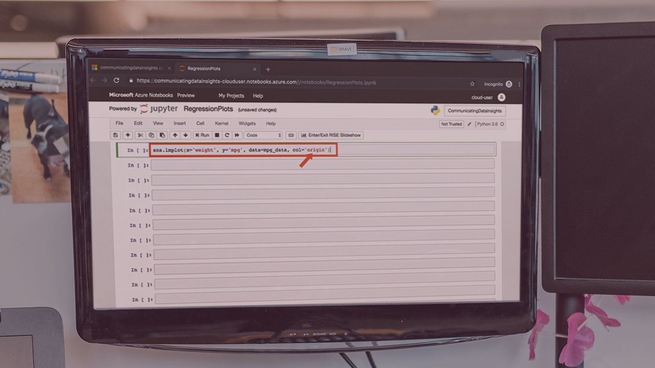
Visualizations and Use Cases | 4m 32s
-
Getting Started with Azure Notebooks | 1m 56s
-
Visualizing Statistical Data | 5m 10s
-
Box Plots and Violin Plots | 6m 8s
-
Histograms | 3m 14s
-
Pie Charts | 4m 7s
-
Visualizing Autocorrelation | 3m 11s
-
Stacked Plots and Stem Plots | 4m 9s
-
Summary | 1m 14s
A problem solver at heart, Janani has a Masters degree from Stanford and worked for 7+ years at Google. She was one of the original engineers on Google Docs and holds 4 patents for its real-time collaborative editing framework.
