
- Course
Creating Responsive Pages with CSS FlexBox
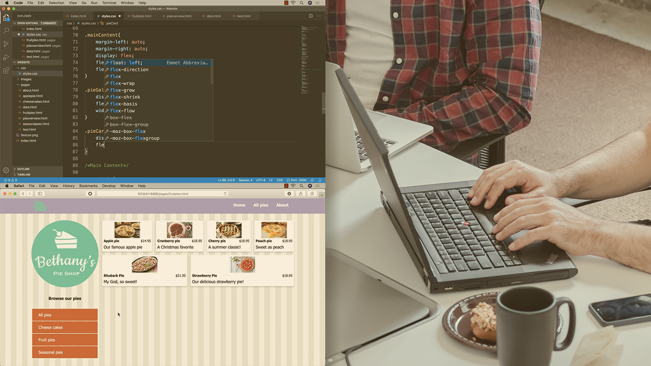
Flexboxes make creating web page layouts quicker, easier, and offer greater flexibility than rows and columns. This course will teach you how to get started with Flexboxes using nothing but CSS.
Beginner
- Course
Creating Responsive Pages with CSS FlexBox
Flexboxes make creating web page layouts quicker, easier, and offer greater flexibility than rows and columns. This course will teach you how to get started with Flexboxes using nothing but CSS.
Beginner
Get started today
Access this course and other top-rated tech content with one of our business plans.
Try this course for free
Access this course and other top-rated tech content with one of our individual plans.
This course is included in the libraries shown below:
- Core Tech
What you'll learn
Creating flexible web page layouts could take complex CSS floats and media queries or require using into third party frameworks that use rows and columns, that then add a lot of extra code to your website. In this course, Creating Responsive Pages with CSS Flexbox, you’ll learn to create responsive webpages using CSS flexboxes. First, you’ll explore the basic concept of the CSS flexbox. Next, you’ll discover how to quickly layout content with the Flexbox using the axis. Then, you'll learn to get your content to be responsive with Flexbox. Finally, you’ll be presented options you can use to scale and align elements within the Flexbox container. When you’re finished with this course, you’ll have the skills and knowledge of using CSS flexboxes needed to create responsive web pages.
Creating Responsive Pages with CSS FlexBox
Beginner
Table of contents
-
Module Introduction | 1m 15s
-
Exploring the Project Files | 1m 27s
-
Knowing the Basics and Flexbox Terminology | 1m 29s
-
Understanding the Flexbox Container | 1m 18s
-
Defining Direction with Rows and Columns | 1m 51s
-
Exploring the Main and Cross Axes | 1m 25s
-
Breaking down a Design to Flexboxes | 2m 51s
-
Module Conclusion | 58s
Jeff has 10+ years experience in the digital learning and media industry. Currently he is Founder and Head Trainer/Sensei at Learning Dojo, a company dedicated to training you to become a software ninja in a variety of eLearning, web, and mobile related software applications.
