
- Course
Designing Data Visualizations
Organizations increasingly need someone to make sense out of all the “Big Data” they are generating. This course will teach you how to identify the signals hidden in your datasets and choose visualizations that tell compelling, interesting stories.
Beginner
- Course
Designing Data Visualizations
Organizations increasingly need someone to make sense out of all the “Big Data” they are generating. This course will teach you how to identify the signals hidden in your datasets and choose visualizations that tell compelling, interesting stories.
Beginner
Get started today
Access this course and other top-rated tech content with one of our business plans.
Try this course for free
Access this course and other top-rated tech content with one of our individual plans.
This course is included in the libraries shown below:
- Data
What you'll learn
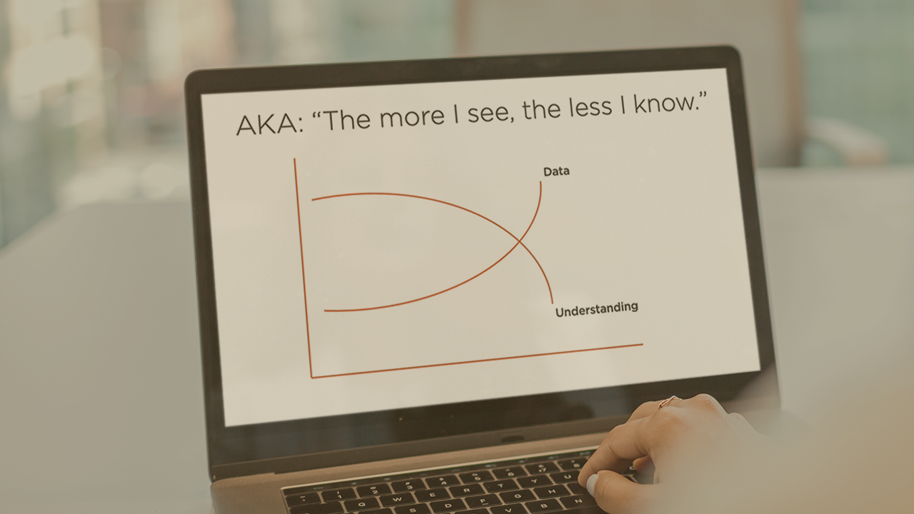
Data Visualization Designer is one of the hottest new careers in tech because organizations around the world are drowning in all the “Big Data” they’re generating. They need people with the skills to turn raw facts and figures into visualizations that tell a story and make an impact. In this course, Designing Data Visualizations, you'll learn how to use your creativity and intuition to find the insights in datasets, as well as basic data-analysis techniques, to create “enriched” data and choose the correct visual to communicate real meaning. First, you’ll see how to spot “signals” in the data – it turns out that human common sense and knowledge of context are not only still relevant, but absolutely crucial. Then, you’ll learn techniques like pivot tables, conditional formatting, and data joins and merges to generate clear insights, while avoiding the “Four Deadly Sins of Data Visualization.” Finally, you’ll explore what kinds of visualizations match up best with what the data is telling you. When you’re finished with this course, you'll understand how to look inside the data, pull out what your audience needs and is most interested in, and use that to design data visualizations that stick.
Designing Data Visualizations
Beginner
Table of contents
-
Intro: Finding the Hidden Meaning in All the Numbers | 6m 23s
-
Before You Start Telling Your Story ... | 6m 54s
-
Avoiding the 4 Deadly Sins of Data Visualization | 5m 50s
-
Performing an Exploratory Data Analysis (EDA) | 8m 28s
-
Hyman's Maxim & Null Hypothesis: How Do We Know Our Data Is Real? | 4m 50s
-
Performing a Null Hypothesis Reality Check | 4m 34s
David LaFontaine is an author, journalist, digital media consultant, and adjunct professor at the University of Southern California.
