
- Course
Dreamweaver CC 2019 Responsive Design with Bootstrap
Take your ideas from design to a responsive website using Dreamweaver CC and Bootstrap. By the end of this course, you’ll know how to use Bootstrap’s grid and components, and you'll be able to build web pages viewable across all screens sizes.
Beginner
Get started today
Access this course and other top-rated tech content with one of our business plans.
Try this course for free
Access this course and other top-rated tech content with one of our individual plans.
This course is included in the libraries shown below:
- Core Tech
What you'll learn
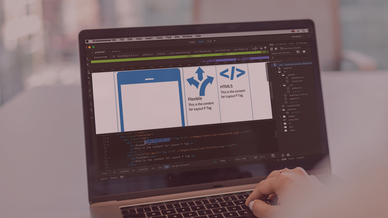
The challenge with building a website is that it may be viewed on any size screen, from the smallest mobile browser to the largest TV monitor. You need to choose a strategy for how you will approach the problem. In this course, Dreamweaver CC Responsive Design with Bootstrap, you will learn the foundational knowledge behind creating a single website that can be viewed across all screen sizes. First, you will explore the core concepts of responsive design (what it is and how to achieve it). Next, you will fill your toolbox with exercises using Bootstrap’s responsive grid and components, and work with CSS and JavaScript to enhance your designs. Finally, you will bring all the concepts together to build a page template and a web page using a PSD mockup. When you are finished with this course, you will have the skills and knowledge needed to start implementing your designs as responsive websites. Software required: Dreamweaver CC 2019 and Photoshop CC 2019.
Dreamweaver CC 2019 Responsive Design with Bootstrap
Beginner
Accomplished, experienced software and web developer with extensive experience in video, messaging, and application development. Expertise in HTML5 and JavaScript, Objective C and Swift, and ActionScript and AIR programming.
