
- Course
Getting Started with Matplotlib
Understanding and presenting complex information is easier with data visualization. In this course, you’ll learn how to use Matplotlib to create and customize line, bar, and scatter plots.
Beginner
- Course
Getting Started with Matplotlib
Understanding and presenting complex information is easier with data visualization. In this course, you’ll learn how to use Matplotlib to create and customize line, bar, and scatter plots.
Beginner
Get started today
Access this course and other top-rated tech content with one of our business plans.
Try this course for free
Access this course and other top-rated tech content with one of our individual plans.
This course is included in the libraries shown below:
- Data
What you'll learn
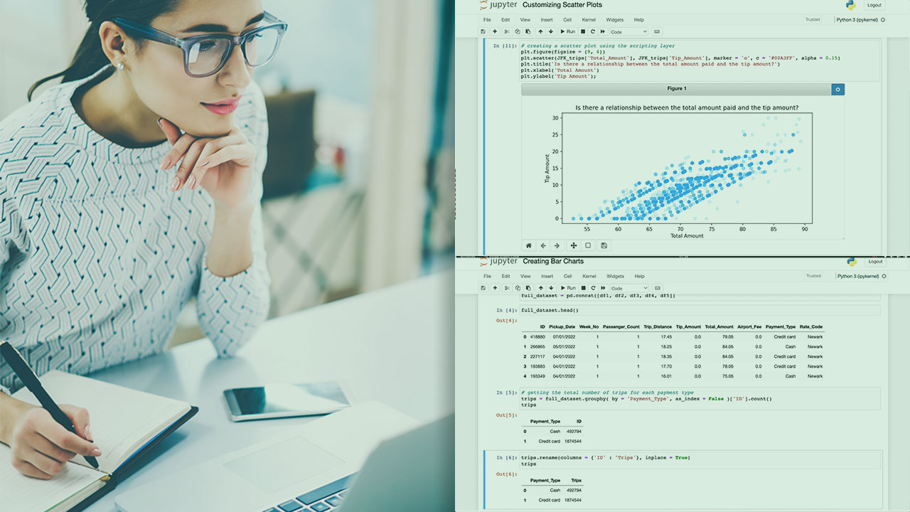
Data visualization represents a great way to explore and understand data. It also helps in effectivity communicating insights to a variety of audiences and facilitating the decision-making process. In this course, Getting Started with Matplotlib, you’ll learn to create basic chart types. First, you’ll explore Matplotlib’s architecture. Next, you’ll discover what the components of a figure are. Finally, you’ll learn how to build and customize line, bar, and scatter plots. When you’re finished with this course, you’ll have the foundational knowledge needed to craft data visualizations using Matplotlib.
Getting Started with Matplotlib
Beginner
Table of contents
As a data analyst enthusiast, Mihaela has special interests in translating vision into action using end-to-end data analysis while being very passionate about teaching.
