
- Course
Hands on Responsive Design Using a CSS Preprocessor
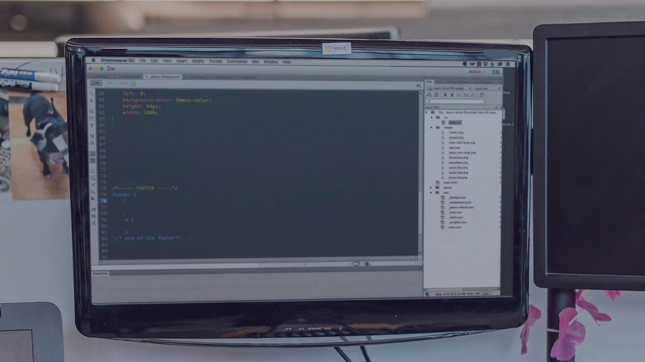
Build a mobile first, responsive website using the power of a CSS preprocessor so you can use variables, functions, calculations, shorthand, and minification in your web design workflow.
Beginner
- Course
Hands on Responsive Design Using a CSS Preprocessor
Build a mobile first, responsive website using the power of a CSS preprocessor so you can use variables, functions, calculations, shorthand, and minification in your web design workflow.
Beginner
Get started today
Access this course and other top-rated tech content with one of our business plans.
Try this course for free
Access this course and other top-rated tech content with one of our individual plans.
This course is included in the libraries shown below:
- Core Tech
What you'll learn
CSS is very basic and tedious to write by hand. However, by using a CSS preprocessor, we can introduce variables, functions, calculations, shorthand, minification, and other cool stuff all while keeping our source files clean and readable. The power of using a CSS preprocessor for doing responsive design should not be underestimated.
Hands on Responsive Design Using a CSS Preprocessor
Beginner
Table of contents
Paul Cheney specializes in Responsive Design, Content Management Systems, and Virtual Reality Photography. He teaches courses for Pluralsight and runs a web development business and Spartan Design University where he hosts resources for many online courses.
