
- Course
Human Factors in Data Visualization
In this course, you will discover the best ways to communicate data with visual tools, and how to leverage the strengths of the human visual system. You'll be provided with the skills to design and structure reports and dashboards.
Beginner
- Course
Human Factors in Data Visualization
In this course, you will discover the best ways to communicate data with visual tools, and how to leverage the strengths of the human visual system. You'll be provided with the skills to design and structure reports and dashboards.
Beginner
Get started today
Access this course and other top-rated tech content with one of our business plans.
Try this course for free
Access this course and other top-rated tech content with one of our individual plans.
This course is included in the libraries shown below:
- Data
What you'll learn
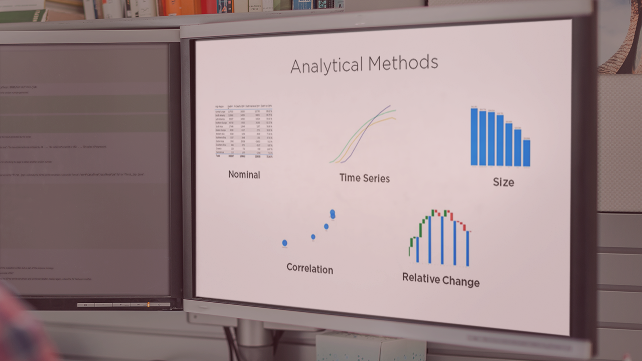
In order to communicate insights and findings effectively with data you need to understand how the human visual system works. In this course, Human Factors in Data Visualization, you will learn how to choose and organize visual objects, to effectively communicate information with data. First, you will explore how to structure and aggregate data, to prepare it for human consumption. Next, you will learn how to select measures and category items to answer a question. Finally, you will discover how to design dashboards and reports by selecting an analytical method and the most effective visual framework to deliver information to your viewers. When you have completed this course, you will have the skills to design visual tools to deliver self service information.
Human Factors in Data Visualization
Beginner
Passionate about Business Intelligence and delivering knowledge and insight to support better decisions. An advocate of Self-Service Reporting, Analytics Data Visualisation. Andi has delivered face to face Business Intelligence training covering topics such as Report Design, Dimensional modeling, and Data Visualisation. Andi is a keen cyclist and amateur cook and lives with his wife in Southern Spain.
