- Course
Leveraging Fluid-width Principles for Responsive Design in jQuery
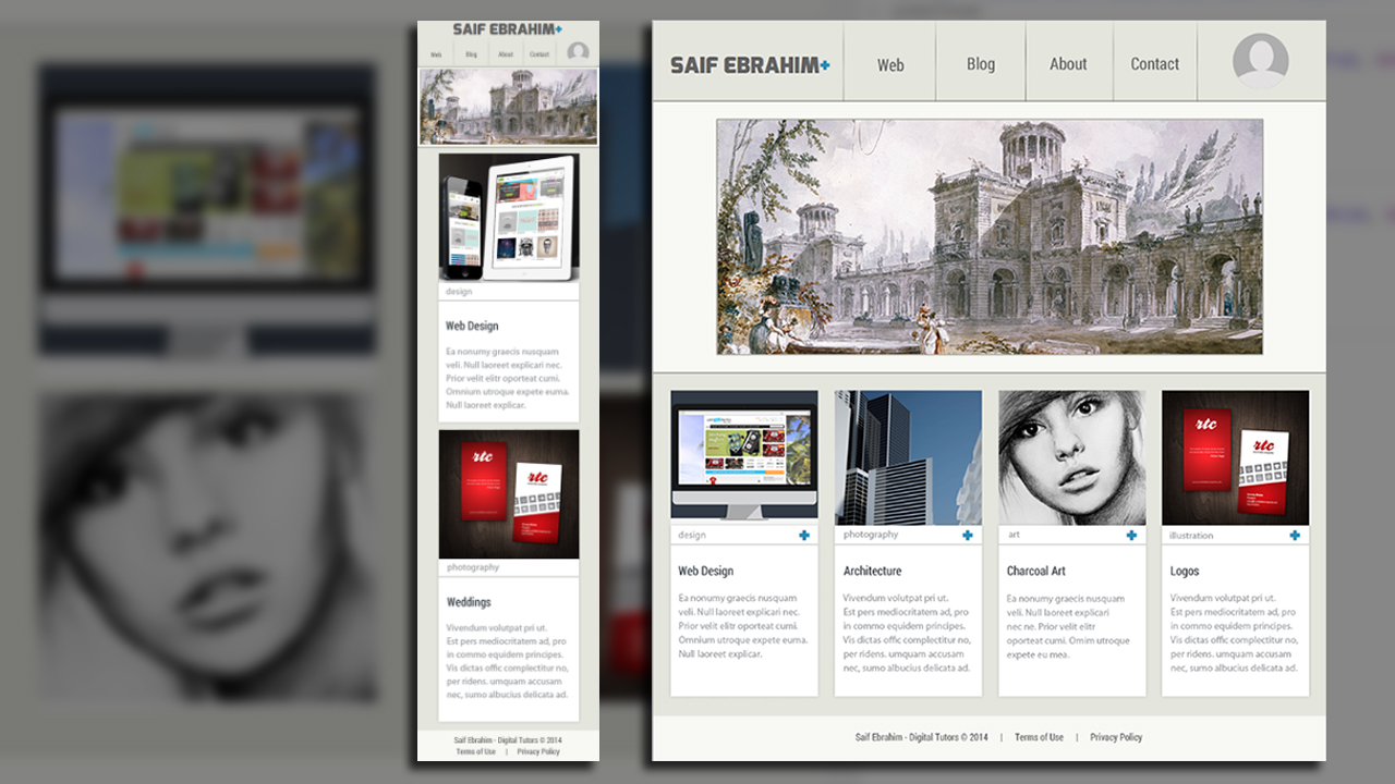
In this jQuery tutorial, we'll learn how to code a fluid-width website from scratch that looks great on all devices, using only a text editor and a browser. Software required: Sublime Text 2, Google Chrome 40, Photoshop CS6.

- Course
Leveraging Fluid-width Principles for Responsive Design in jQuery
In this jQuery tutorial, we'll learn how to code a fluid-width website from scratch that looks great on all devices, using only a text editor and a browser. Software required: Sublime Text 2, Google Chrome 40, Photoshop CS6.
Get started today
Access this course and other top-rated tech content with one of our business plans.
Try this course for free
Access this course and other top-rated tech content with one of our individual plans.
This course is included in the libraries shown below:
- Core Tech
What you'll learn
In this jQuery tutorial, we'll learn how to code a fluid-width website from scratch that looks great on all devices, using only a text editor and a browser. The lessons will show you how to start with a blank document and code the HTML, CSS, and JavaScript needed to make the website look and behave as designed. While coding the website, we'll learn important fluid-width responsive principles to ensure the website scales down to any size. In later lessons, we'll learn about some of the more advanced techniques such as responsive images, CSS3 animations, and performance tricks to make our website perform optimally on any device. By the end of the jQuery training, we'll have leveraged fluid-width principles and media queries to make our website work on a desktop, mobile phone, and everything in between. Software required: Sublime Text 2, Google Chrome 40, Photoshop CS6.

