
- Course
Creating Responsive Product Emails in Photoshop and HTML
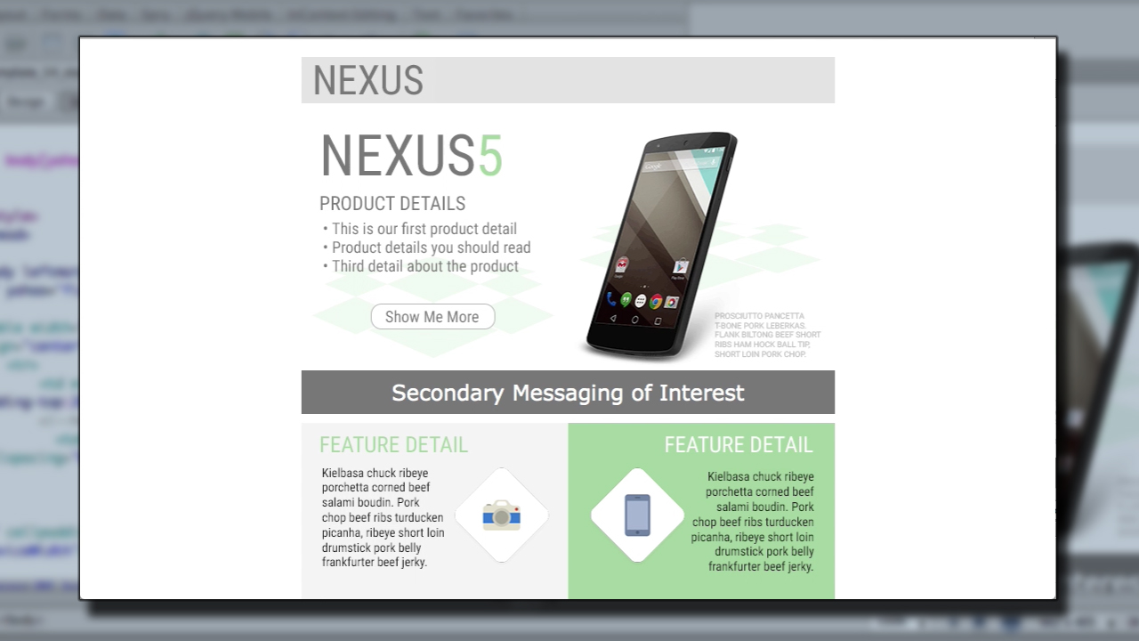
In this Photoshop and HTML tutorial, we'll learn to design and develop a responsive email intended to promote and market a consumer product utilizing the popular 2-to-1 column method of responsive design. Software required: Photoshop CS6, HTML, Dreamweaver CS6.
Intermediate
- Course
Creating Responsive Product Emails in Photoshop and HTML
In this Photoshop and HTML tutorial, we'll learn to design and develop a responsive email intended to promote and market a consumer product utilizing the popular 2-to-1 column method of responsive design. Software required: Photoshop CS6, HTML, Dreamweaver CS6.
Intermediate
Get started today
Access this course and other top-rated tech content with one of our business plans.
Try this course for free
Access this course and other top-rated tech content with one of our individual plans.
This course is included in the libraries shown below:
- Core Tech
What you'll learn
In this Photoshop and HTML tutorial, we'll learn to design and develop a responsive email intended to promote and market a consumer product utilizing the popular 2-to-1 column method of responsive design. We'll start with the structure of the email using wireframes for both desktop and mobile versions and design the email based on the wireframe. Next, we'll go over a popular email service provider, MailChimp, which we'll eventually use to prepare our coded email for delivery and to review two popular HTML email boilerplates. Then, we'll code out the email using media queries and review some helpful practices for developing a responsive email that can perform optimally across different platforms. By the end of the Photoshop and HTML training, you'll have learned how to design a sales-targeted email that is compatible across multiple platforms while being developed using popular techniques and finally tested and distributed using MailChimp. Software required: Photoshop CS6, HTML, Dreamweaver CS6.
Creating Responsive Product Emails in Photoshop and HTML
Intermediate
Table of contents
