
- Course
Hands-on Responsive Web Design 1: Media Queries & CSS Preprocessing
Responsive, mobile first web design is a skill required for web developer's in today's mobile world. This course, you'll learn how to build a responsive template using SASS and a CSS preprocessor that you'll use in your next web development project. Software required: Brackets.
Beginner
Get started today
Access this course and other top-rated tech content with one of our business plans.
Try this course for free
Access this course and other top-rated tech content with one of our individual plans.
This course is included in the libraries shown below:
- Core Tech
What you'll learn
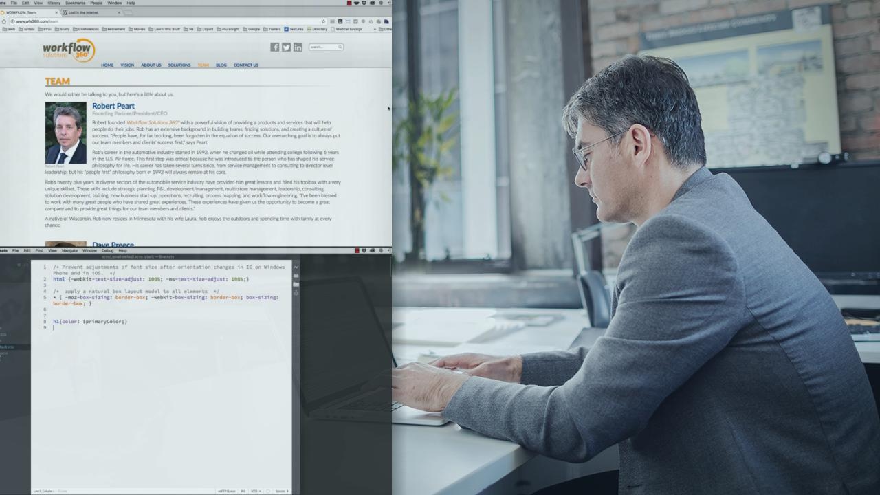
At the heart of developing any responsive website is a thorough knowledge of how to use HTML5, CSS3, and SASS. In this course, Responsive Web Design 1: Media Queries and CSS Preprocessing, you'll learn the skills you need to create a mobile first, responsive web page template that can be used as a basis for an entire site or even a CMS. First, you'll learn the appropriate way to organize your SCSS partial files and how to reassemble them while including media queries. Next, you'll discover how to use variables and math operations to quickly create standard CSS. Finally, you'll cover html semantics and way-finding so that your websites are attractive as well as functional. When you're finished with this course, you'll have built a responsive template, which is ready to be used as you create your own personal or commercial websites. Software required: Brackets.
Hands-on Responsive Web Design 1: Media Queries & CSS Preprocessing
Beginner
Table of contents
Paul Cheney specializes in Responsive Design, Content Management Systems, and Virtual Reality Photography. He teaches courses for Pluralsight and runs a web development business and Spartan Design University where he hosts resources for many online courses.
