
- Course
Visualizing Statistical Data Using Seaborn
Data analysts and scientists are tasked with extracting information and insights from huge datasets. This course introduces the Seaborn Python library helping engineers communicate information via its high-level and powerful visualization tools.
Beginner
Get started today
Access this course and other top-rated tech content with one of our business plans.
Try this course for free
Access this course and other top-rated tech content with one of our individual plans.
This course is included in the libraries shown below:
- Data
What you'll learn
As deep learning approaches to machine learning rise in popularity, models are increasingly hard to understand and pick apart. Consequently, the need for sophisticated visualizations of the data going into the model is becoming more and more urgent and important. In this course, Visualizing Statistical Data Using Seaborn, you will work with Seaborn which has powerful libraries to visualize and explore your data. Seaborn works closely with the PyData stack - it is built on top of Matplotlib and integrated with NumPy, Pandas, Statsmodels, and other Python libraries for data science You will start off by visualizing univariate and bivariate distributions. You will get to build regression plots, KDE curves, and histograms to extract insights from data. Next, you will use Seaborn to visualize pairwise relationships of high dimensionality using the FacetGrid and PairGrid. Plot aesthetics, color, and style are important elements to making your visualizations memorable. Given this, you will study the color palettes available in Seaborn and see how you can manipulate specific plot elements in our graph. At the end of this course you will be very comfortable using Seaborn libraries to build powerful, interesting and vivid visualizations - an important precursor to using data in machine learning. Software required: Seaborn 0.8, Python 3.x.
Visualizing Statistical Data Using Seaborn
Beginner
Table of contents
-
Version Check | 20s
-
Module Overview | 1m 25s
-
Prerequisites and Course Overview | 1m 43s
-
Installing Seaborn and Exploring the Wine Dataset | 3m 57s
-
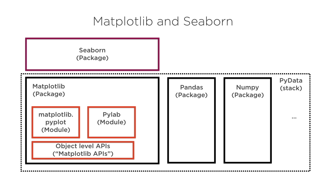
Matplotlib and Seaborn | 5m 58s
-
The Kernel Density Estimation (KDE) | 4m 43s
-
Visualizing Univariate Distributions: Histograms, KDE Plots, Rugplots | 6m 12s
-
Visualizing Bivariate Distributions: Jointplots, Hexbin Plots, KDE Plots | 4m 48s
-
Pairwise Relationships Using Pairplot and Correlations Using Heatmap | 5m 38s
-
Regression Plots Using Lmplot | 5m 18s
-
Regression Plots Using Regplot | 2m 24s
-
Stripplots and Swarmplots for Categorical Data | 2m 51s
-
The Boxplot and the Violinplot | 3m 21s
-
Statistical Estimation and Factorplots | 6m 12s
A problem solver at heart, Janani has a Masters degree from Stanford and worked for 7+ years at Google. She was one of the original engineers on Google Docs and holds 4 patents for its real-time collaborative editing framework.
