
- Course
Visualizing Data with MongoDB Charts
MongoDB Charts is a fast and convenient way of building powerful visualizations from your MongoDB data. Capability of getting actionable insights from the data using various dimensions is extremely valuable.
Beginner
- Course
Visualizing Data with MongoDB Charts
MongoDB Charts is a fast and convenient way of building powerful visualizations from your MongoDB data. Capability of getting actionable insights from the data using various dimensions is extremely valuable.
Beginner
Get started today
Access this course and other top-rated tech content with one of our business plans.
Try this course for free
Access this course and other top-rated tech content with one of our individual plans.
This course is included in the libraries shown below:
- Data
What you'll learn
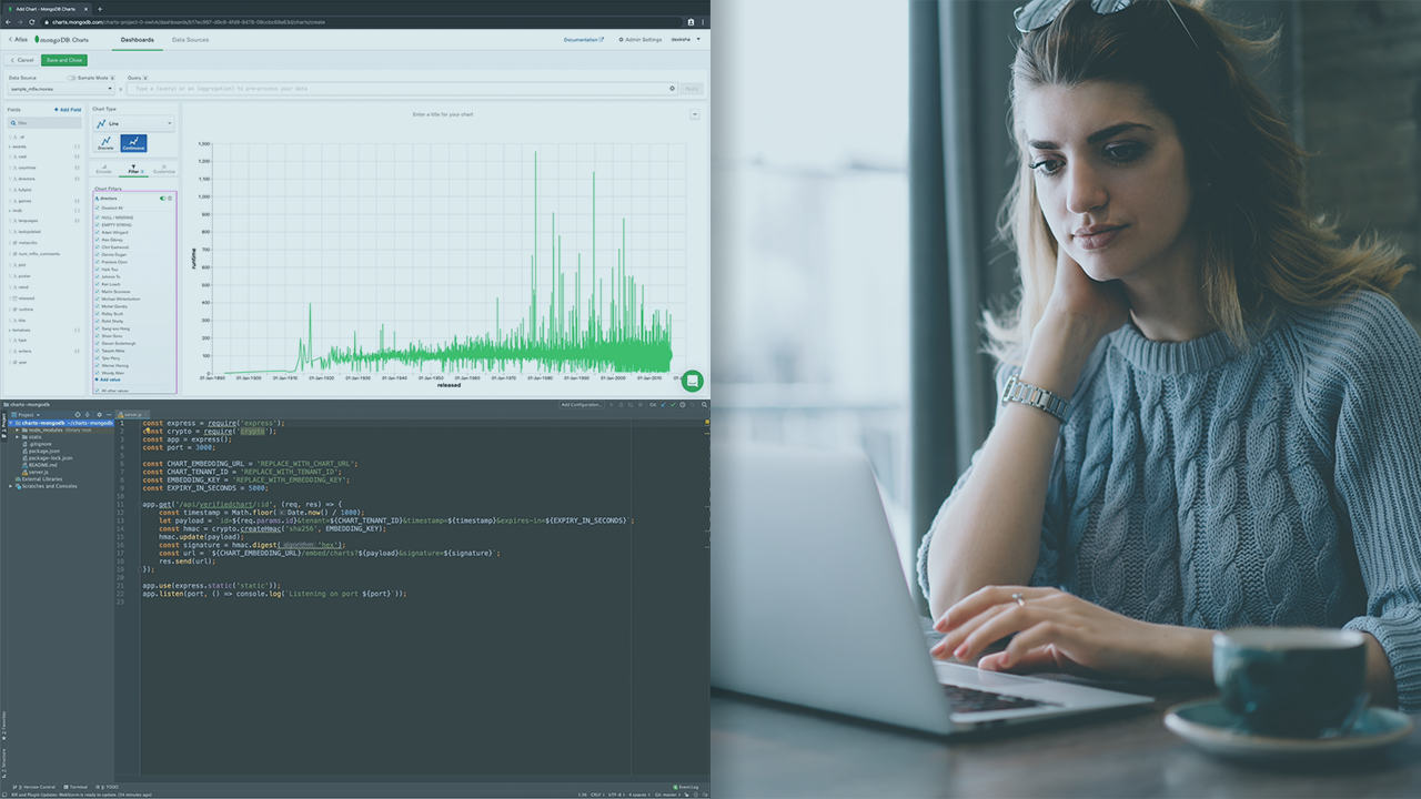
MongoDB is considered as a popular choice for applications and services with document based database model. Charts is a service from MongoDB to support creation of various chart types and render MongoDB data. In this course, Visualizing Data with MongoDB Charts, you will learn how to spin up your own MongoDB Atlas cluster and use the cluster data to create charts using sample datasets. First, you will build some intriguing visualizations in MongoDB Atlas using a variety of datasets. Next, you will spin up an AWS cluster and import your custom data into it. Then, you will learn the concepts of encoding channels, filtering, sorting, and binning on data. Finally, you will discover how to embed charts on static sites using unauthenticated, as well as verified signature techniques. After finishing this course, you will be proficient in working with MongoDB charts and can proudly share and embed charts into your applications with ease.
Visualizing Data with MongoDB Charts
Beginner
Deeksha is an independent remote engineer. Since 2010, she worked with tech companies in 7 cities across 4 countries. She is an avid traveller and a programmer who believes anything can be learned and practiced if we put our heart and soul to it!
