
- Course
Web Layouts with Flexbox and Bootstrap 4
Flexboxes make creating web page layouts quicker, easier, and offer greater flexibility than traditional columns. Bootstrap 4 introduced the ability to develop Flexboxes quickly and added several additional utilities that make layouts even easier
Beginner
Get started today
Access this course and other top-rated tech content with one of our business plans.
Try this course for free
Access this course and other top-rated tech content with one of our individual plans.
This course is included in the libraries shown below:
- Core Tech
What you'll learn
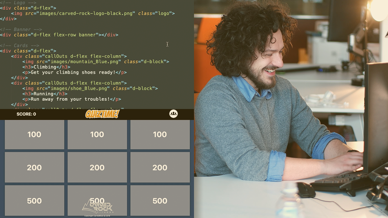
Using rows and columns can work for most webpages, but you are typically restricted to working with twelve columns, especially in Bootstrap. In this course, Web Layouts with Flexbox and Bootstrap 4, you will gain the ability to create custom web page layouts without having to define columns or stick within the column layouts. First, you will learn how to get started with defining flex containers and the different types of containers. Next, you will discover how to combine vertical and horizontal flex containers to create complex layouts. Then, you will learn how to add additional classes to refine your website. Finally, you will explore how to create a custom game layout using nothing but Flexbox layouts. When you’re finished with this course, you will have the skills and knowledge of using Flexboxes to create custom web page layouts without a lot of CSS, which will help you become a more efferent web designer working on large scale web pages.
Web Layouts with Flexbox and Bootstrap 4
Beginner
Table of contents
-
Version Check | 15s
-
Module Introduction | 46s
-
What You Need to Know | 1m 33s
-
The Struggle with Columns | 2m 12s
-
Understanding Standard Flex Layouts | 2m 8s
-
Exploring the Sample Files | 5m 23s
-
Defining the Flex Container Layout | 5m 58s
-
Exploring Flexbox Row vs. Flexbox Columns | 4m 33s
-
Adjusting the Container Direction | 2m 27s
-
Combining Flex Containers and Using Flex Wrap | 6m 11s
-
Using Bootstrap Built-in Sizes | 7m 18s
-
Module Conclusion | 1m 35s
Jeff has 10+ years experience in the digital learning and media industry. Currently he is Founder and Head Trainer/Sensei at Learning Dojo, a company dedicated to training you to become a software ninja in a variety of eLearning, web, and mobile related software applications.
