Adding Slicers to a Power BI Report
Nov 20, 2020 • 7 Minute Read
Introduction
In Power BI, the filters option is used to drill down on a particular chart. But sometimes you want a selection to be applied to all the visuals in the report. Slicers are the on-canvas filters that get applied to all reports or charts in the page. This helps in interacting dynamically with the Power BI report. This guide will demonstrate how to utilize the slicer option in Power BI desktop.
Data
In this guide, you will work with a fictitious data set of bank loan disbursal across years. The data contains 3,000 observations and 17 variables. You can download the dataset here. The variables to be used in this guide are described below:
-
Loan_disbursed: Loan amount (in US dollars) disbursed by the bank.
-
Date: Date of loan disbursal.
-
Purpose: Purpose for which loan was disbursed.
-
Interest_rate: Annual interest rate charged on the disbursed loan.
-
Weeknum: Week number when the loan was disbursed.
Start by loading the data.
Loading Data
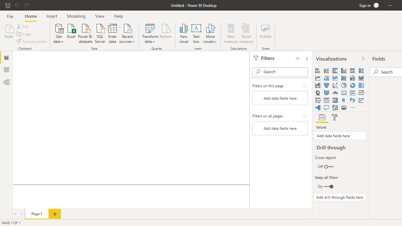
Once you open the Power BI Desktop, the following output is displayed.
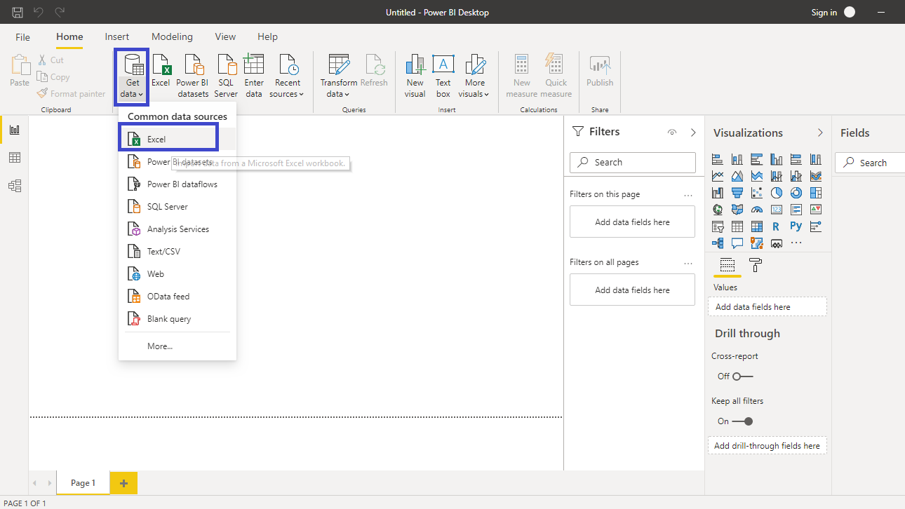
Click on Get data option and select Excel from the options.
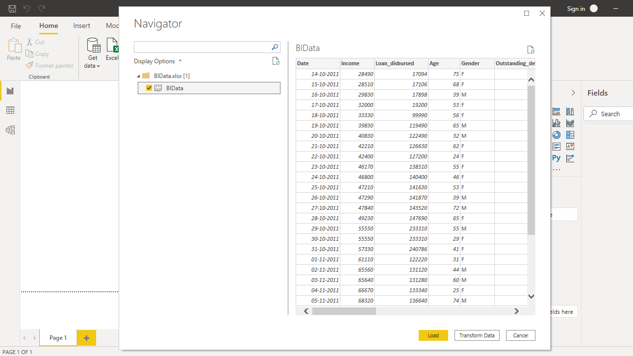
Browse to the location of the file and select it. The name of the file is BIdata.xlsx, and the sheet you will load is BIData sheet. The preview of the data is shown, and once you are satisfied that you are loading the right file, click Load.
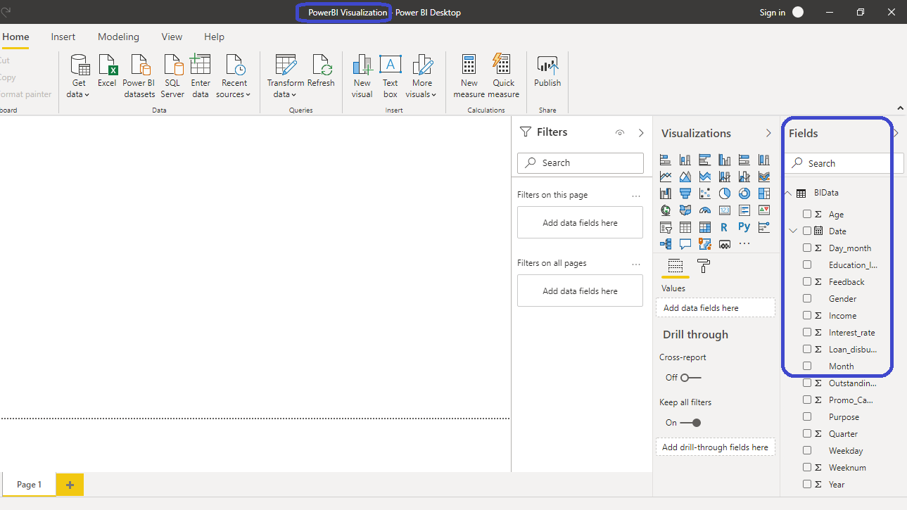
You have loaded the file, and you can save the dashboard. It is named PowerBI Visualization. The Fields pane contains the variables of the data.
Adding Visualization
To begin, you will need a chart, table, or matrix. You will create a line and stacked column chart in this guide. You can locate it in the Visualizations pane. Click on the chart and it will create a chart box in the canvas. Nothing is displayed because you are yet to add the required visualization arguments.

You can resize the chart on the canvas, and the next step is to fill the visualization arguments. Drag the Date variable into the Shared axis field, and Loan_disbursed in the Column values field.

Drag the Interest_rate variable into the Line values field.

You can see that the interest rate values are adding up, which is incorrect. To change it to average, right click and select the Average option.

The above steps will create the desired chart.

You can format the chart and turn on Data labels as shown below. This displays the values in the chart.

To understand the functionality of slicers better, you can add one more chart. This time you will create a tree map chart. Start by clicking on the Treemap option under Visualizations.

Drag the variable Weeknum into ** Group** field, and Loan_disbursed into the Values field.

You have the desired charts into the canvas, and you are now ready to explore the functionality of slicers.
Adding Slicer to the Chart
To begin, click on the Slicer option that creates a slicer box in the canvas.

The slicer you will build is on the Purpose variable. The objective is to look at loan disbursal, interest rate and week number with respect to the Purpose variable. Drag the variable into the Field option as shown below.

You can see the slicer box with different categories of Purpose variable.
Formatting the Slicer
Under the Format pane, you will see various options for formatting the slicer. The Selection controls option details how you can control the slicer display.

Turn on the Show “Select all” option , and turn off the Multi-select with CTRL opton.

If you want to display the charts on the canvas, only for the Education label of the Purpose variable, click on the label as shown below. This will change both the visuals in the canvas, which are now sliced to display only the Education category.

You can perform multiple selections of categories as shown below, which displays the visuals for categories, Education, Home, and Personal.

Now the charts titled Loan_disbursed and Average of Interest_rate by Year and Loan_disbursed by Weeknum will slice the data and display the result for categories, Education, Home, and Personal.
Conclusion
Slicing the data is an integral component of data manipulation and exploratory data analysis. To be able to visualize the different charts at the same time, with single or multiple slicers, is an important skill in descriptive and diagnostic analytics. This a common task and is sector agnostic in nature, which means it has applications across industries such as banking and financial services, manufacturing, utilities, ecommerce, retail, etc. This skill will improve your analytics and business intelligence capabilities.
To learn more about building powerful visualizations in Power BI desktop, please refer to the following guides:
Advance your tech skills today
Access courses on AI, cloud, data, security, and more—all led by industry experts.
