Exploratory Data Analysis in R with Tidyverse
This guide will demonstrate how to use the Tidyverse library, which contains all the necessary tools to perform exploratory data analysis.
Oct 29, 2020 • 8 Minute Read
Introduction
Exploratory data analysis (EDA) is not based on a set set of rules or formulas. It is rather a state of curiosity about a dataset. In the beginning, you are free to explore in any direction that seems valid to you; later, your exploration will depend on the ideas that you can apply to the dataset.
In short, exploratory data analysis is an iterative process that can be divided into three steps:
- Generate questions about your data
- Visualize, transform, and model your data for the answers
- Use your learning to generate more questions
This guide will demonstrate how to use the Tidyverse library, which contains all the necessary tools to perform EDA.
      # installing and loading tidyverse

install.packages("tidyverse")
library(tidyverse)
Asking Questions
To develop an understanding of your data, you have to ask questions. These questions need to focus your attention on a specific part of your dataset. Exploratory data analysis is a creative process, and it focuses on the quality of the questions rather than quantity. But asking a quality question is difficult when you are starting out.
However, there are few questions that are always helpful to start the iteration of analysis:
- What type of variation occurs within the variables?
- What type of covariation occurs between the variables?
The following sections will work on these two questions in a dataset.
Variation
The change of values of a variable is called variation. In real life, there is always some variation because there is always some amount of error involved while measuring quantities. Even categorical variables show variation.
The most efficient way to see the variation is through visualizing the variables' distribution. It can also be called univariate analysis. How to visualize the distribution of a variable depends upon whether it is categorical or continuous.
This guide will do EDA on the following dataset.
      # Loading data
data("diamonds")

# Getting the column names from the dataset
colnames(diamonds)

  "carat"   "cut"     "color"   "clarity" "depth"   "table"   "price"   "x"       "y"       "z"

# lets look at the sample data
head(diamonds)

# A tibble: 6 x 10
  carat       cut       color   clarity  depth  table  price     x     y     z
  <dbl>    <ord>     <ord> <ord>   <dbl> <dbl> <int> <dbl> <dbl> <dbl>
1 0.23      Ideal         E      SI2         61.5    55    326  3.95  3.98  2.43
2 0.21     Premium   E      SI1          59.8    61    326  3.89  3.84  2.31
3 0.23    Good         E      VS1        56.9    65    327  4.05  4.07  2.31
4 0.290 Premium    I      VS2        62.4    58    334  4.2   4.23  2.63
5 0.31     Good        J      SI2         63.3    58    335  4.34  4.35  2.75
6 0.24  Very Good J     VVS2       62.8    57    336  3.94  3.96  2.48
When you look at the data you can decide whether a variable is categorical or continuous. Look at the distribution for the variable cut by plotting a bar chart.
      # Plotting a bar plot

ggplot(data = diamonds) +
  geom_bar(mapping = aes(x = cut))
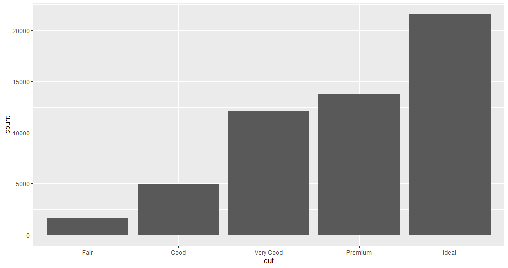
In the plot, you can see the distribution of the variable.
Now, pick a continuous variable and plot its distribution.
      ggplot(data = diamonds) +
  geom_histogram(mapping = aes(x = carat), binwidth = 0.5)
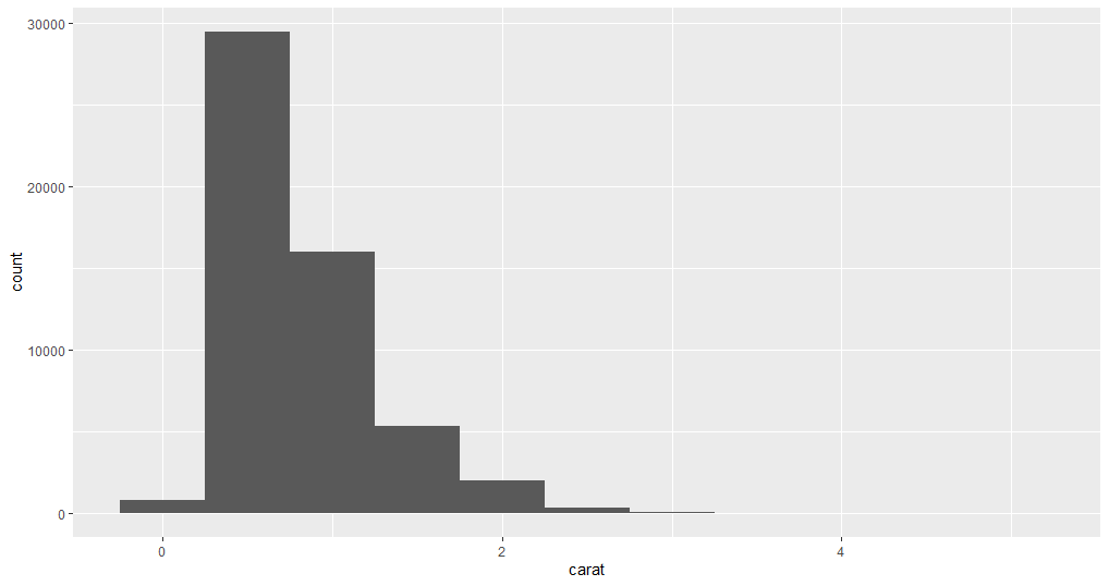
Here, the binwidth argument is used to set the range of the values in each bar of the histogram, the lower the binwidth the detailed information histogram will show.
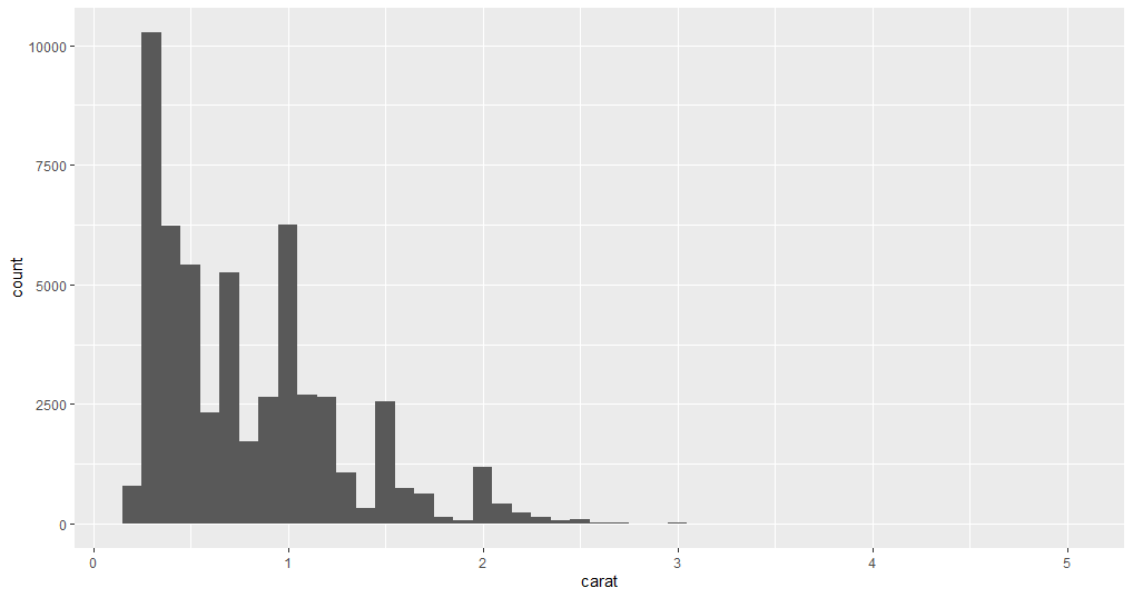
      ggplot(data = diamonds) +
  geom_histogram(mapping = aes(x = carat), binwidth = 0.1)
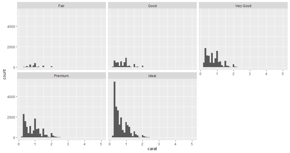
Now that you have analyzed two variables separately, suppose you want to know carat values are distributed for each cut. You can find the answer again by plotting those two variables. The below example plots the data points in two different ways.
      # Creating facets
ggplot(data = diamonds) +
  geom_histogram(mapping = aes(x = carat), binwidth = 0.1)+
  facet_wrap(~cut)
      # Creating frequency polygon
ggplot(data = diamonds, mapping = aes(x = carat, colour = cut)) +
  geom_freqpoly(binwidth = 0.1)
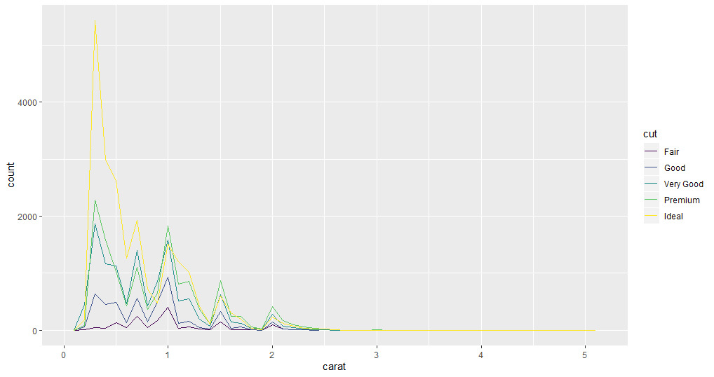
You can decide which plot is better suited for analyzing the variables in your use case.
These variations might prompt questions such as why there are unusual values in some variables, whether there is any pattern in the distribution, etc. How you investigate depends on your data and your thought process.
Covariation
Covariation is when the values of two or more variables vary in a related manner. The best way to discover covariation is to visualize the relation.
This example plots the relationship between two continuous variables: price and carat.
      # plotting a scatter plot

ggplot(data = diamonds) +
  geom_point(mapping = aes(x = carat, y = price))
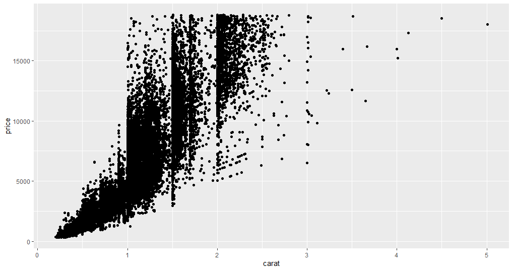
As you can see in the plot, it is obvious that with an increase in carat the price also increases, but due to a large number of data points, it creates an issue of overplot. Overplot is when there are too many data points in a plot, making it very difficult to summarize the findings from the plot.
Instead, try using a boxplot to divide the continuous data points into quartiles. In this example, you will take carat as a categorical variable and create a bin of 0.1.
      # creating boxplot

ggplot(data = diamonds, mapping = aes(x = carat, y = price)) +
  geom_boxplot(mapping = aes(group = cut_width(carat, 0.1)))
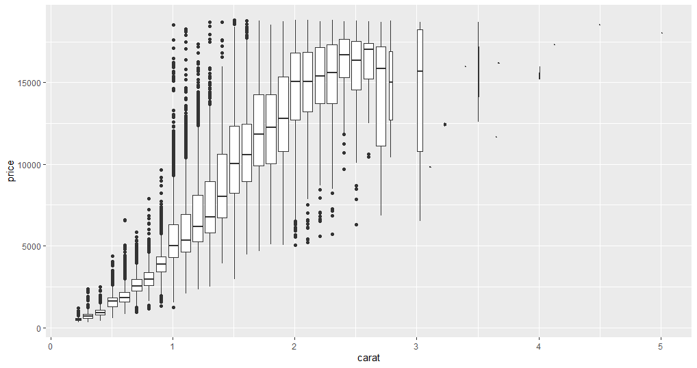
Now you can see a few unusual data points. For instance, some one carat diamonds have an exceptionally high price, and the average price of three carat diamonds is relatively low. The data points above three carats can be ignored because they are not contributing much to the analysis. With this plot, you can find the relationship between two categorical variables or one categorical and one continuous variable.
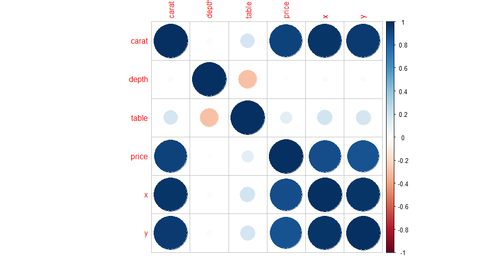
Correlation plot
Another way to find covariation between all continuous columns of the dataset is to create a correlation plot. This method is efficient and can filter out the columns for which you need to do a more detailed analysis.
      #install package
install.packages("corrplot")
      # loading corrplot
library(corrplot)
# Creating correlation matrix for diamonds dataset
D <- cor(diamonds[,c(1, 5,6,7,8,9)])
coorplot(D, method = "circle")
Conclusion
Whenever there is unknown data handed to you for analysis or some other work you will need to do exploratory data analysis. To do an efficient exploratory data analysis in R you will, knowledge of a few packages will help you write code for handling data. The most important libraries are ggplot2 and dplyr. You can get more information here.
Advance your tech skills today
Access courses on AI, cloud, data, security, and more—all led by industry experts.
