Implement Clustering in Power BI
In this guide, you will learn how to implement two types of clustering in Power BI Desktop: bivariate and multivariate.
Nov 16, 2020 • 9 Minute Read
Introduction
Clustering is an unsupervised machine learning algorithm that looks for patterns in data by dividing it into clusters. These clusters are created such that the points are homogenous within the cluster and heterogenous across clusters. Clustering is commonly used in market segmentation and several areas of marketing analytics.
In this guide, you will learn how to implement clustering in Power BI Desktop. You will implement two types of clustering: bivariate and multivariate.
Data
In this guide, you will work with a fictitious data set of bank loan disbursal across years. The data contains 3000 observations and 17 variables. You can download the dataset here. The major variables are described below:
- Date: Loan disbursal date.
- Income: Annual Income of the applicant (in US dollars).
- Loan_disbursed: Loan amount (in US dollars) disbursed by the bank.
- Age: The applicant’s age in years.
- Gender: Whether the applicant is female (F) or male (M).
- Interest_rate: Annual interest rate, in percentage, charged for the disbursed loan.
- Purpose: Purpose for which loan was taken.
- Weeknum: Week number of the year.
- Outstanding_debt: Outstanding debt (in US dollars) of the applicant prior to loan disbursal.
Start by loading the data.
Loading Data
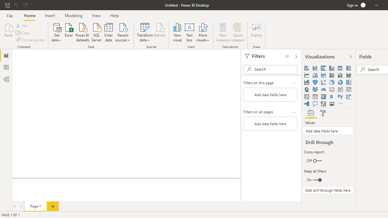
Once you open Power BI Desktop, the following output is displayed.
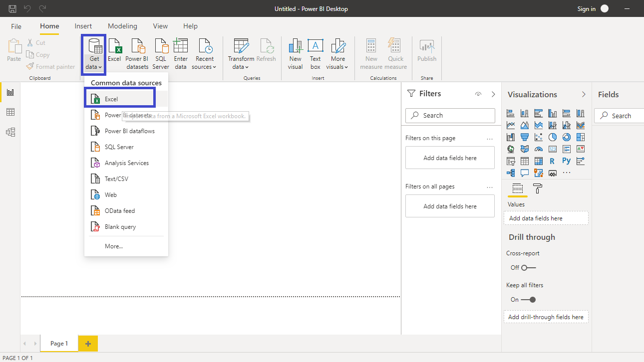
Click on Get data and select Excel from the options.
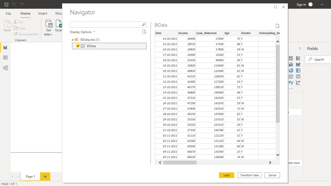
Browse to the location of the file and select it. The name of the file is BIdata.xlsx, and the sheet you will load is BIData sheet. The preview of the data is shown, and once you are satisfied that you are loading the right file, click Load.
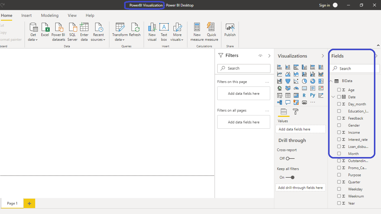
You have loaded the file, and you can save the dashboard. It is named PowerBI Visualization. The Fields pane contains the variables of the data.
Bivariate Clustering
Bivariate clustering refers to the technique of finding clusters in the data when you have two quantitative variables. The two variables to be used for clustering are Income and Loan_disbursed. To implement bivariate clustering, a scatter chart is a powerful visualization plot. You can locate it in the Visualizations pane.

Click on the chart shown above, and it will create a chart box on the canvas. Nothing is displayed yet because you are yet to add the required visualization arguments. These are added in the options located under the Visualizations pane.

You can resize the chart on the canvas. Another thing you can do is collapse the Filters option in the pane with the arrow > sign.

The next step is to fill the visualization arguments under the Fields option as shown below. Drag the variable Income into the X Axis field and Loan_disbursed into the Y Axis field. You also need to provide a variable in the Details field for displaying the scatter plot against that variable. Drag the Weeknum variable into the Details field.

The scatter chart is created and the next step is to create clusters. Right-click on the three dots … shown below, and you will have the option to Automatically find clusters.

The step above will create an option to select the number of clusters. You also have the option of keeping it automatic, but in this case, you will set the number of clusters to four.

Click on OK, and Power BI will work in the background to create and add the four clusters to the bivariate scatter chart. You can see the distinction of the cluster points through the different cluster colors.

In the output above, you can see that Power BI has created a new variable, Weeknum (clusters), and placed it in the Legend field. This gives you the flexibility to use this new variable in the same manner as any other variable in the original dataset.
Multivariate Clustering
In the above section, you implemented clustering on two variables. Quite often in business intelligence and analytics, you will want to consider multiple variables for clustering. In such cases, you can extend the above analysis and include multiple variables. To do this, start by resizing the scatter chart to make space for multivariate clustering, and click on Table under the Visualizations pane.

Click on the Table chart shown above, and it will create a table on the canvas. Nothing is displayed yet because you are yet to add the required visualization arguments.

Under the Values field, as shown below, drag the variables Weeknum, Income, Loan_disbursed, Interest_rate, Age, and Outstanding_debt. This will generate the following table.

The next step is to create clusters. To do this, right-click on the three dots as before, and select Automatically find clusters.

In the option pane that will be generated, give the name Multivariate Clusters. Set the Number of clusters value to Auto.

Clicking OK will create a Multivariate Clusters variable and add it to the table. It will also add it to the Values field.

You can analyze the clusters better in the same manner as any other variable of the original dataset. For example, you can click on the Table chart option, which will create a table in the canvas.

Click on the chart, and under Values, drag the Multivariate Clusters variable twice.

Right-click on the second Multivariate Clusters variable and select Count.

Completing the above step will generate the following output.

The output above shows that three clusters were created. Cluster1 has 905 records, while Cluster2 and Cluster3 have 72 and 2023 observations, respectively.
Conclusion
Clustering is an unsupervised machine learning technique with several application areas. A financial services company might want to create customer segments using clustering to enable them serve and target these customers better. In this guide, we looked at one such example, where clustering was applied on bank data for disbursing loans. Clustering is also used for predictive modelling, where you can create clusters and then predict the target variable. Marketing budgets are allocated in many organizations based on statistical segmentation, referred to as clustering.
In this guide, you learned how to implement clustering in Power BI Desktop. This is a great skill set to add because clustering is a sector-agnostic discipline and is used across industries such as manufacturing, utilities, ecommerce, retail, and almost every other industry.
To learn more about building powerful visualization in Power BI Desktop, please refer to the following guide:
Advance your tech skills today
Access courses on AI, cloud, data, security, and more—all led by industry experts.
