Installing and Using Chakra UI with React
Chakra UI gives you more power to style and customize components. If you're a fan of Tailwind CSS's minimalist and modular approach, you'll love Chakra UI.
Oct 30, 2020 • 9 Minute Read
Introduction
Compared to other React UI libraries like React Bootstrap, Material UI, etc., Chakra UI gives you much more power to style and customize components.
If you are a fan of Tailwind CSS, you will love Chakra UI since it follows the same minimalistic and modular approach as Tailwind CSS.
In this guide, we will discuss how to install, import, and use components from Chakra UI. We will use Chakra UI version 0.8 since version 1.0 is yet to be released officially.
Installation
To install chakra-ui, run the following command in your project's root directory.
npm install @chakra-ui/core @emotion/core @emotion/styled emotion-theming
Chakra UI uses Emotion for handling component styles. As you can see, you have to install peer dependencies yourself as they do not come with chakra-ui by default.
Next, wrap your React app in a ThemeProvider. Modify your index.js like this.
      import React from "react";
import ReactDOM from "react-dom";
import App from "./App";
import { ThemeProvider } from "@chakra-ui/core";

ReactDOM.render(
  <ThemeProvider>
    <App />
  </ThemeProvider>,
  document.getElementById("root")
);
Importing Box Component
In this section, we will import the Box component from chakra-ui.
One of the coolest features of chakra-ui is that you can use shorthand for props. For example, instead of width, you can use w, which will work the same.
First, import Box from chakra-ui in App.js and use it inside the App() function.
import React from "react";
import { Box } from "@chakra-ui/core";
export default function App() {
return (
<div>
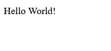
<Box w="400px" h="400px">
Hello World!
</Box>
</div>
);
}
In the above code, w and h are shorthand for width and height respectively.
Here is how this will look.
Styling Box Component
The Box component in the above example doesn't look like a box, just some text in some corner of the app. Add some background color using bg shorthand prop.
      <Box bg="lavender" w="400px" h="400px">
  Hello World!
</Box>
Here is how this will look.
.png)
You can now differentiate the 400x400 box from the background. Next, style the text and horizontally align it in the center of the box.
      <Box
  bg="lavender"
  color="#2d383c"
  fontSize="2rem"
  textAlign="center"
  fontFamily="Consolas"
  w="400px"
  h="400px"
>
  Hello World!
</Box>
You passed color, textAlign, fontSize and fontFamily prop to style the text inside the box. Here 1rem is equal to 16px.
Here is how this will look.
.png)
Now, add a border to the box using the border prop.
      <Box
  border="1px"
  rounded="10px"
  borderColor="gray.300"
  boxShadow="md"
  bg="lavender"
  color="#2d383c"
  fontSize="2rem"
  textAlign="center"
  fontFamily="Consolas"
  w="400px"
  h="400px"
>
  Hello World!
</Box>
Here rounded is shorthand for border-radius, and boxSahdow is shorthand for box-shadow. You have used md as the value of boxShadow prop, which is equivalent to 16px.
Here is how this will look.
.png)
To add some margin and padding, use the shorthand prop p and m. You can also use px and py where px sets the padding for left and right. Similarly, py sets it for top and bottom.
Also, change the text Hello World! to Lorem Ipsum.
      <Box
  m="8px"
  p="8px"
  border="1px"
  rounded="10px"
  borderColor="gray.300"
  boxShadow="md"
  bg="lavender"
  color="#2d383c"
  fontSize="2rem"
  textAlign="center"
  fontFamily="Consolas"
  w="400px"
  h="400px"
>
  Lorem ipsum dolor sit amet, consectetur adipisicing elit. Molestias aperiam
  doloremque exercitationem saepe, sed modi odit officia illum iste vel? Rerum
  dignissimos pariatur, odit impedit iste aperiam facere atque iure!{" "}
</Box>
.png)
As you can see, the text is overflowing the Box component; you can fix this by passing overflow="hidden" prop to Box.
      <Box
  m="8px"
  p="8px"
  border="1px"
  rounded="10px"
  borderColor="gray.300"
  boxShadow="md"
  bg="lavender"
  color="#2d383c"
  fontSize="2rem"
  textAlign="center"
  fontFamily="Consolas"
  w="400px"
  h="400px"
  overflow="hidden"
>
  Lorem ipsum...
</Box>
.png)
isTruncated is another cool prop you can pass to truncate long texts.
      <Box
  m="8px"
  p="8px"
  border="1px"
  rounded="10px"
  borderColor="gray.300"
  boxShadow="md"
  bg="lavender"
  color="#2d383c"
  fontSize="2rem"
  textAlign="center"
  fontFamily="Consolas"
  w="400px"
  h="400px"
  isTruncated
>
  Lorem ipsum ....
</Box>
.png)
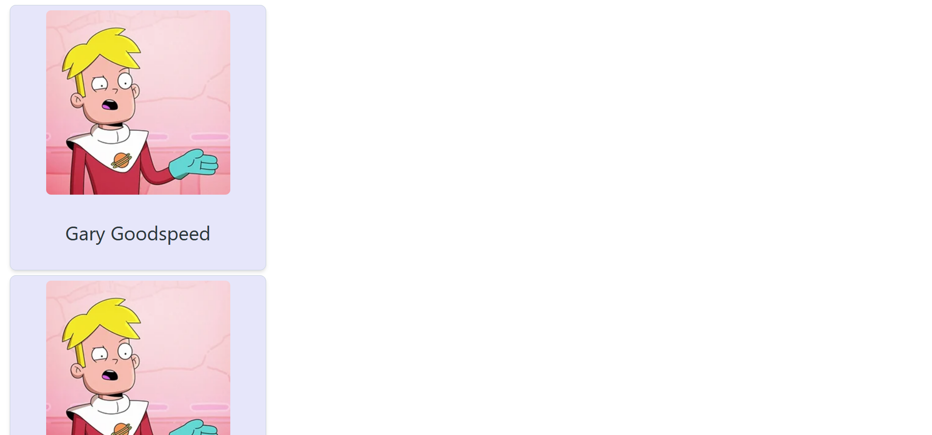
Adding Image to Box
In this section, you will add an image to the Box component in the above example. For this, you will use the Image and Text components.
Import Image and Text in your App.js.
import { Box, Image, Text } from "@chakra-ui/core";
Now add these components inside the Box component.
      <Box
  m="8px"
  p="8px"
  border="1px"
  rounded="10px"
  borderColor="gray.300"
  boxShadow="md"
  bg="lavender"
  color="#2d383c"
  fontSize="2rem"
  textAlign="center"
  fontFamily="Consolas"
  w="400px"
  h="400px"
>
  <Image
    rounded="0.5rem"
    src="https://finalspaceapi.com/img/gary_goodspeed.webp"
    alt="Gary Goodspeed"
  />
  <Text>Gary Goodspeed</Text>
</Box>
.png)
What if there are multiple boxes one after another?
Copy and paste this box multiple times.
      <div>
  <Box>
    <Image
      rounded="0.5rem"
      src="https://finalspaceapi.com/img/gary_goodspeed.webp"
      alt="Gary Goodspeed"
    />
    <Text>Gary Goodspeed</Text>
  </Box>

  <Box>
    <Image
      rounded="0.5rem"
      src="https://finalspaceapi.com/img/gary_goodspeed.webp"
      alt="Gary Goodspeed"
    />
    <Text>Gary Goodspeed</Text>
  </Box>

  <Box>
    <Image
      rounded="0.5rem"
      src="https://finalspaceapi.com/img/gary_goodspeed.webp"
      alt="Gary Goodspeed"
    />
    <Text>Gary Goodspeed</Text>
  </Box>
</div>
Here is how this will look.
You can make the layout of this card system responsive by using the SimpleGrid component. First, import the SimpleGrid component in your App.js.
import { Box, Image, Text, SimpleGrid } from "@chakra-ui/core";
Now wrap all the Box components inside this SimpleGrid component.
Pass the minChildWidth prop to this SimpleGrid component, which will adjust the arrangement of the boxes according to minChildWidth.
Here the boxes are of 400x400px dimension, so you can pass 410px as minChildWidth.
      <SimpleGrid minChildWidth="410px">
  <Box> ...</Box>
  <Box> ...</Box>
  <Box> ...</Box>
  <Box> ...</Box>
  <Box> ...</Box>
  <Box> ...</Box>
  <Box> ...</Box>
  <Box> ...</Box>
  <Box> ...</Box>
</SimpleGrid>
Here is how this will look.
There is still so much more that you can do to customize and style components in Chakra UI.
Conclusion
In this guide, we discussed how to install chakra-ui in a React app. We also covered how to import and customize different components from chakra-ui.
Chakra UI is the perfect choice for your React app when you want to customize components and want your app to have a unique look, which is difficult to achieve in other React UI libraries like React Bootstrap, Material UI, etc.
Here are some additional resources that can be helpful.
Happy coding!
Advance your tech skills today
Access courses on AI, cloud, data, security, and more—all led by industry experts.
