Create a Hover Button in a React App
Learn how to create a hover button in a React app using CSS and mouse events. This guide covers hover effects like color change, grow/shrink, and opacity.
Sep 17, 2020 • 12 Minute Read
Introduction
This guide will discuss the step-by-step process of creating a hover button in a React app. We will see two methods of creating a hover button: using pure CSS and using mouse events in the React app. We will also discuss different effects of a hover button such as grow, shrink, change color, etc.
Using Hover Selector
In this section, you will create a button with a hover effect using pure CSS, with :hover selector. When a hover selector is used with an element, that element gets selected when you hover over it.
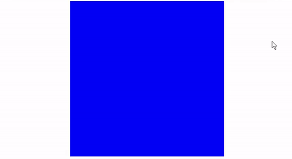
This example has a div with className="example" and a blue background:
      import React from "react";
import "./style.css";

export default function App() {
  return (
    <div className="example">

    </div>
  );
}
Here is the CSS for this div:
      .example {
    background: blue;
    width: 400px;
    height: 400px;
    margin: 0 auto;
}
Here is how this div will look:
.png)
If you add a :hover selector to this div then as long as you are hovering over the div, the CSS inside :hover will take effect.
      .example:hover {
    background: black;
}
In this case, background property inside .example:hover{} will override the background property under .example as long as you move your mouse over it.
You can explore this example on Stackbitz.
Creating a Button
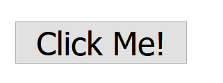
Create a simple button with className="click" in your App.js file like this:
      import React from "react";
import './App.css'
function App() {
  return (
    <div className="App">
    <button className="click">Click Me!</button>
    </div>
  );
}

export default App;
Here is how your button will look like by default, without any custom styling.
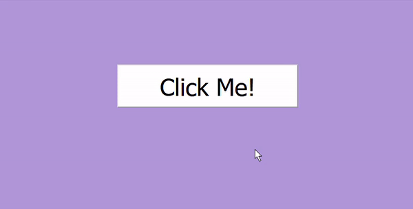
Style this button by adding the following code in the App.css file.
      html {
    background: #b19cd9;
}

.App {
    display: flex;
}

.click {
    width: 300px;
    background: white;
    font-size: 40px;
    margin: 100px auto;
    padding: 10px;
    cursor: pointer;
}
The above CSS code will change the app's background color and style the button to look like this.
.png)
Now you will add the effects that will be seen when you hover on the button.
- Opacity
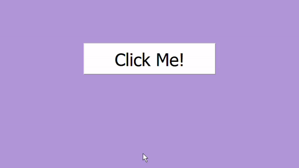
Opacity refers to the transparency of an element. Add the following code to App.css for the opacity hover effect.
      .click:hover {
    opacity: 0.3;
}
You can see the above code in action by hovering on the button.
- Color Change
As discussed in the above example, you can change the button's color using a hover selector like this.
      .click:hover {
    background: palegreen;
}
Here is the above code in action.
- Grow/Shrink
You can grow or shrink an element using the scale() function in CSS. You can read more about this here.
To create a grow hover effect, add scale() to the transform property. The number inside scale() represents the scaling vector.
      .click:hover {
    transform: scale(2);     /* Equal to scaleX(2) scaleY(2) */
}
Here is how this will look.
.gif)
As you can see above, the transformation is instantaneous and doesn't look right. You can fix this by adding a delay using the transition-duration property.
      .click:hover {
    transform: scale(2);
    transition-duration: 0.5s;
}
You can see this delay in transformation here.
.gif)
Using the same scale() function, you can also shrink an element. To shrink an element, you have to specify a number less than one inside scale() like this.
      .click:hover {
    transform: scale(0.6);
    transition-duration: 0.5s;
}
Here is how this effect will look.
.gif)
You can explore this example here.
Using Mouse Events
In this section, you will create a button with a hover effect using mouse events in React. Based on the app requirements, you can use different mouse events such as onClick, onContextMenu, onDoubleClick, onDrag, onDragEnd, etc. You can see the complete list here.
For hover effect you will use onMouseEnter and onMouseLeave events. As the name suggests, onMouseEnter will be triggered when the mouse enters an element, and onMouseLeave will be triggered when the mouse leaves an element. This will be more apparent with an example.
Example
Consider a div that is the same as the blue div discussed in the example above. Here is the code for a blue div with inline styling:
      import React from "react";

export default function App() {
 return (
   <div style={{ width: "400px", height: "400px", background: "blue" }}></div>
 );
}
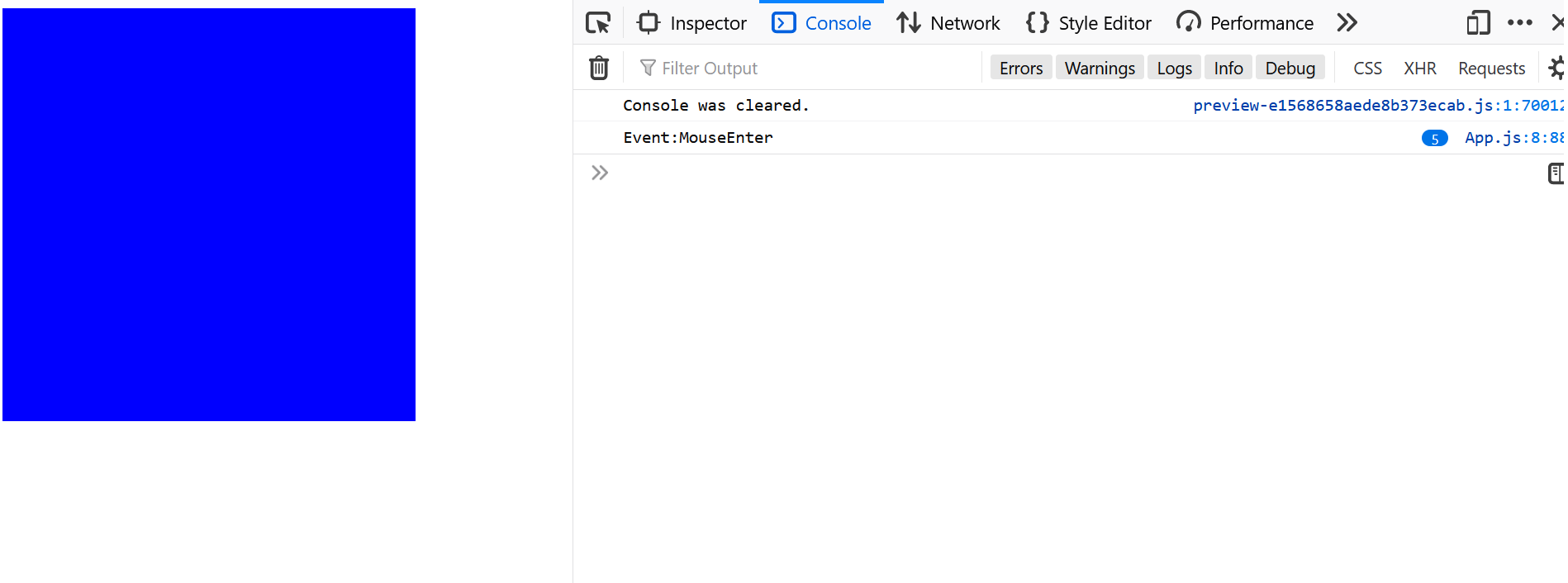
Here is how this div will look.

Now add the onMouseEnter event to this div. This event will take an arrow function, which will log the event name in the console. It is crucial to use the arrow function; otherwise, the event will only occur once, when the component is mounted.
      return (
  <div
    onMouseEnter={() => {
      console.log("Event:MouseEnter");
    }}
    style={{ width: "400px", height: "400px", background: "blue" }}
  ></div>
);
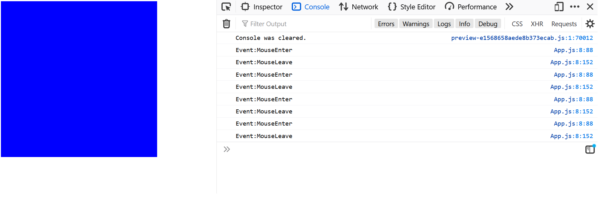
Open the console by pressing CTRL + Shift + K in Firefox or CTRL + Shift + J in Chrome. Now try hovering over the div. You will see that the event name is logged in the console.
You can similarly add an onMouseLeave event to this div.
      <div
  onMouseEnter={() => {
    console.log("Event:MouseEnter");
  }}
  onMouseLeave={() => {
    console.log("Event:MouseLeave");
  }}
  style={{ width: "400px", height: "400px", background: "blue" }}
></div>;
You can explore this example on Stackblitz.
Creating a Button
Add the following code to App.js to create a simple button. The style object styles is used with the inline style attribute.
import React from "react";
function App() {
const styles = {
width: "100px",
fontSize: "20px",
borderRadius: "40px",
border: "1px solid black",
color: "#fafafa",
margin: "0.5em 1em",
padding: "0.25em 1em",
background: "#c83f49",
};
return (
<div className="App">
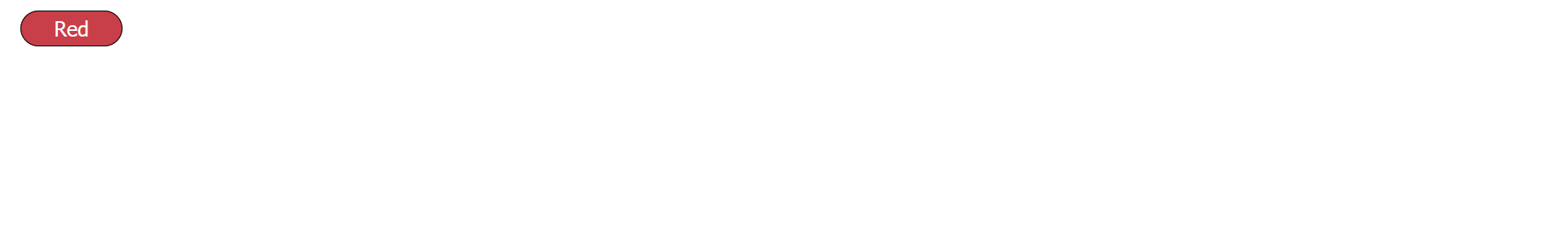
<button style={styles}>
{" "}
Red
</button>
</div>
);
}
export default App;
Here is how this button will look.
For this example, you will use mouse events to change states with React hooks. When the user hovers over the button, the entire app's background color will be changed according to the button's color, Red or #c83f49 (hex code for strawberry red).
Import useState in App.js file.
import React, {useState} from "react";
Next, define a new state bgColour and give it an initial value of #fafafa. This is the hex code for very light gray.
      import React, {useState} from "react";

function App() {

const [bgColour, setBgColour] = useState("#fafafa")

...
}
Set this state as the background color of the app. For this, you will need to create another style object named appStyles for the div with className="App". For the background property, add the state bgColour using the template literals.
      function App() {

const [bgColour, setBgColour] = useState("#fafafa")

const appStyles={
  height:"100vh",
  background:`${bgColour}`
}
...
}
Add this appStyles object to the div.
      <div className="App" style={appStyles}>
</div>
You will see that the app's background color will change, though the change is very slight.
For the final step, you will add the onMouseEnter and onMouseLeave events to this button. Inside the arrow function, you will update the bgColour state with the #c83f49 when the onMouseEnter event is triggered and revert it back to #fafafa when the mouse leaves the button or onMouseLeave event is triggered using setBgColour() function.
      return (
    <div className="App" style={appStyles}>
      <button
        className="primary"
        style={styles}
        onMouseEnter={() => setBgColour("#c83f49")}
        onMouseLeave={() => setBgColour("#fafafa")}
      >
        {" "}
        Red
      </button>
    </div>
  );
And it's done, you can see the above code in action.

Here is the complete code for this background color changing hover effect.
      import React, { useState } from "react";

function App() {
  const [bgColour, setBgColour] = useState("#fafafa");

  const appStyles = {
    height: "100vh",
    background: `${bgColour}`,
  };

  const styles = {
    width: "100px",
    fontSize: "20px",
    borderRadius: "40px",
    border: "1px solid black",
    color: "white",
    margin: "0.5em 1em",
    padding: "0.25em 1em",
    background: "#c83f49",
  };

  return (
    <div className="App" style={appStyles}>
      <button
        style={styles}
        onMouseEnter={() => setBgColour("#c83f49")}
        onMouseLeave={() => setBgColour("#fafafa")}
      >
        {" "}
        Red
      </button>
    </div>
  );
}

export default App;
You can explore this example on Stackblitz.
Conclusion
In this guide, we discussed two methods of creating a hover button in a React app. The first method, pure CSS, is ideal for when the button itself does transformations such as grow, shrink, etc. The second method, using mouse events, is perfect when hovering on a button changes React components.
Here are a few resources that you may find useful:
Happy coding!
Learn More
Explore these React & CSS courses from Pluralsight to continue learning:
Advance your tech skills today
Access courses on AI, cloud, data, security, and more—all led by industry experts.
