Create a Reference Distribution in Tableau
Aug 14, 2020 • 6 Minute Read
Introduction
In business analytics, it is often required to visualize and interpret the distribution of a measure. One such technique is using reference distributions, which add a gradient of shading to indicate the distribution of values along the axis. The shading is computed using statistical computations like percentage, percentiles, quantiles, and standard deviation. In this guide, you will learn how to create a reference distribution in Tableau.
Data
The data used in incorporating the reference distribution consists of measures. The view might contain the combination of date and measures, or that of dimensions and measures. The gradient of the distribution range is represented with the help of different colors.
In this guide, you will use the Sample Superstore data source available in the Tableau repository. The variables to be used are Ship Mode and Ship Date.
Building Blocks
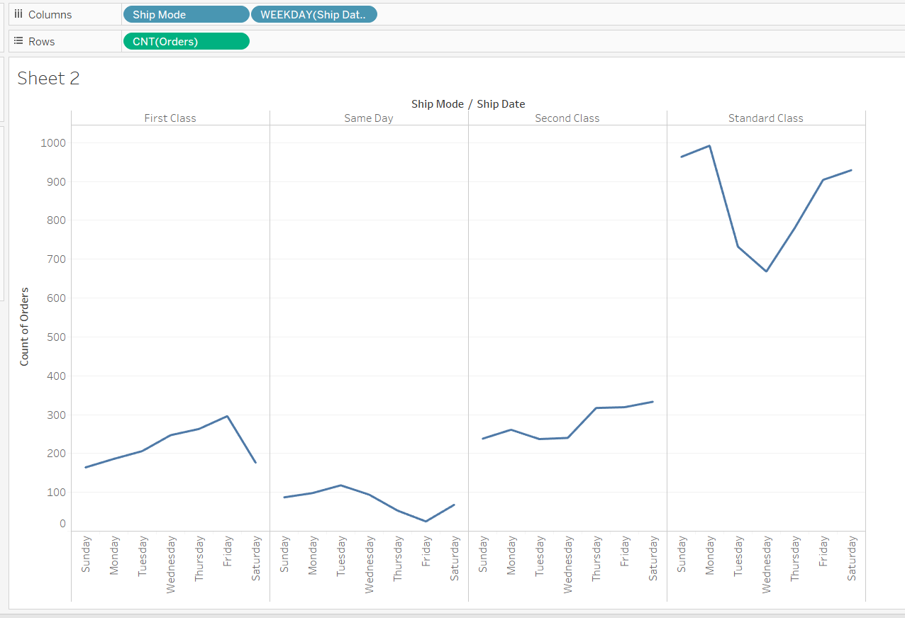
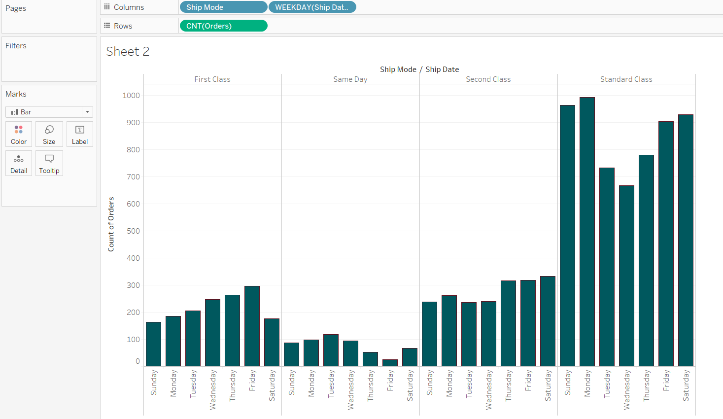
To begin, you will build a view on top of which the distribution range will be added. The objective is to build a view that displays count of orders against shipping mode and date. For this demonstration, you will set the shipping date to weekdays, i.e. Monday to Sunday.
Start by dragging the Ship Mode and Ship Date to the Columns shelf.
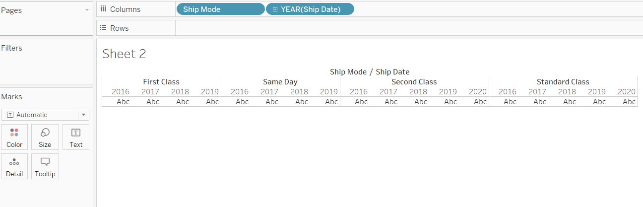
Next, right click on Ship Date and select Weekday from the More options list.
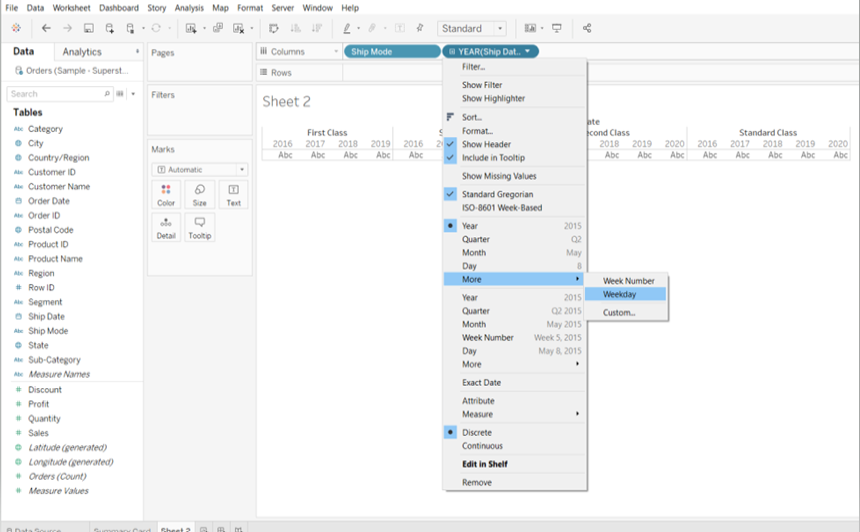
The next step is to drag the Orders (Count) field from the measures pane into the Rows shelf. In the upgraded version of Tableau, Orders (Count) field is auto generated by counting the number of records. In the older version, the corresponding field was called Number of Records.
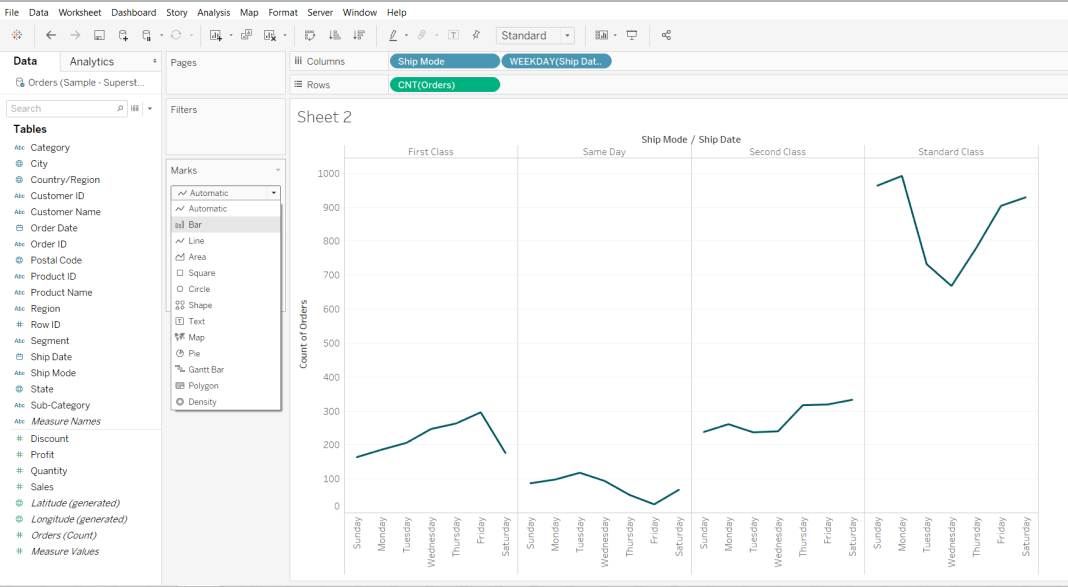
Change the Marks option to Bar.
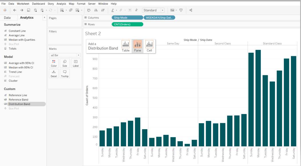
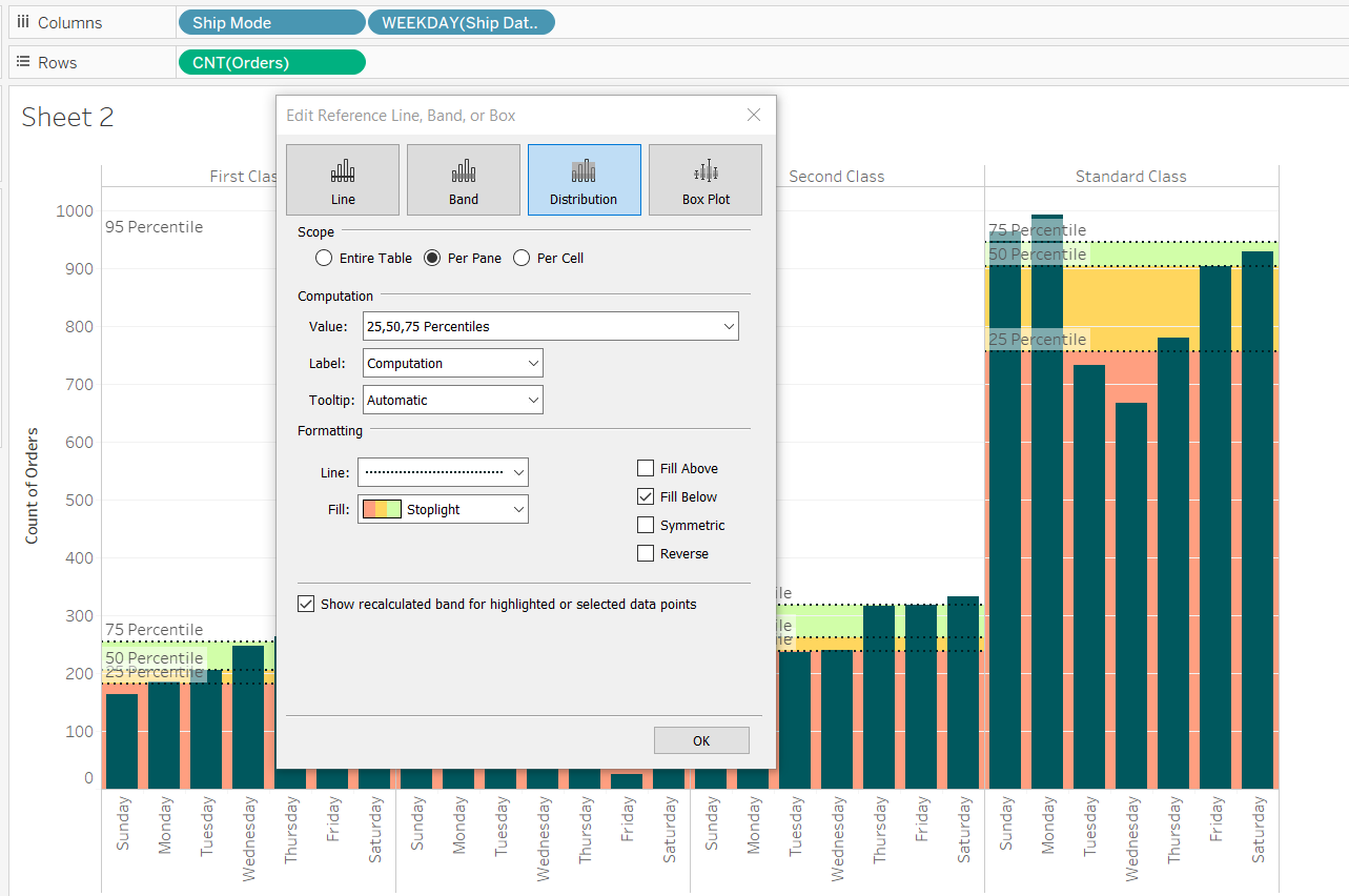
Adding Reference Distribution
To add a reference distribution, go to the Analytics pane, and drag the Distribution Band to the view. You will have three options for distribution: table, pane, and cell level. Select Pane from the three options for this demo.
Once you select the Pane option, a pop-up window is generated that requires further input. The first input is to provide the Value. These are percentile values and you will provide the values of 25, 50, and 75. This will display the information regarding the percentage of data points falling below these percentile values.
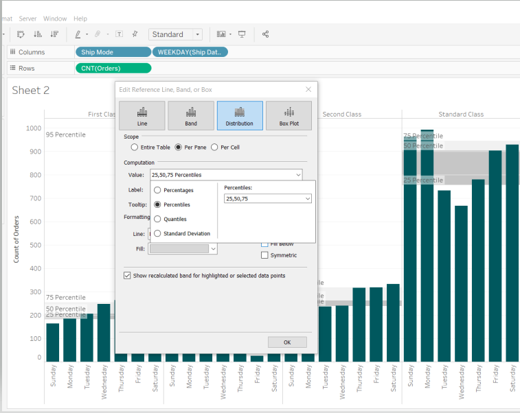
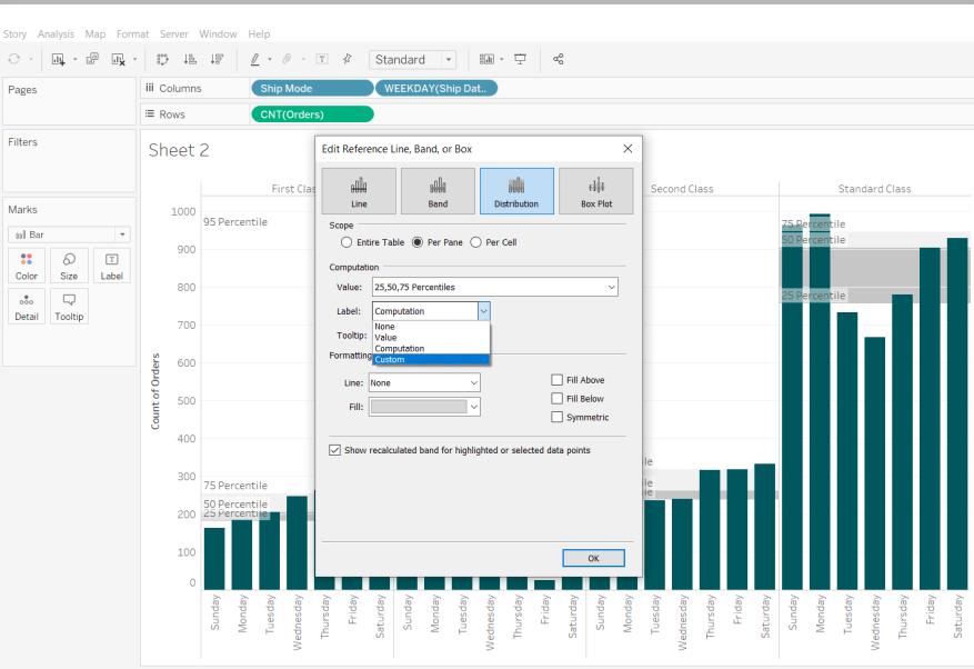
The second input under Computation is Label. Select the Custom option.
The next input required is for Formatting. Provide the inputs as shown below. The Fill Below option will ensure the points below the percentile is represented with different colors.
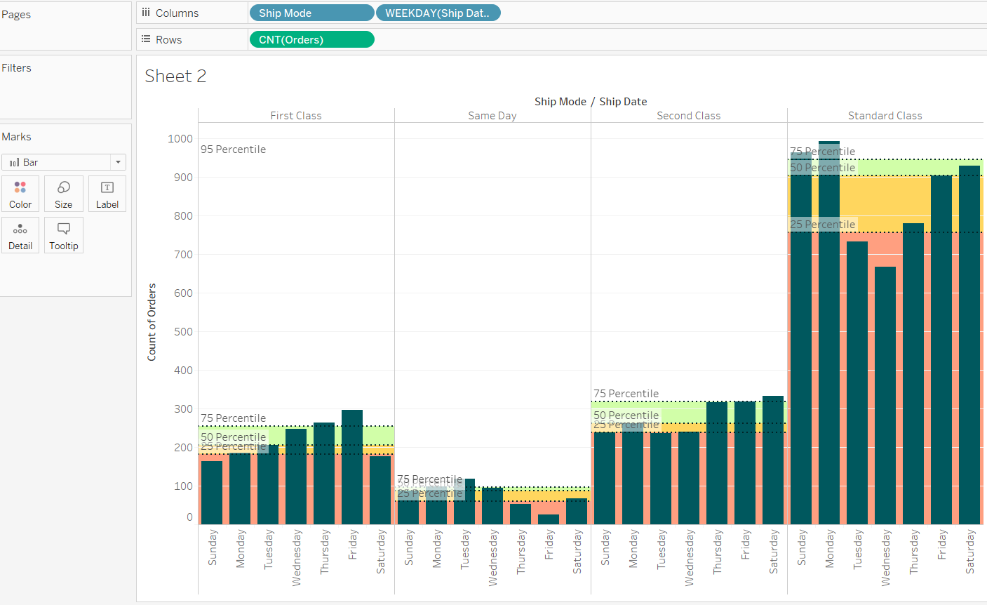
Completing the above steps will produce the final output. You can see that there are three colors, which represent the percentage of data points falling below the three percentile levels of 25th Percentile, 50th percentile, and 75th Percentile, respectively.
Conclusion
In this guide, you learned how to create a reference distribution in Tableau. This will help in strengthening your descriptive and diagnostic analytical capabilities.
To learn more about visualization and data analysis using Tableau, please refer to the following guides:
Advance your tech skills today
Access courses on AI, cloud, data, security, and more—all led by industry experts.
