
- Course
Creating an Adaptive and Responsive Layout in Axure
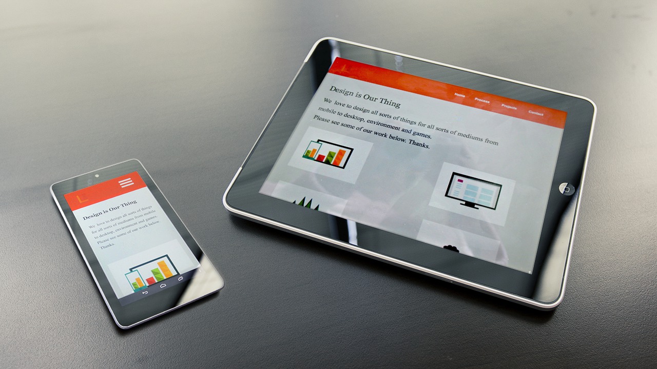
In this tutorial we'll learn how to use Axure's features to create a layout for web that is responsive and adaptive to different screen sizes on mobile devices. Software required: Axure RP Pro 7.0.
Advanced
- Course
Creating an Adaptive and Responsive Layout in Axure
In this tutorial we'll learn how to use Axure's features to create a layout for web that is responsive and adaptive to different screen sizes on mobile devices. Software required: Axure RP Pro 7.0.
Advanced
Get started today
Access this course and other top-rated tech content with one of our business plans.
Try this course for free
Access this course and other top-rated tech content with one of our individual plans.
This course is included in the libraries shown below:
- Core Tech
What you'll learn
In this tutorial we'll learn how to use Axure's features to create a layout for web that is responsive and adaptive to different screen sizes on mobile devices. We’ll learn how to create breakpoints, a responsive background, customize content to different screens and create a mobile prototype with a slide menu. Software required: Axure RP Pro 7.0.
Creating an Adaptive and Responsive Layout in Axure
Advanced
Table of contents
