
- Course
Charting Data with Excel
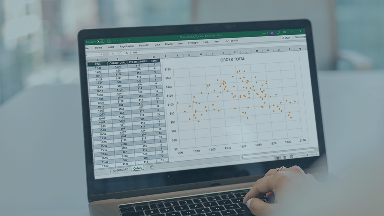
It is often difficult to read and understand complex data by looking at a big table of numbers. Using Excel's rich charting tools, you will learn how to transform data into compelling visuals and uncover the important insights.
Beginner
- Course
Charting Data with Excel
It is often difficult to read and understand complex data by looking at a big table of numbers. Using Excel's rich charting tools, you will learn how to transform data into compelling visuals and uncover the important insights.
Beginner
Get started today
Access this course and other top-rated tech content with one of our business plans.
Try this course for free
Access this course and other top-rated tech content with one of our individual plans.
This course is included in the libraries shown below:
- Data
What you'll learn
Data is an increasingly important part of our organizations, and it's critical that you learn how to effectively communicate and visualize this information. In this course, Charting Data with Excel, you will gain the ability to work with several fundamental components of Excel's charting tools. First, you will learn how to create and change charts. Next, you will discover how to work with multiple data series. Finally, you will explore how to enhance your charts with features like trendlines and secondary axes. When you are finished with this course, you will have the skills and knowledge of Excel charts needed to build a dashboard full of interesting visuals for your data.
Charting Data with Excel
Beginner
Carlos Gutierrez is a Software Engineer working in the highly competitive world of professional motorsports. His career is focused on data analysis and application development for technical collaboration and decision making. Carlos uses SQL Server, .NET Framework, WPF, UWP, Office 365, R and Azure to build end-to-end solutions for a fast paced, dynamic industry.
