
- Course
Visualize Data with PivotCharts in Microsoft Excel
Are you struggling to present data to your colleagues in a meaningful way? This course will teach you how to create and customize PivotCharts, what type of chart should be used in a certain instance, and how to provide interactivity on a chart.
Intermediate
Get started today
Access this course and other top-rated tech content with one of our business plans.
Try this course for free
Access this course and other top-rated tech content with one of our individual plans.
This course is included in the libraries shown below:
- Data
What you'll learn
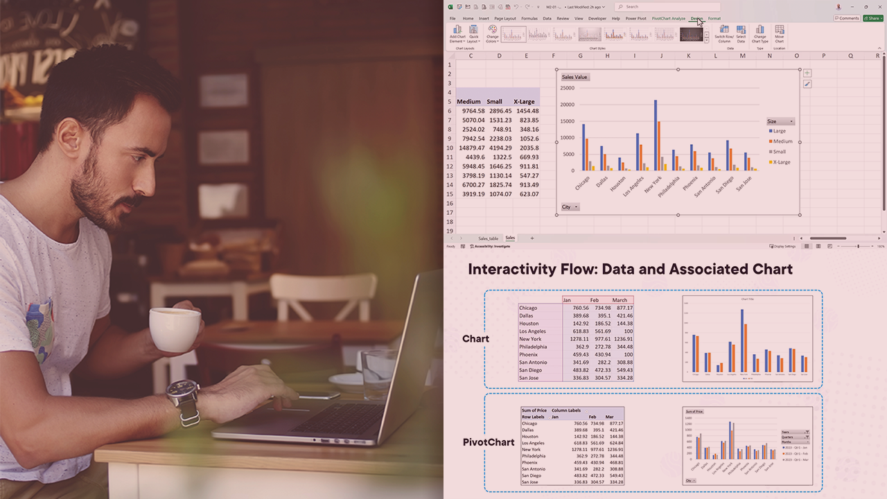
A picture is worth a thousand words, or in our case, a thousand data points! However, understanding the trend across a thousand, ten thousand, or even a million data points is difficult without some sort of summarization or visualization technique. In this course, Visualize Data with PivotCharts in Microsoft Excel, you’ll gain the ability to create stunning, interactive PivotCharts that allow you to tell the story of your data. First, you’ll explore how to create PivotCharts. Next, you’ll discover how to customize PivotCharts to enable you to highlight specific data points. Finally, you’ll learn how to add interactivity onto your PivotCharts. When you’re finished with this course, you’ll have the skills and knowledge of PivotCharts in Microsoft Excel needed to create and present the story behind your data.
Visualize Data with PivotCharts in Microsoft Excel
Intermediate
Table of contents
Ben is a Power BI & Data Specialist with a healthy interest in Microsoft Project with over 30 years of customer and implementation experience. He has been a Microsoft MVP for 13 years, is a frequent speaker at several European conferences, and blogs and creates videos on a semi-regular basis.
