
- Course
Advanced Data Visualization Techniques in R
Unlock advanced visualizations in R to create effective and meaningful plots. This course explores the creation of professional plots with ggplot2 for detailed colors, labeling, and animations for powerful data storytelling — all within R.
Advanced
Get started today
Access this course and other top-rated tech content with one of our business plans.
Try this course for free
Access this course and other top-rated tech content with one of our individual plans.
This course is included in the libraries shown below:
- Data
What you'll learn
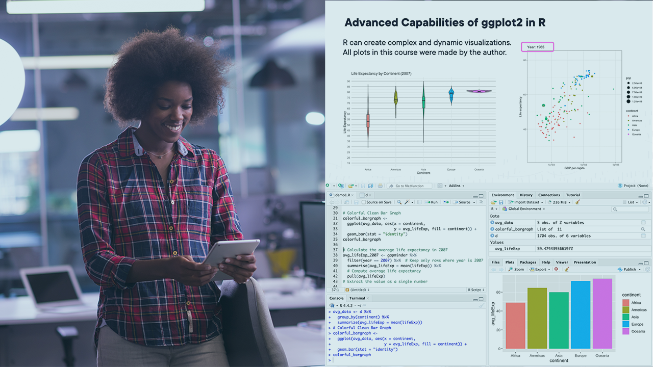
This course explores advanced visualization techniques in R for data analysts and data scientists. The course focuses on advanced, effective, and meaningful visualizations and how to communicate data and statistical findings clearly.
In this course, Advanced Data Visualization Techniques in R, you’ll learn how to use R and RStudio to create effective and meaningful data visualizations at an advanced level.
First, you’ll explore the fundamentals of layering and aesthetics in ggplot2, becoming adept in annotated plots, theming, and faceting to present data clearly and professionally.
Next, you’ll discover how to communicate uncertainty and statistical findings effectively by visualizing confidence intervals and working with distributions through density plots, violin plots, and ridgeline plots. You’ll also learn techniques for time-based visualizations and best practices for avoiding misleading graphs.
Finally, you’ll apply your knowledge to real-world data in RStudio, integrating interactive components via Plotly and Shiny to build engaging, dynamic dashboards. You’ll learn to automate your reporting process with R Markdown and gt tables to create compelling reports and shape your visual narratives for different audiences, ensuring that insights are conveyed powerfully and accurately.
When you’re finished with this course, you’ll have the skills and knowledge to produce compelling, advanced visualizations and clear reports — capable of influencing data-informed business decisions and resonating with both technical and non-technical stakeholders.
Advanced Data Visualization Techniques in R
Advanced
Table of contents
Joan Palmiter Bajorek is a data, analytics, and AI nerd based in Seattle. With a Linguistics MA and PhD in multimodal AI/speech language tech, she loves data and customer projects.
