
- Course
Muse CC Responsive Design
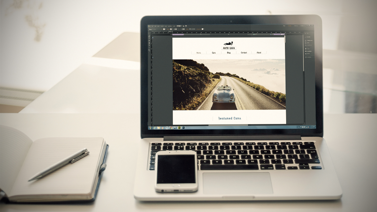
Create a better experience for your user, no matter what kind of display or device they use. This course will teach you how to use Adobe Muse CC to create responsive websites. You'll cover breakpoints, mobile design, widgets, and more. Software required: Muse CC.
Beginner
- Course
Muse CC Responsive Design
Create a better experience for your user, no matter what kind of display or device they use. This course will teach you how to use Adobe Muse CC to create responsive websites. You'll cover breakpoints, mobile design, widgets, and more. Software required: Muse CC.
Beginner
Get started today
Access this course and other top-rated tech content with one of our business plans.
Try this course for free
Access this course and other top-rated tech content with one of our individual plans.
This course is included in the libraries shown below:
- Core Tech
What you'll learn
These days, websites need to be able to respond well to any size screen or device. In this course, Muse CC Responsive Design, you'll learn to easily create responsive websites using Adobe Muse's intuitive tools, so that your website will work no matter what kinds of displays your users have. First, you'll learn the difference between responsive vs. adaptive websites and why it's important. Next you'll move onto creating a new site and its elements, as well as adding and using breakpoints. Finally, you'll create a mobile menu and responsive widgets for your site. By the end of this course, you'll be able to create websites that provide a great user experience on all kinds of screens and devices. Software required: Muse CC.
Muse CC Responsive Design
Beginner
Matthew Pizzi is an Adobe Certified instructor with over 15 years of experience teaching Adobe applications.
